Rempart is a serif typeface in six weights and four widths. Rooted in François Ganeau’s Vendôme, Rempart is an irreverent take on a little-known, but influential cult classic. Instead of attempting to recreate or improve upon Vendôme’s distinct, controlled chaos, Rempart is a reinterpretation that is familiar in spirit, but brand new in form. View and test ↗
On Designing Rempart
Part I: Information, Features, and Details
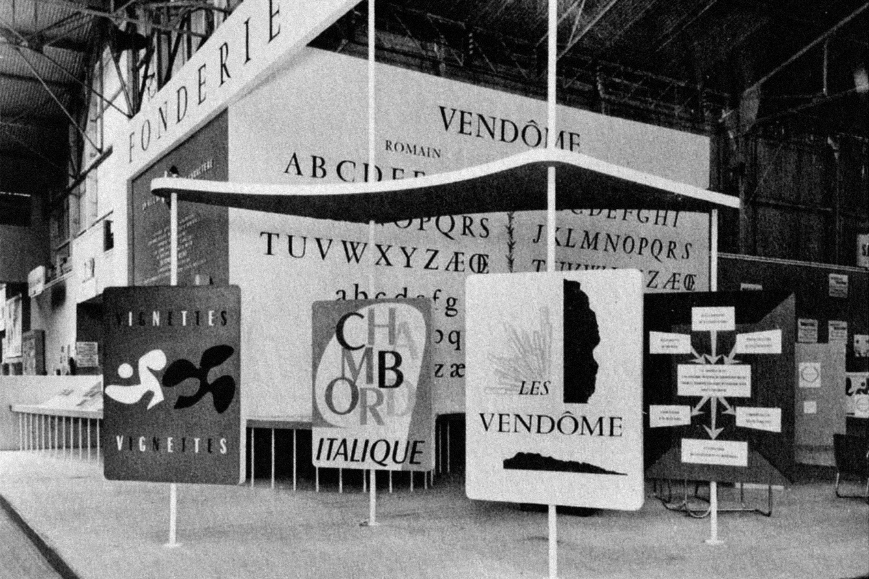
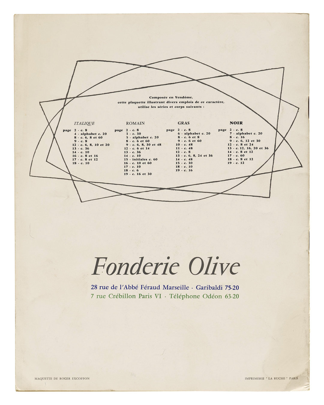
Designed between 1950 and 1957, Vendôme was Francois Ganeau’s only typeface, supervised by Roger Excoffon for Fonderie Olive. It’s a playful, theatrical take on the Garamond genre, which is characterized by a dense calligraphic foundation, classical proportions, and prominent serifs. Vendôme was a near-instant commercial success, and expanded to a number of additional weights, widths, and italics.
Roger Excoffon, in a 1951 interview published by Le Courrier Graphique, is quoted saying: “And so François Ganeau wanted to give us a ‘stylish character’ that would ennoble the page, preserve its literary charm, but without making it look dated…” In 1983, José Mendoza y Almeida remarked that “Ganeau … began work on his preliminary sketches for the typeface that was to be called Vendôme. The object was to renew and rejuvenate the Garamont by creating a classic typeface of modern make…”
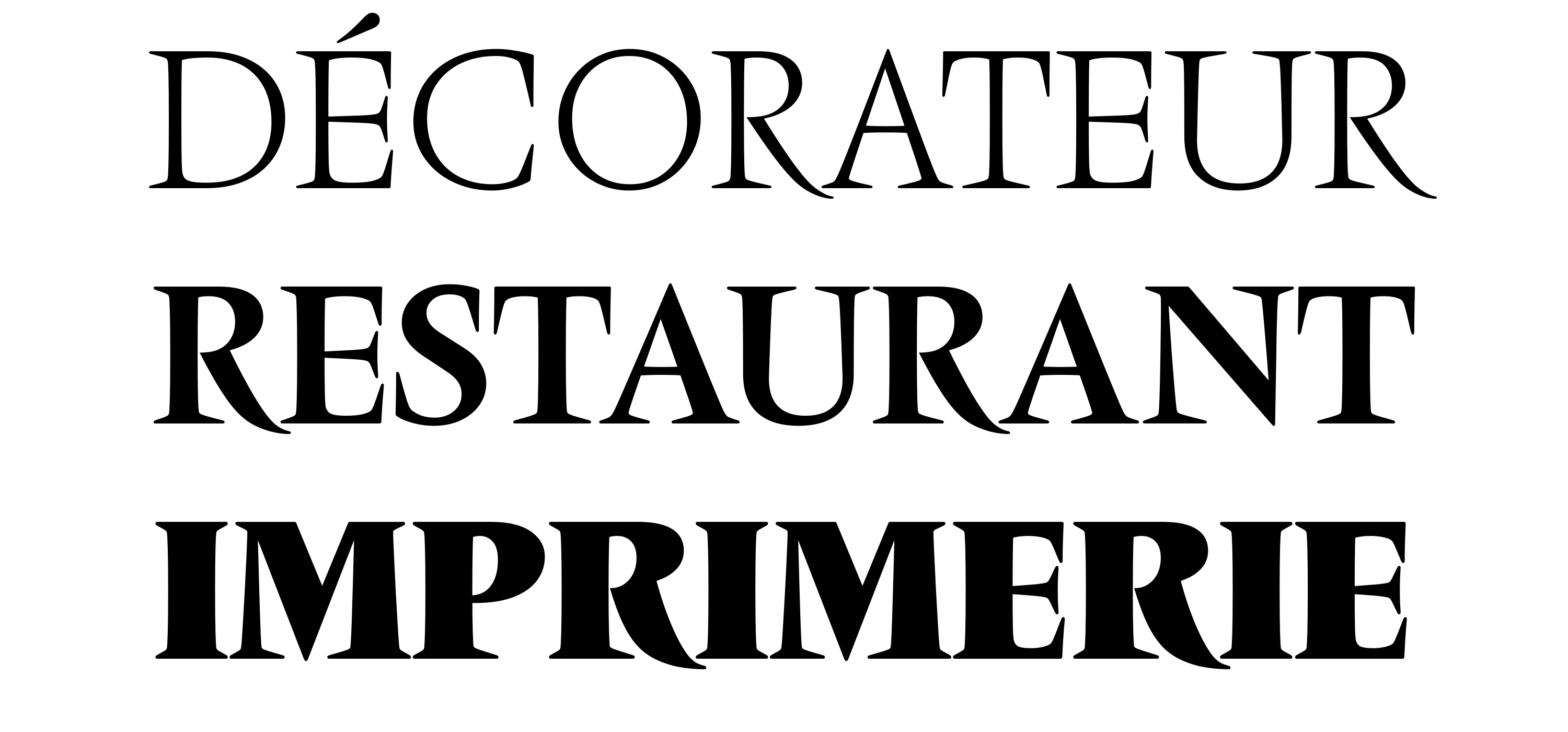
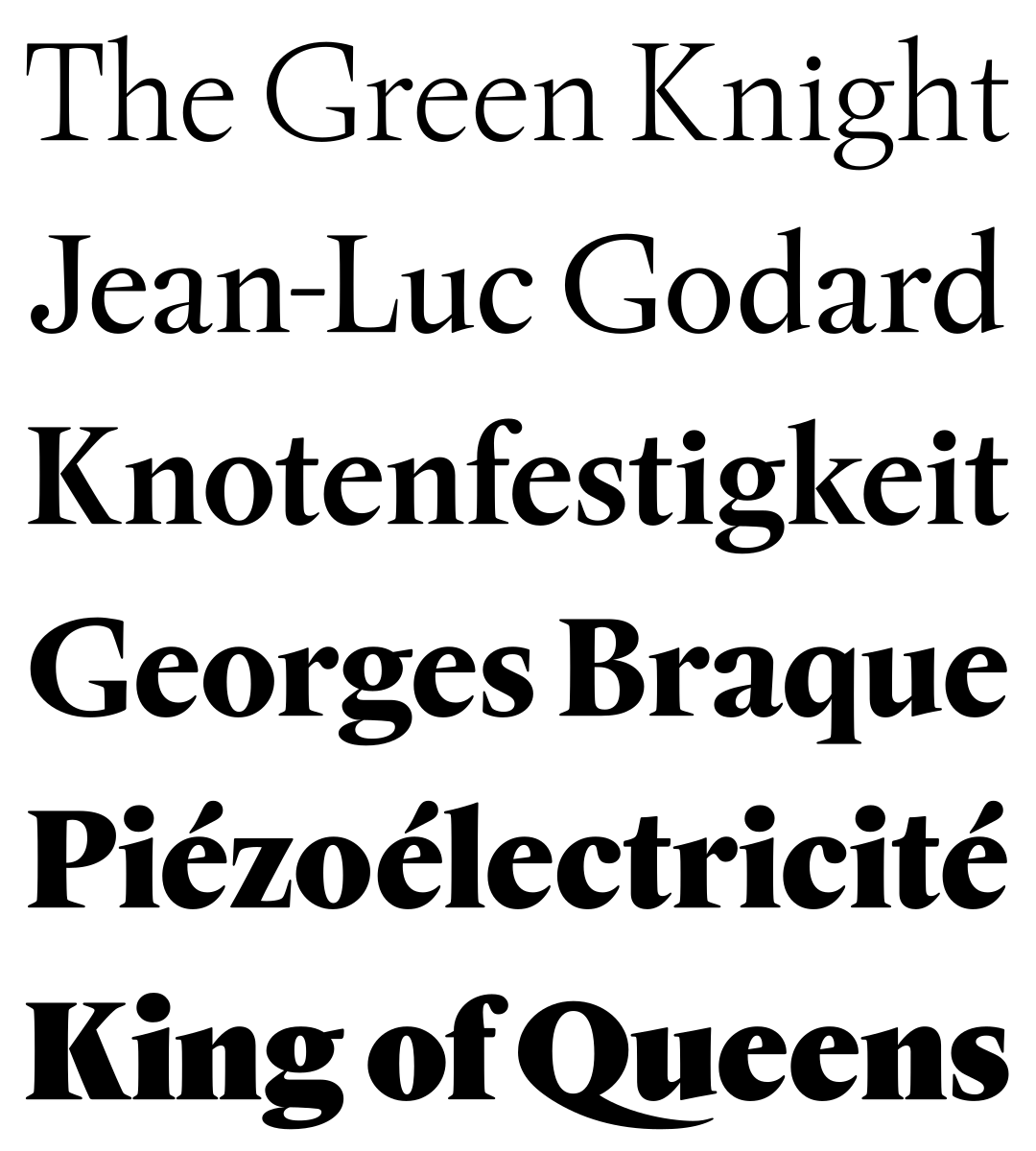
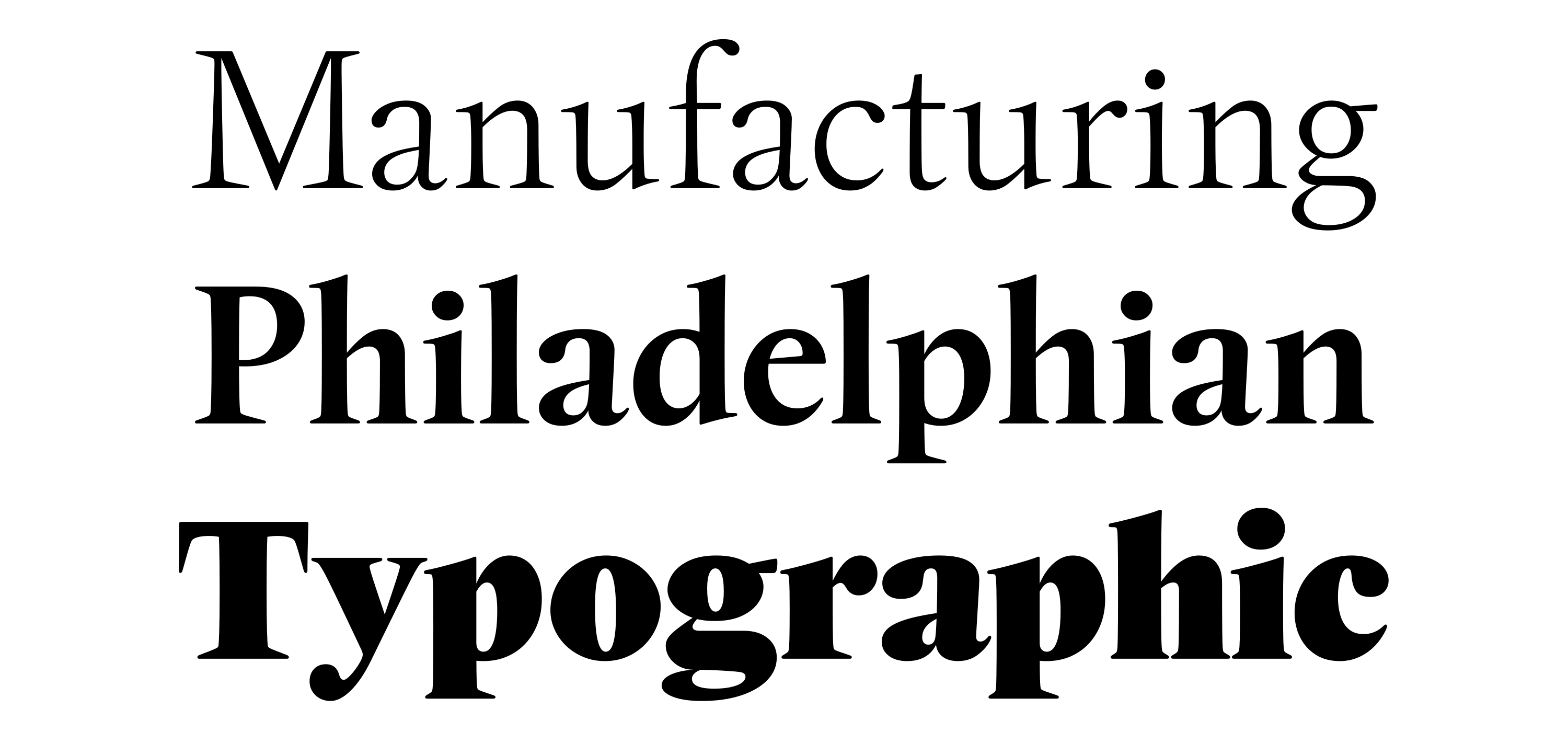
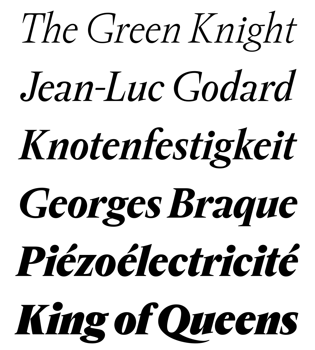
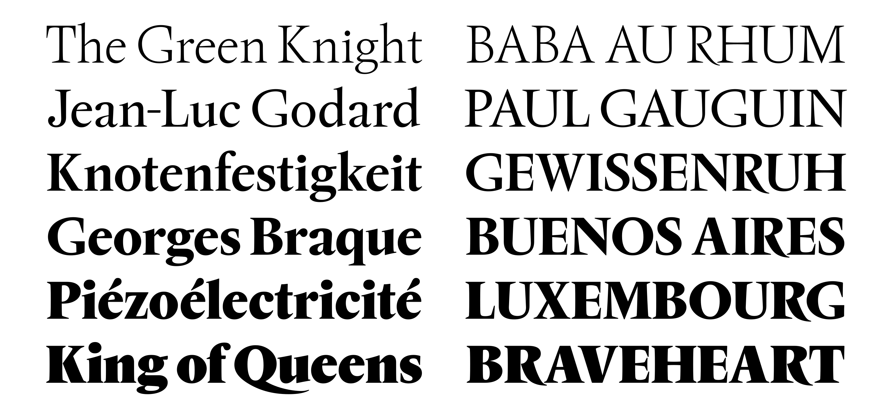
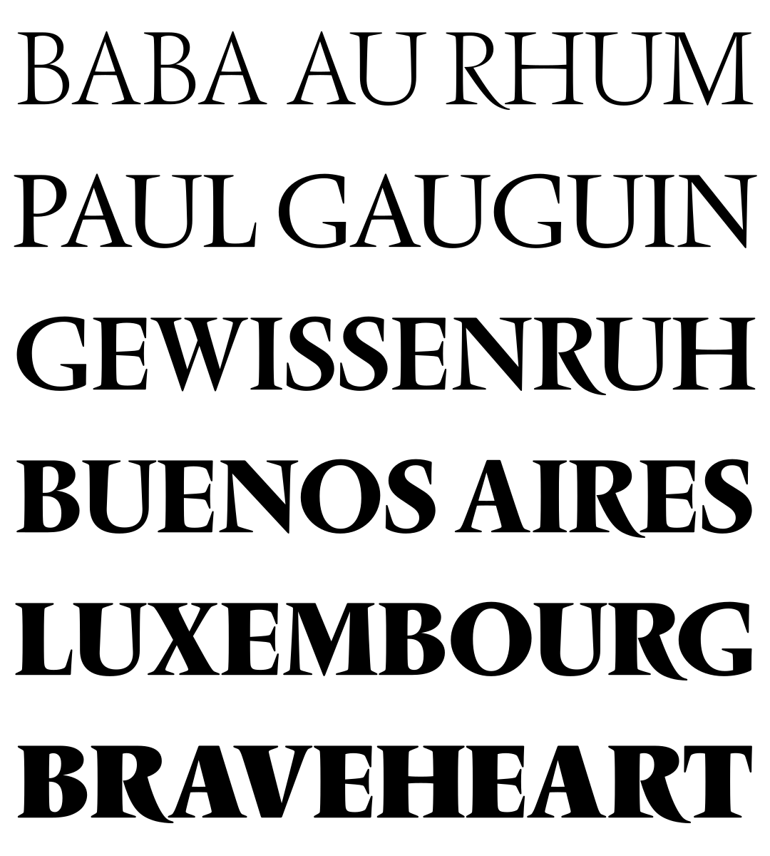
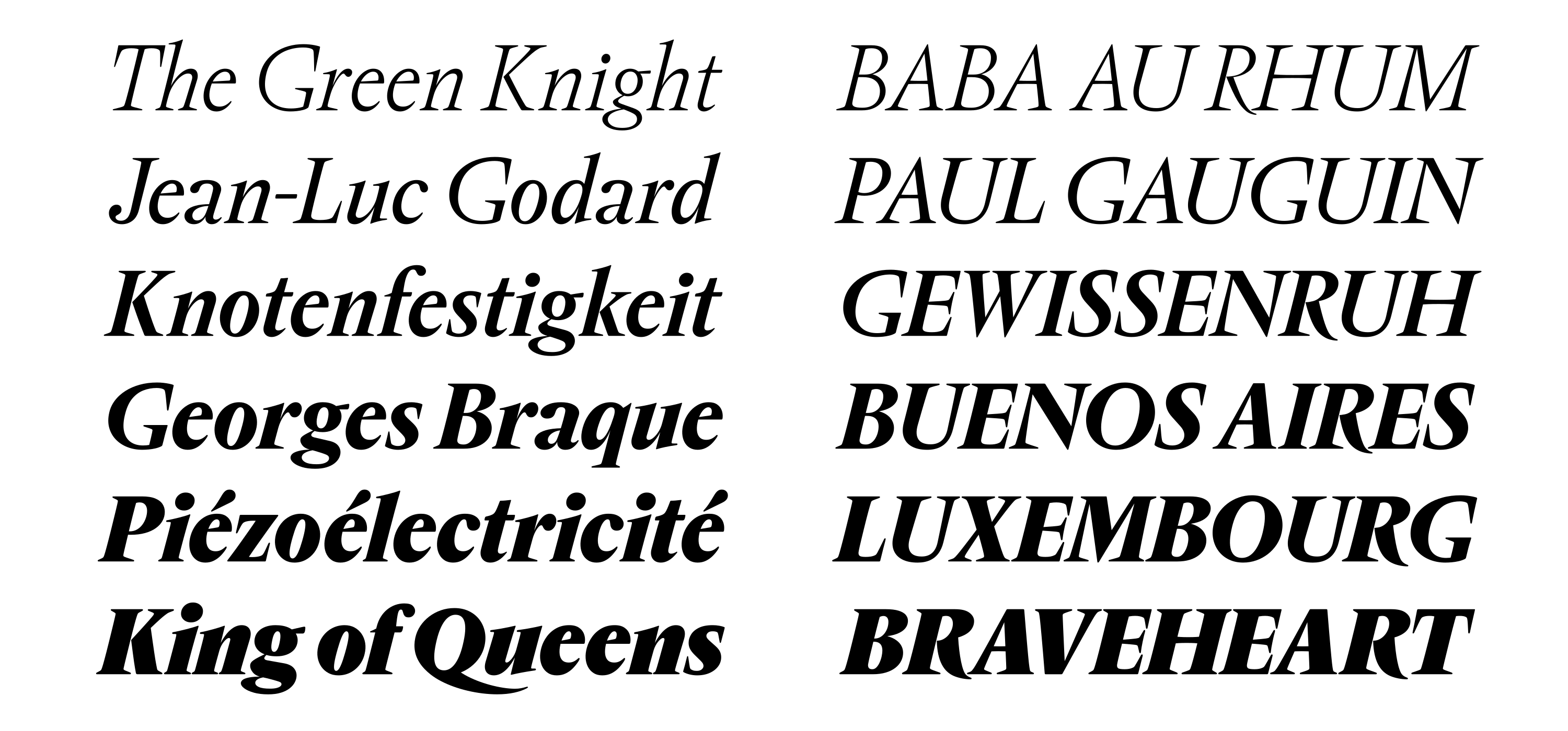
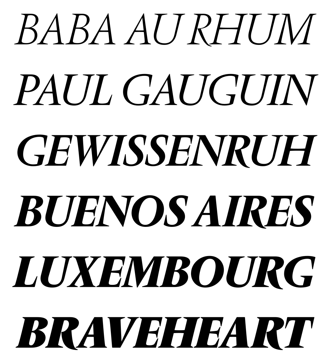
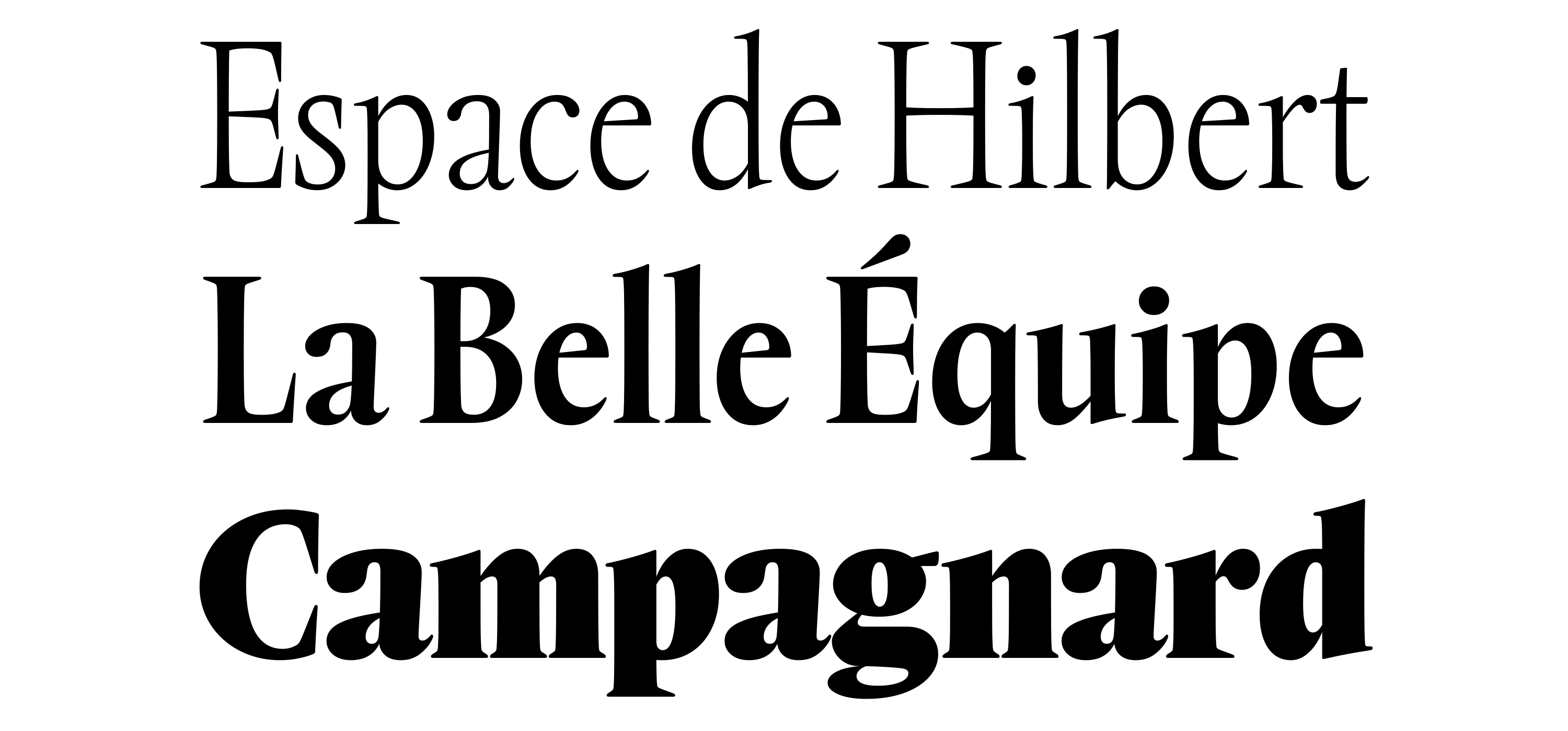
Rempart Light, Medium, Black
Much like Vendôme, Rempart’s serifs are wide, heavy, and prominent. In certain forms where a lot of negative space is created (F, G, K, N, P, R, T, Y, f, k, p, q, r), these serifs double, sometimes triple in length, adding both stability and forward movement. Some vertical serifs follow this same logic (C, G, S, T, Z), filling in space and adding density when necessary. Unlike Vendôme, Rempart’s serifs and stroke endings are rounded, reminiscent of the way ink expands when pressed into paper.

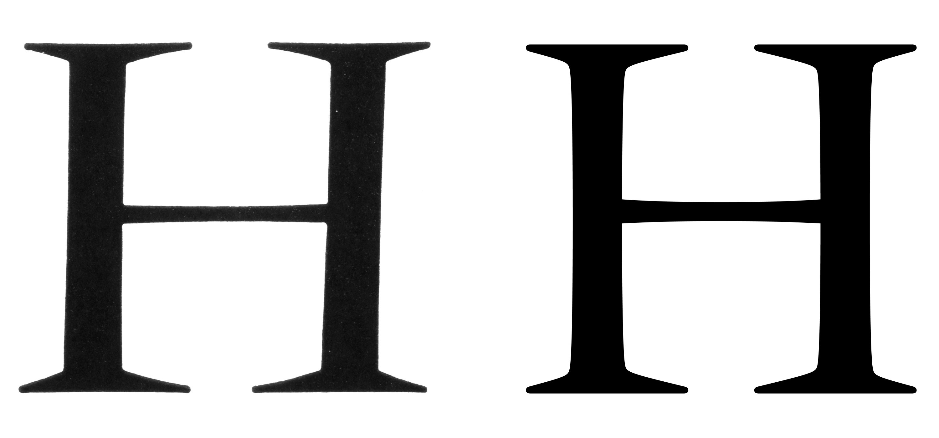
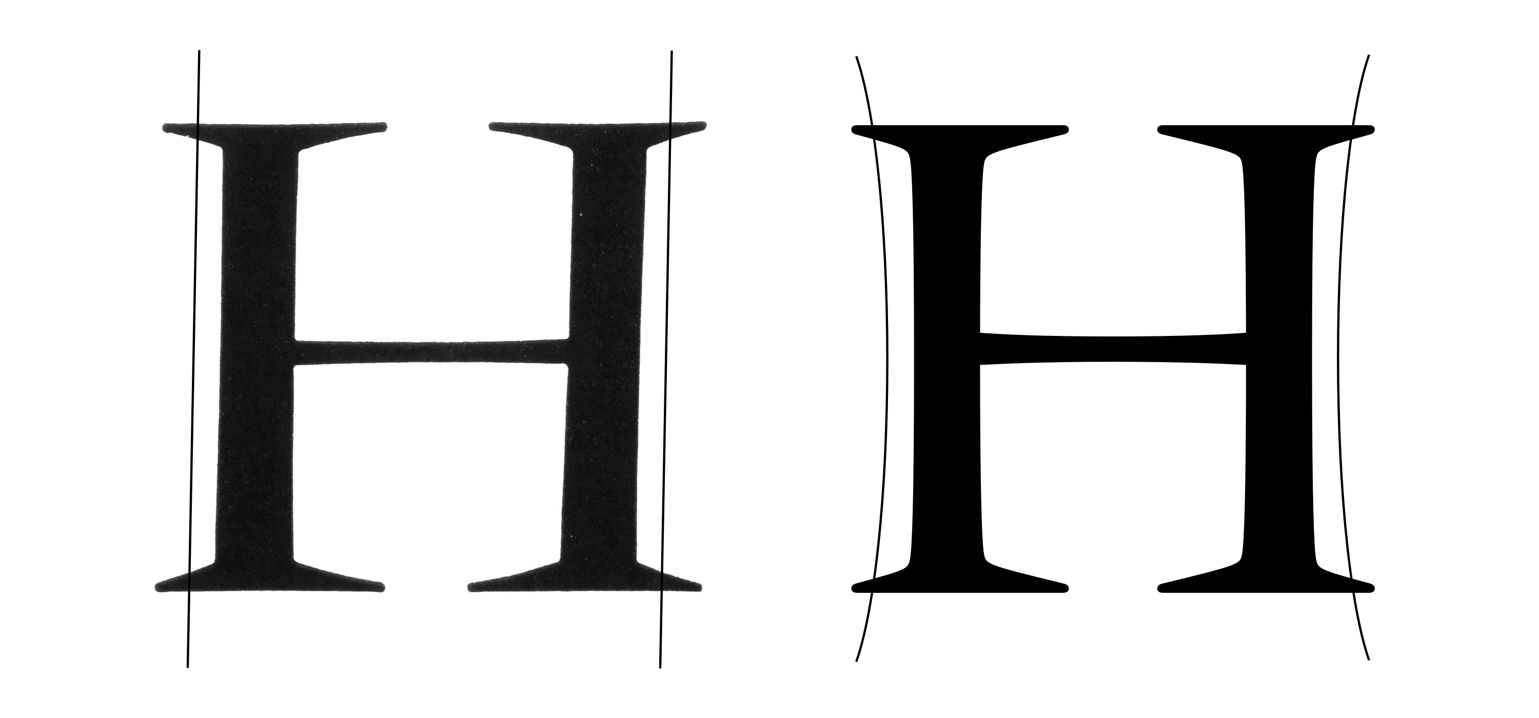
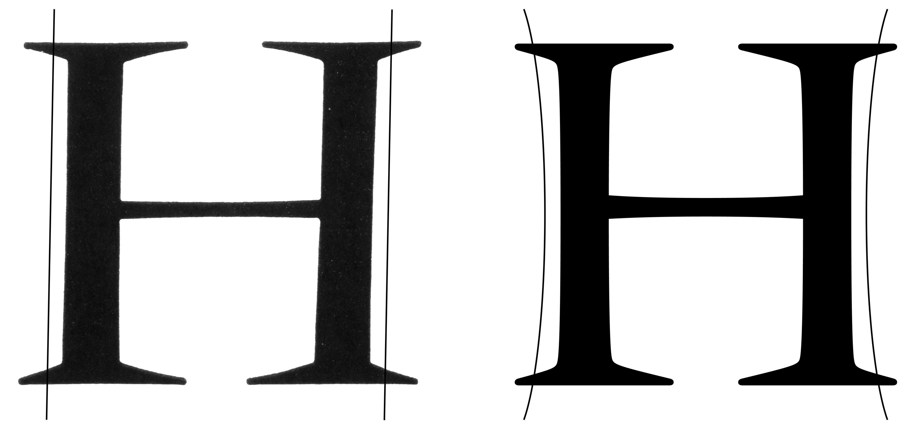
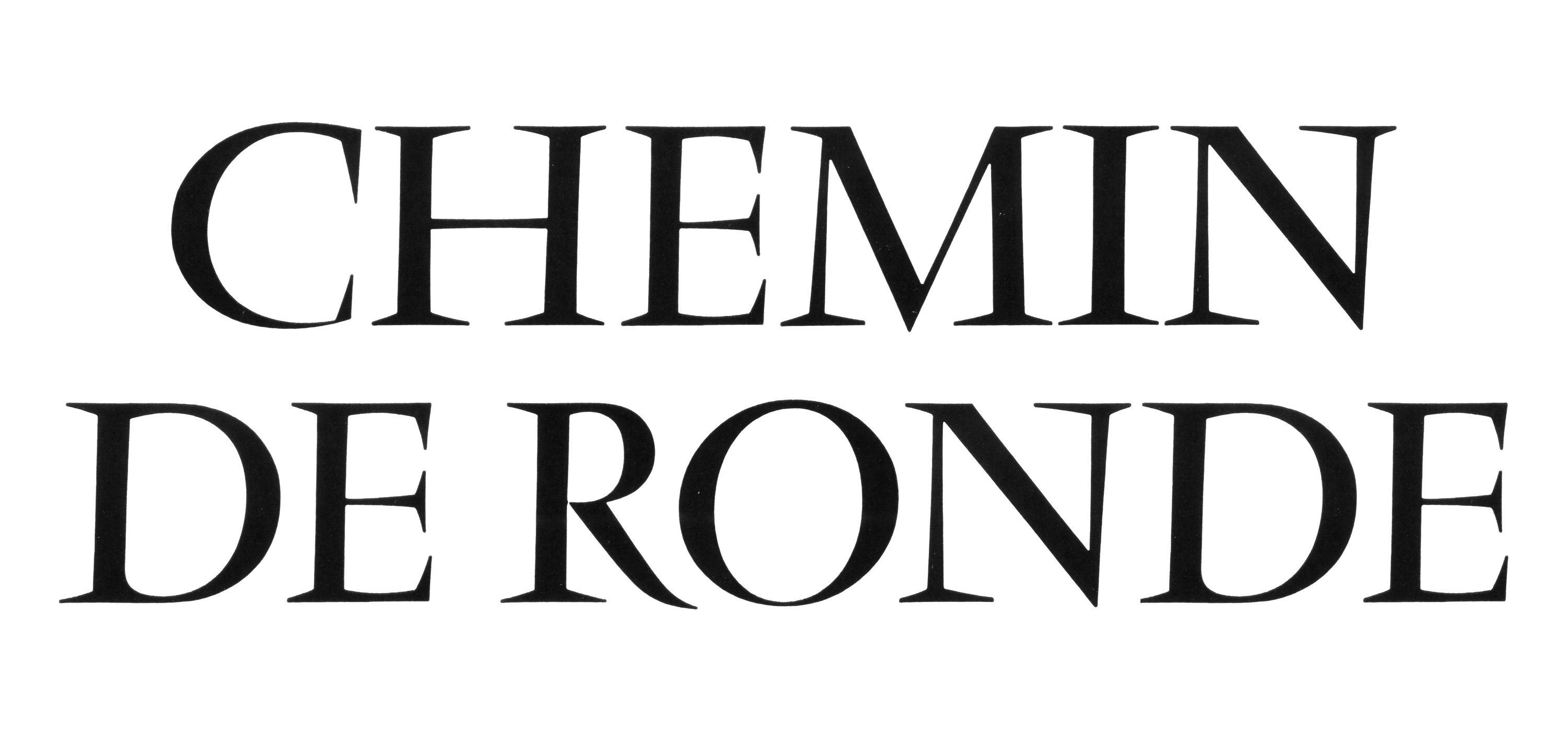
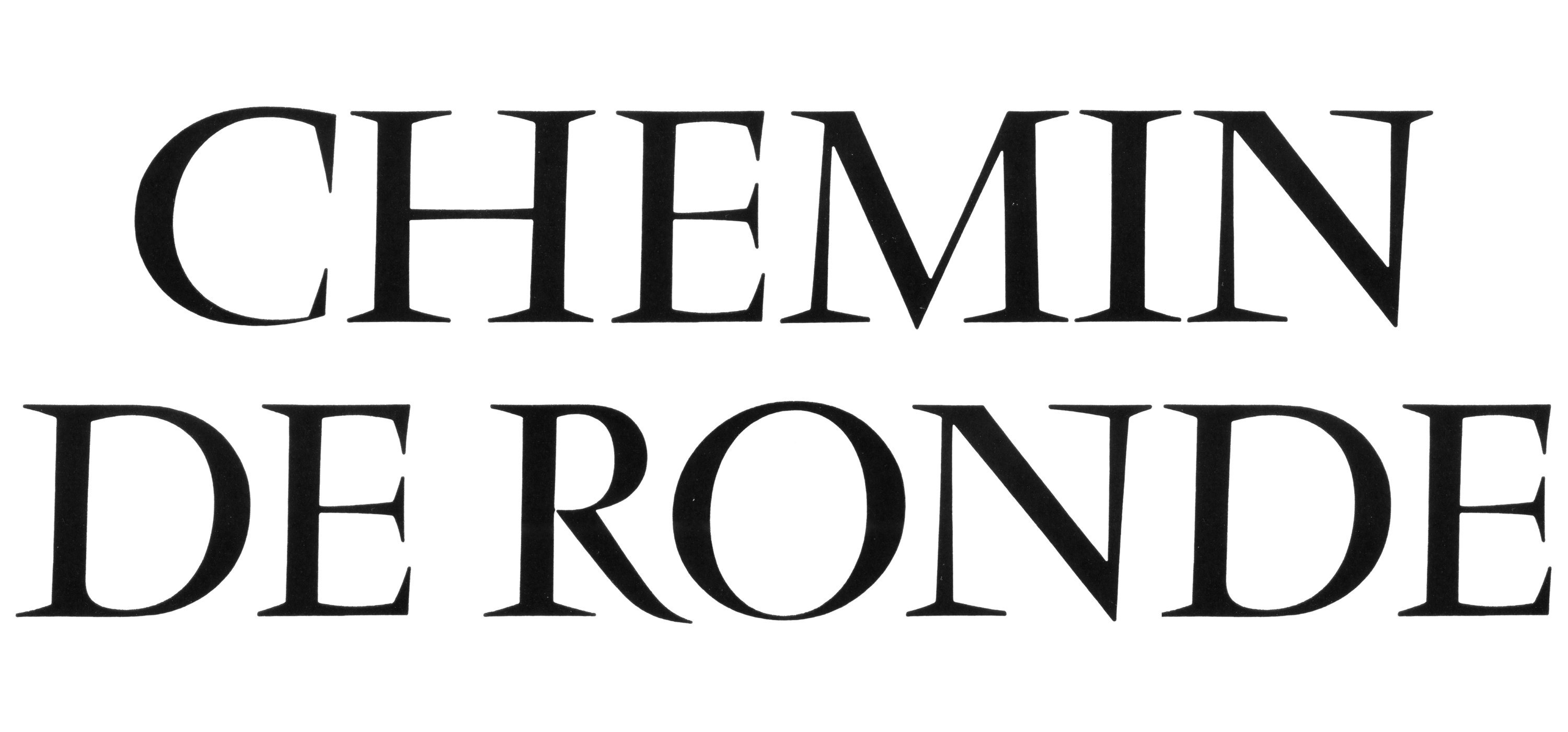
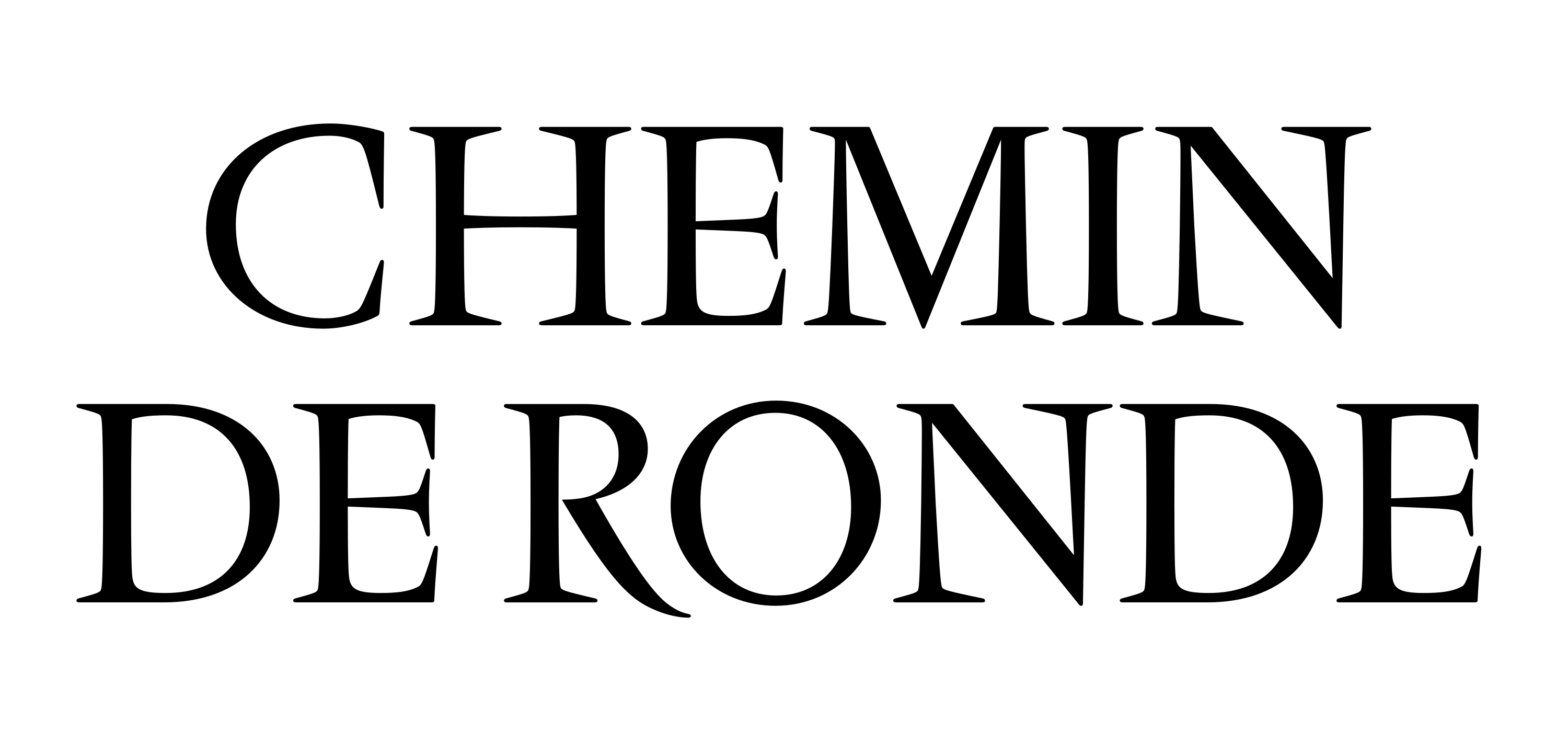
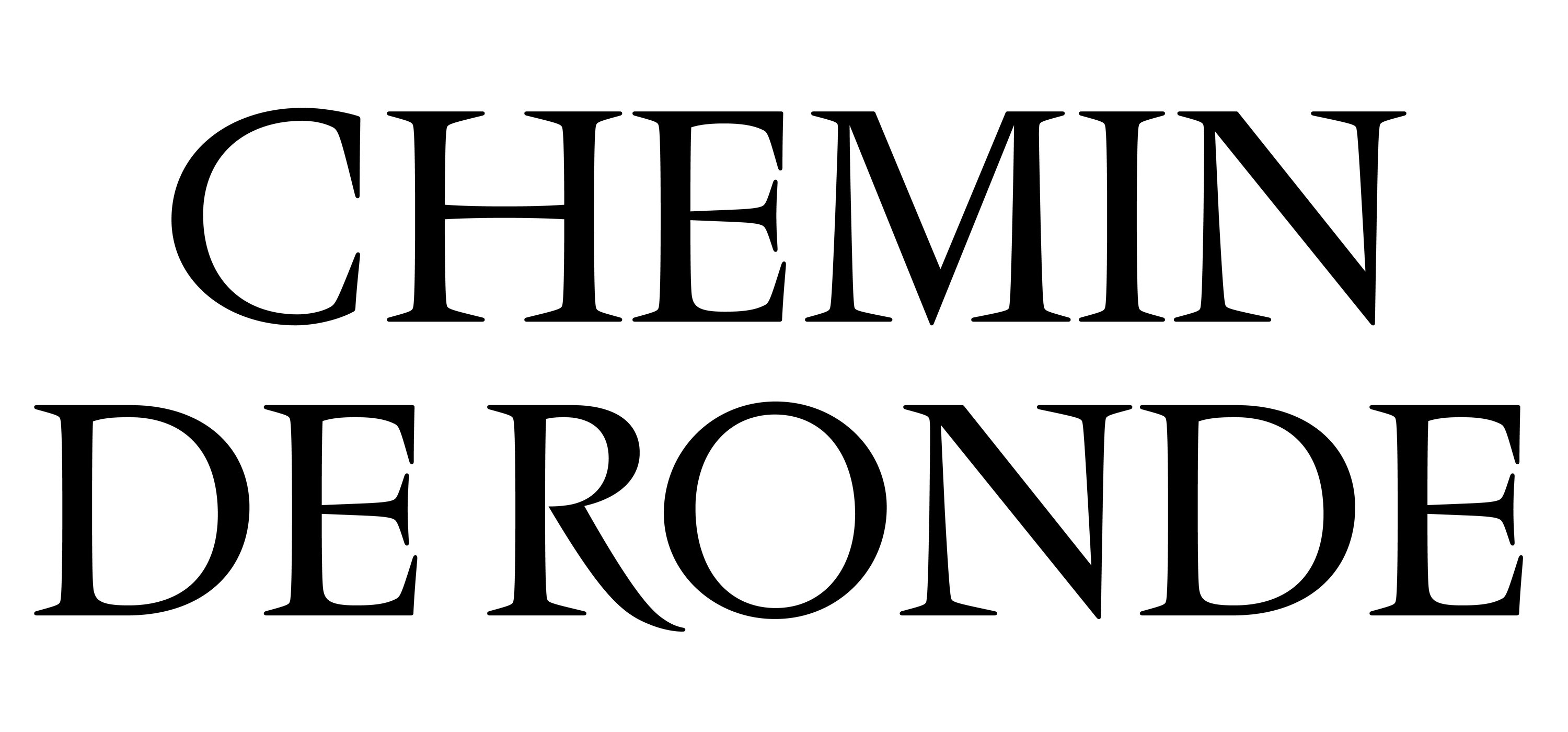
Left: Vendôme Right: Rempart
In contrast to all this angularity, Rempart’s vertical stems carry a slight curvature known as entasis, adding density and warmth with a connection to inscriptional calligraphy. These concave stems also create an unexpected nod to Aldo Novarese’s Augustea, Adrian Frutiger’s Méridien, and even Carol Twombly’s Charlemagne.
Despite Vendôme lacking a true calligraphic structure, it leans forward slightly, adding warmth and movement to its texture. This forward lean is also intended to connect Vendôme’s upright to its unusual italic structure (see below.) Rempart chooses not to lean like Vendôme does, and instead, relies on entasis to attain a similar vibrance.
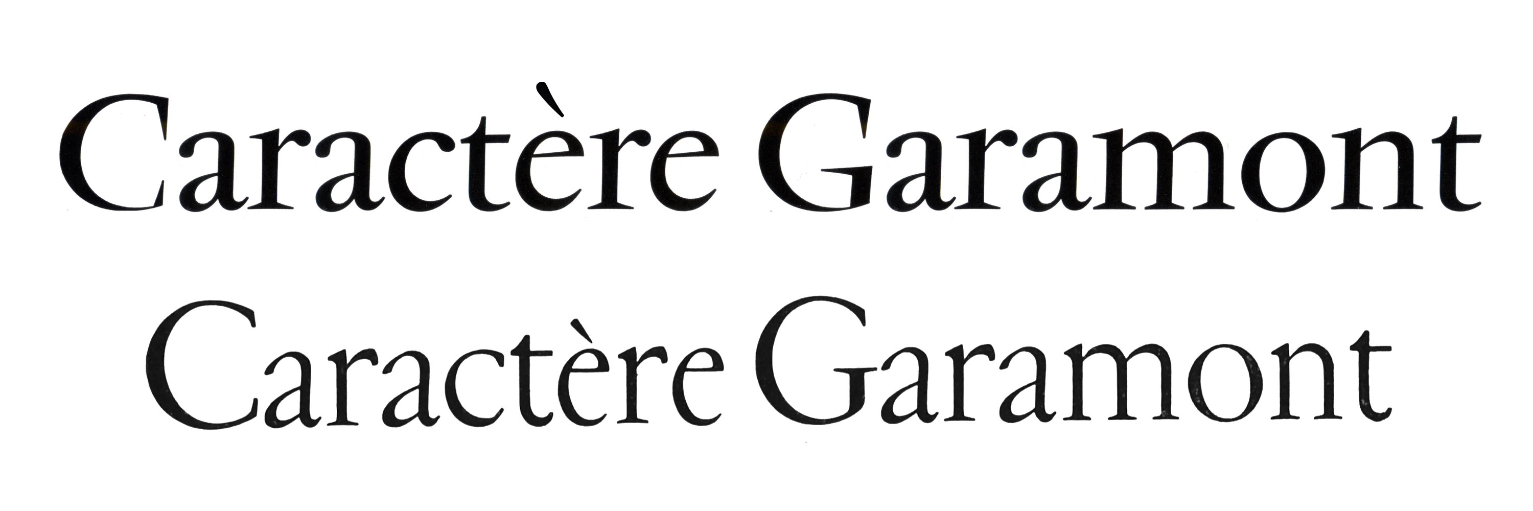
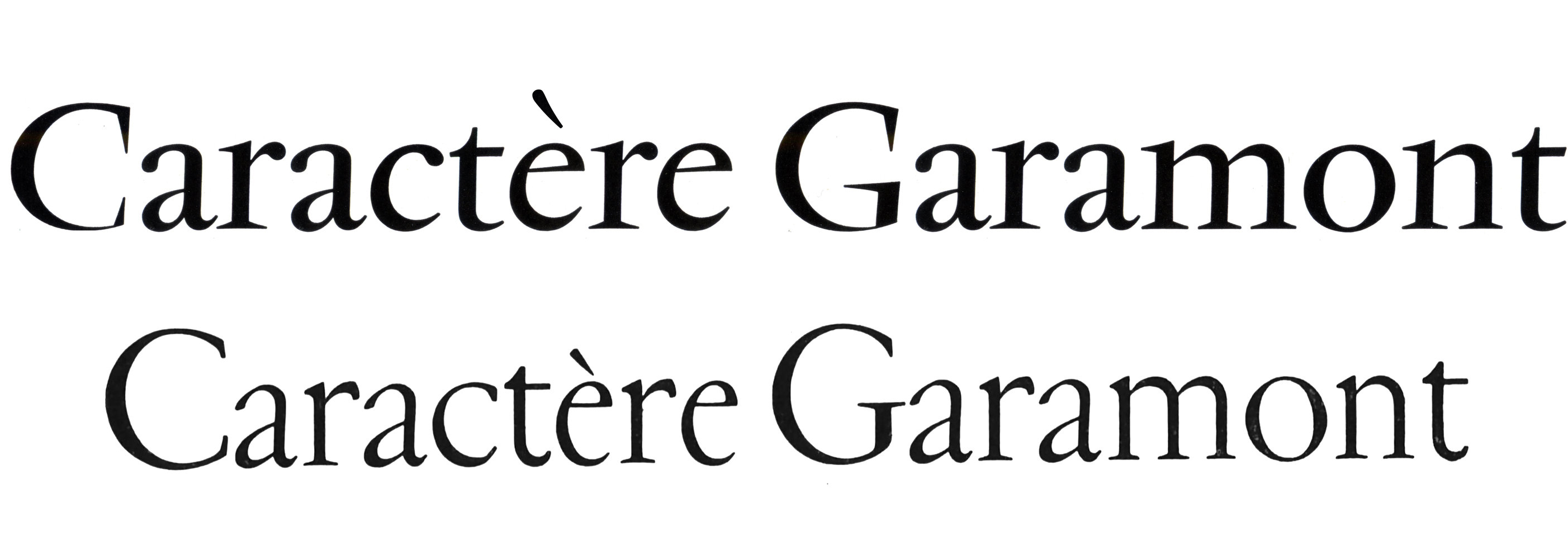
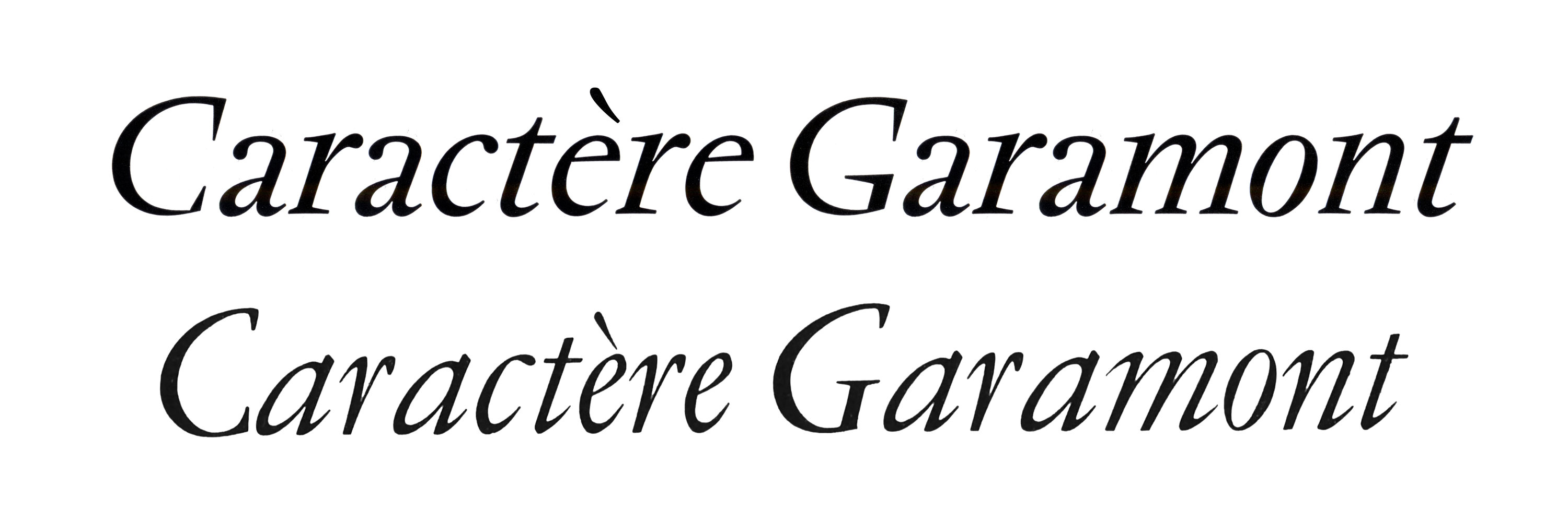
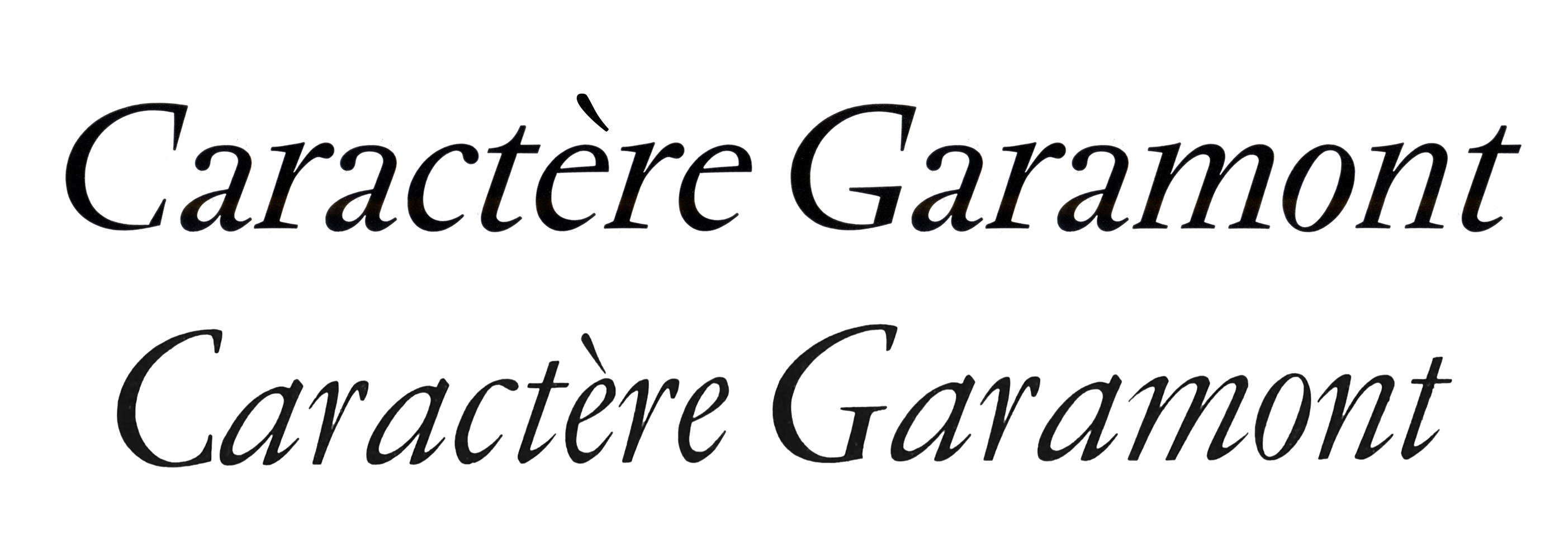
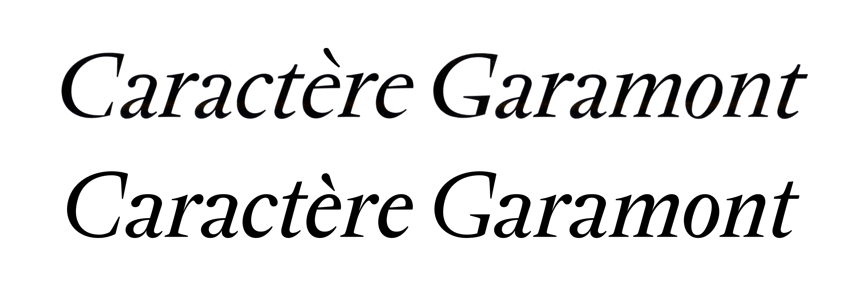
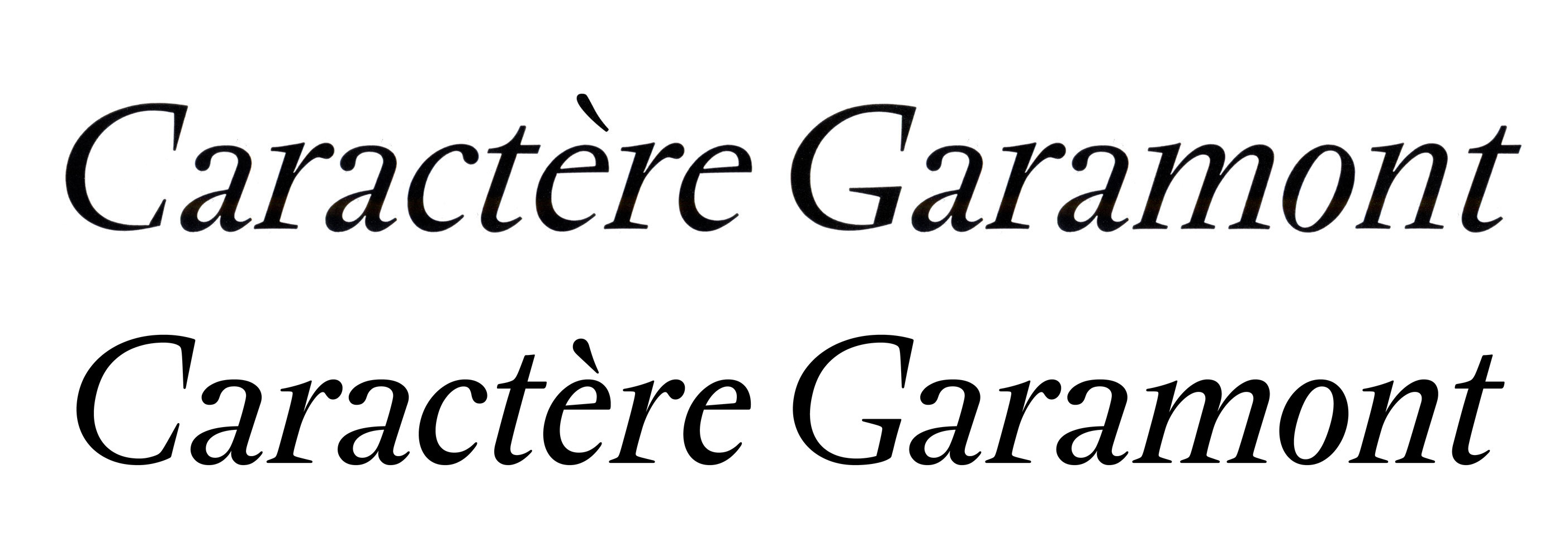
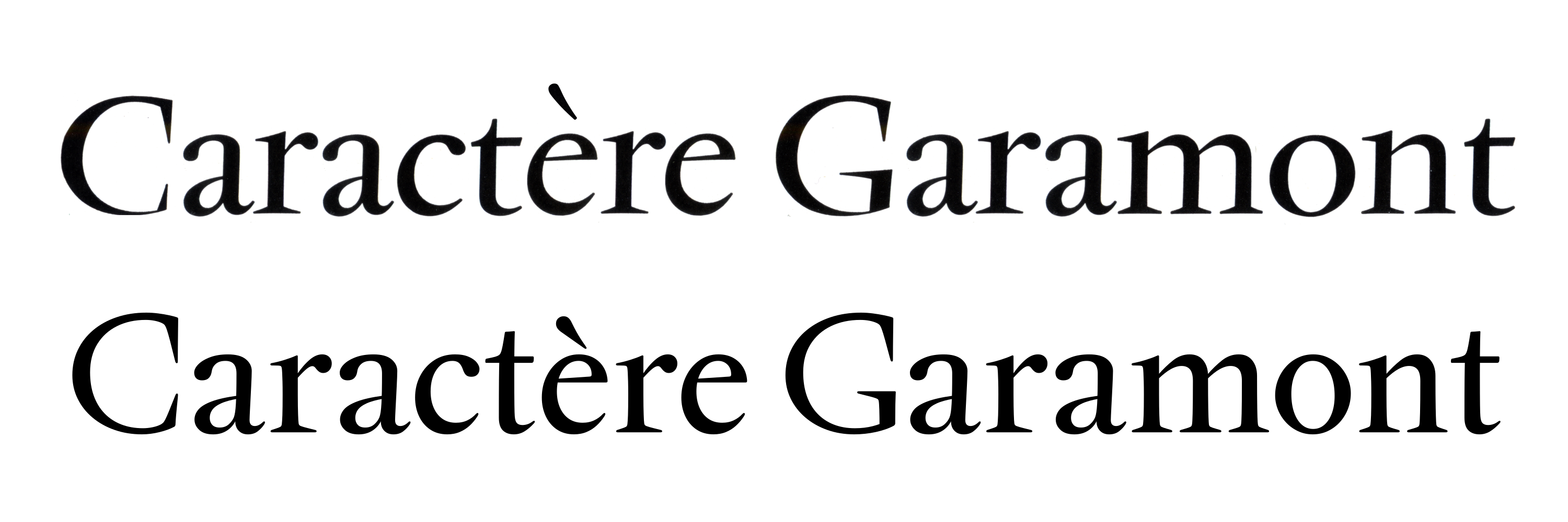
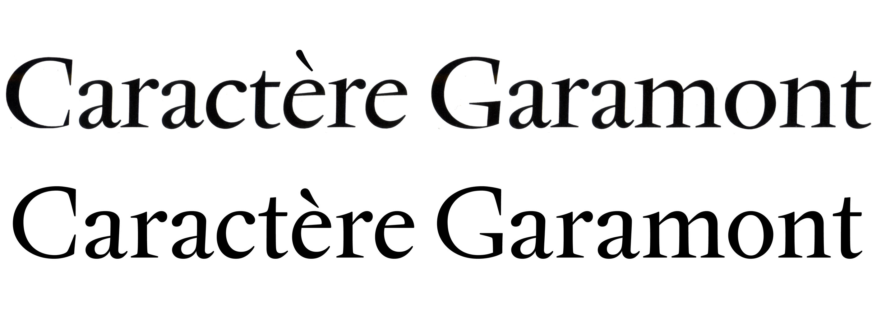
Above: Vendôme Below: Deberny & Peignot Garamond
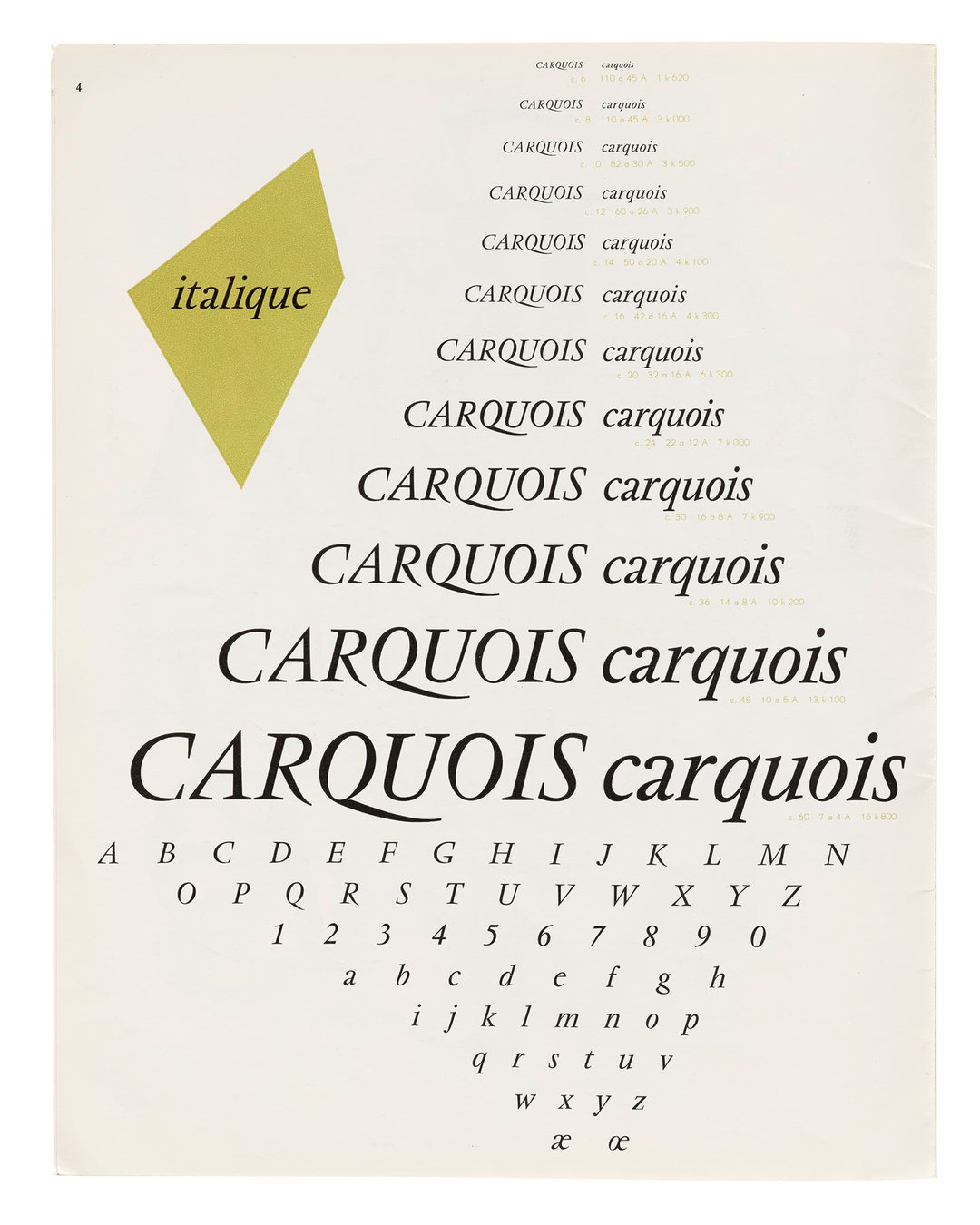
Vendôme’s italics are unmistakable. Instead of relying on a typical calligraphic convention for its lowercase (as shown in the above Deberny & Peignot Garamond), Ganeau, encouraged by Roger Excoffon, came up with the idea of keeping the upright skeleton and serifs in place, and adding a strong forward slant. Traditionally, this method of obliquing upright forms was reserved for sans-serifs. Vendôme was one the first, and still one of the very few, serif typefaces to have this feature. Look closely, however, and you’ll notice that Vendôme’s italics do, in fact, have some key details that not only depart from the upright, but follow the same calligraphic models that they deviate from.
Branching on shapes like h, n, m, r, and u transition from a stab-connection to a tangent-connection, interior bowls of shapes b, d, p, and q become fully round (b loses its lower-left spur), and exterior curves of of c, e, and o are rotated just as much as they are slanted. Together, these details make Vendôme’s italics actually italic, and not just skewed roman shapes. Rempart’s italics follow Vendôme’s model: carefully considering when to skew and when to rotate, when to change the way serifs take up space, when to rely on, and when to abandon calligraphy.
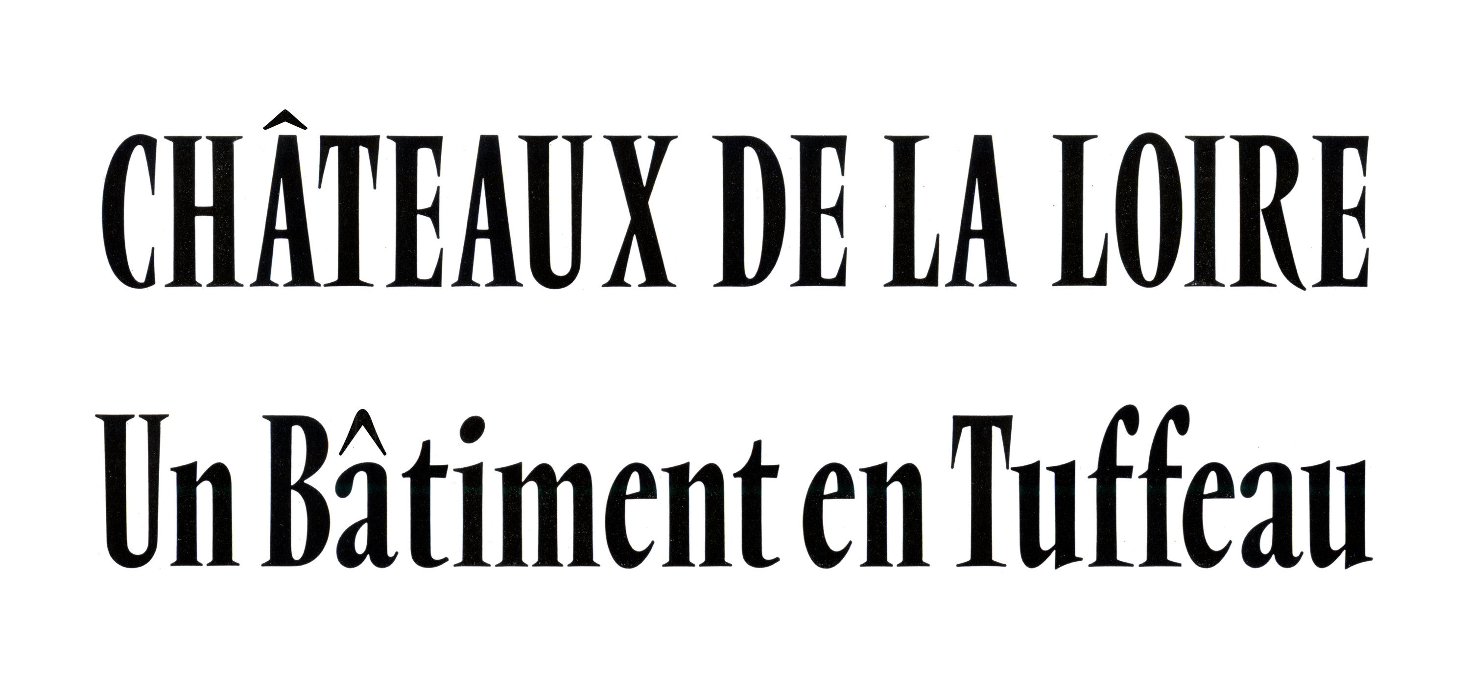
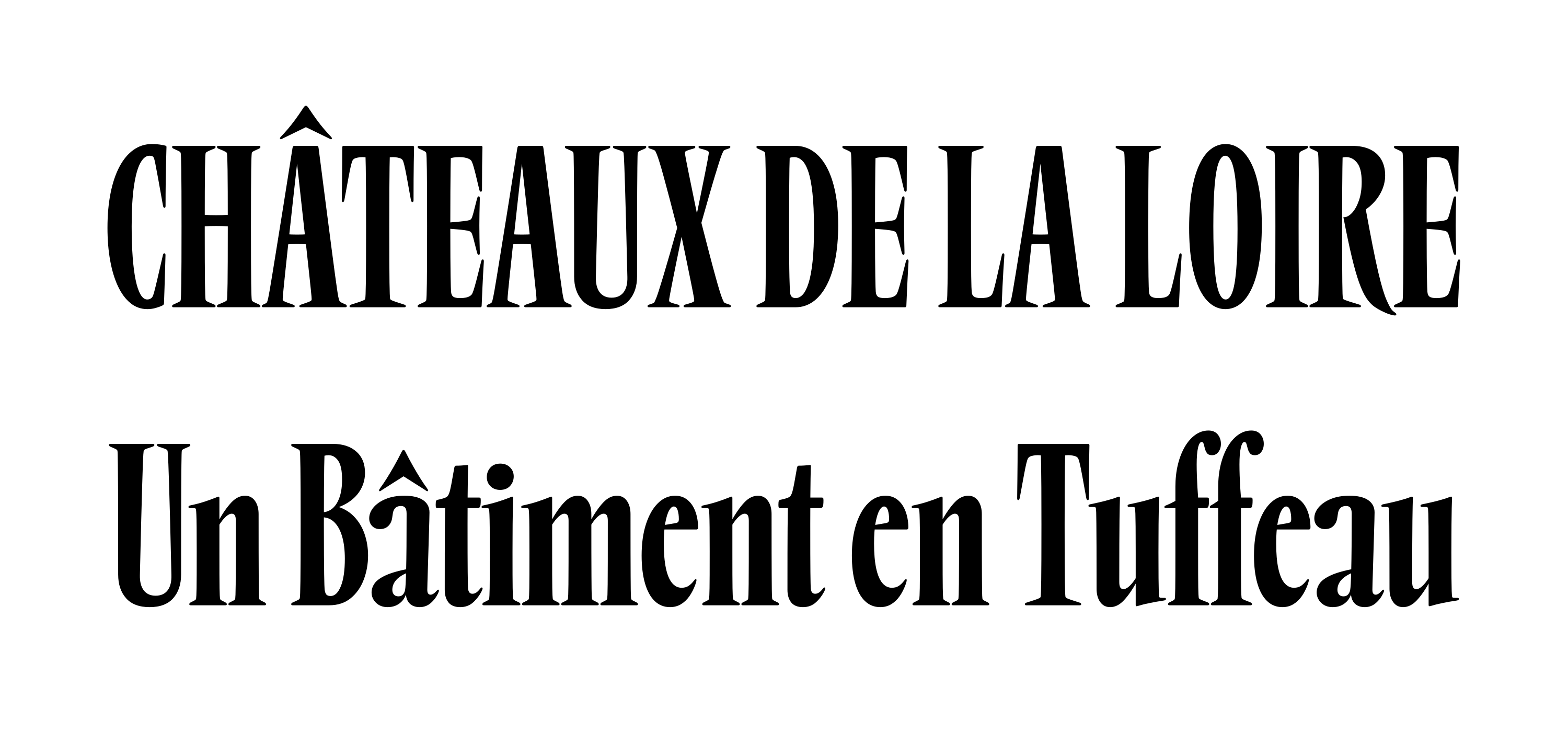
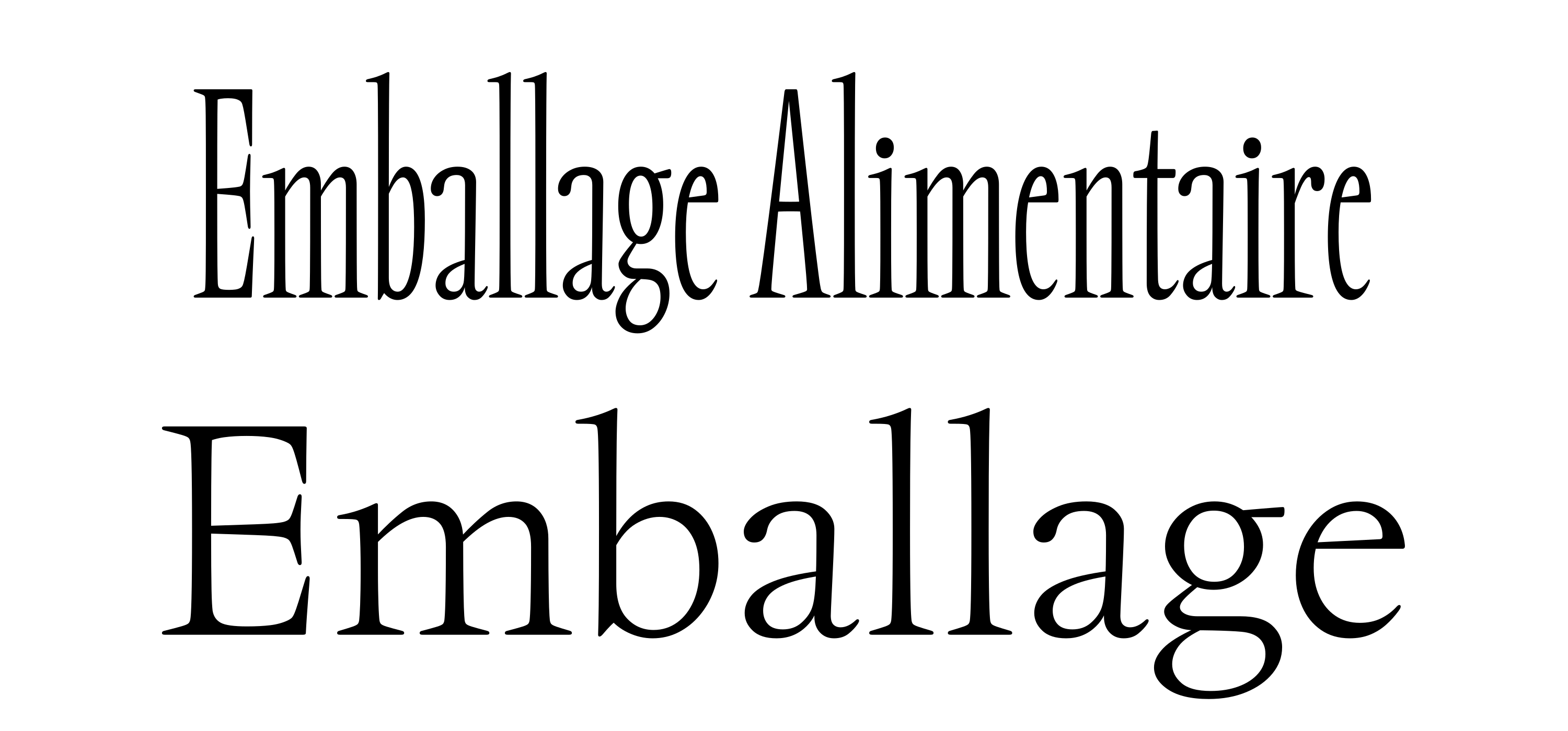
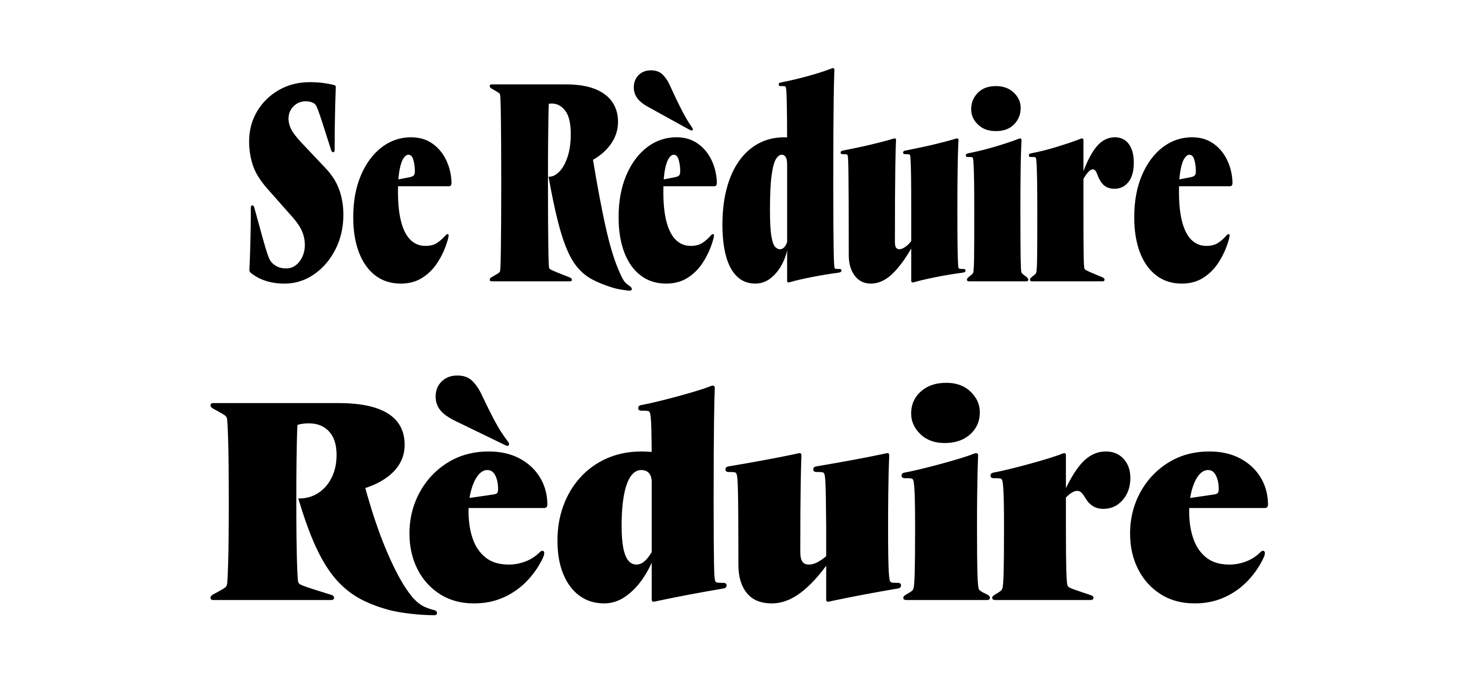
Vendôme Condensed
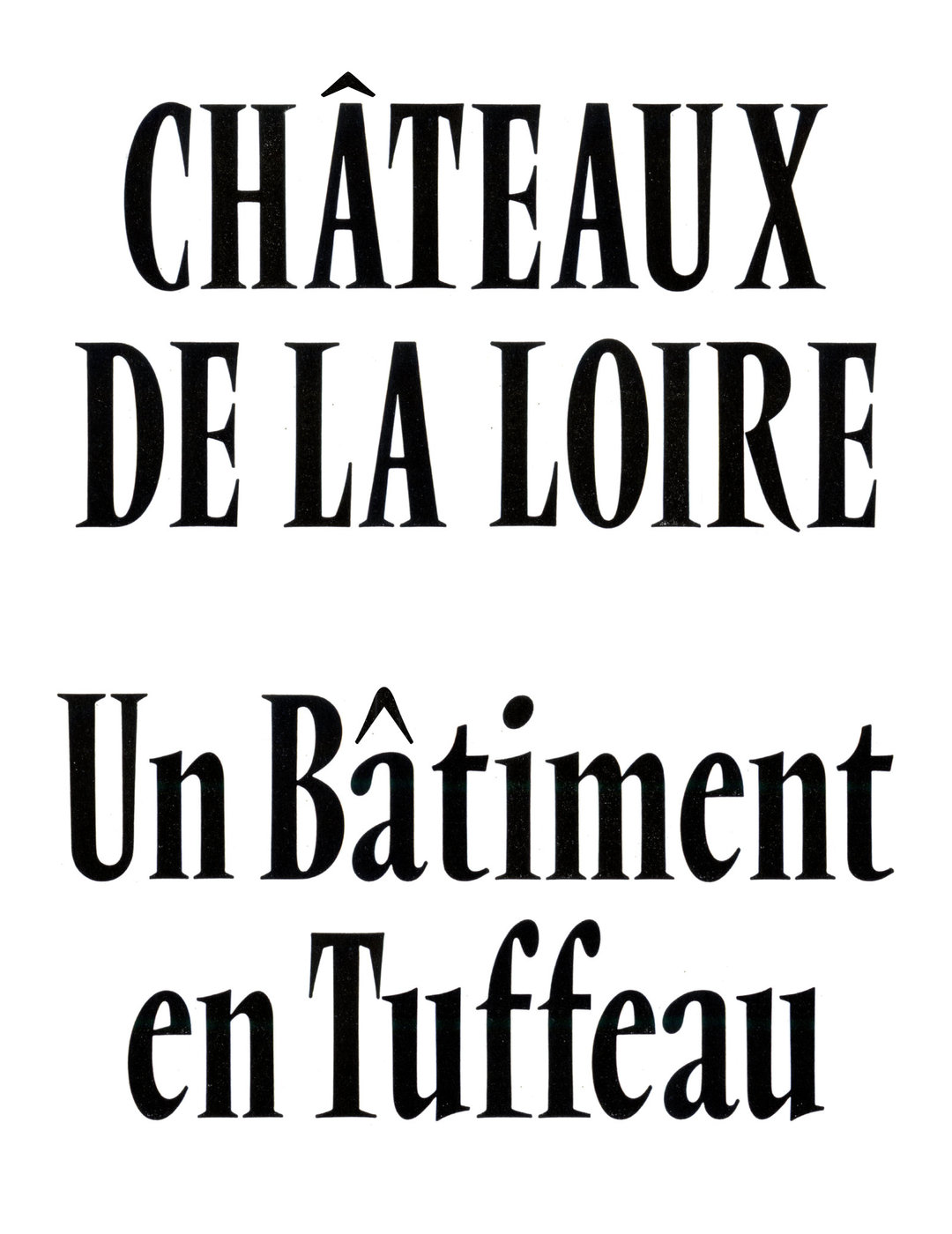

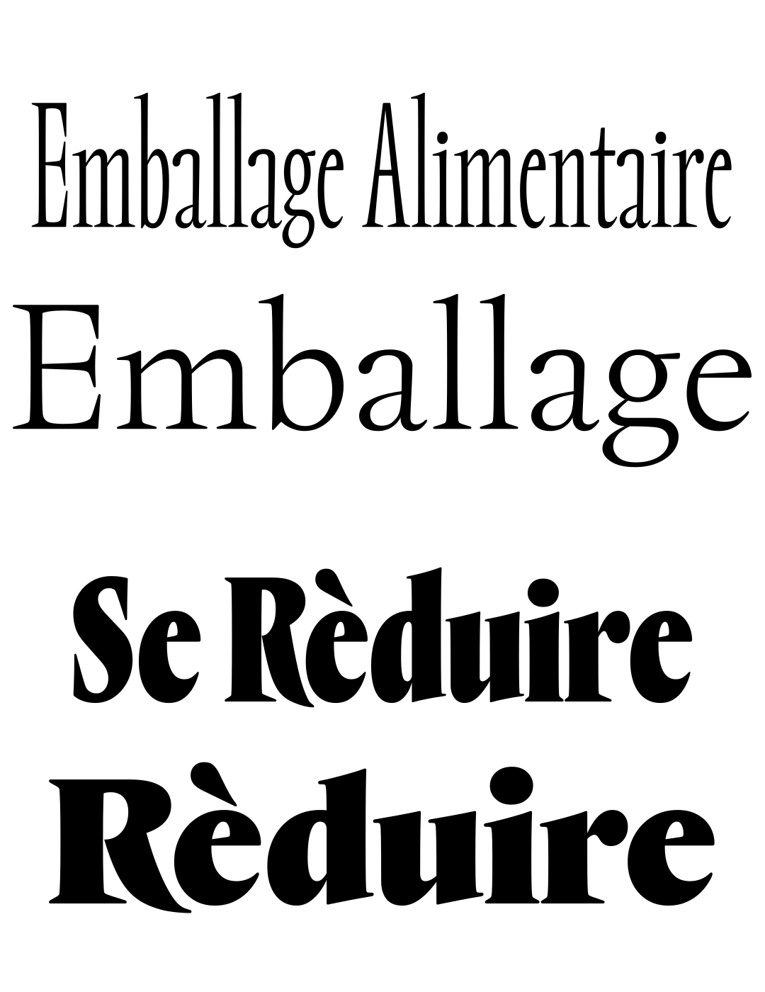
Vendôme Condensed
As was common with the time, Vendôme’s collection of styles were added one by one over a few years. At one point, a single condensed style was added. Much like the italics, a condensed style of this exaggerated proportion was reserved mostly for sans, or slab-serif type … models with simple, un-angled stroke contrast. Vendôme Condensed, especially when set all-caps, is stunning. Instead of tempering to allow for more compact settings, the forms exaggerate in a rather over-pronounced, over-compensated, and over-zealous way.
In the same theme of over-exaggerating, Rempart Compressed transforms to an extreme measure. Serifs remain extra long in some places to provide balance and density. Bowls of a and e scale vertically as well as horizontally, and ball-terminals of c and r remain close to the x-height, providing a distinct under- (and over-) bite to the lowercase. Ascenders keep their height, but descenders reduce their length considerably, allowing for ultra-tight vertical spacing. The thickness of Rempart’s horizontal strokes remain almost un-changed from Normal to Compressed as a way to keep the forms dense and impactful, much like Vendôme’s.
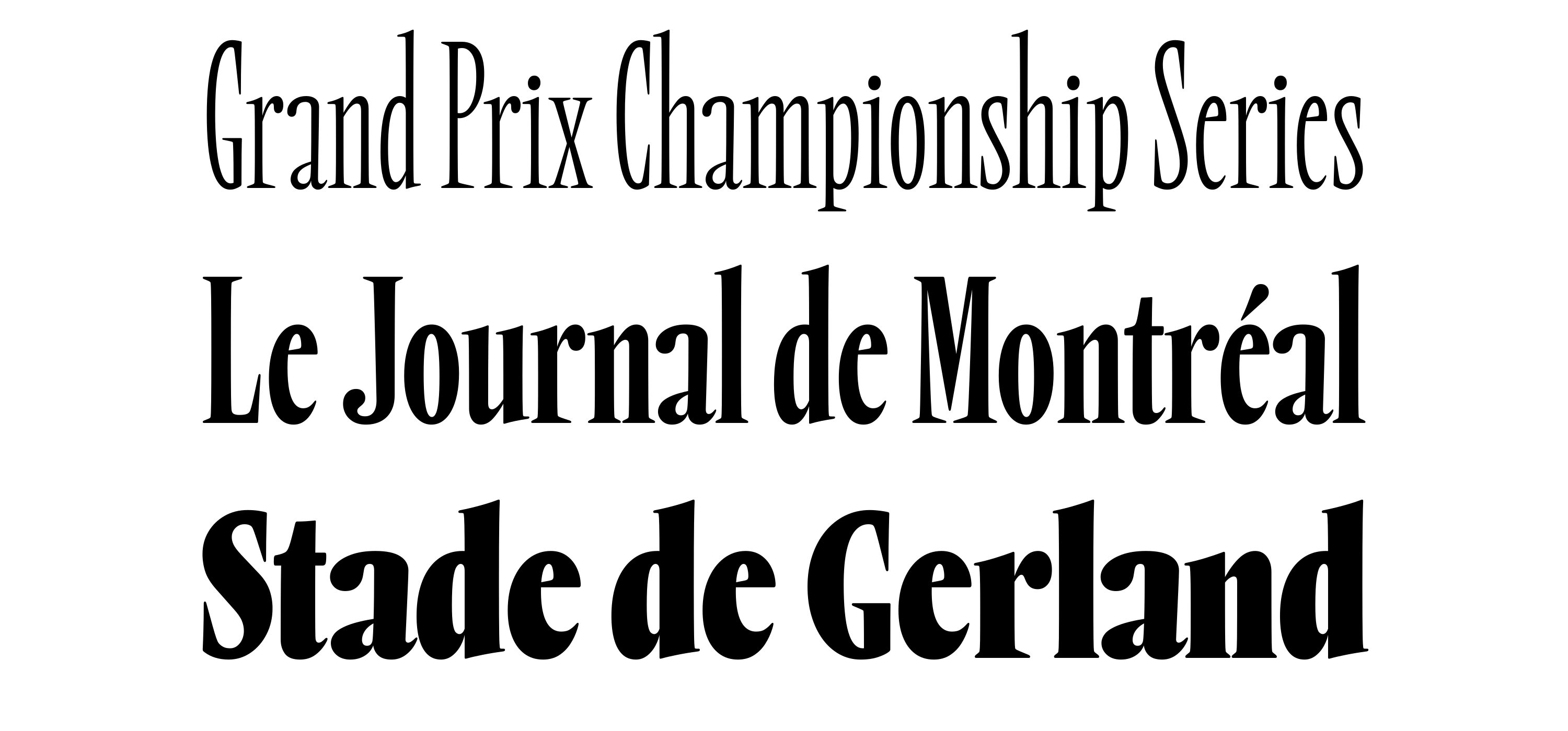
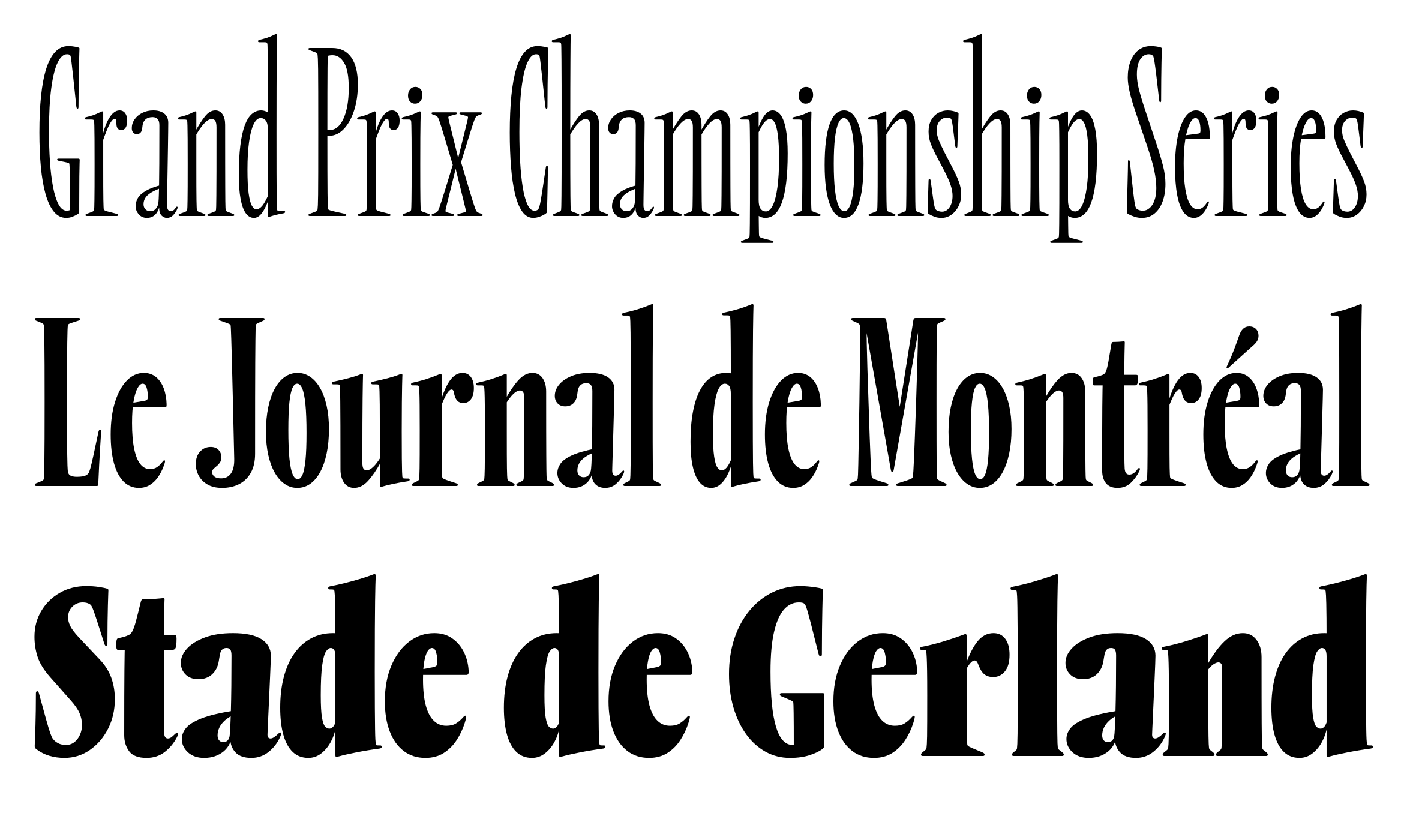
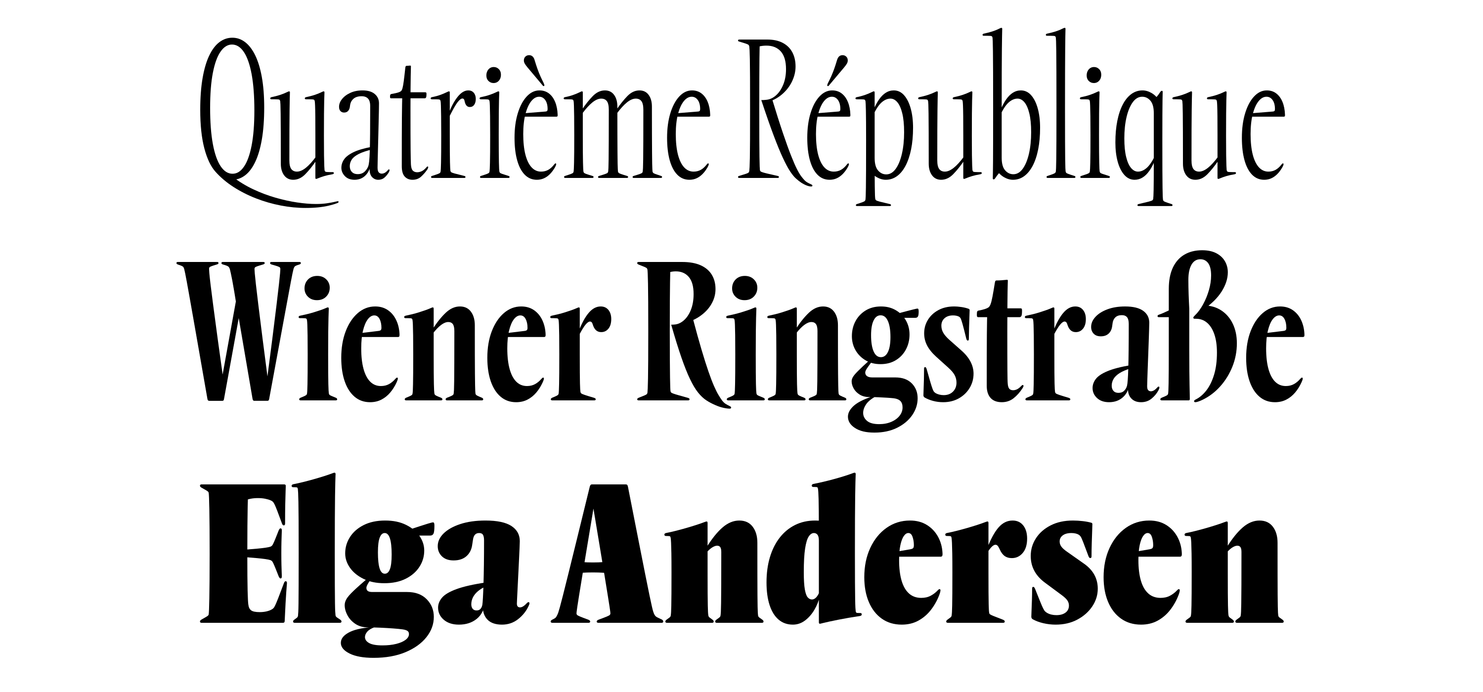
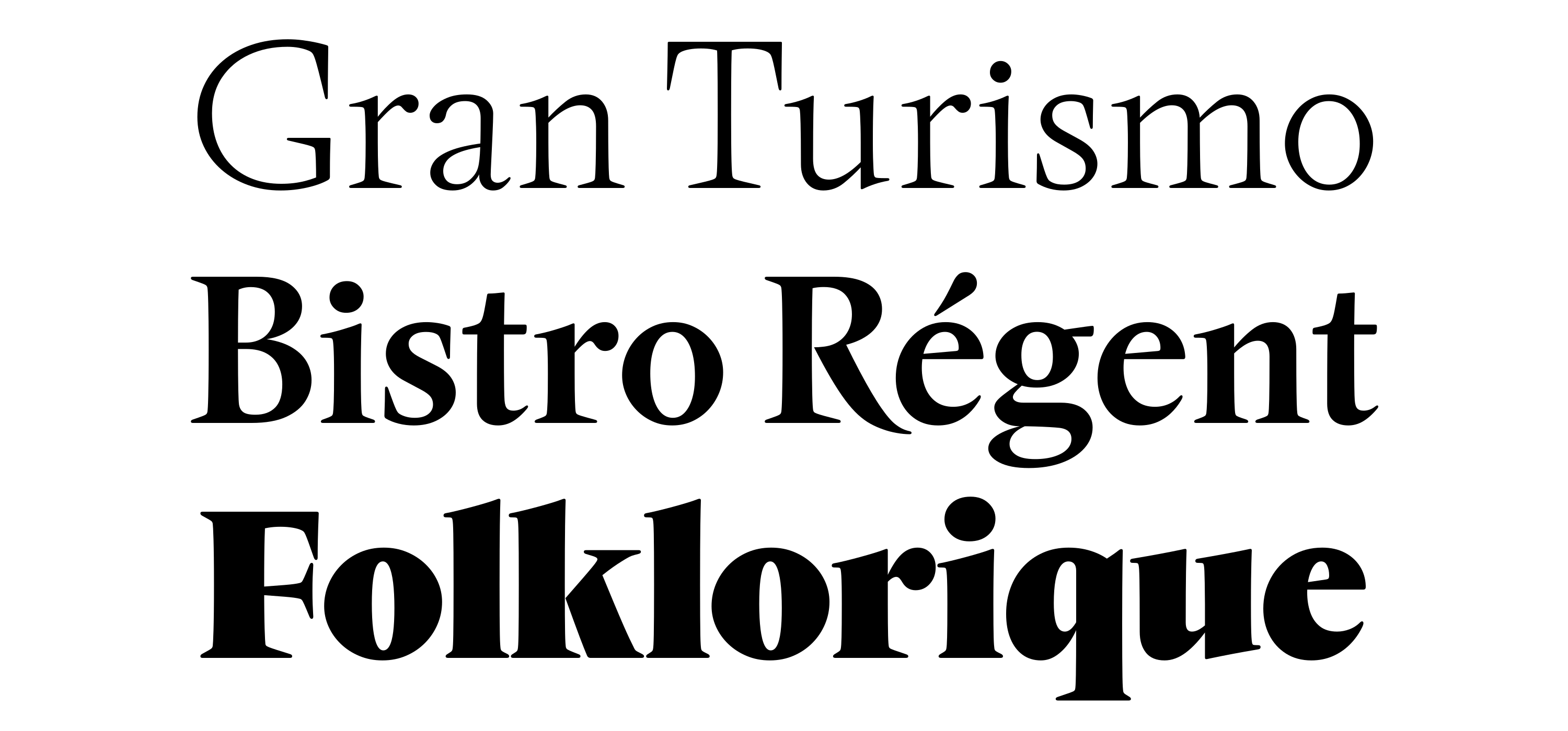
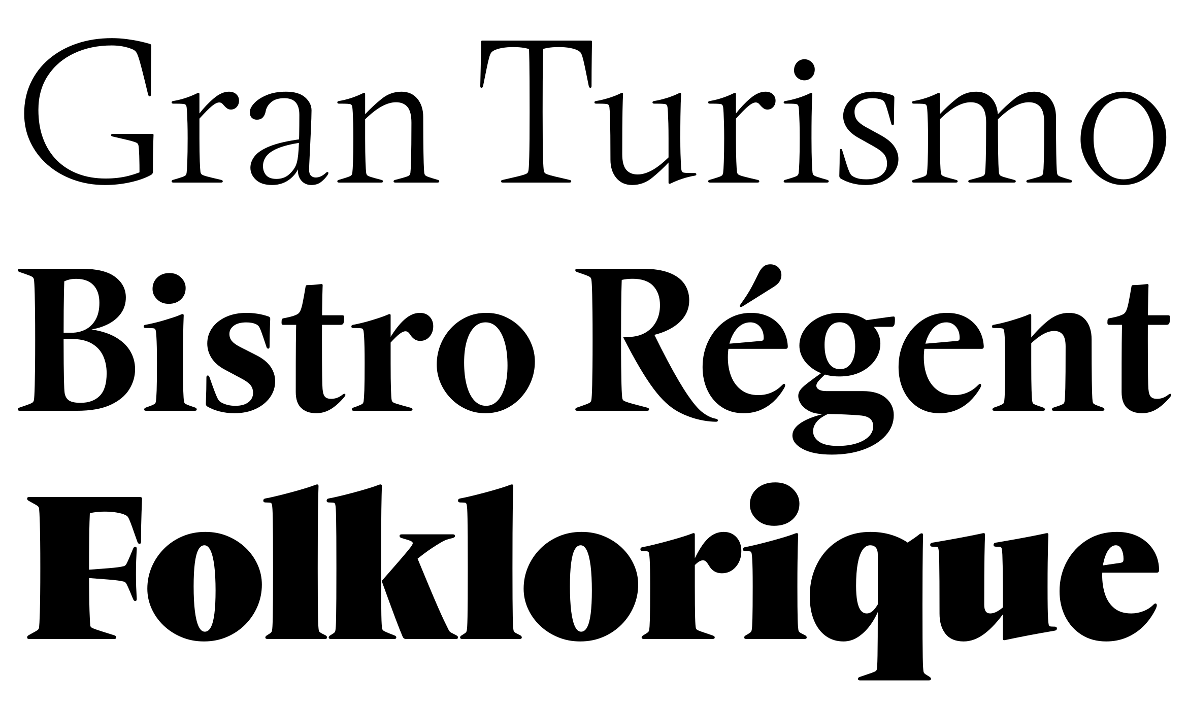
Rempart Compressed Light, Medium, Black
Like a carefully prepared Demi-glace, Rempart Compressed is a dense, flavorful reduction. And, much like how a good Demi-glace serves as a base for a litany of other sauces, Rempart Compressed interpolates with Rempart’s normal width, creating Condensed and Narrow sub-families.
Along with language support for over 200 Latin-based languages, Rempart has a number of features for advanced typesetting: All-caps punctuation, ligatures, ordinals, superscript and subscript figures, arrows, an alternate Q, and even a castle emoji. View and test ↗
Part II: Origins, thoughts, and references
After watching Louis Malle’s Ascenseur pour l’Échafaud on a warm summer night in 2017, I began looking online for any information I could find on who had done the lettering for its title sequence. The titles move at a somber pace, set to a soundtrack by Miles Davis. In cold, gray tones, the lettering’s excessive, spikey forms are softened by the technological capabilities of film, ink, and light exposure. I find these forms to be so intoxicating, even almost ten years later.
I couldn’t find anything specific to the film’s titles, but looking at typefaces from the same country and time period led me to a very close match in Vendôme. My interest in this typeface quickly turned from fascination to obsession. And as I began to collect what I could on Vendôme itself, I also began to look out for pieces of lettering that derive from it, much like Ascenseur’s film titles.
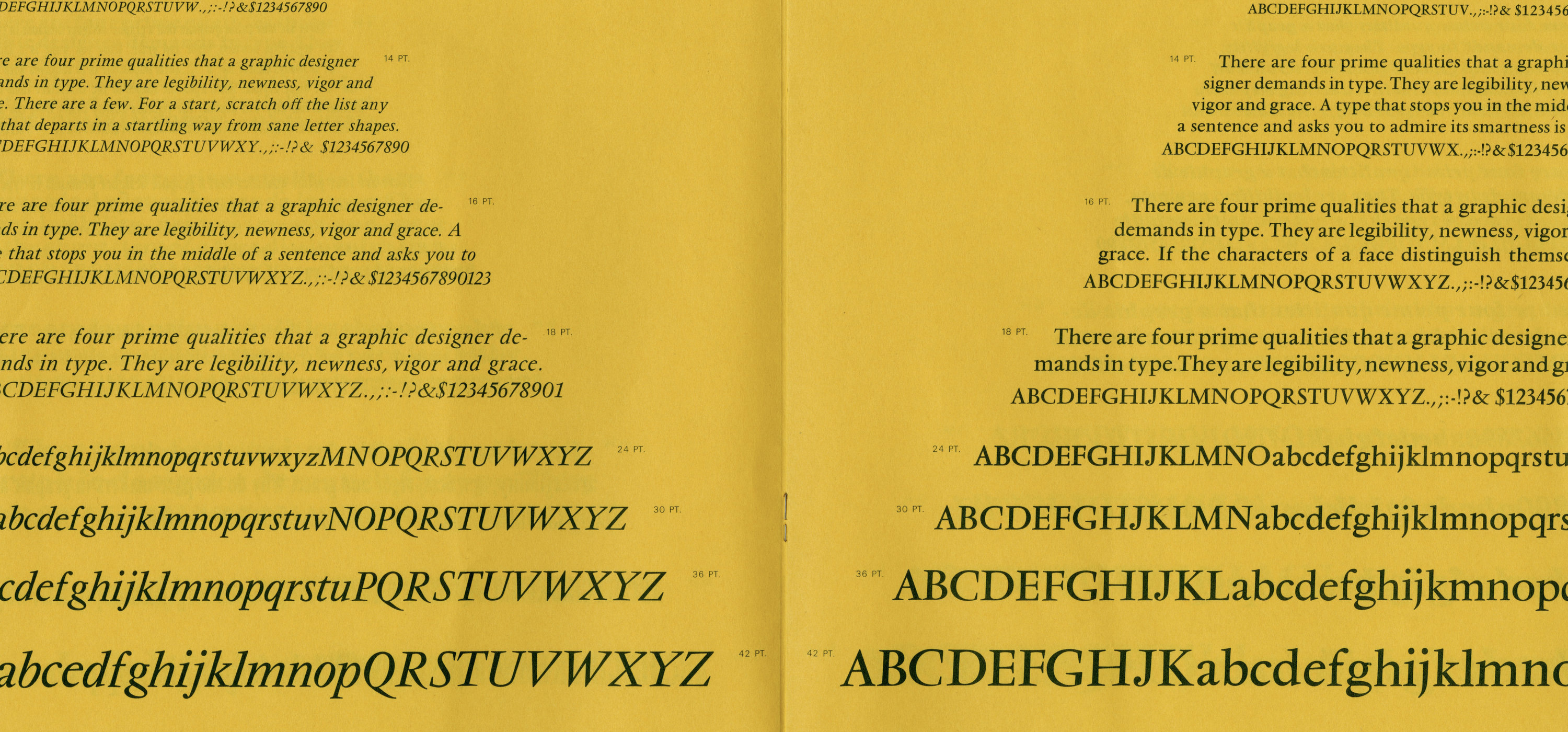
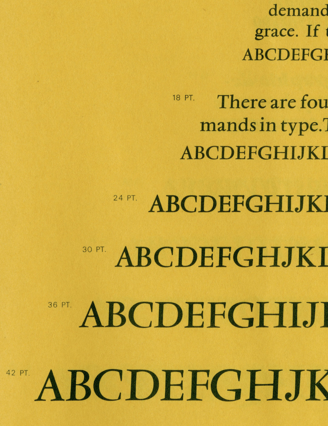
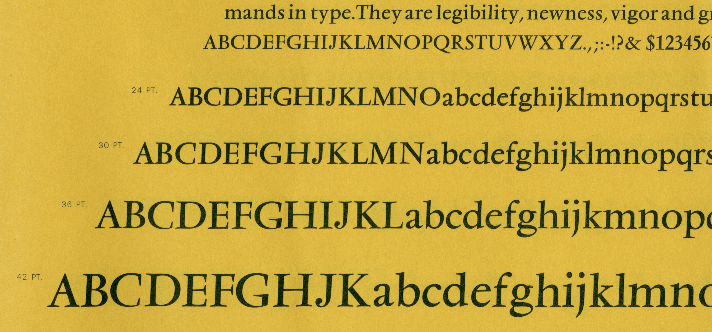
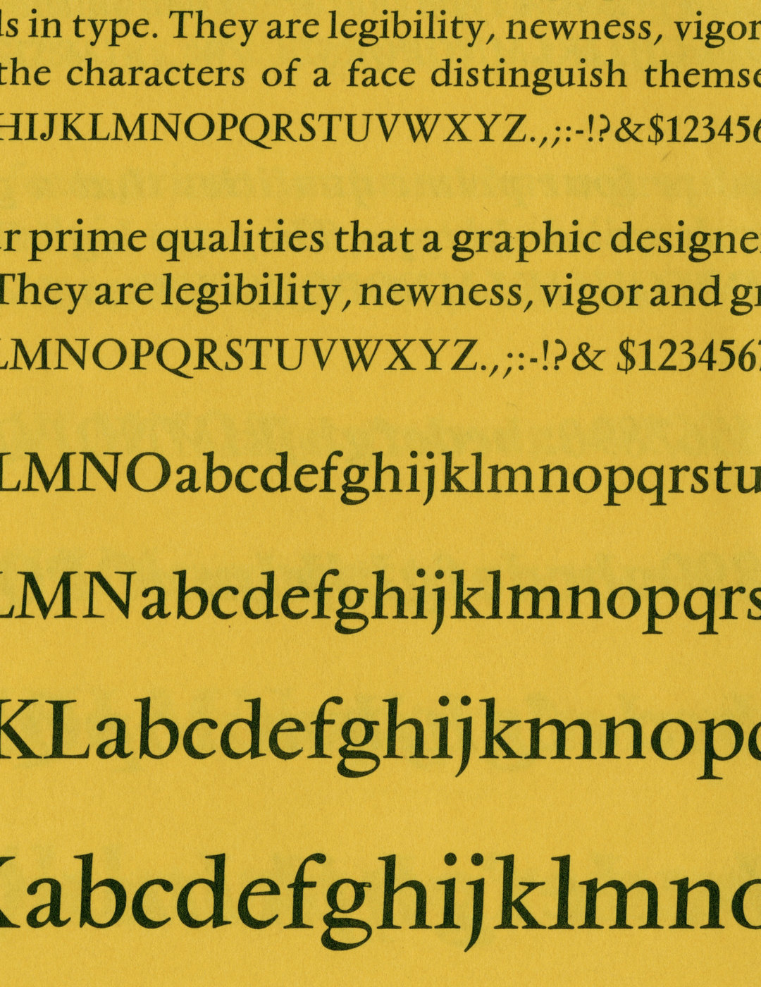
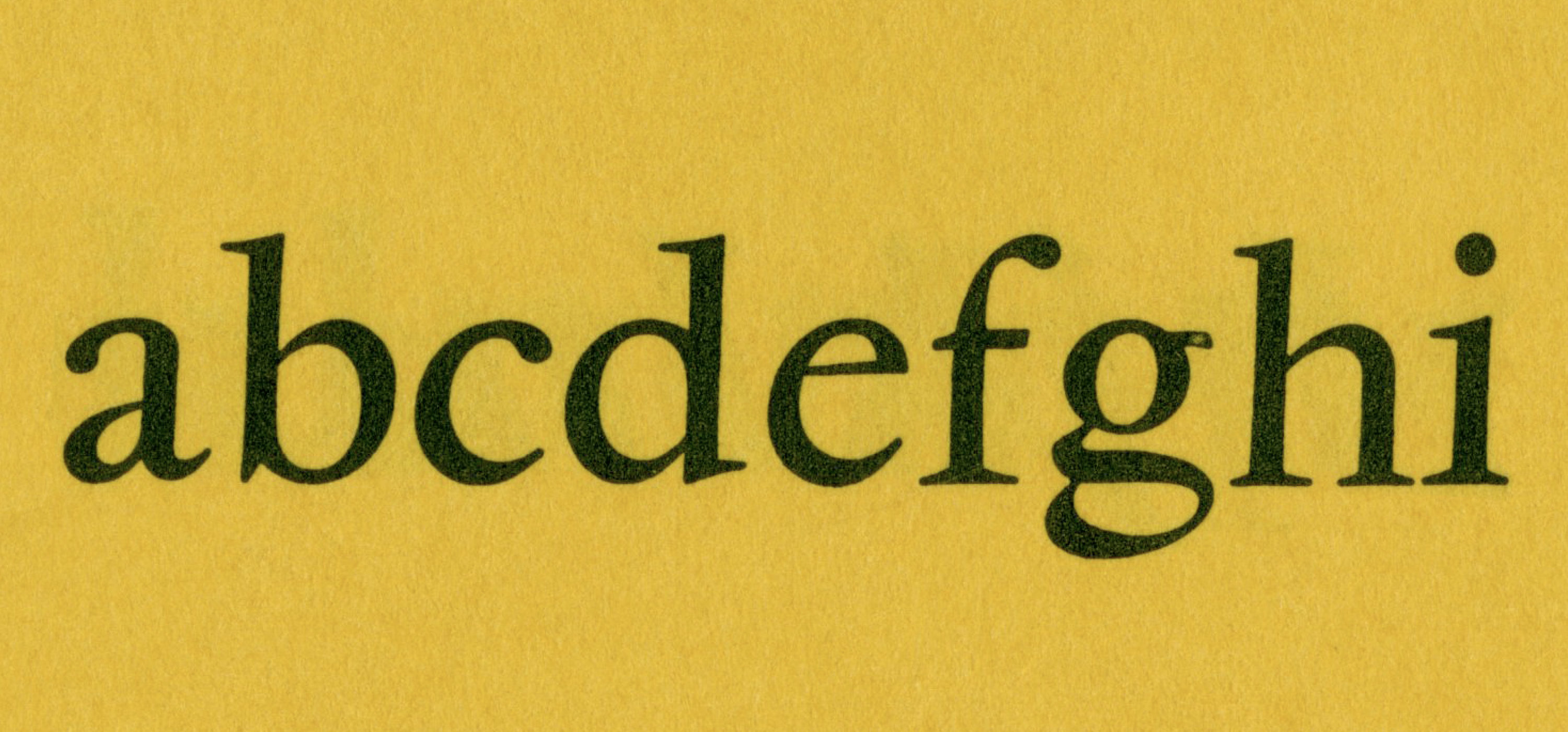
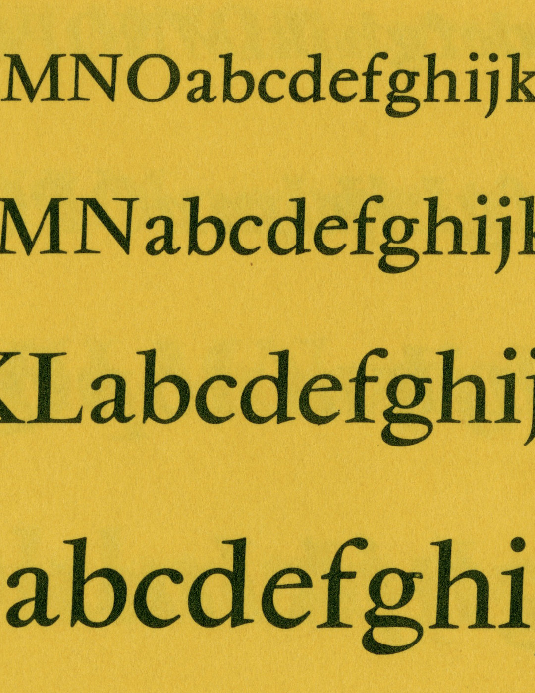
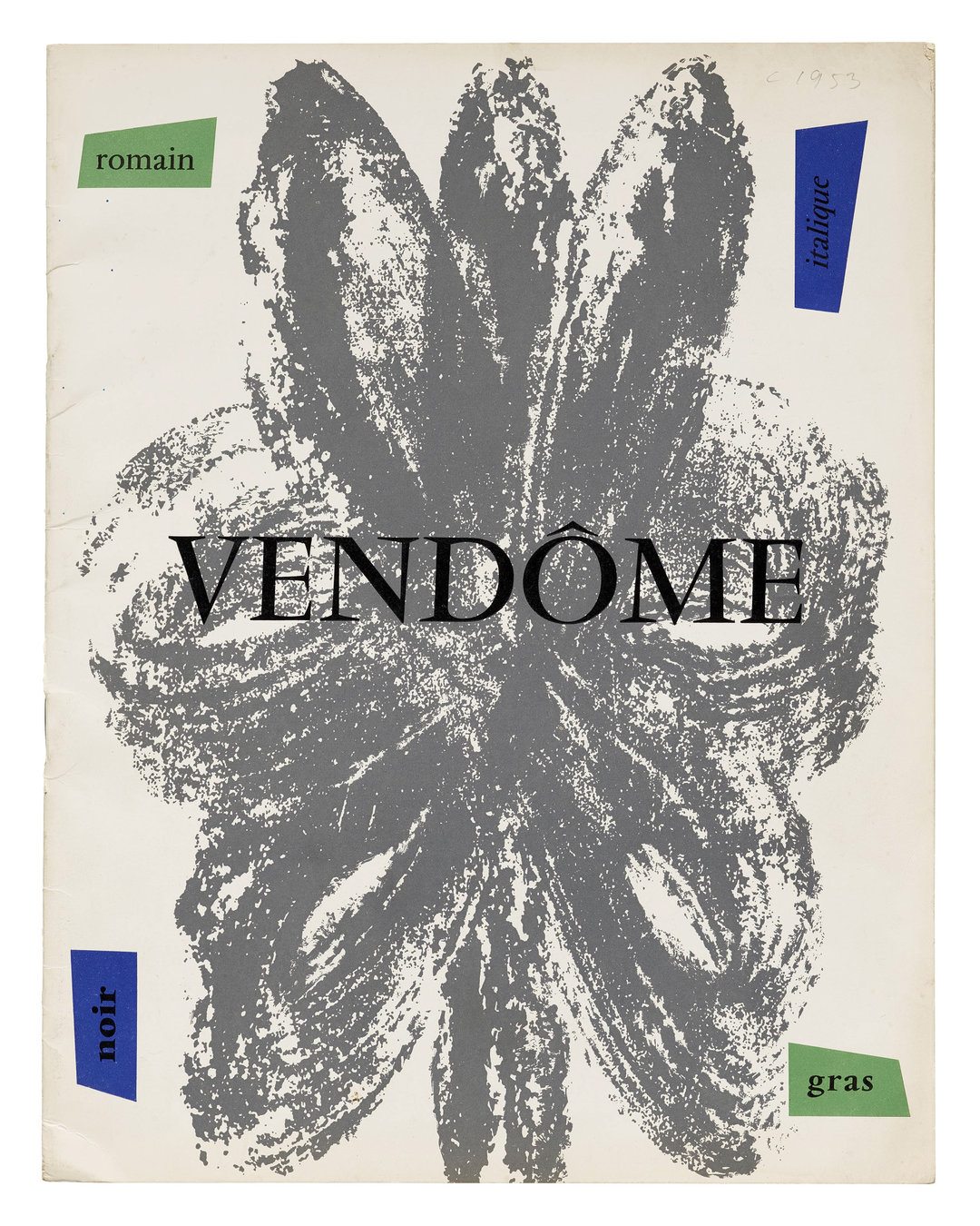
I asked Sasha Tochilovsky if the Lubalin Center had anything on Vendôme, and the only specimen in their collection is a rather obscure pamphlet from VGC. The forms in this specimen are just slightly over-exposed as well, softened by the printing process. This being the first time I had a look at Vendôme up close, I was left with the impression of Vendôme being something that had an inherent fuzz to it. Combined with the blurry, grainy quality of the film titles, these scans made me want to draw something with a plush, over-inked feeling.
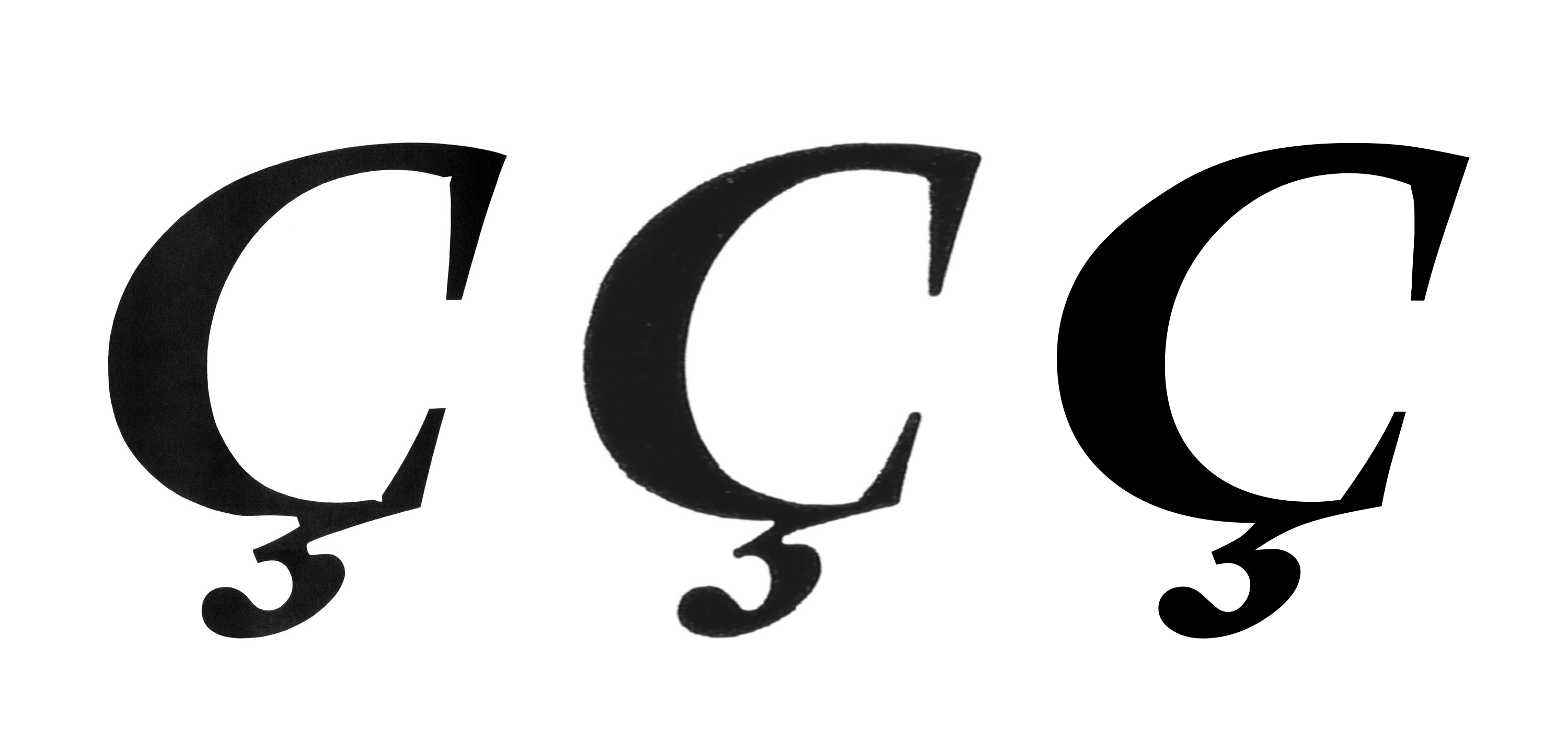
Left: Vendôme Gras, petit corps, original drawing, 1952.
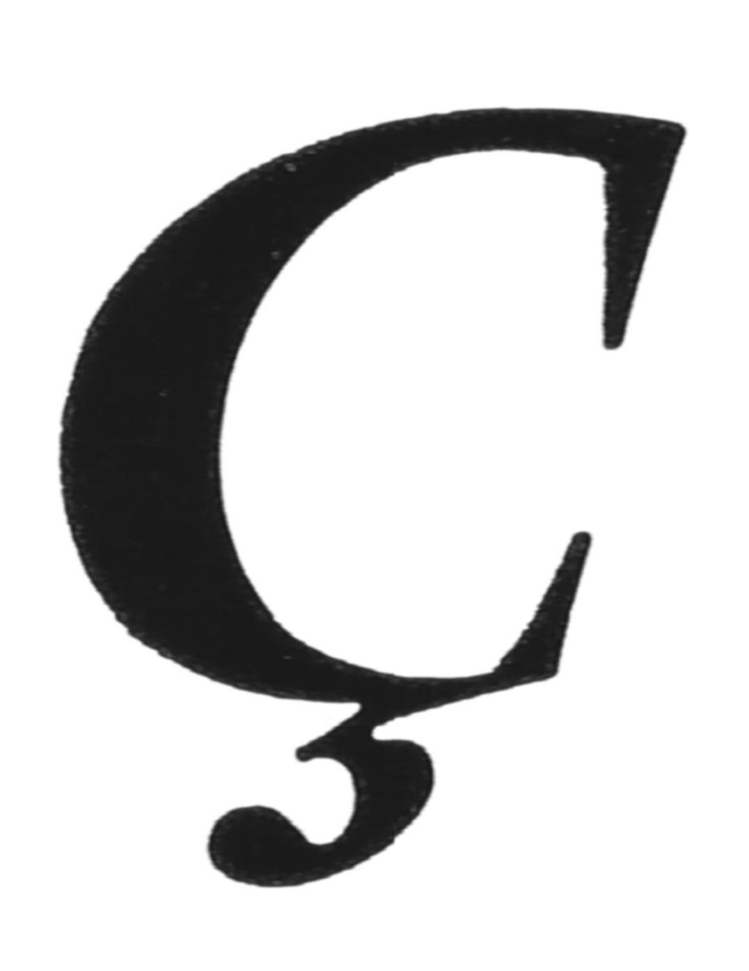
Center: Scan of Vendôme Gras, 20pt.
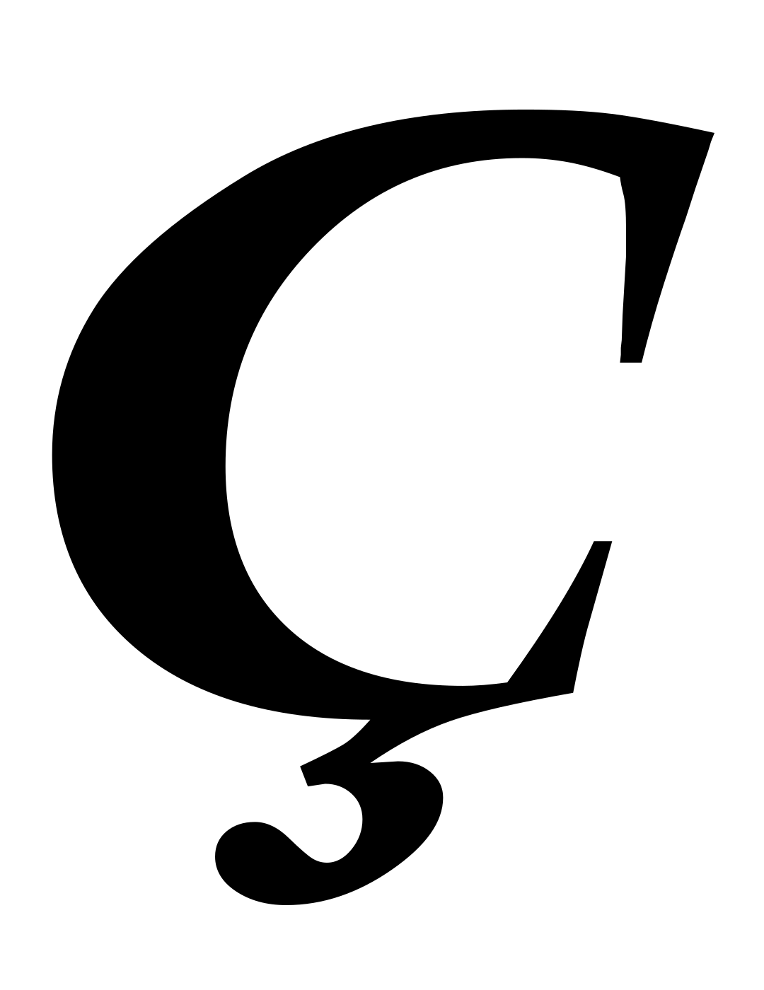
Right: URW Vendôme Bold vector outline, 1993.
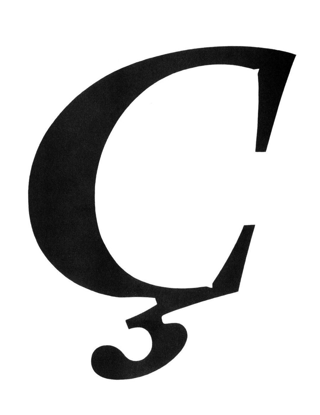
Vendôme Gras, petit corps, original drawing, 1952.
This same softening from ink is prevalent in a few other specimens of Vendôme I’ve collected, despite mechanical drawings by Fonderie Olive having completely sharp, crisp forms. This paradox often presents itself in the pursuit of “reviving” an old typeface. Do you draw (or interpret) the actual drawings of the designer if you can find them, or focus on the designer’s intent? Do you instead focus on how the typeface was produced, printed, and seen with your own eye? There’s no clear answer to this, and in fact, the conceptual gray area between a typeface’s intent versus its impact is something type designers have exploited since the 17th century.
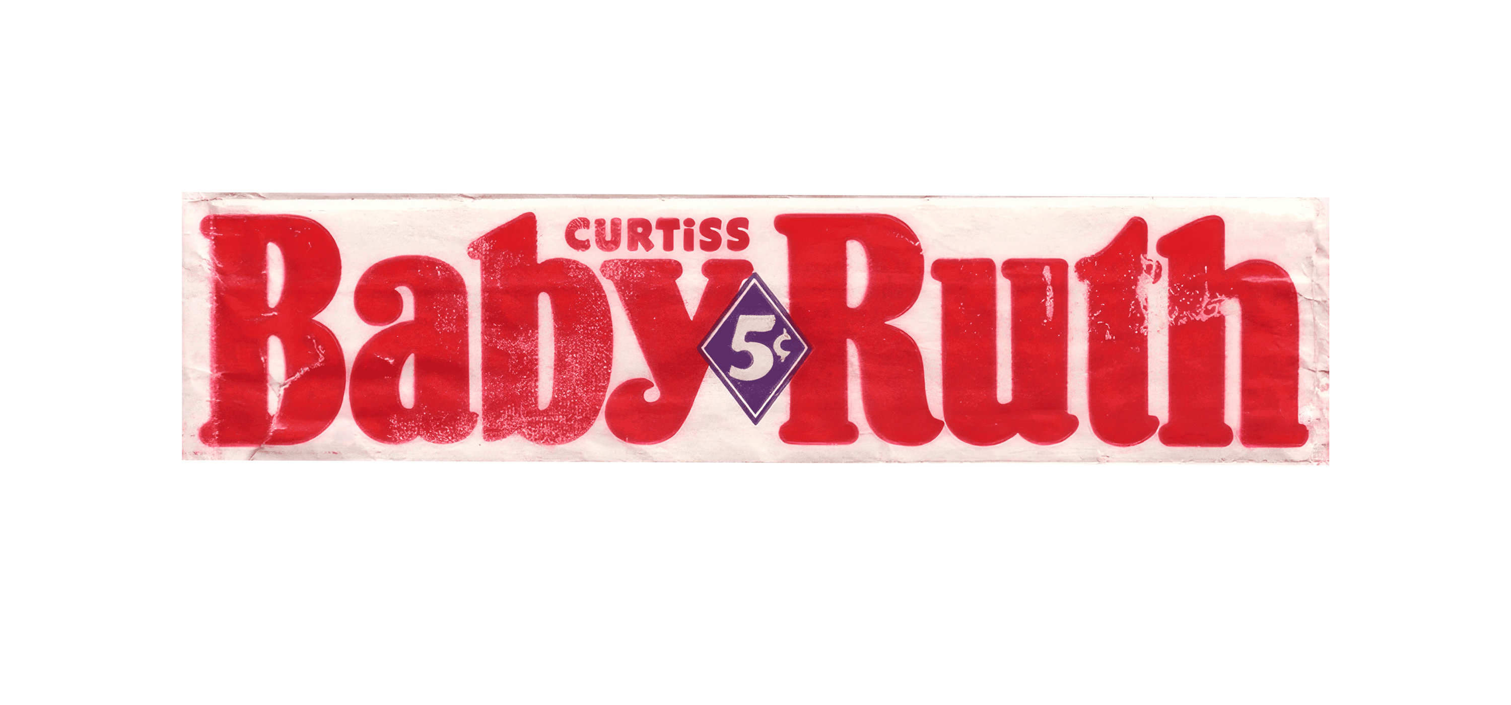
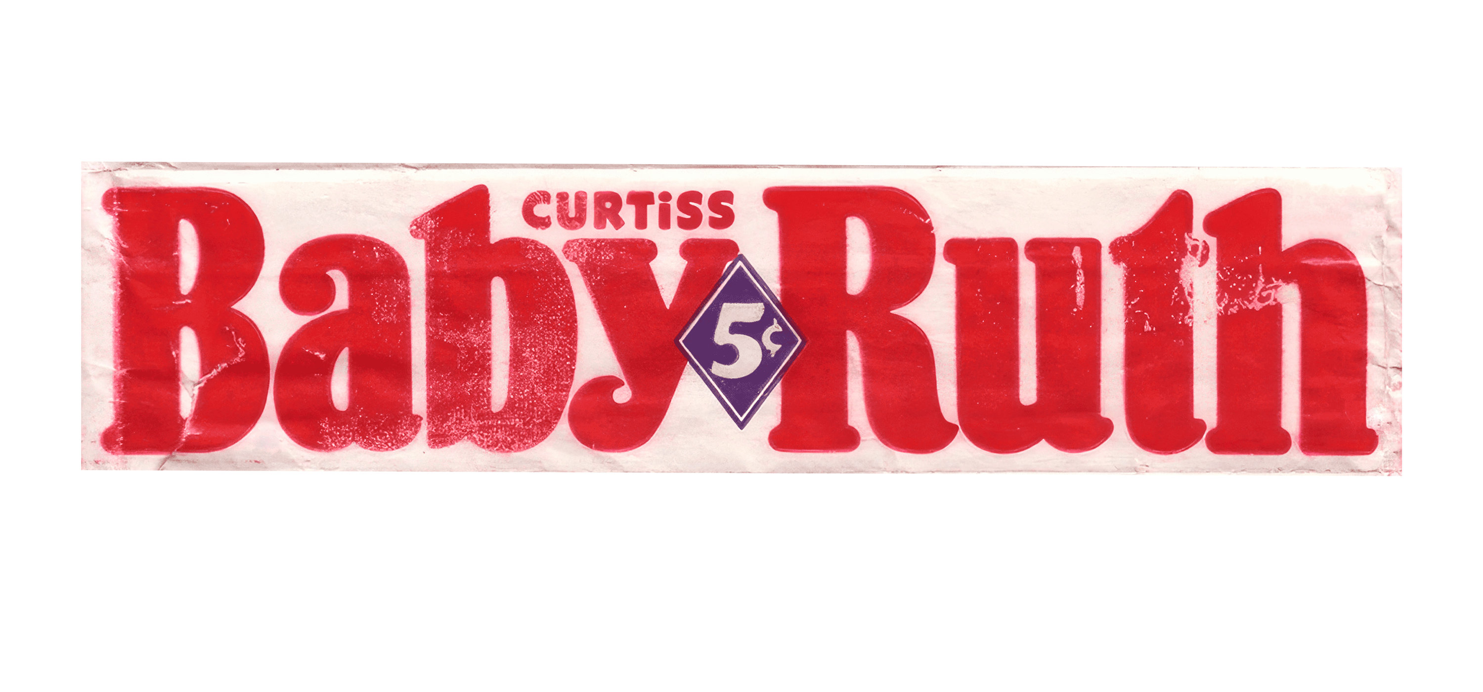
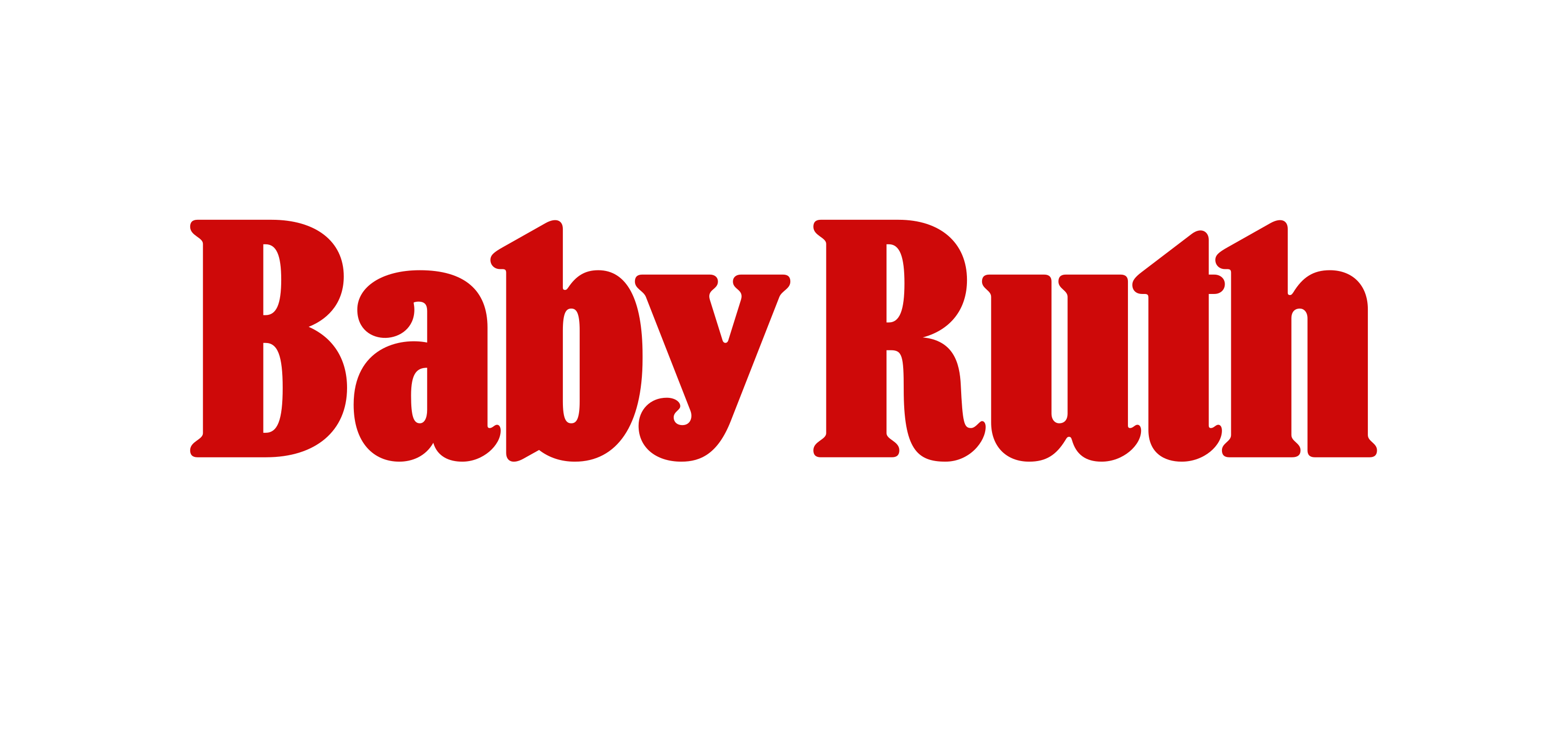
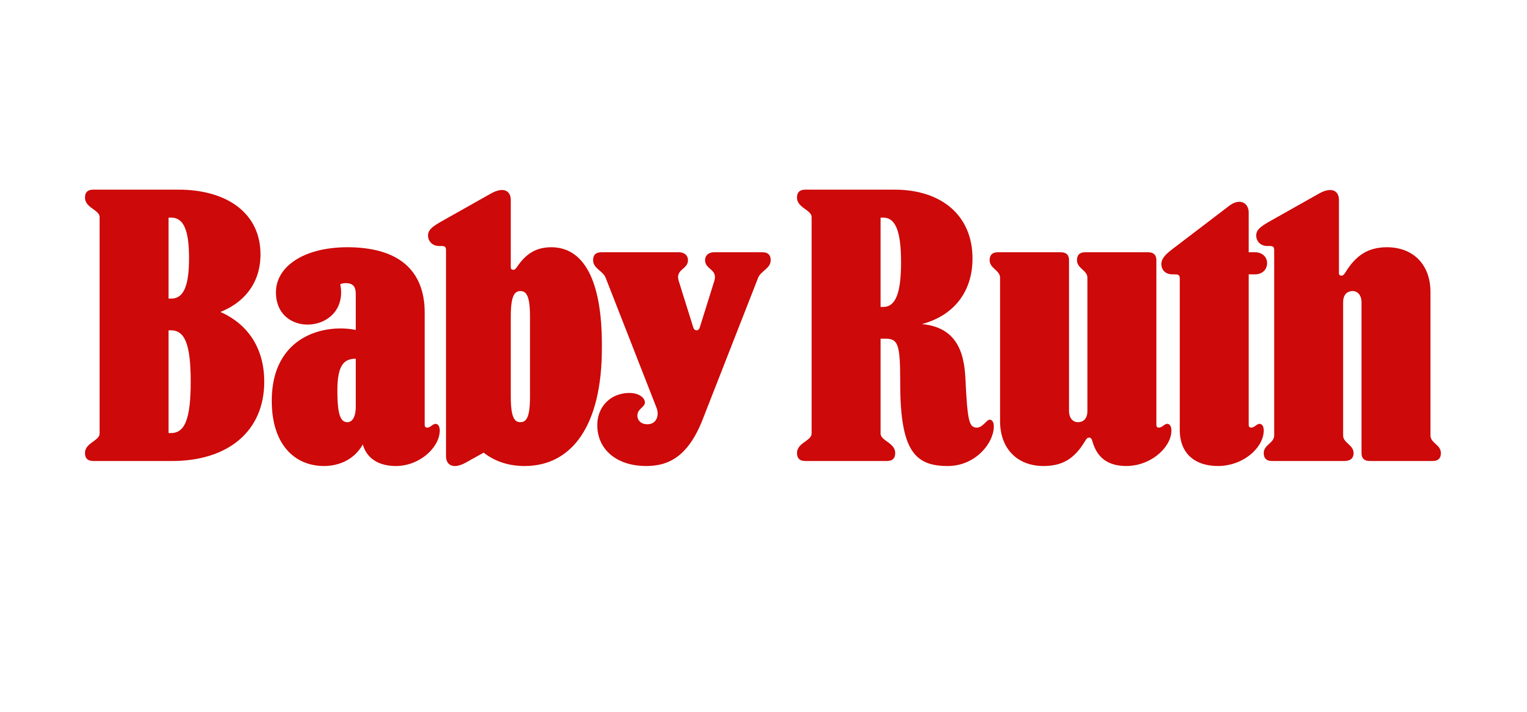
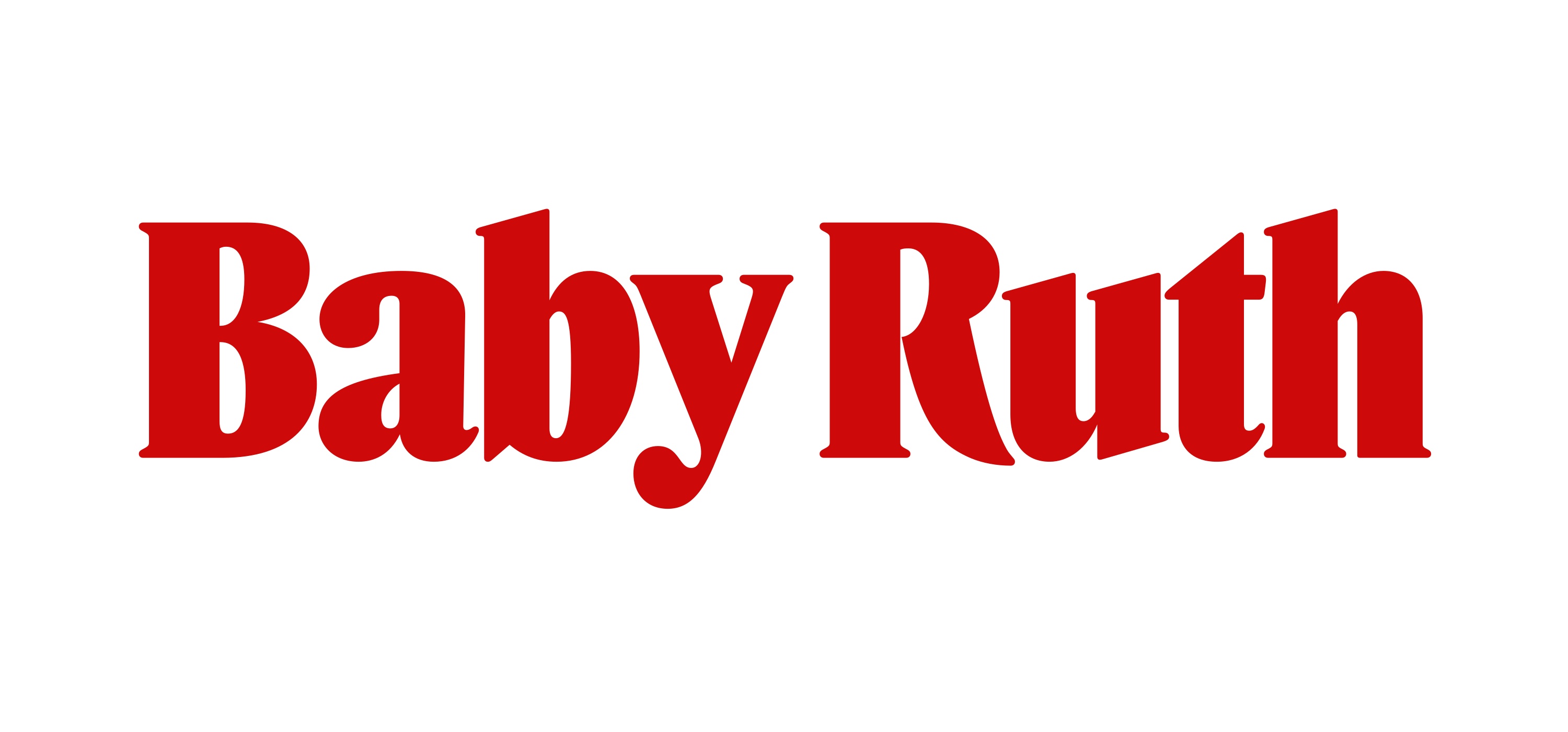
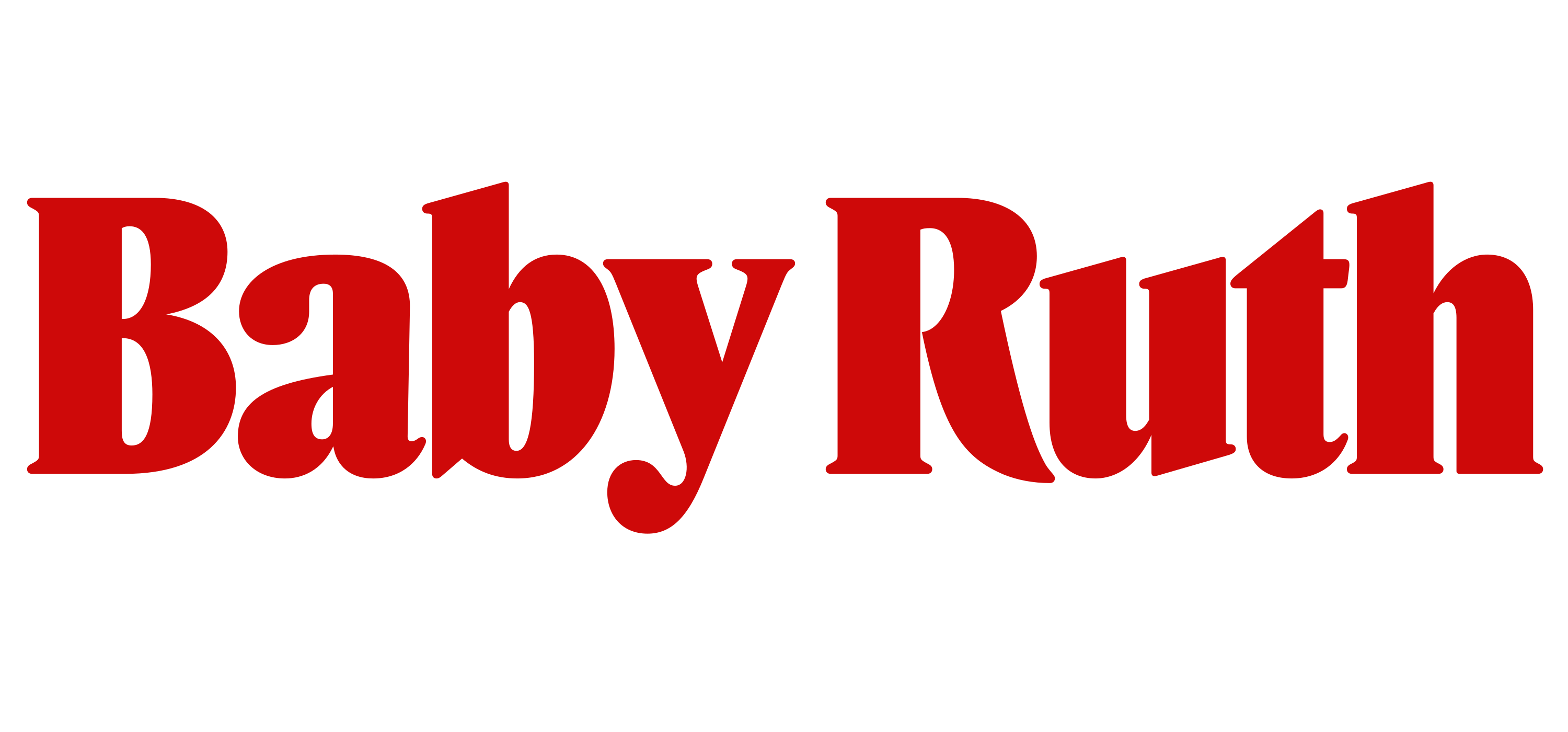
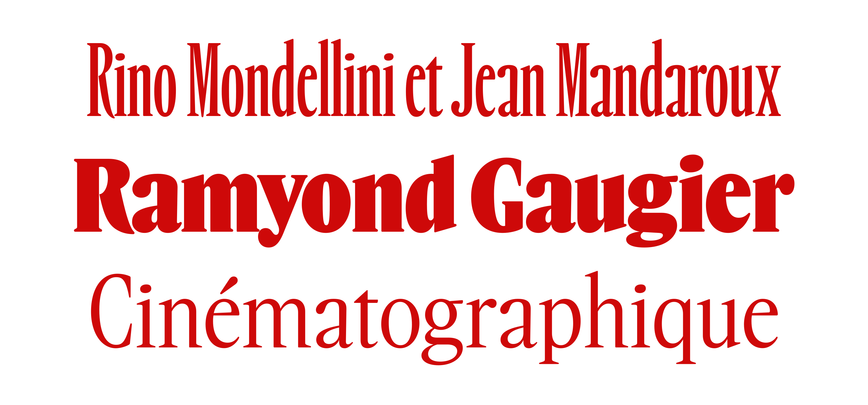
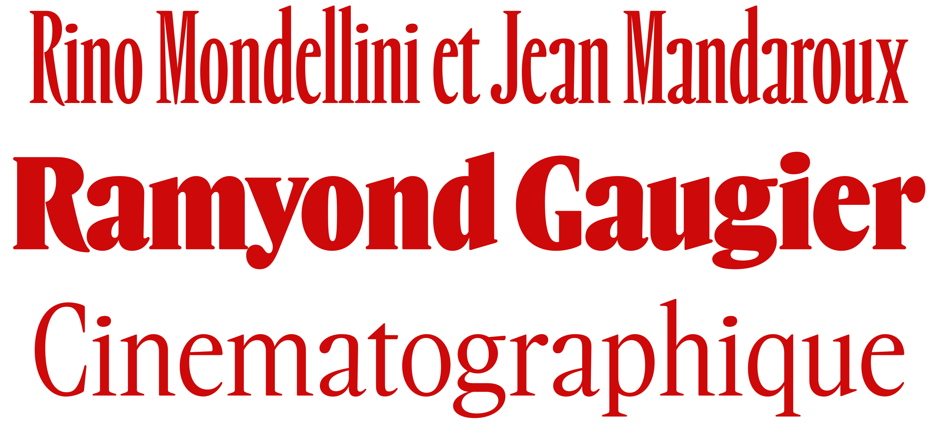
In 2020, an old Baby Ruth candy bar wrapper made its way into a mood board for a project I was working on. I became enamored by its dense weight, rounded serifs, and compact proportions. I drew the logo on the packaging to see if I could turn it into anything, and after becoming disinterested in the original forms, I thought back to Vendôme, and drew something that applied the trappings of Vendôme Condensed to the weight and proportions of the Baby Ruth lettering.
This project turned into something that I could pick up and put down on my own time. It evolved into a combination of Vendôme and various wood type forms that felt similar to the Baby Ruth logo. I put about as much effort into referencing Vendôme as I did staying away from it. By tempering Vendôme’s skeleton with the routed, almost mechanical feeling of the Baby Ruth logo, it (I kept the files named Baby Ruth) ended up feeling like it was trying to do two things at once: get very close to, but also stay far away from, Vendôme. To put it plainly, I got stuck.
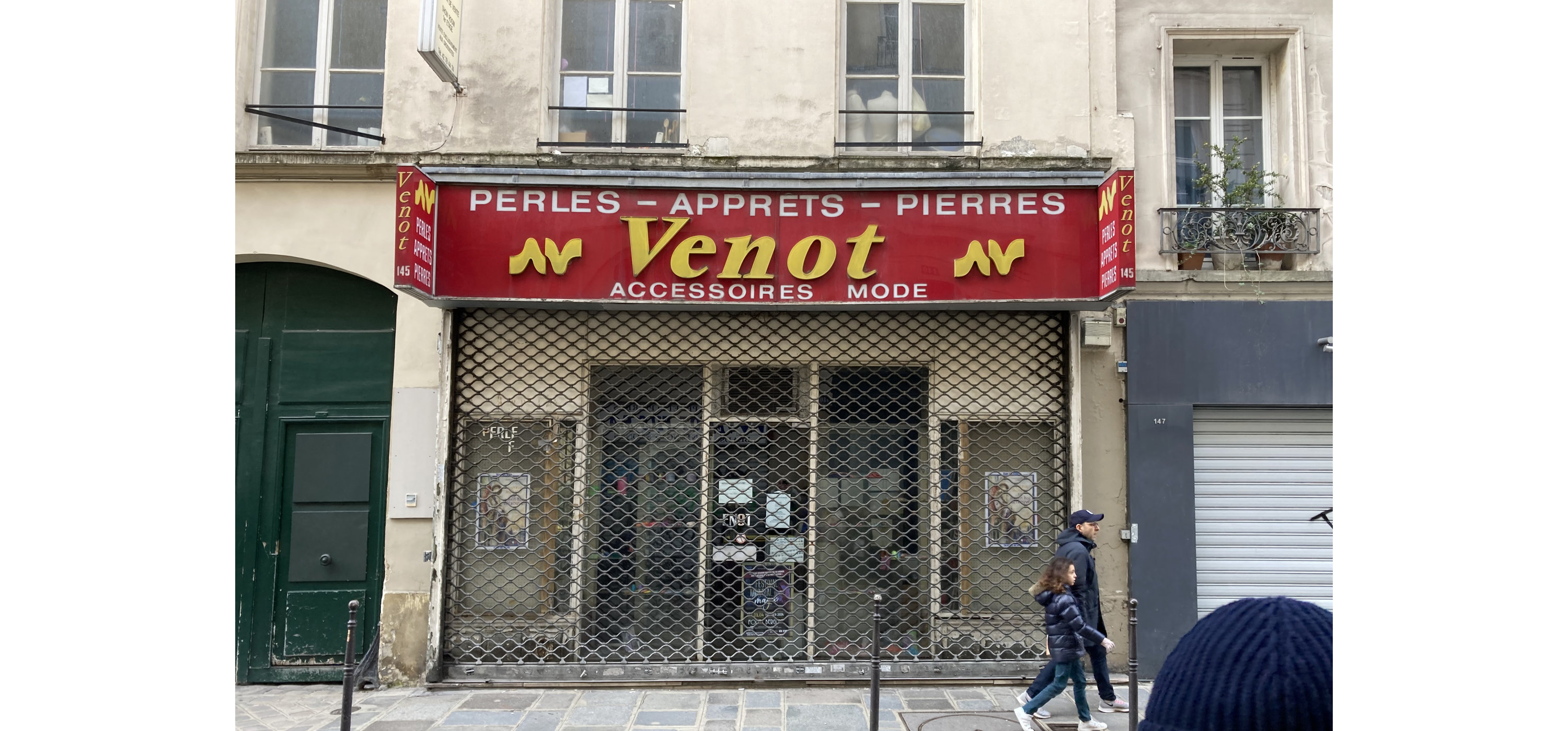
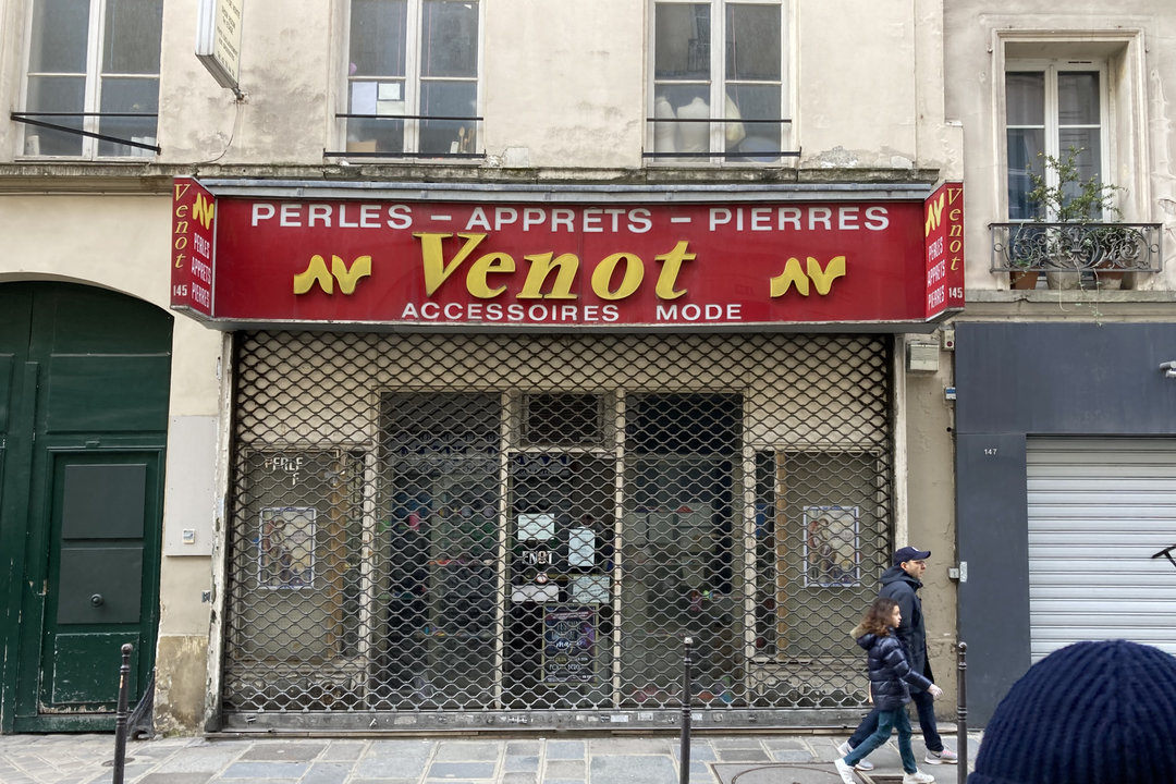
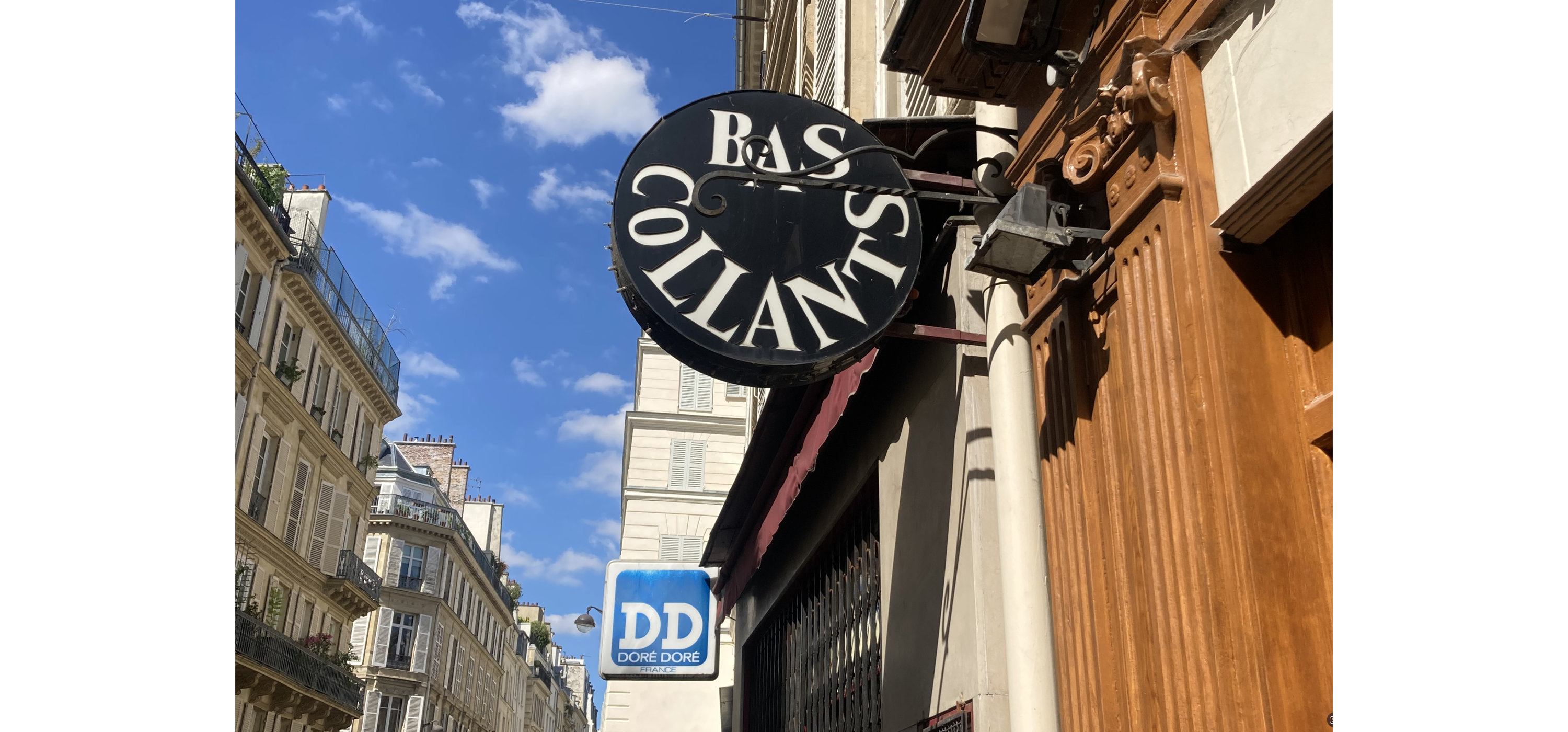
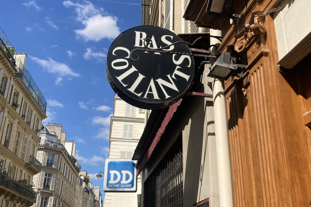
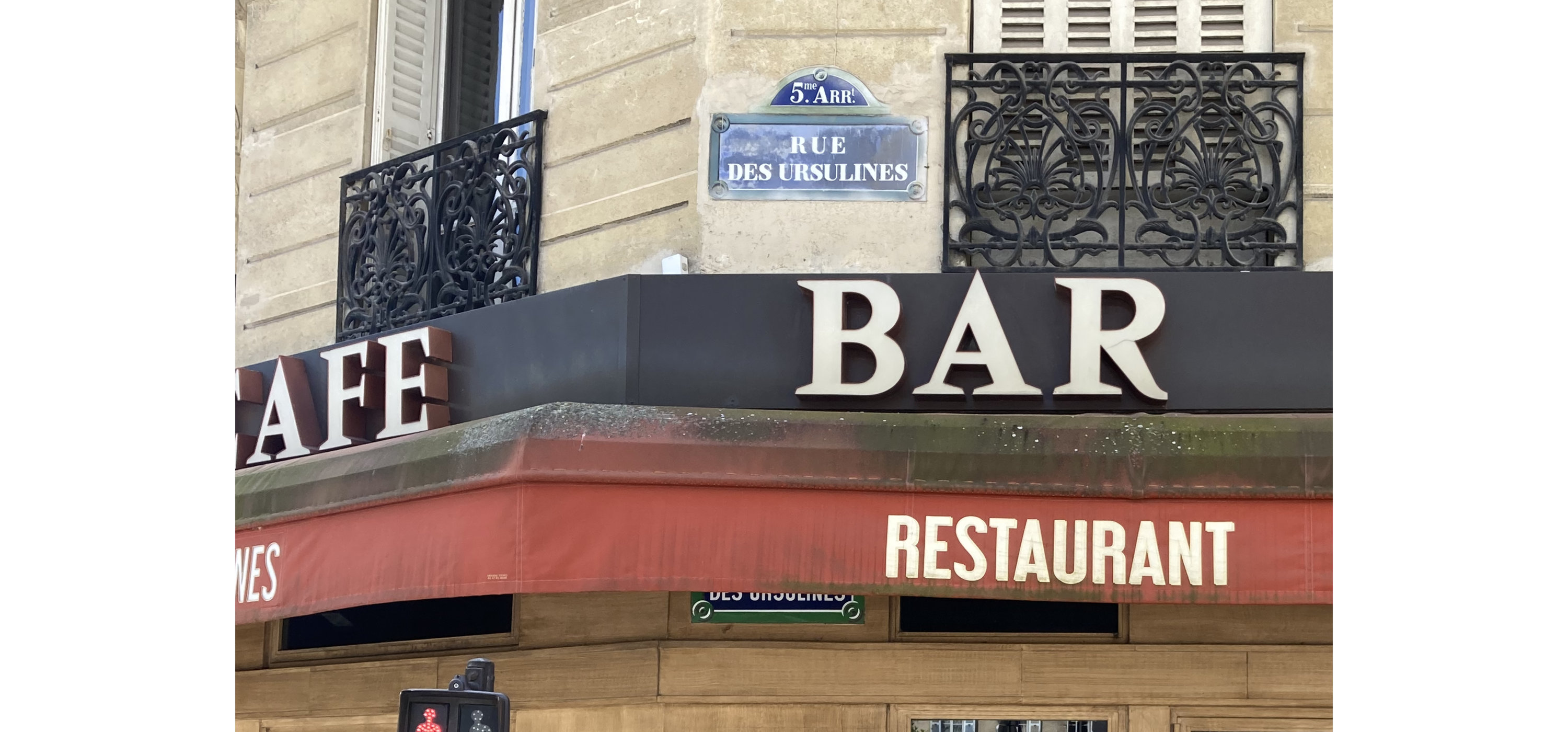
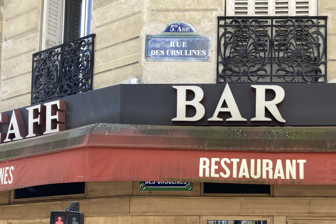
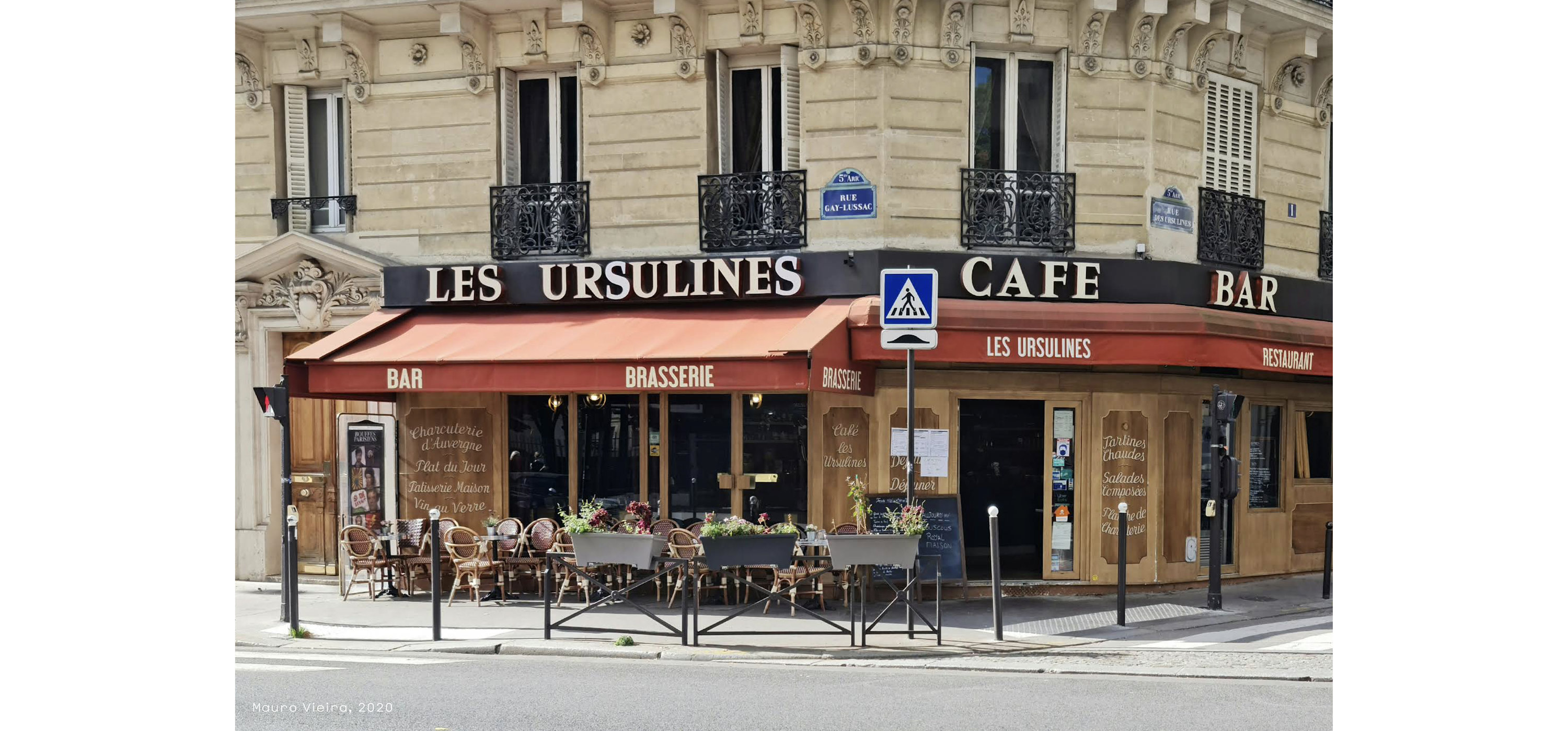
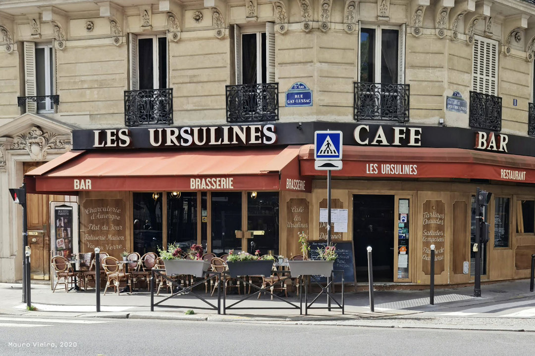
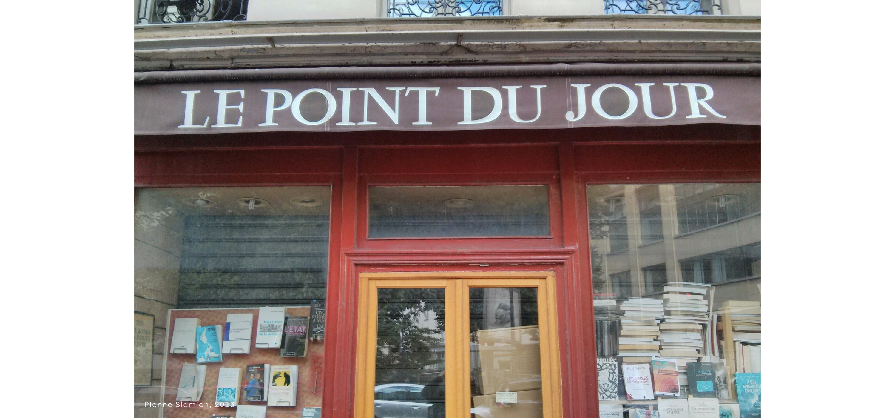
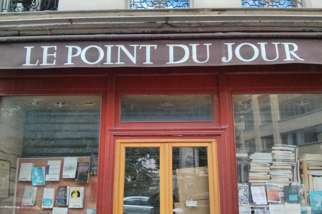
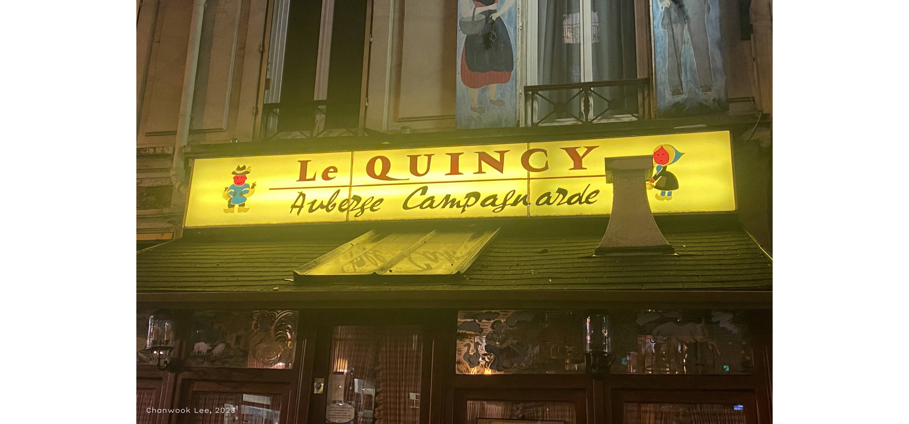
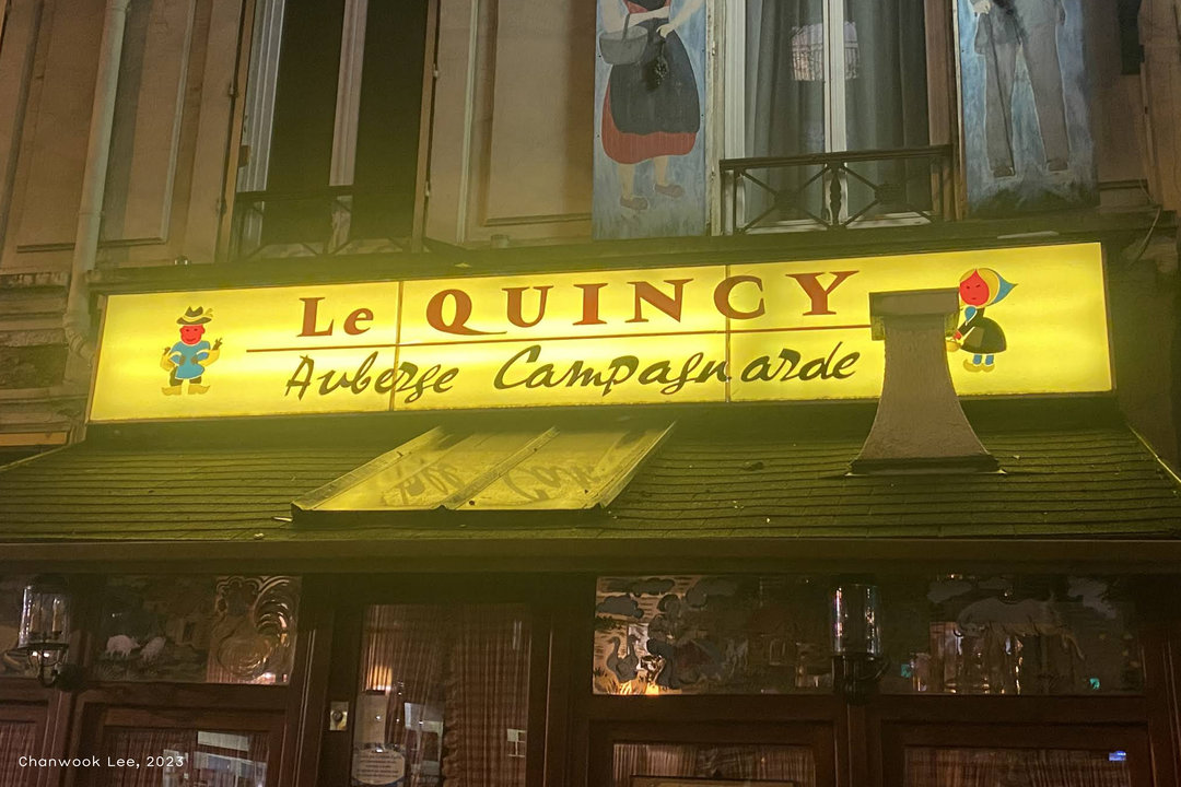
On two separate occasions in 2024, I found myself in Paris for a long weekend. I don’t know anything substantial about Paris, but I had a great time simply walking, eating, and taking pictures of storefronts. I of course saw Vendôme on plenty of used book covers, and on a few signs. I even spotted a few signs with letterforms that clearly derive from the typeface, but are just a little different. Sometimes an honest attempt, sometimes copied and altered just enough, and sometimes shaped by the material of the sign. It’s a bit rare to see this typeface away from a screen, especially here in the US, so encountering Vendôme in its more native habitat was quite a treat. I didn’t have this case study in mind at the time when taking pictures. Thankfully, I can retrace my steps with Google Maps for a second look.
Taking all this in lead me to reconsider Baby Ruth. I had tried so hard to steer clear of redrawing Vendôme in Baby Ruth because in a way, Vendôme feels untouchable to me. It’s perfect as it is, and in its concept, it’s just as modern as anything type designers are making today. It deserves a true, historically correct revival. I’m just not the designer for that. But I loved seeing all these Vendôme remixes, and I began to wonder what these signmakers must have been thinking when they were imitating these forms. One day I got thinking, “what if, instead of trying so hard to stay away from what attracts me to this typeface, I embrace what I love about it? What if I take a good look at what I have on Vendôme, really study it, and just respond to what I see.” Rempart, as it stands today, took shape in this fashion beginning in the fall of 2024.
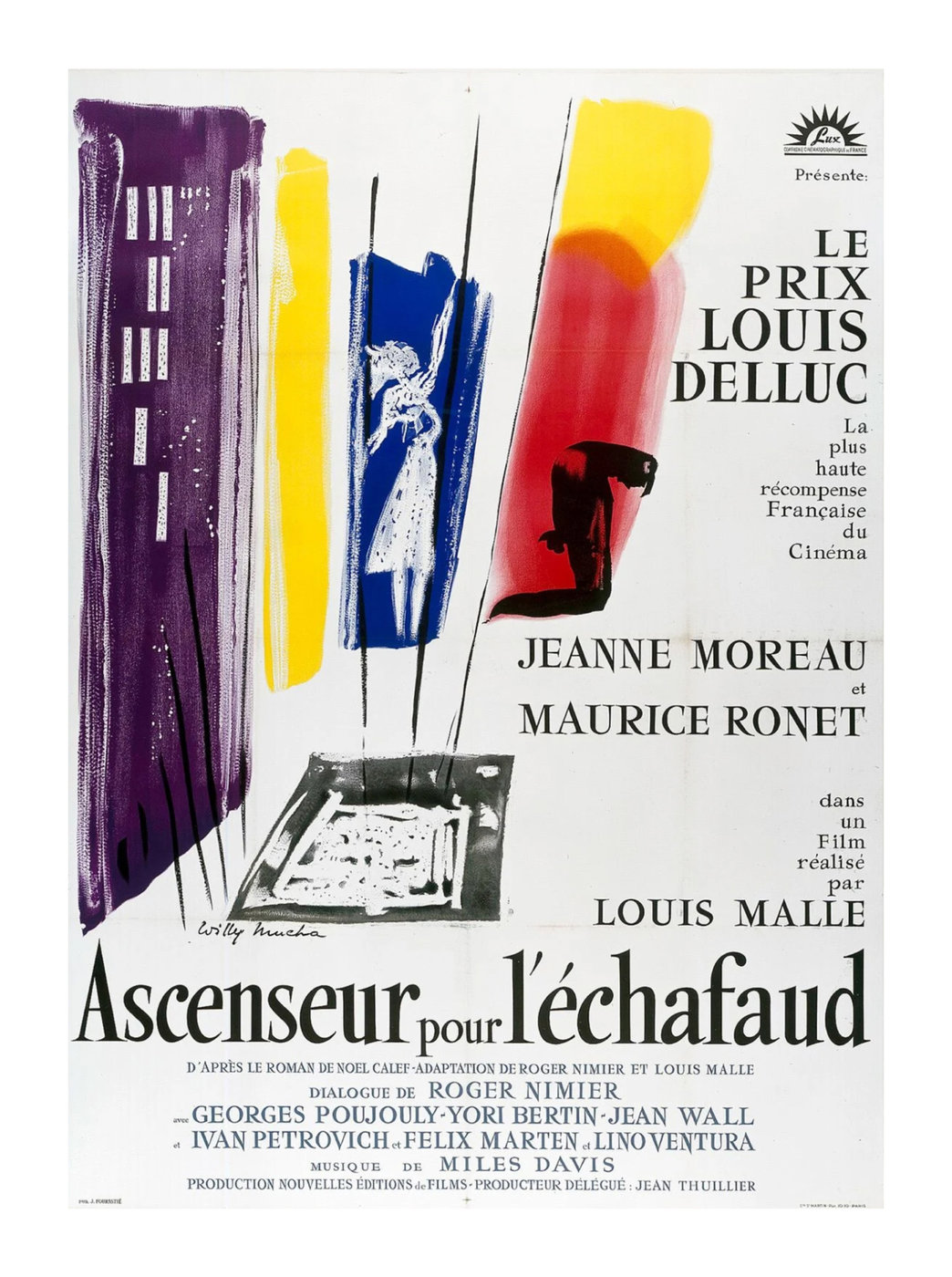
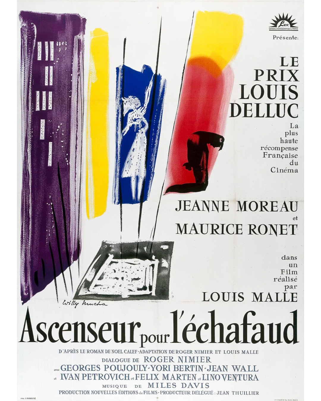
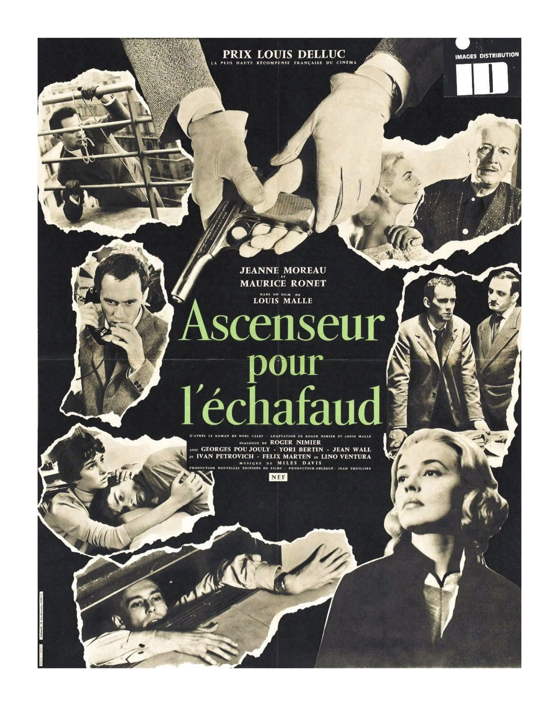
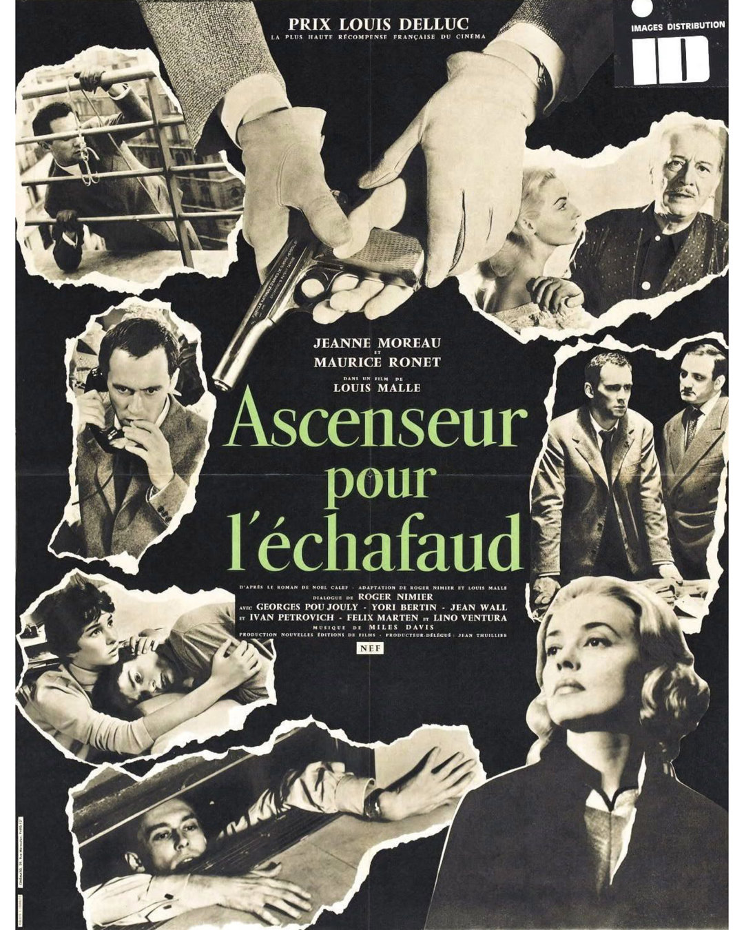
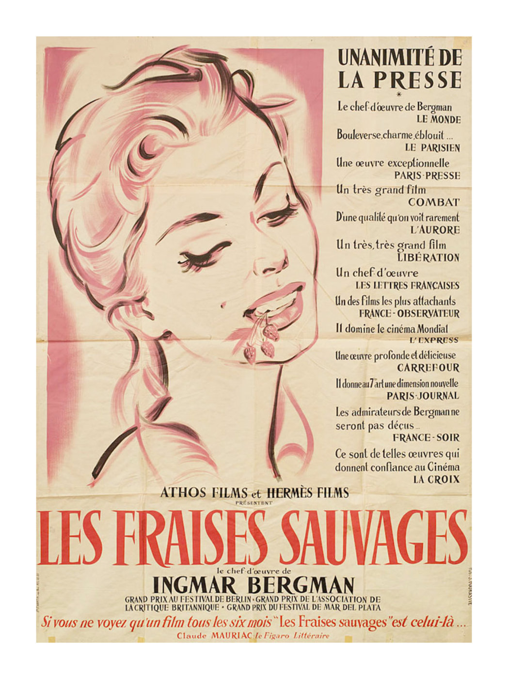
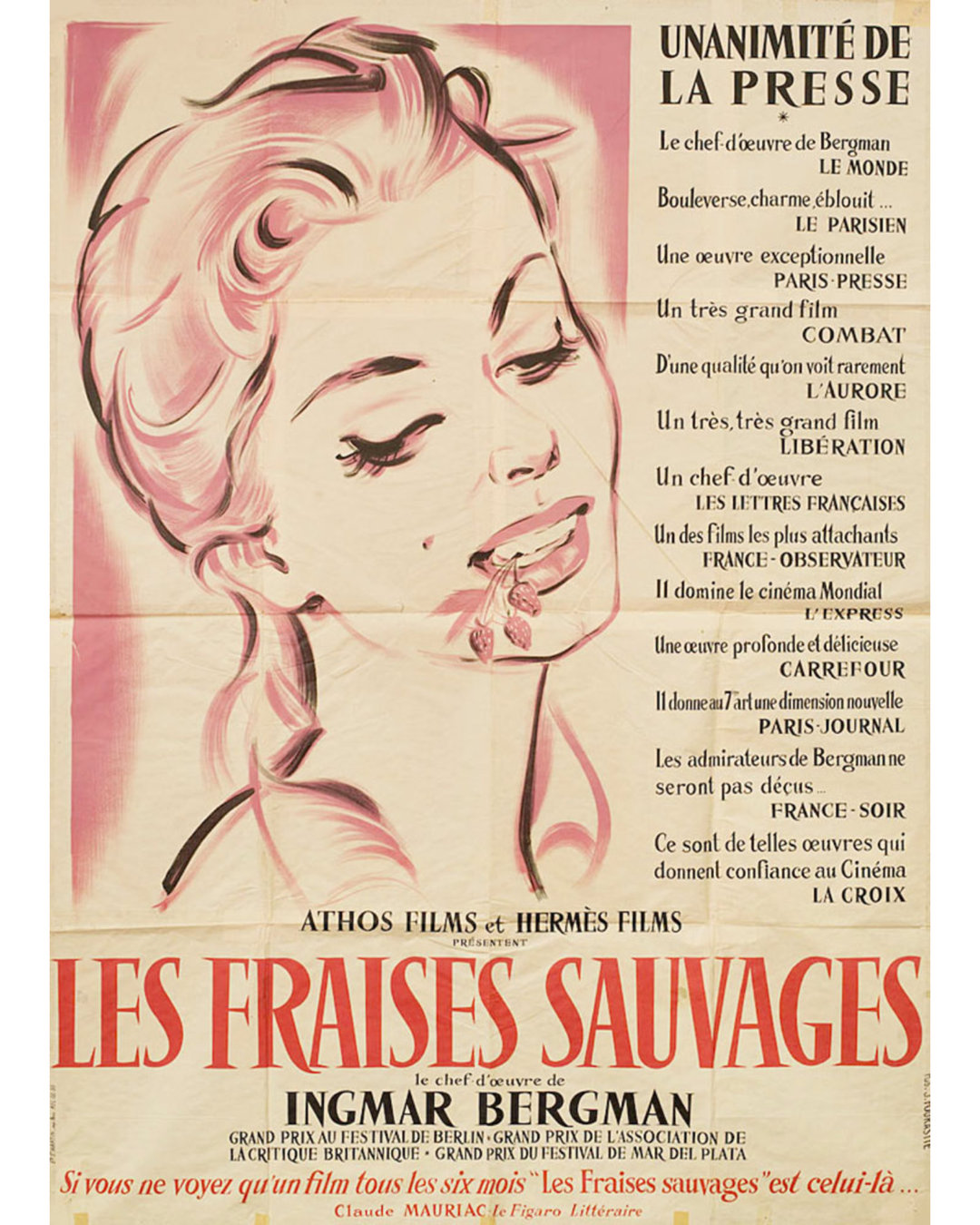
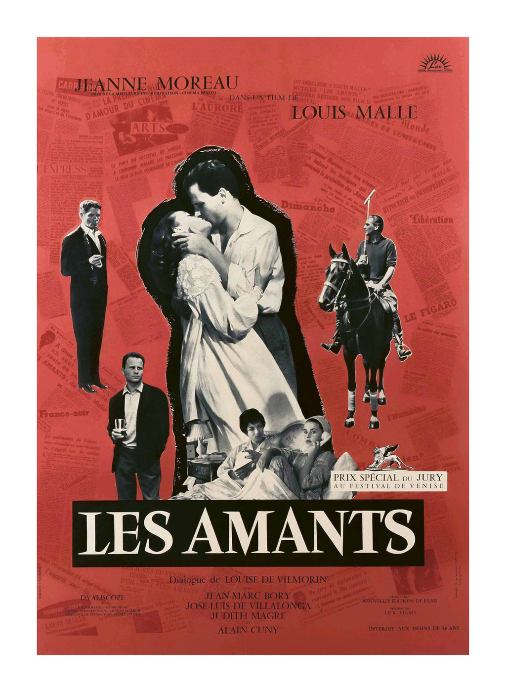
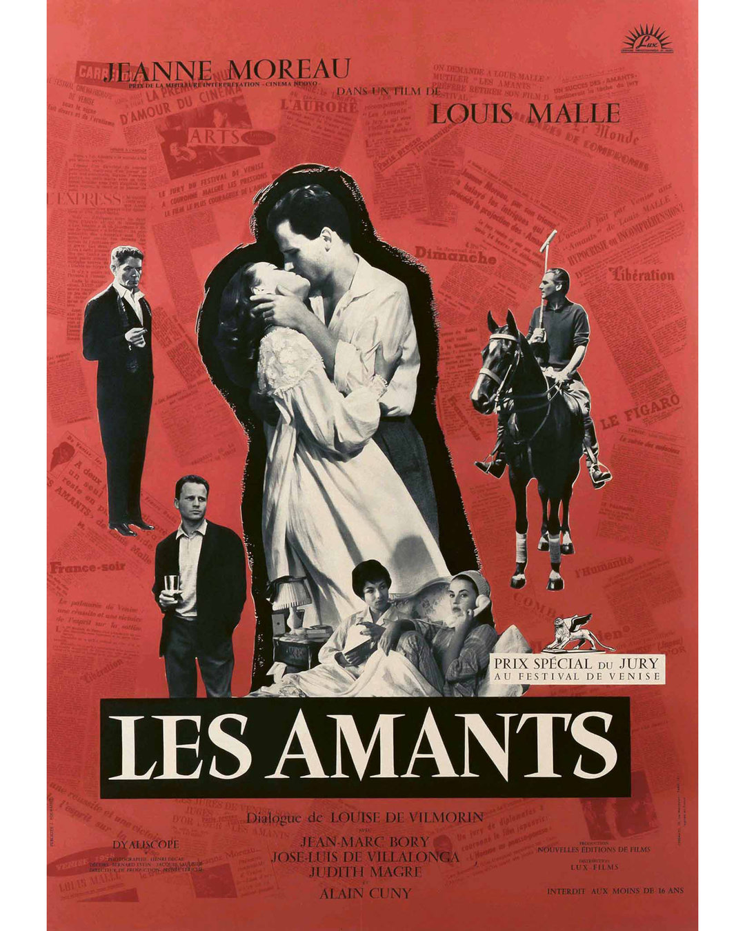
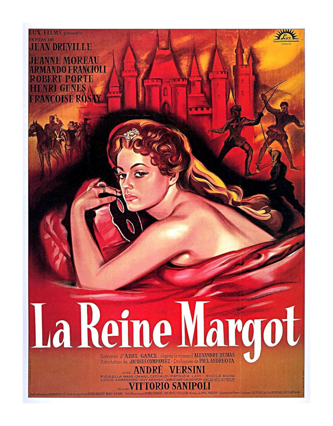
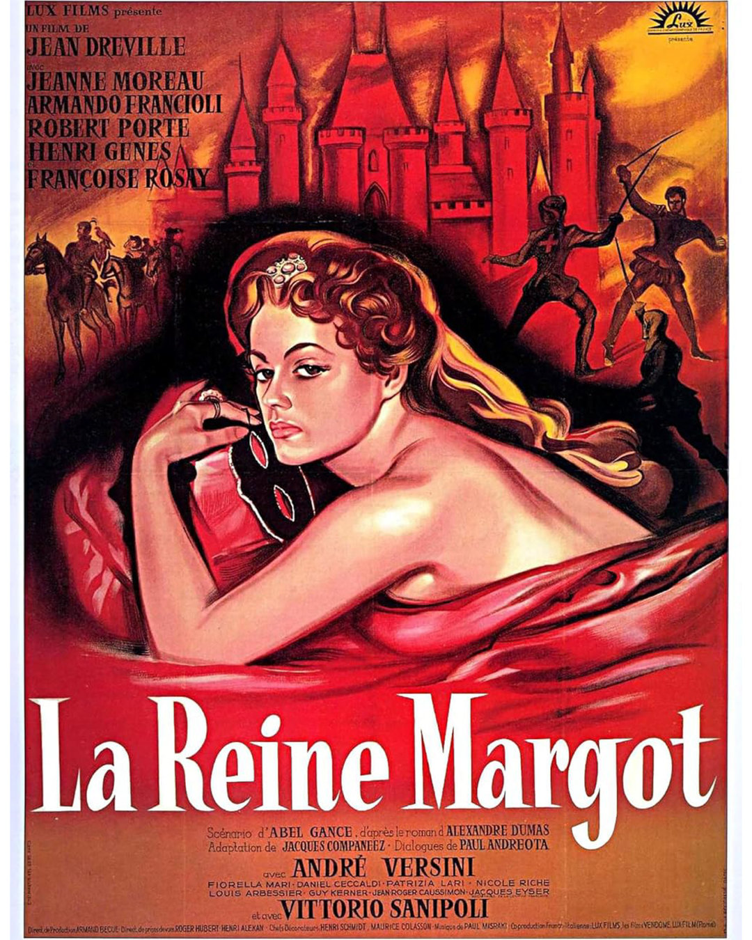
As I began to look back on all of the lettering references I had collected that were related to Vendôme, this theme of interpreted forms began to appear over and over.
There are a number of posters by Jacques Fourastie for Ascenseur pour l’Échafaud that all have hand-drawn lettering with this theme. I’m uncertain though, if Fourastie had anything to do with the film’s title sequence. From what I can find online, it looks like Fourastie drew Vendôme-like letterforms for other posters as well.
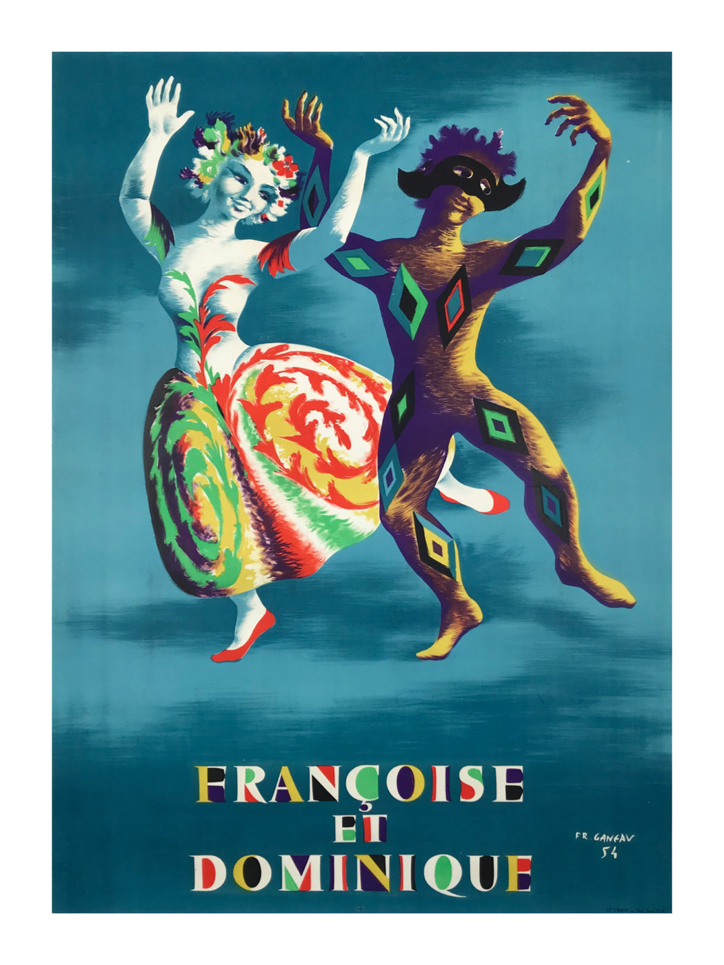
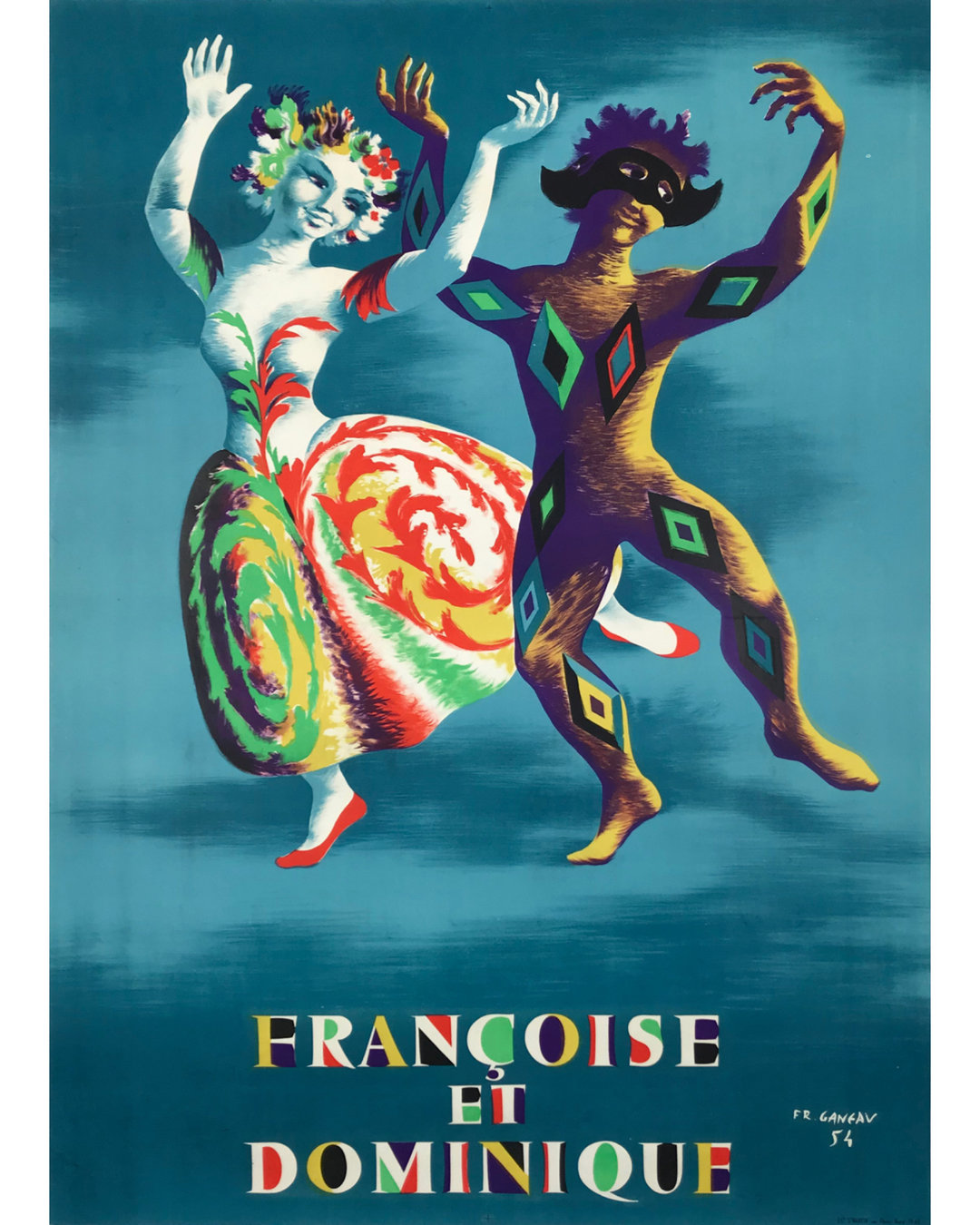
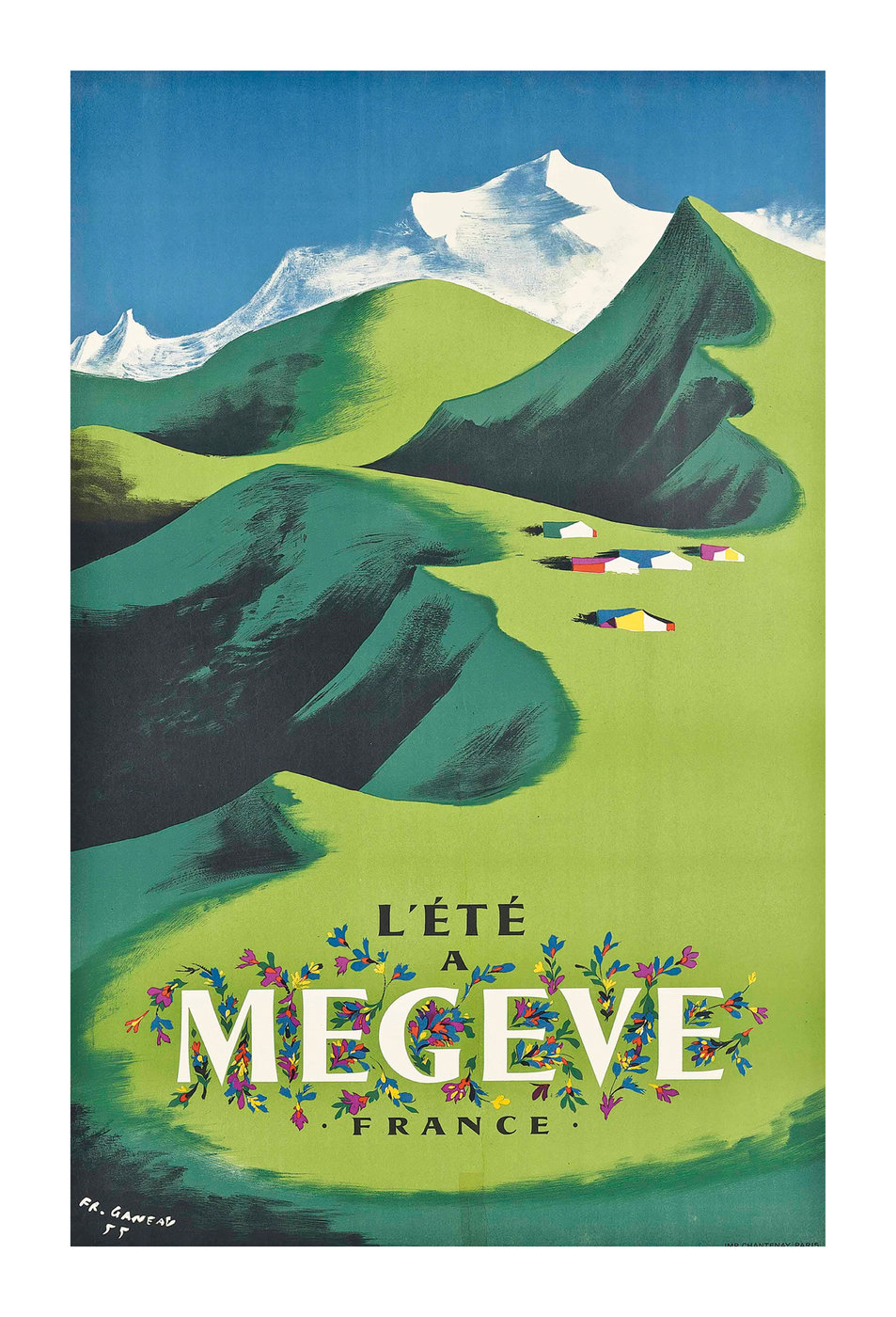
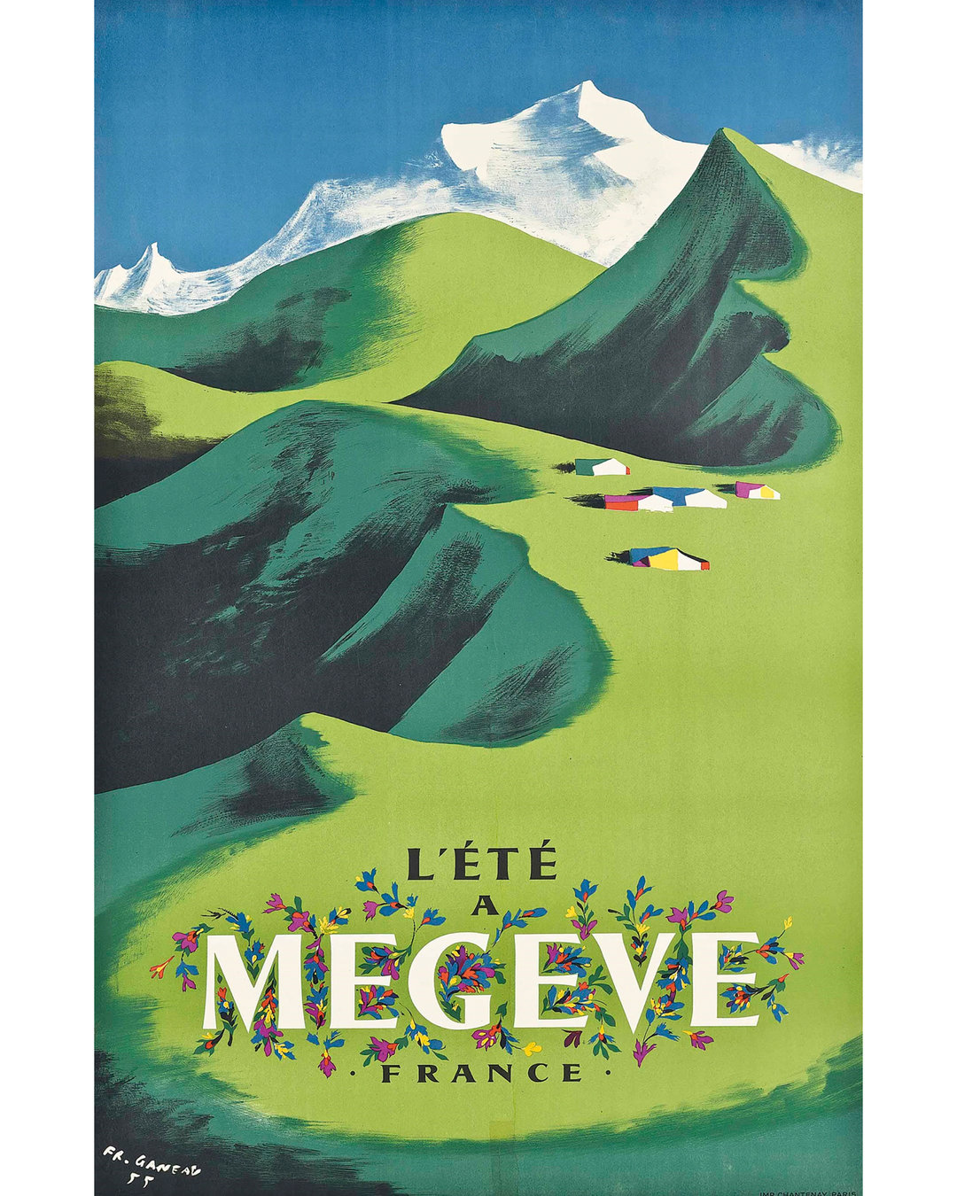
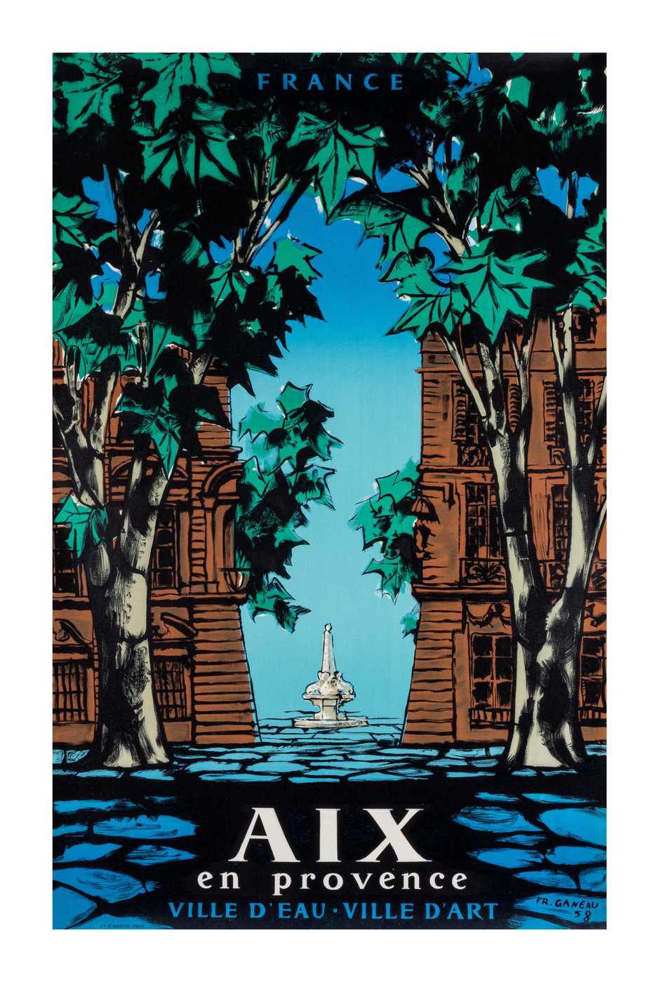
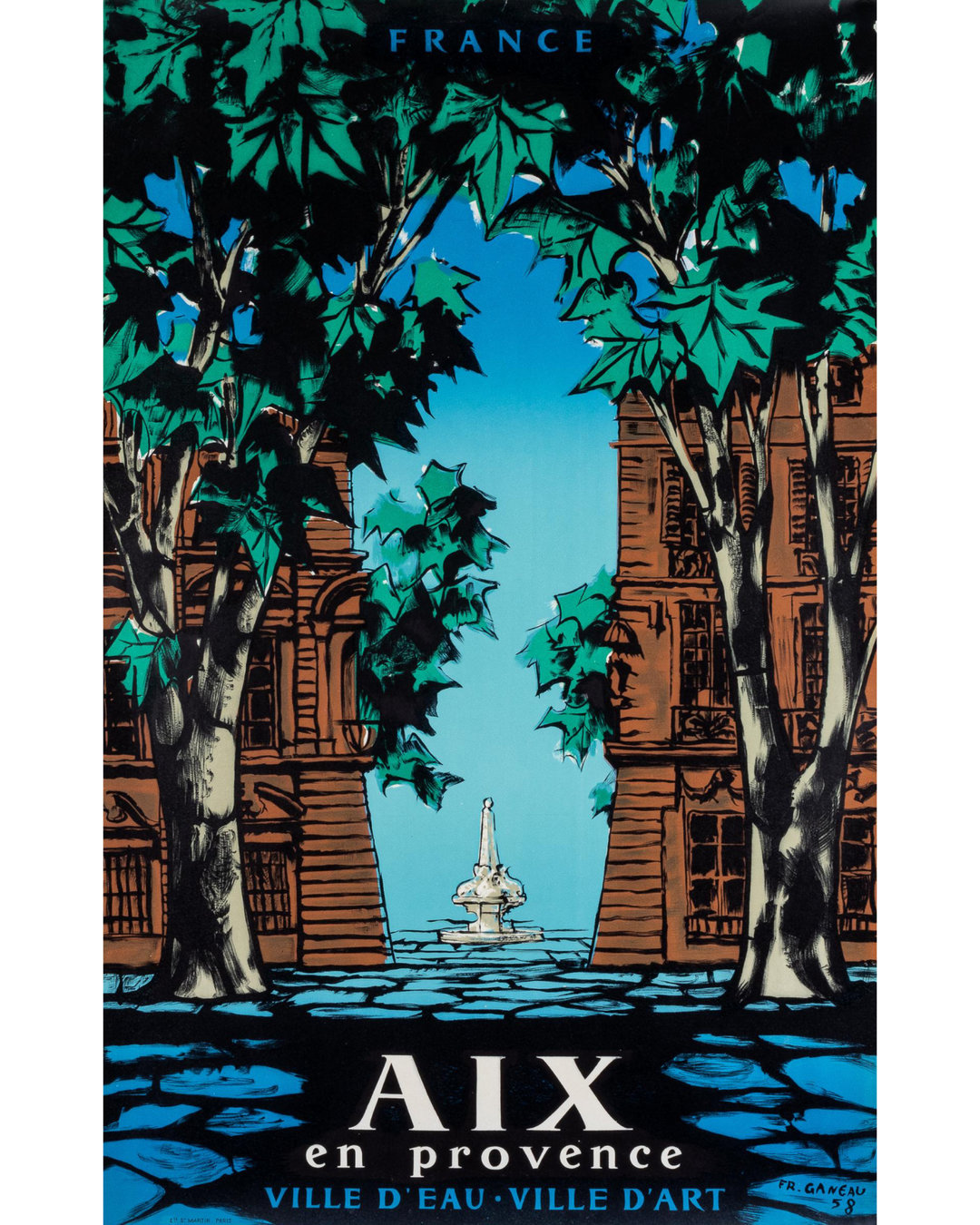
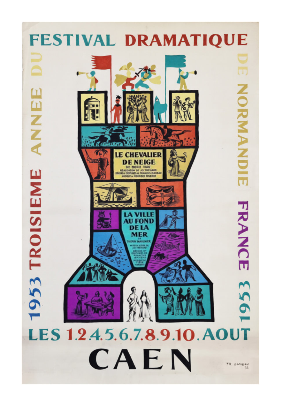
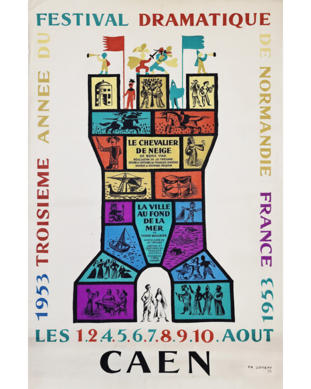
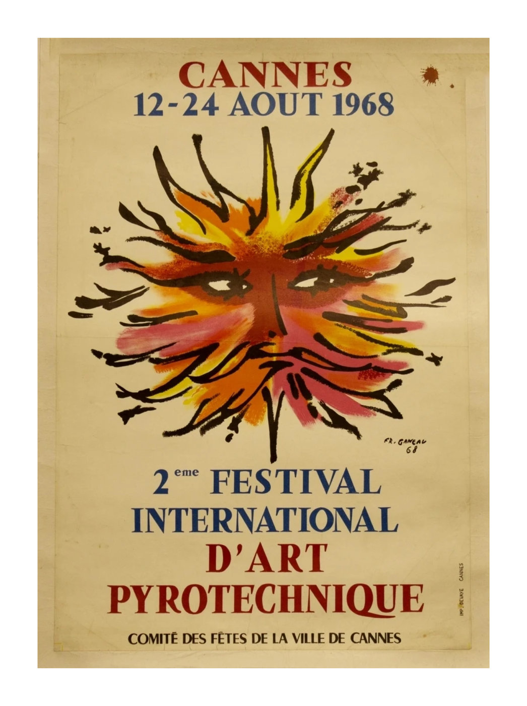
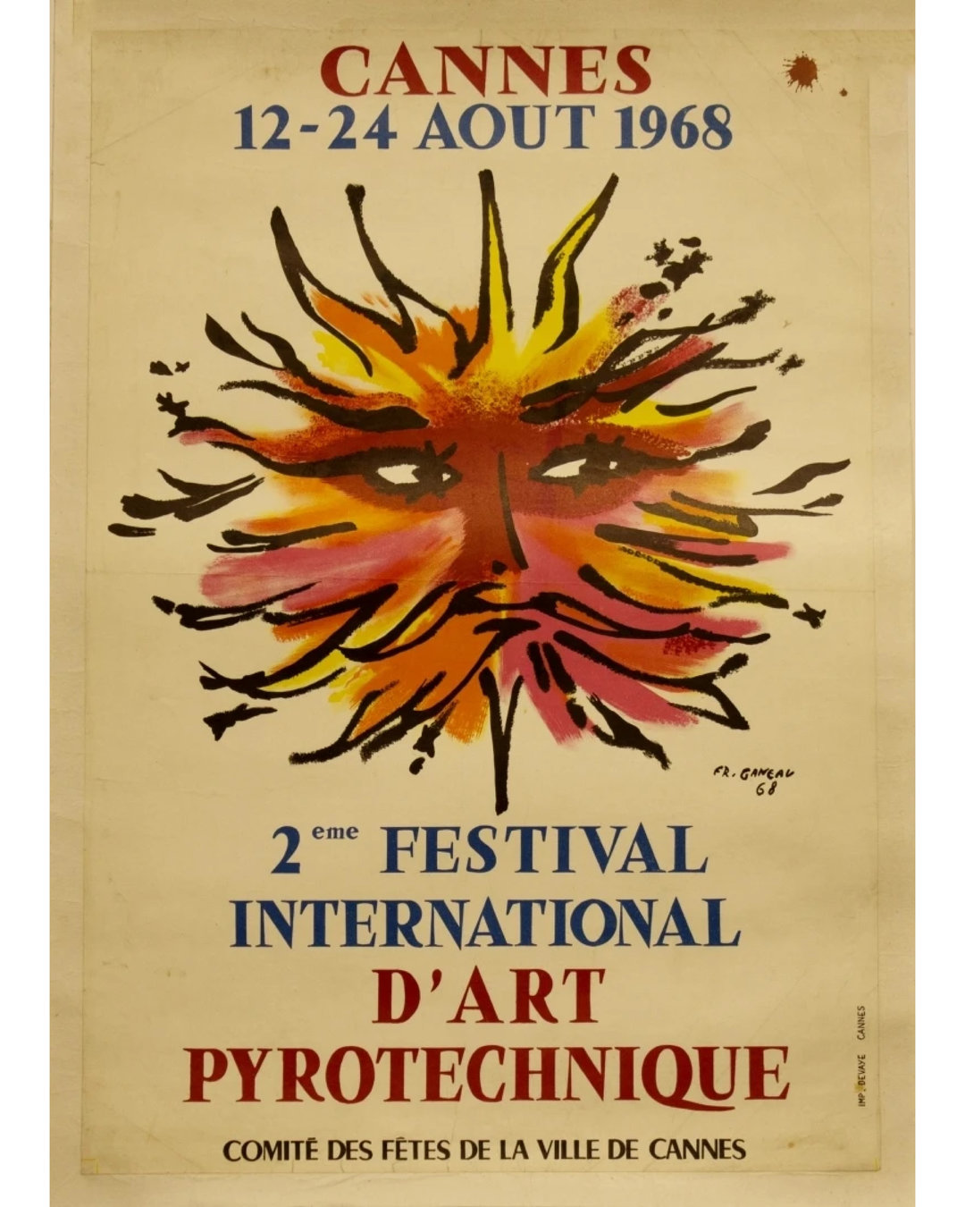
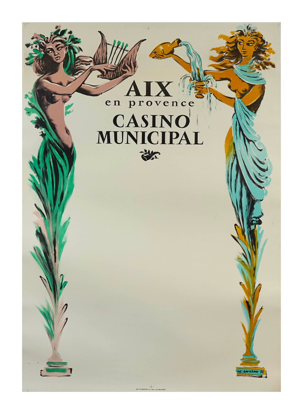
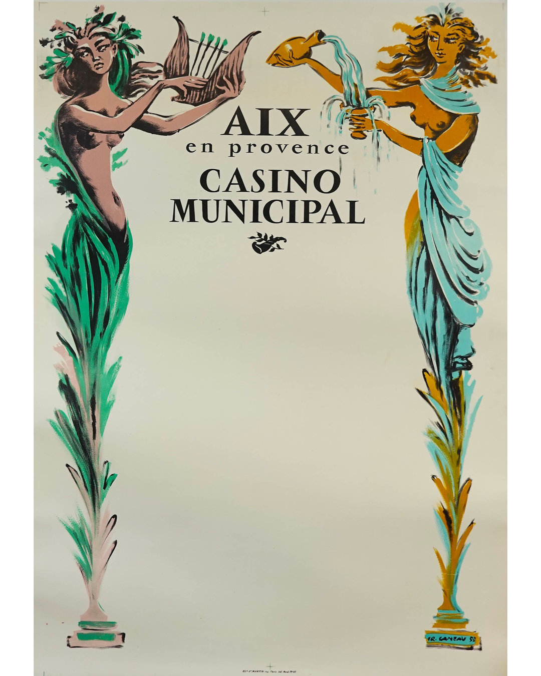
It turns out François Ganeau, too, was a rather prolific poster artist. In what I’ve been able to find, it looks like he was actively working for a number of clients during and immediately after the years he spent working on Vendôme. Each poster I’ve found has an incredible artistic spirit, a recognizable hand, and fantastic lettering. When looking at his lettering, it appears that he often used his own typeface as a starting point to create something new. Some of these letters are clearly adapted from Vendôme, while others keep a similar skeleton (look at every R), but are nearly sans-serif.
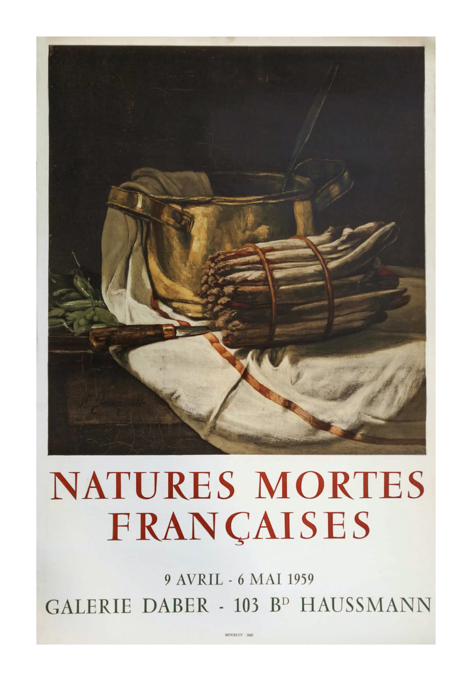
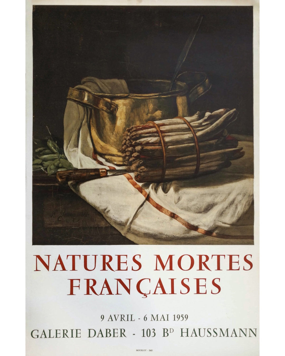
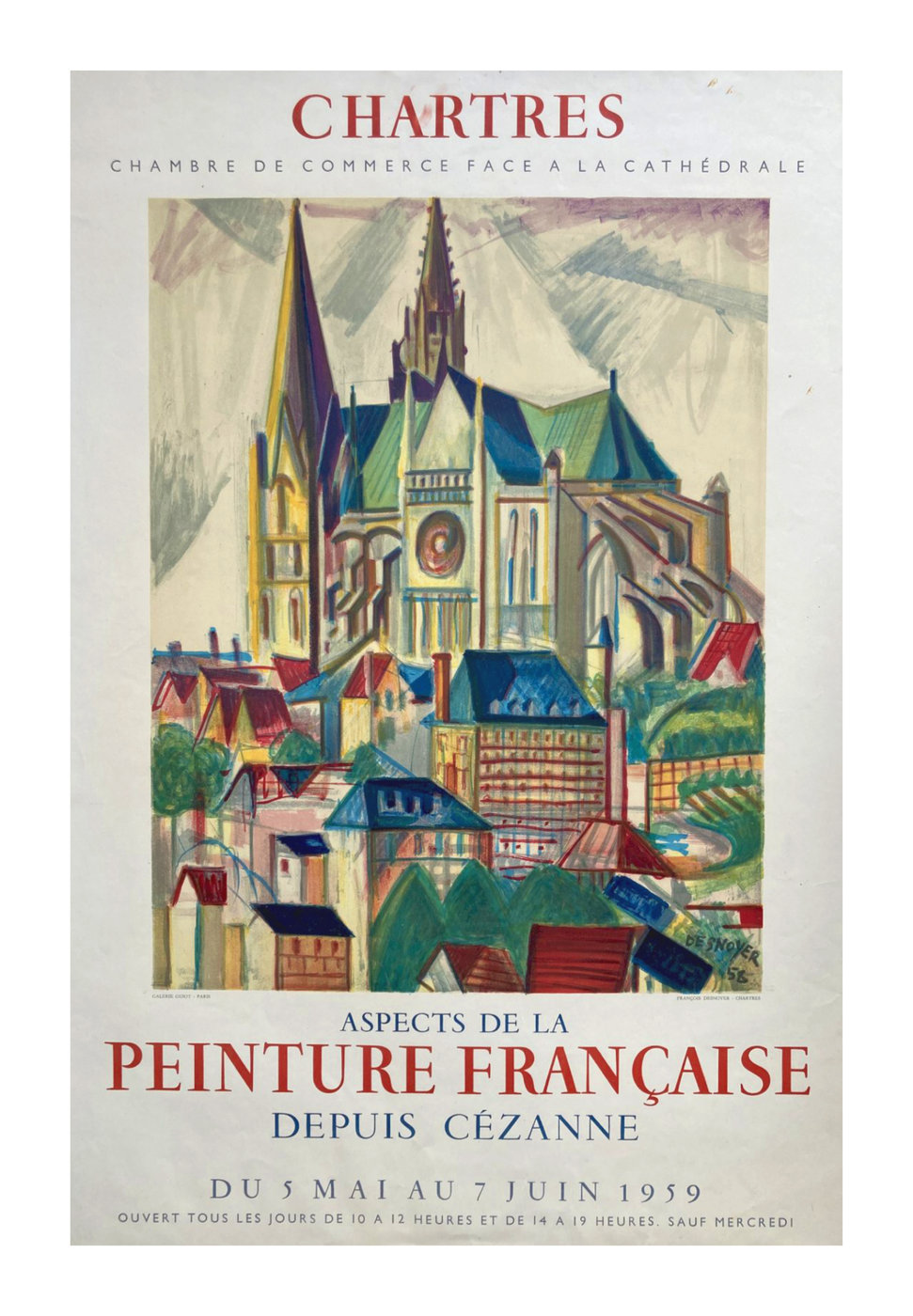
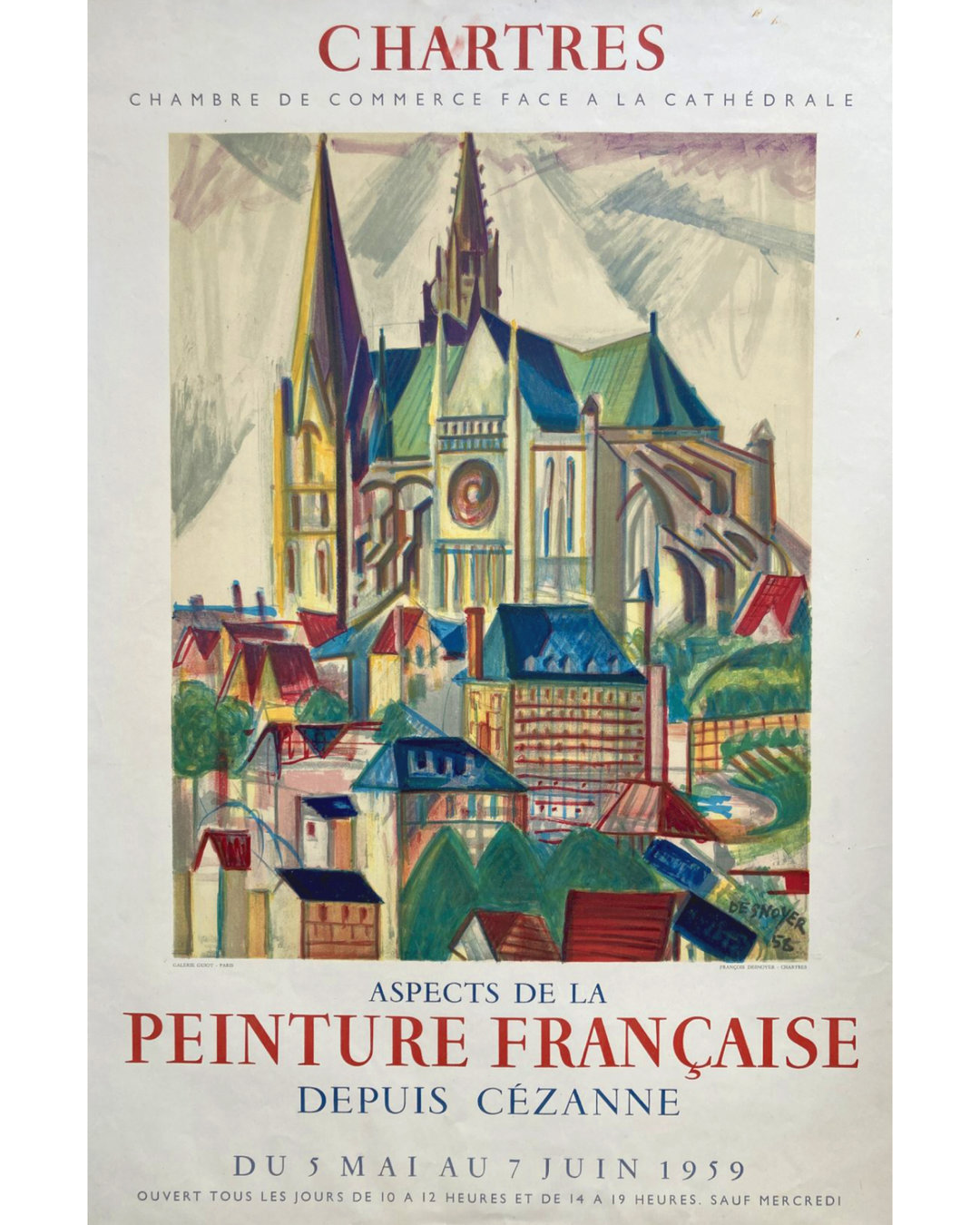
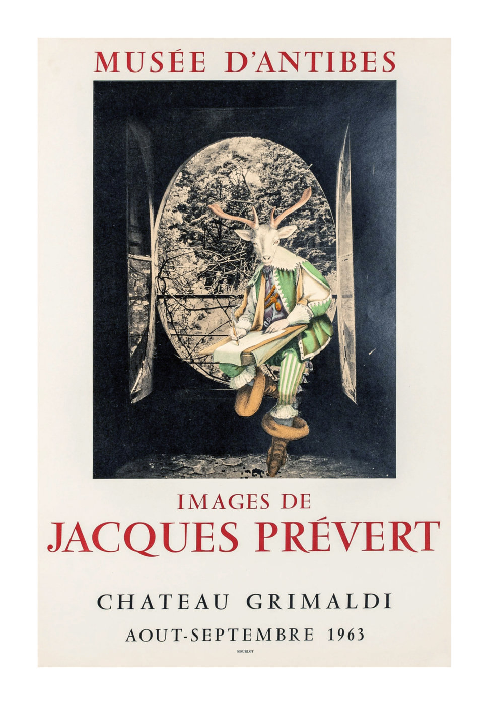
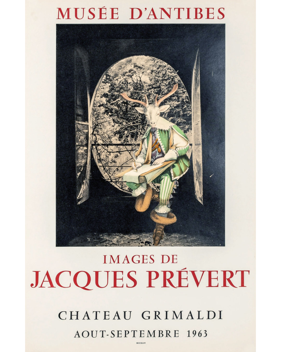
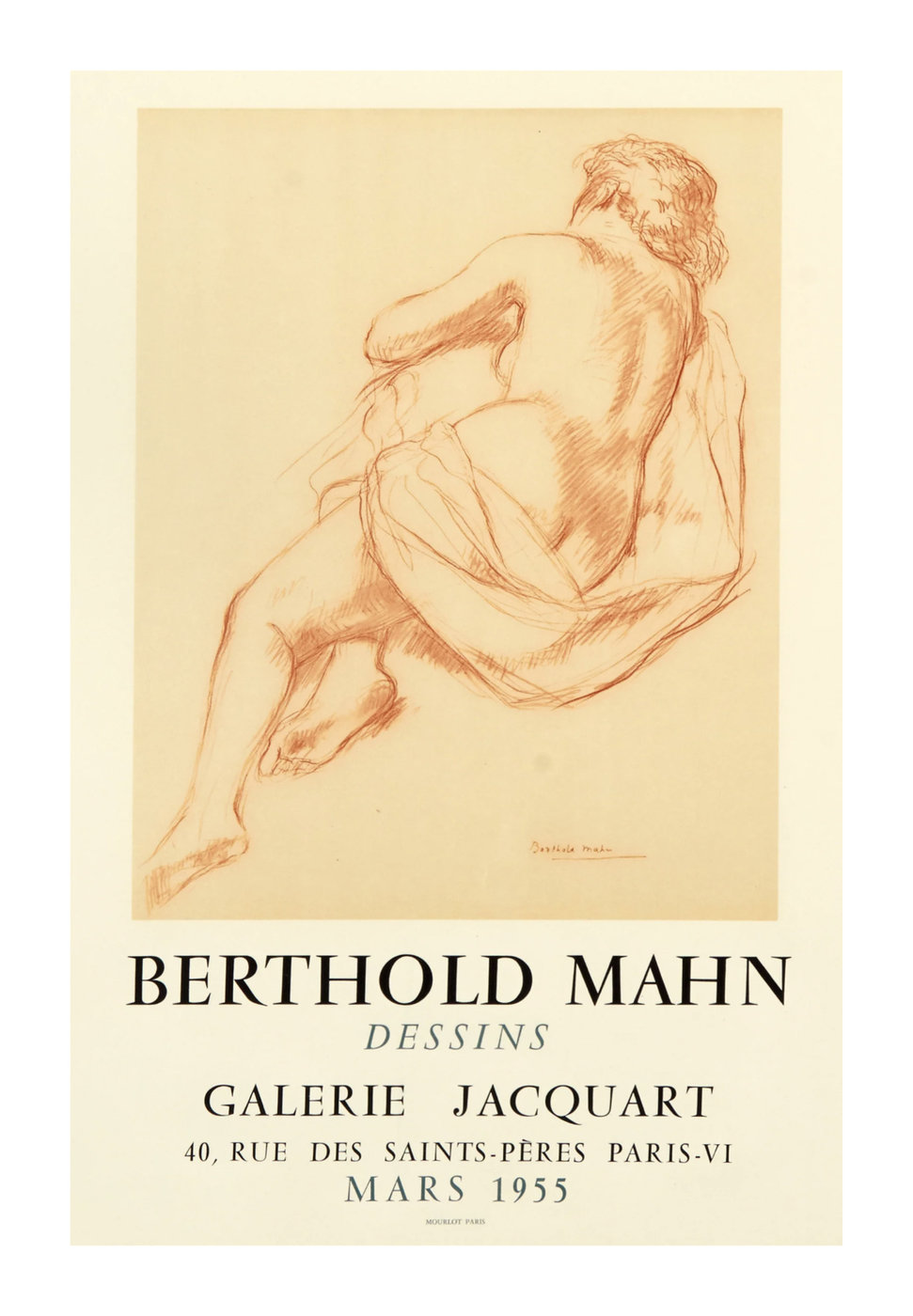
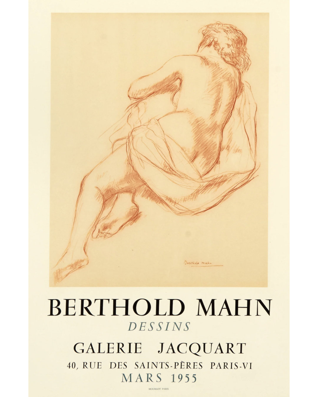
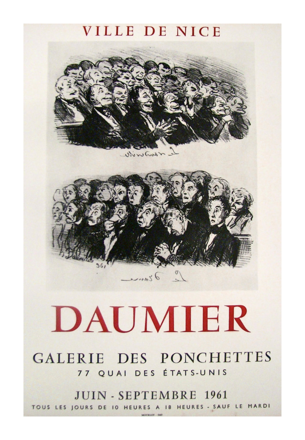
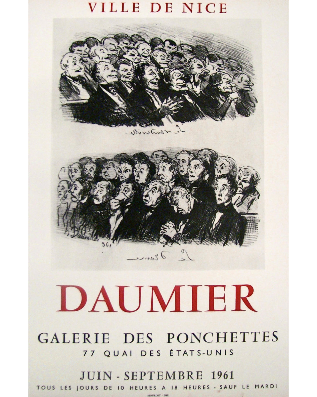
I found this poster, Natures Mortes Françaises, while flipping through the endless collection of 20th Century French posters at La Belle Epoque in New York City. You’ll notice the large red type, if you look closely, is a hand-drawn rendition of Vendôme. Aspects de la Peinture Française Depuis Cézanne was displayed right next to Natures Mortes, with its large red type being a hand-drawn rendition of Deberny & Peignot’s Garamond. Both pieces of lettering have an intriguing detail in common. The cedillas underneath C (Ç) are nearly identical in both their form and their placement underneath the letter. This cedilla shape is neither the cedilla designed for Vendôme, nor is it the D&P Garamond cedilla. This repeated improvisation is such a fun detail, and to the trained eye, a giveaway that these letters were created by hand, and not by set type.
I was so charmed by these two posters that I took some time out to look further into Imprimerie Mourlot. It turns out they have a long history of designing and printing posters for art galleries during the 20th century, and so many of them look to have hand-drawn serif capitals. The artists behind these posters had to carefully draw their own letters, probably because the fonts they were using weren’t available at such large sizes. Because of their efforts to appear just like the typefaces they were copying, these drawings sit in a gray area between deriving and outright bootlegging. Among all of the styles I could find, the Vendôme caps stuck out to me the most, of course.
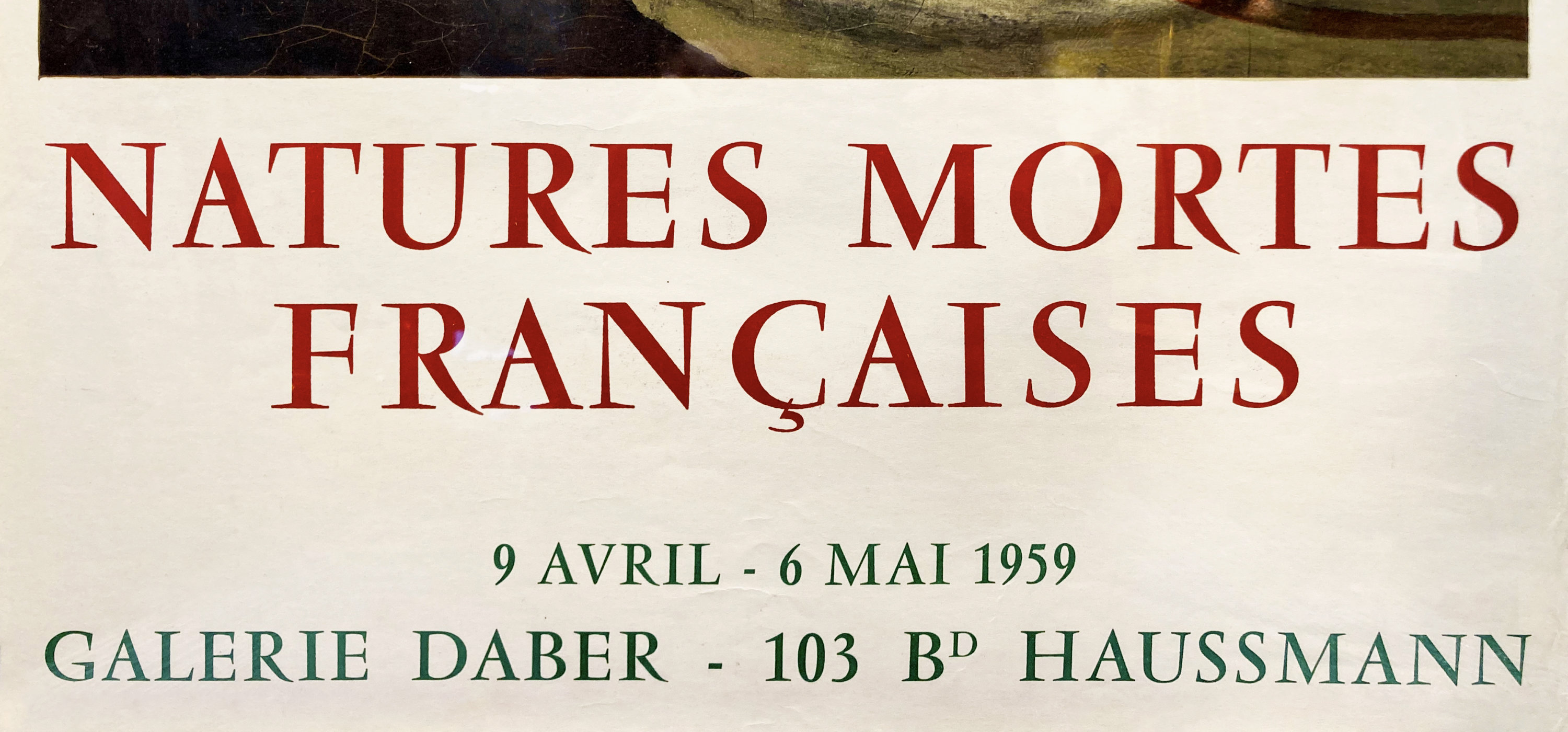
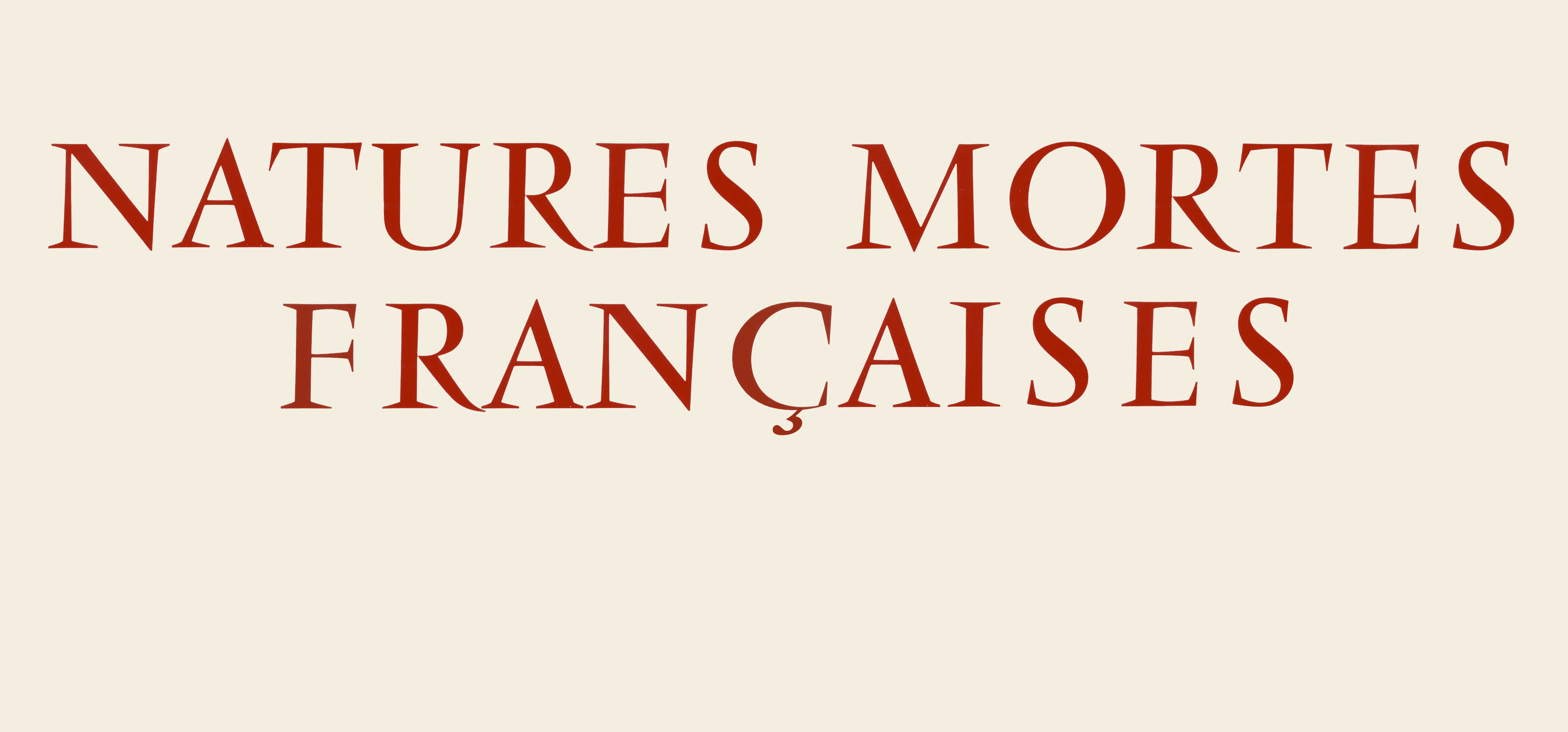
Close-up of poster lettering.
This overlay makes it clear how the artist of this poster really worked to make their lettering feel like Vendôme without tracing and enlarging its forms. Compared with a scan of Vendôme at 72pt, there are a number of changes to proportion and serif width, and even a few forms that look to do their own thing entirely, like S.
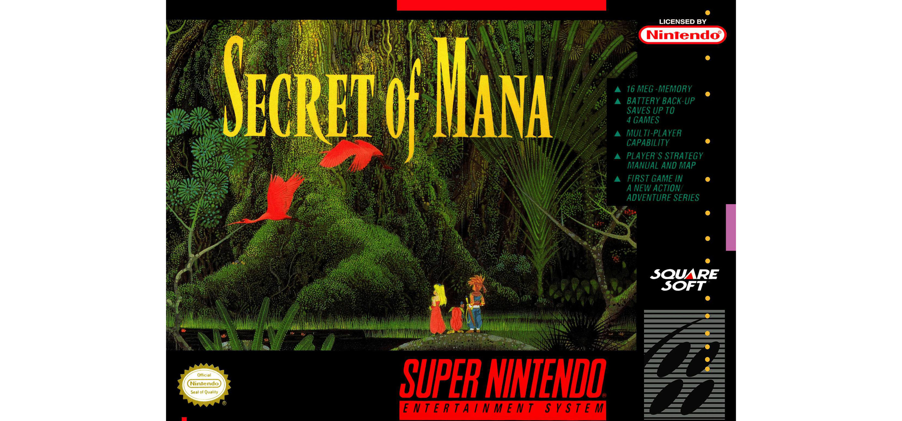
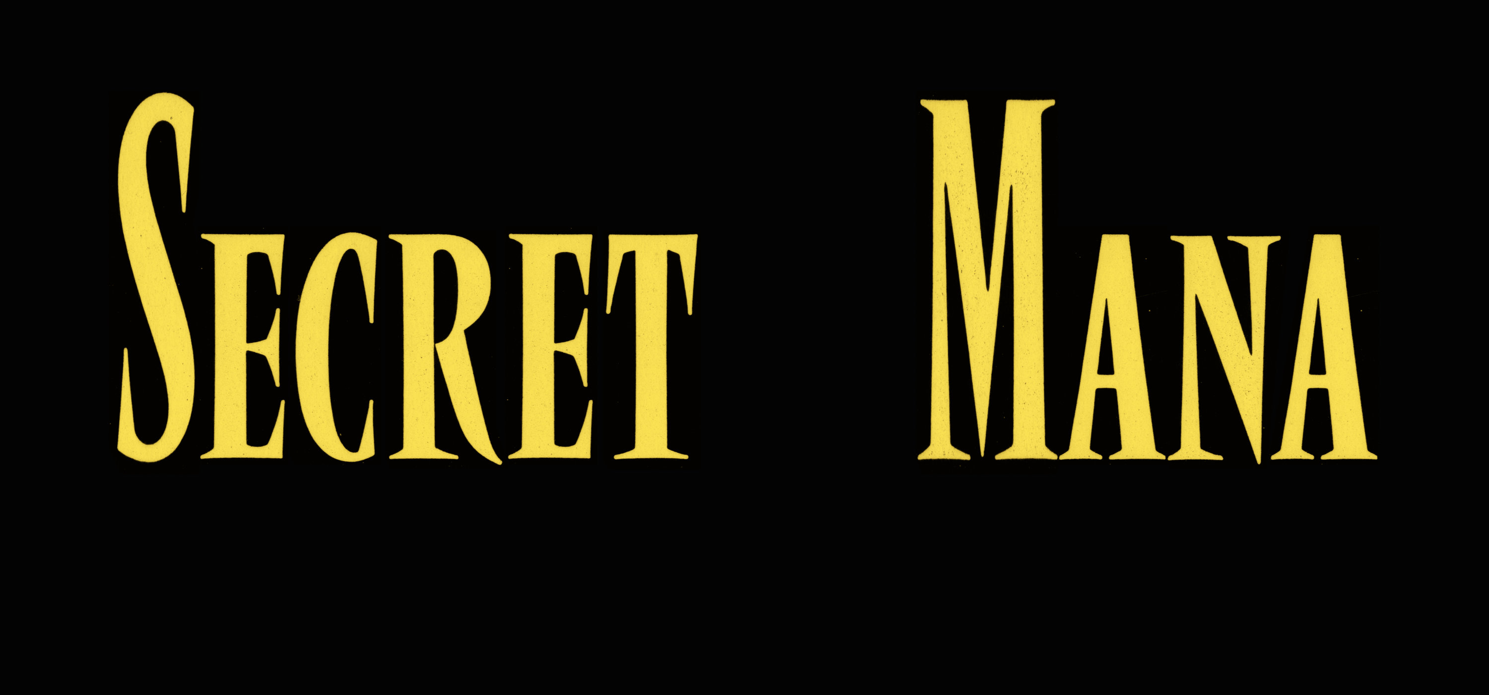
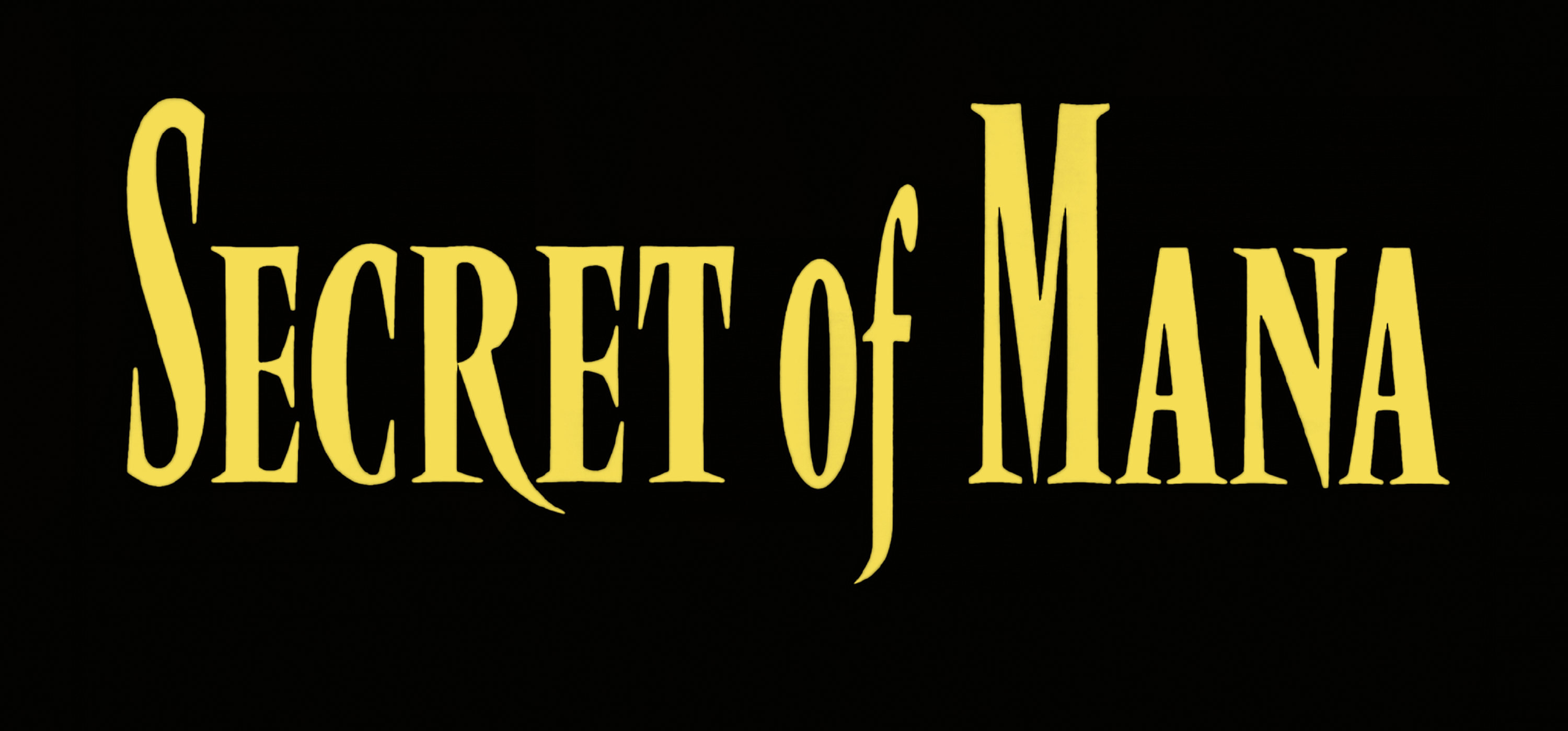
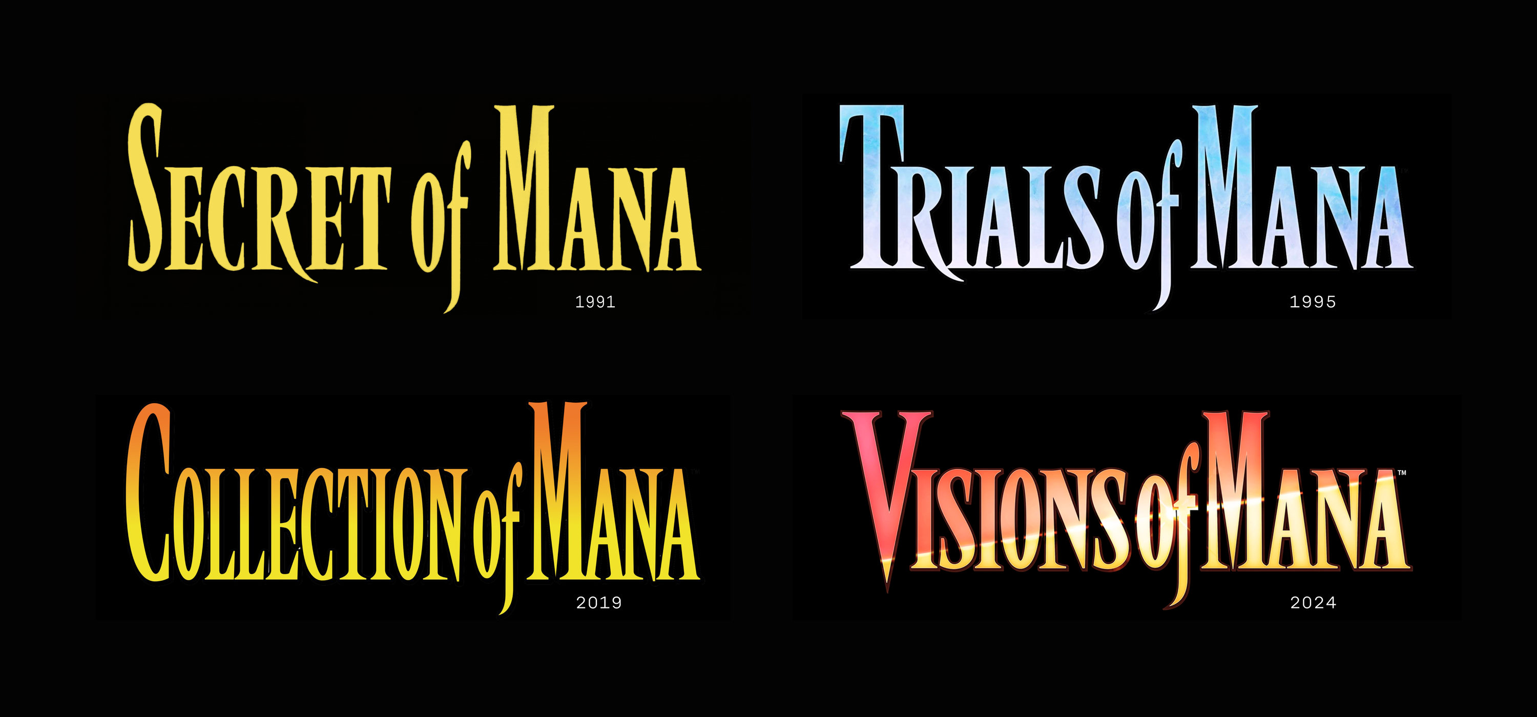
Secret of Mana Box Art. Hiroo Isono, 1993.
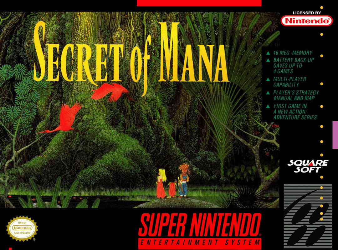
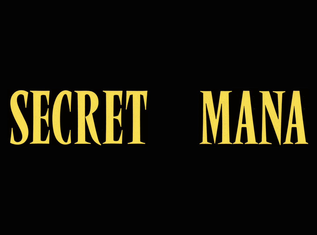
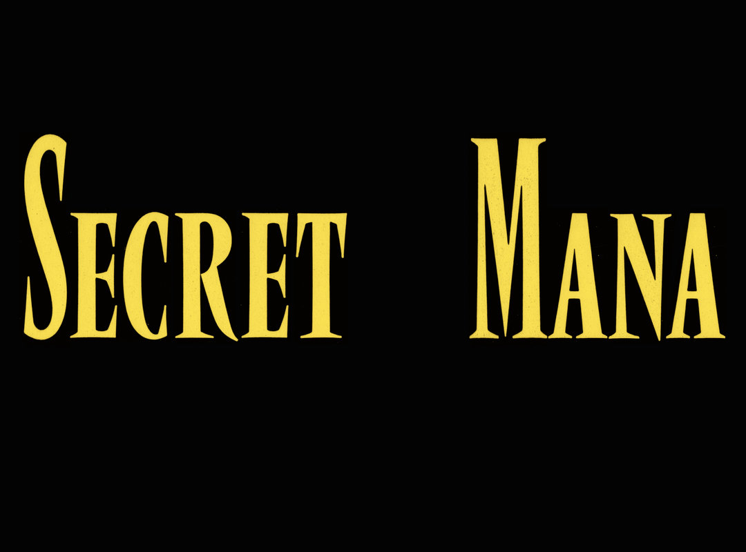
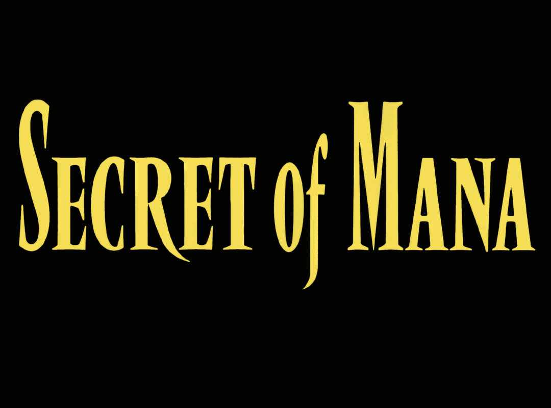
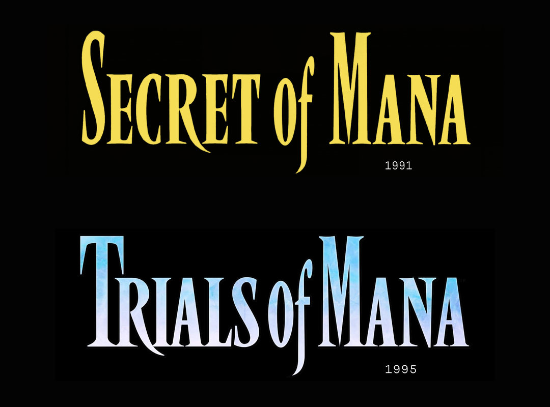
Secret of Mana Box Art. Hiroo Isono, 1993.
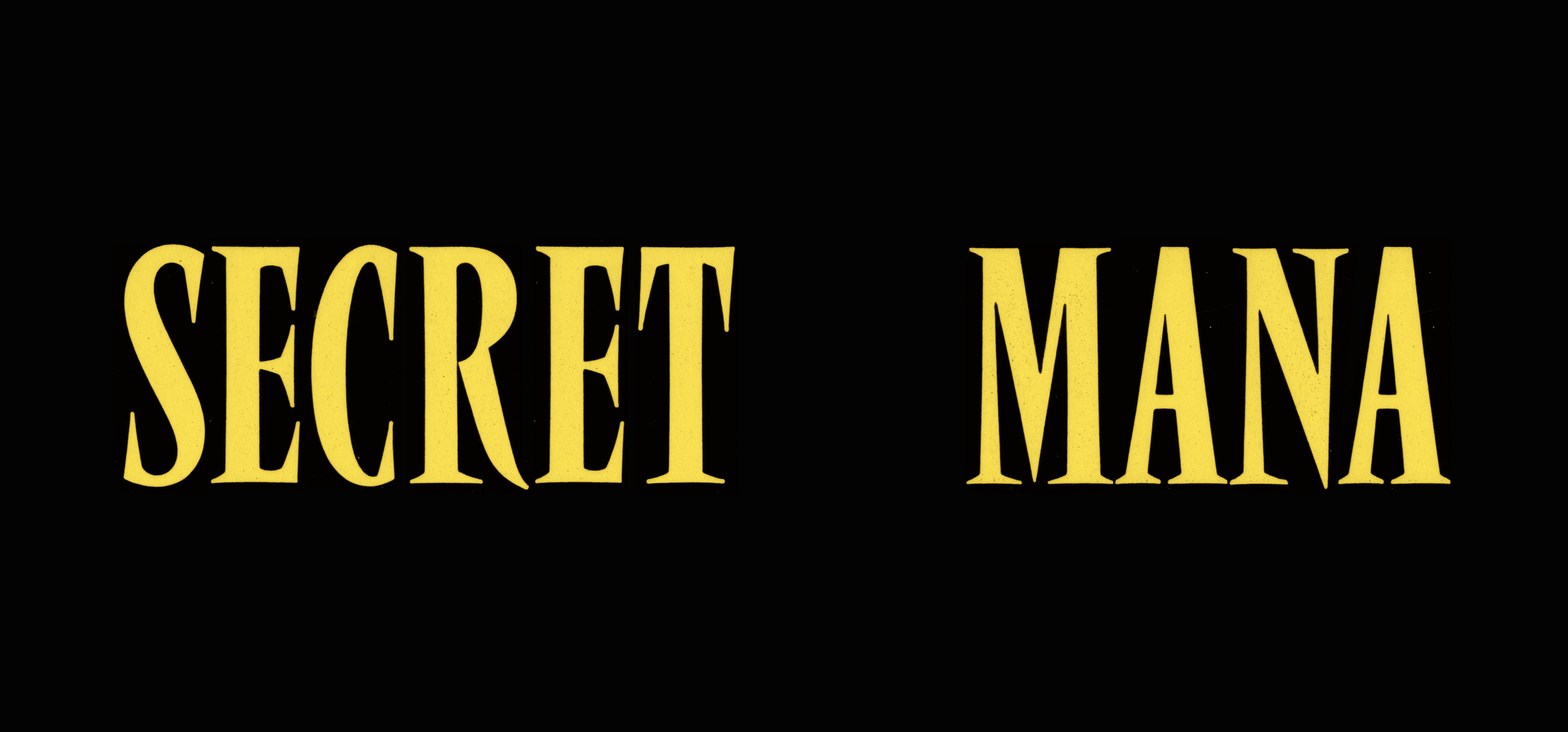
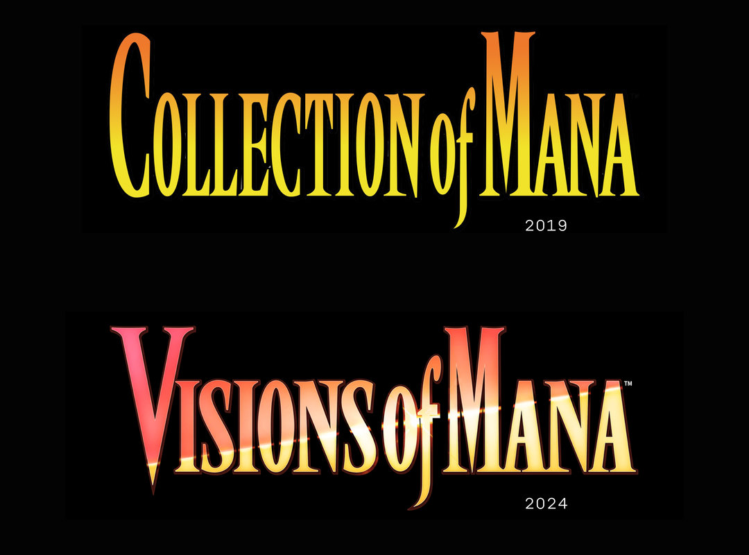
The first time I probably ever encountered Vendôme was renting Secret of Mana at my local Blockbuster in the 90s. Seeing this video game in a “Best SNES RPG’s” article during lockdown instantly jogged my memory. My first thought was that the artist had improvised a set of small-caps (ECRET and ANA) for the game’s logo. What’s actually happened is that they took Vendôme Condensed, stretched S and M to their extremely tall proportions, and then made additional moves from there. I love it when designers do stuff like this, especially when the result is so convincing. It feels like small caps for Vendôme have always existed. Bonus points for the long leg on R, and the tail on f. The new proportions of the S and M in this logo are what gave me the idea to push the proportions as much as I could with Rempart Compressed.
The Mana series spans about 18 games over a 30 year stretch. From what I’m able to find, it looks like Vendôme was used for 1995’s Trials of Mana (Secret’s sequel), and then not used again until 2019, when Nintendo published Collection of Mana. 2024’s Visions of Mana also uses Vendôme, and I hope that future additions to the series continue doing so. Say what you will about any errors and inconsistencies there may be in these logos … I think they’re all perfect.
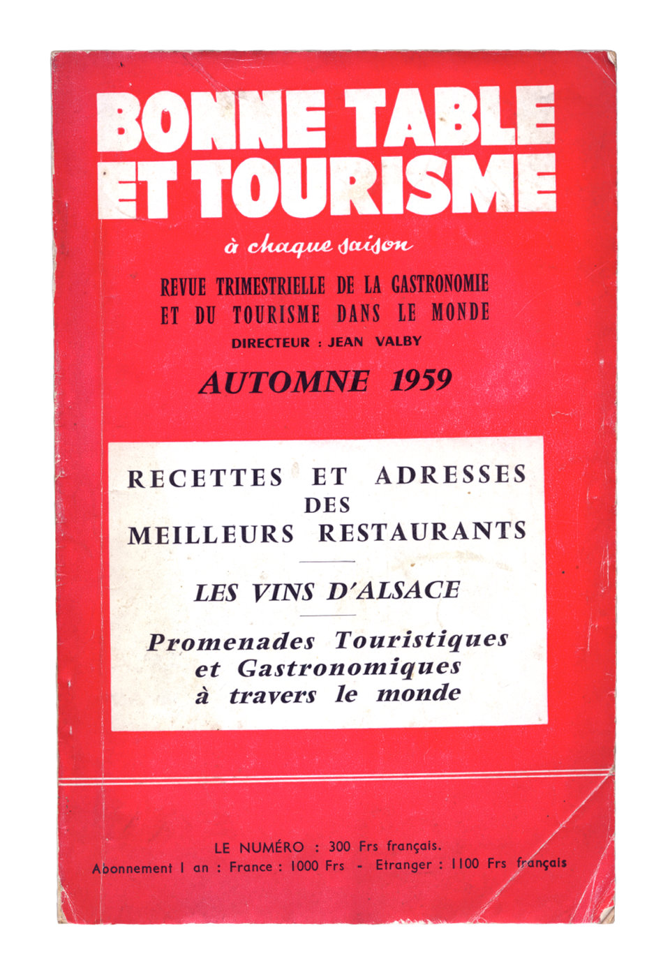
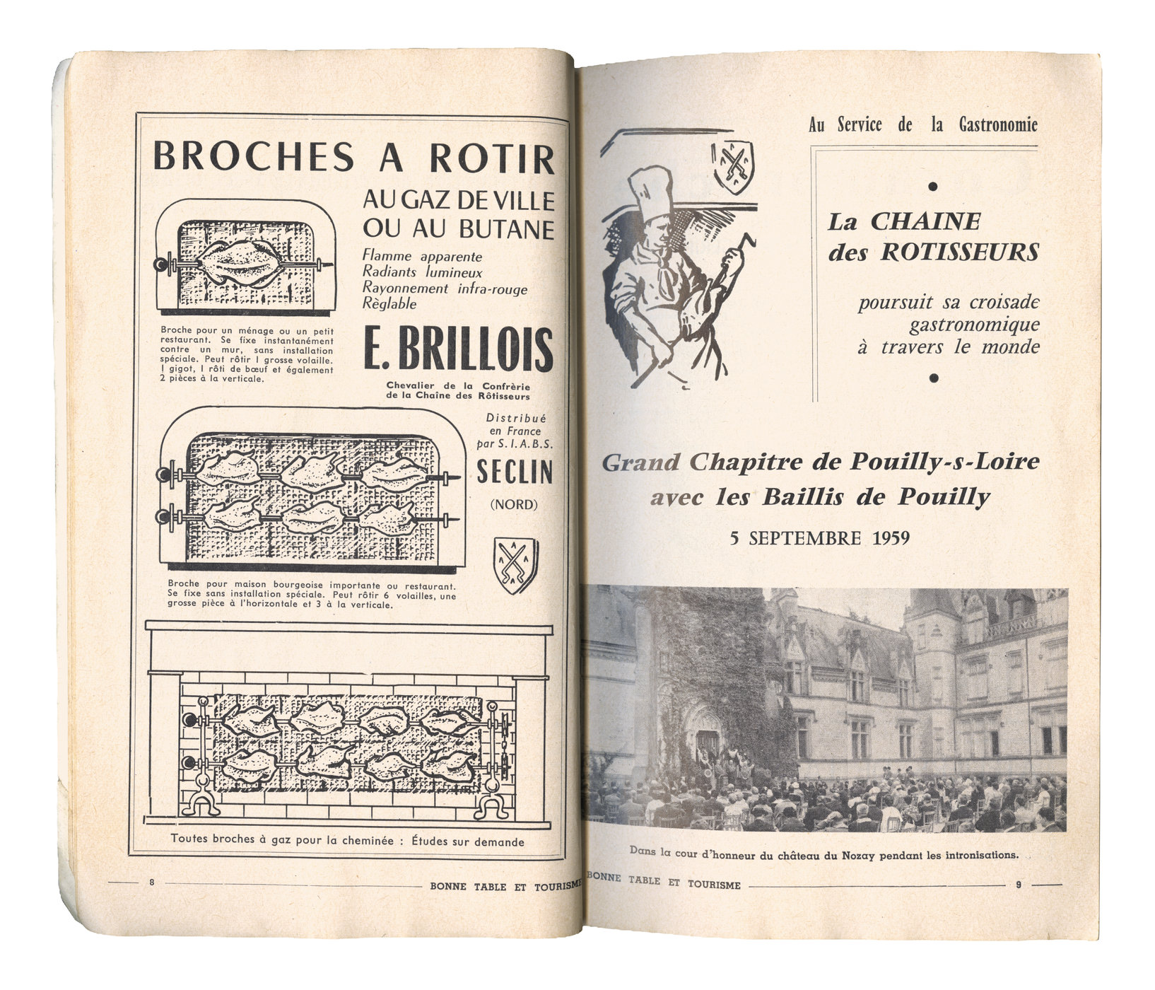
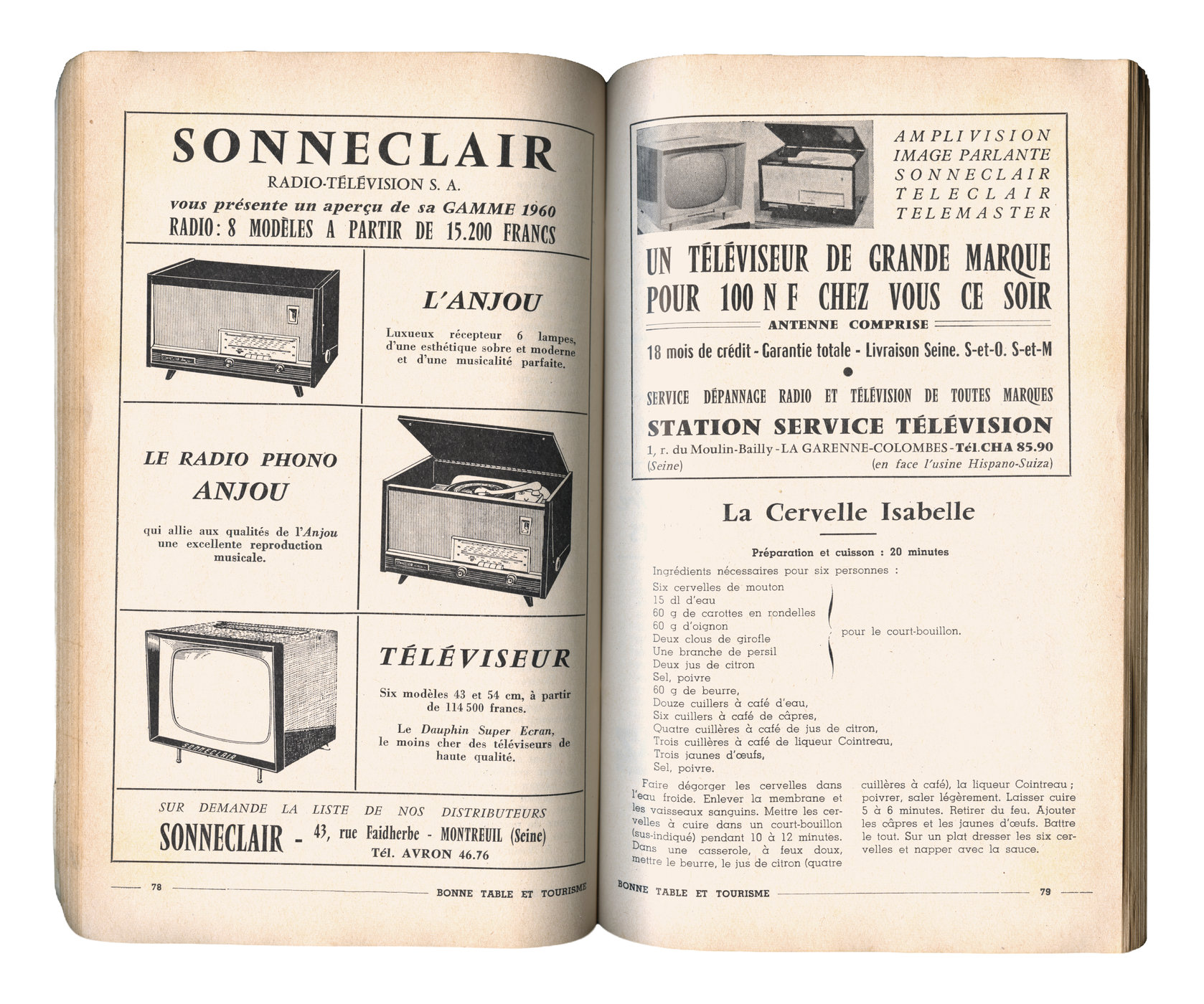
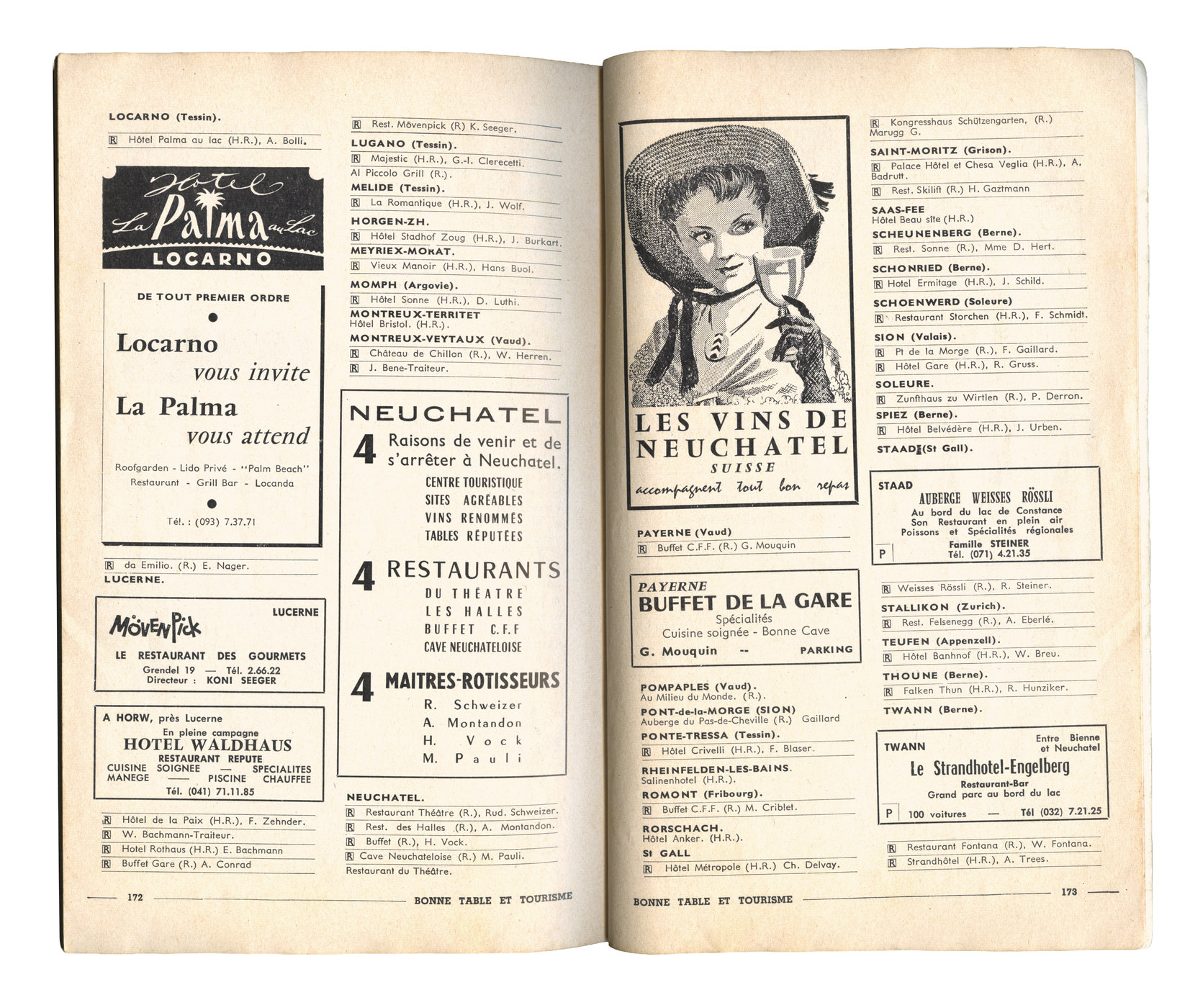
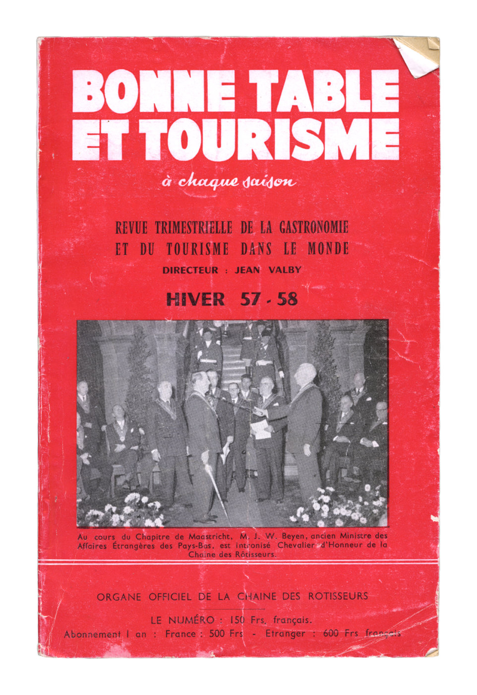
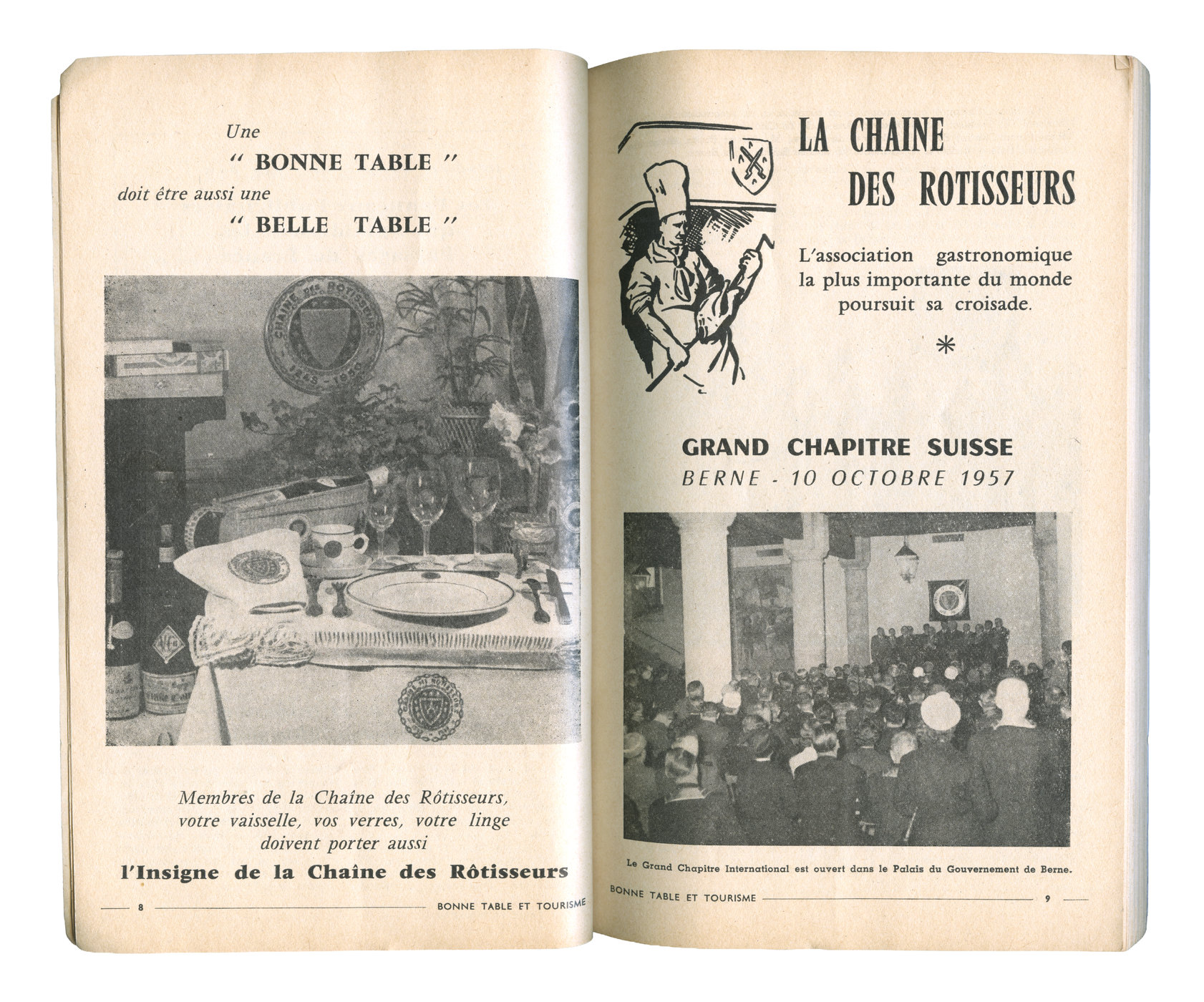
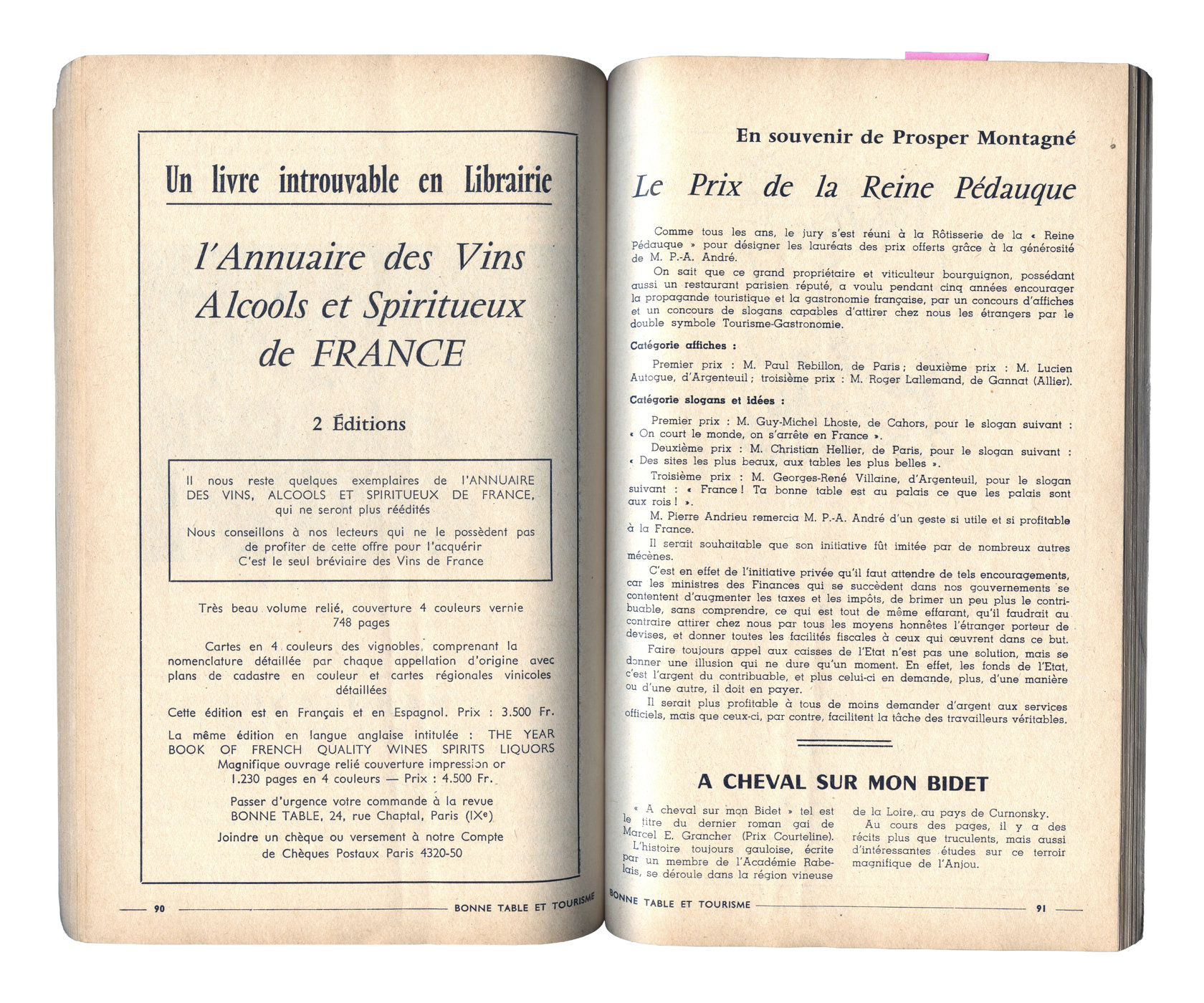
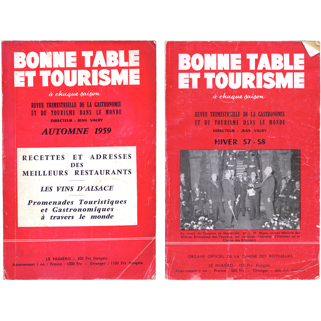
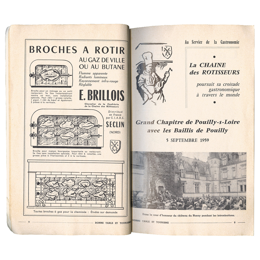
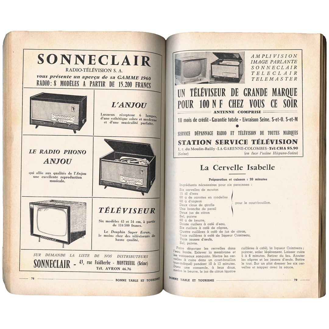
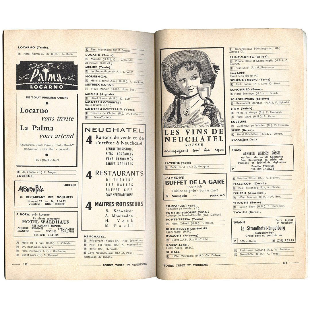
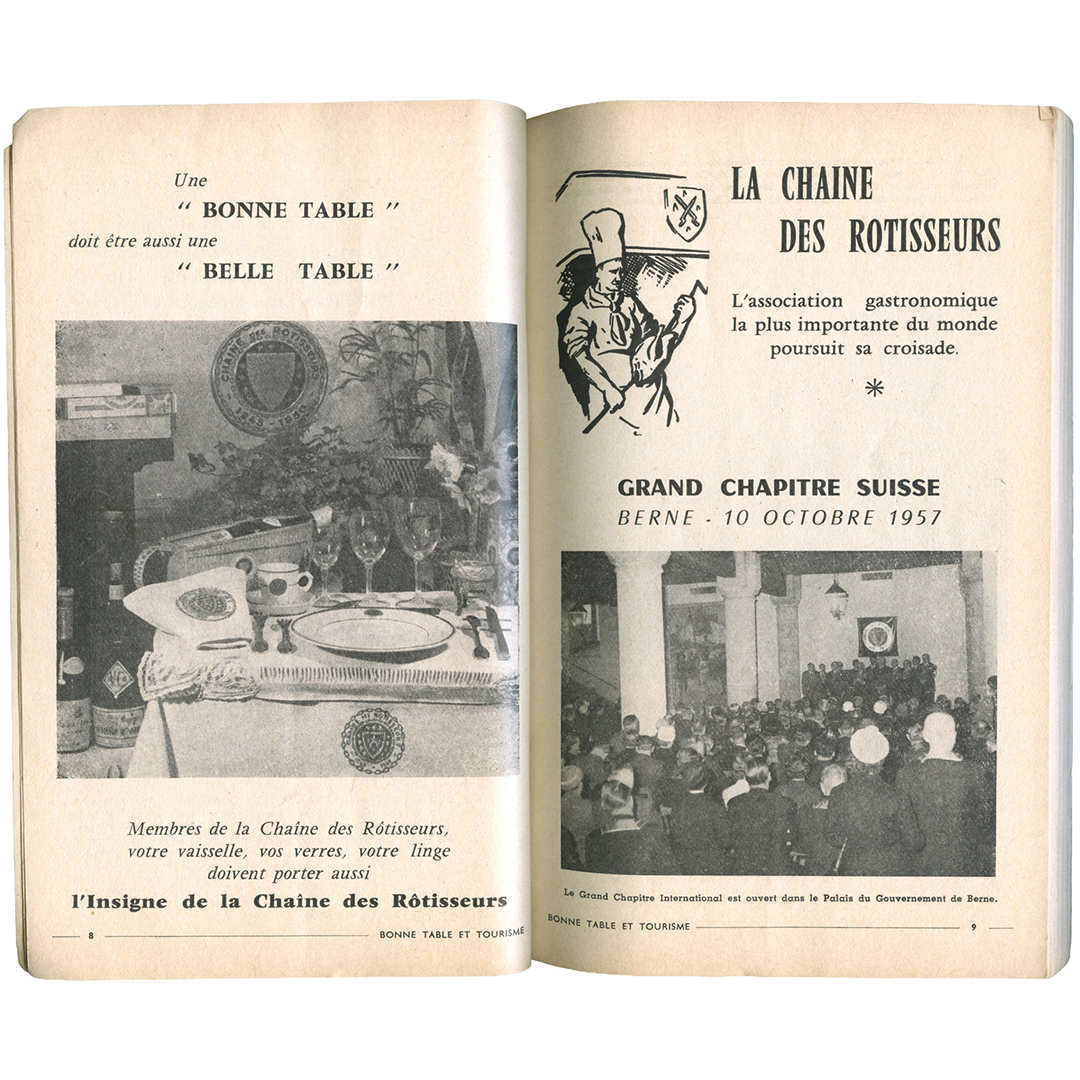
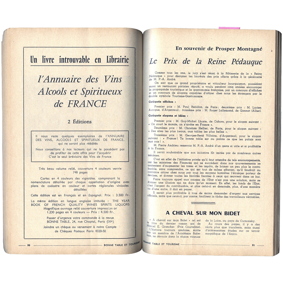
Vendôme was never much of a book-face, finding a lot more use in advertising and headline-style typesetting. This edition of Bonne Table et Tourisme, purchased at Bonnie Slotnick Cookbooks, is a perfect example. What I find particularly interesting in these books is that almost all weights and widths of Vendôme make an appearance, at least once or twice. I also really enjoy when Vendôme is combined with Chambord (the sans), another Olive best-seller.
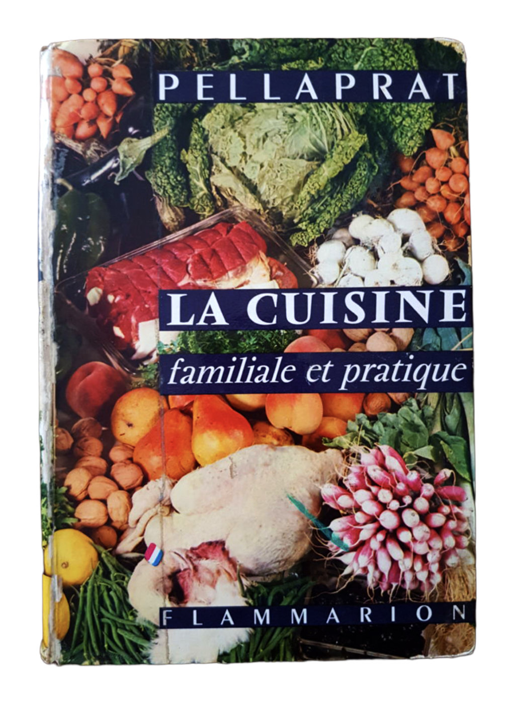
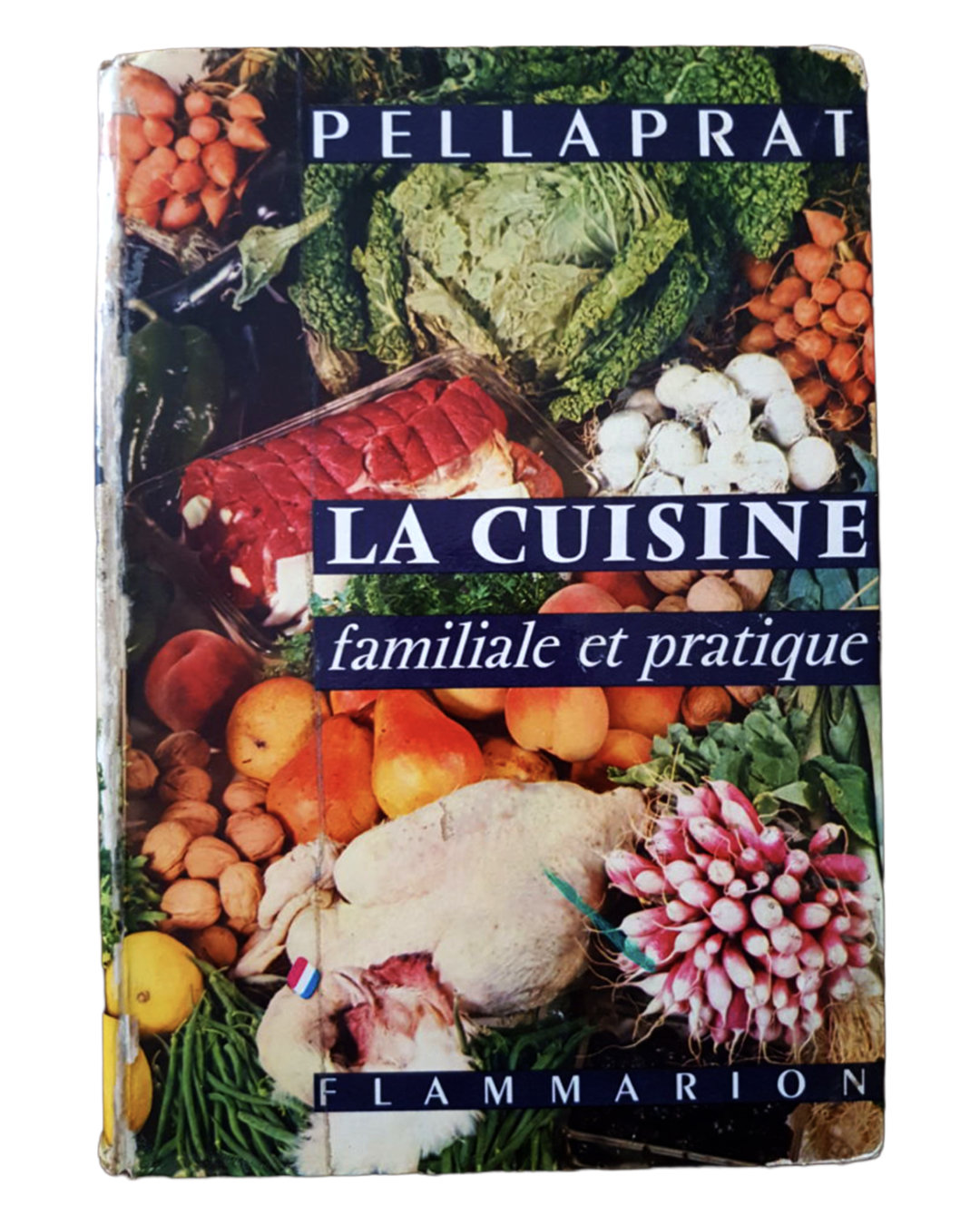
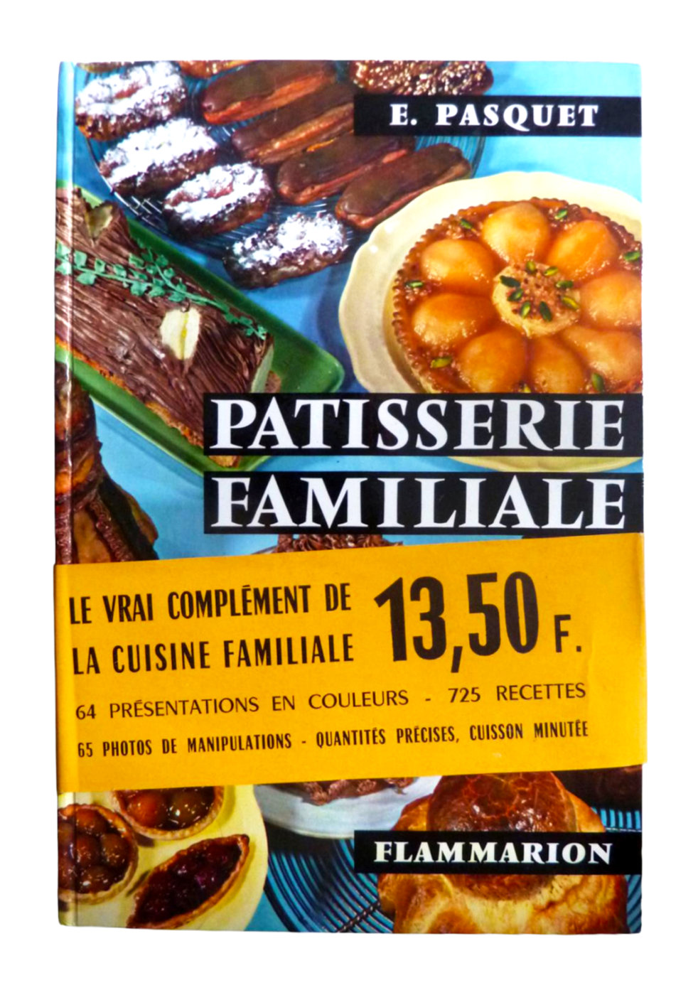
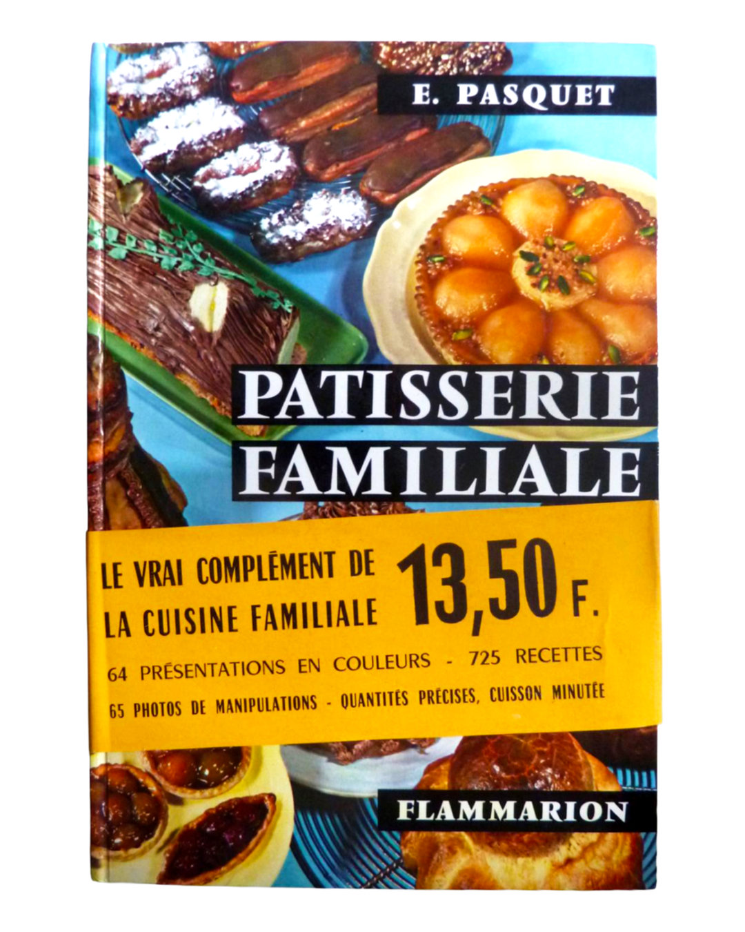
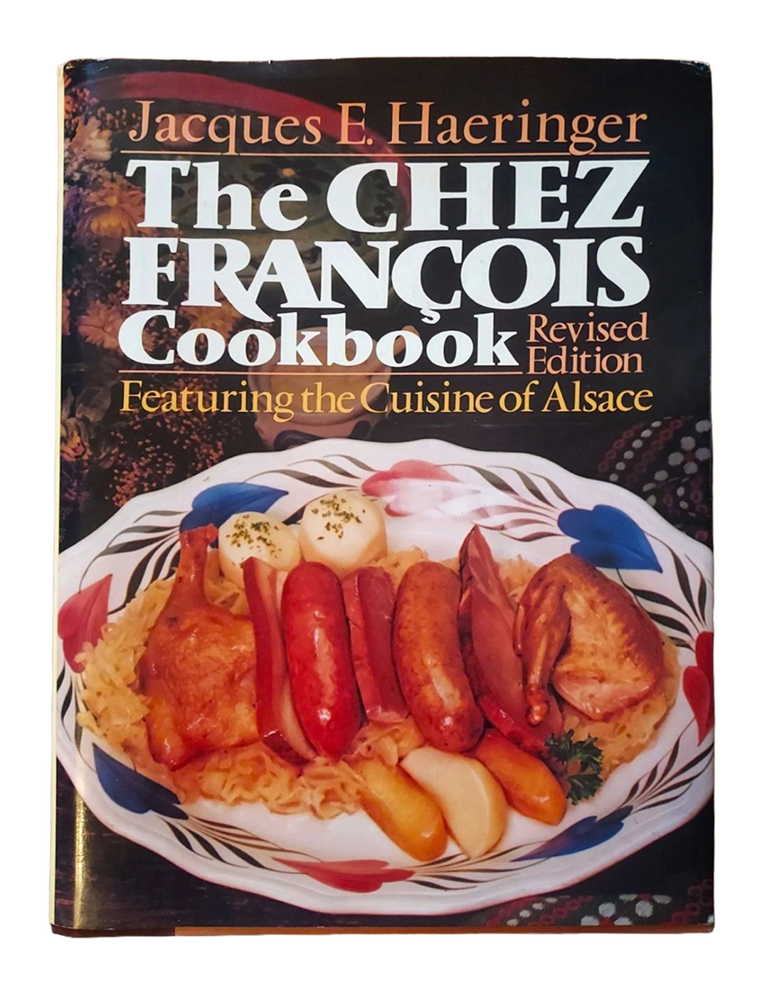
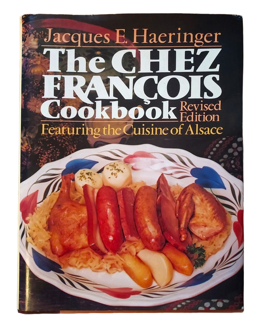
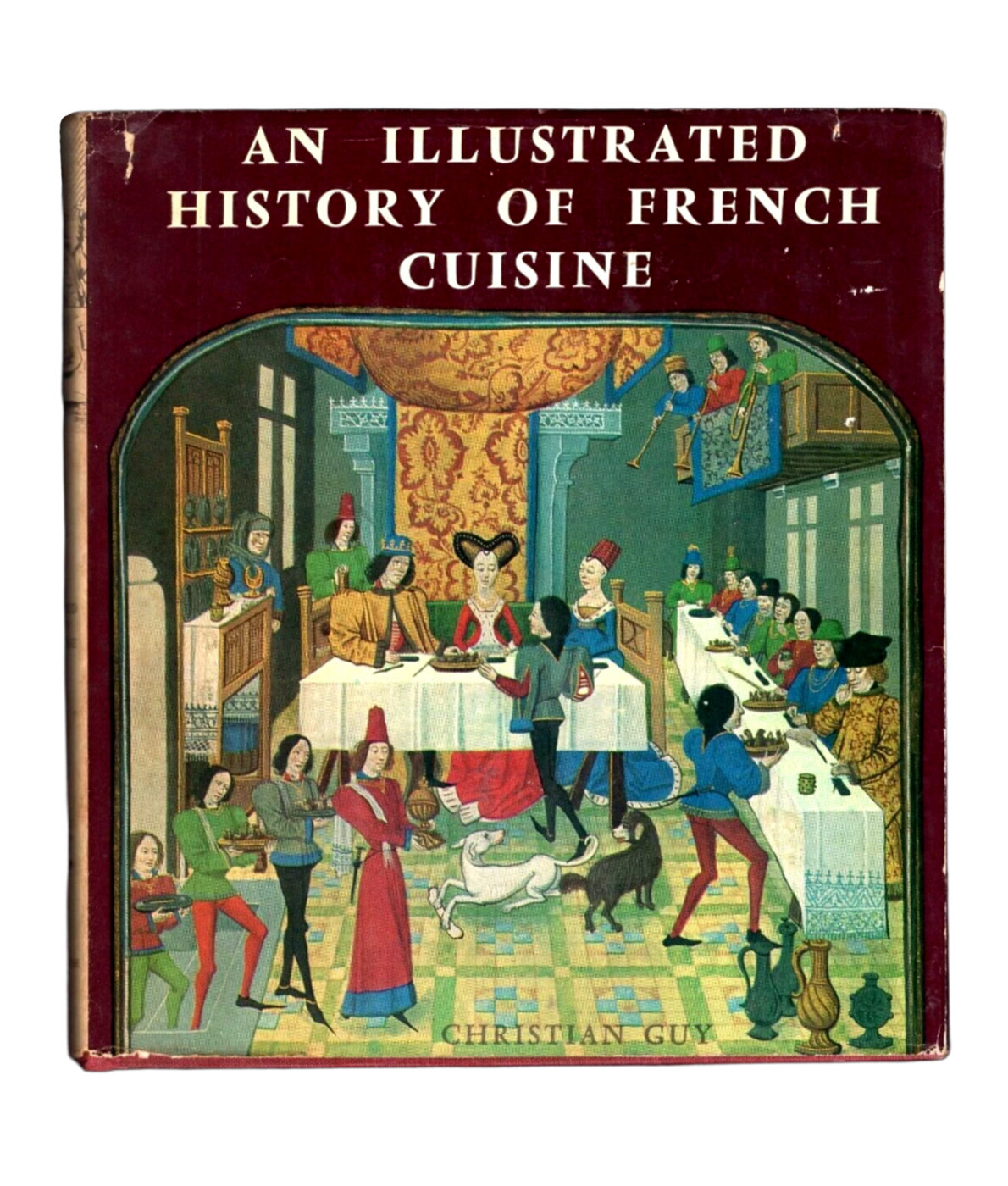
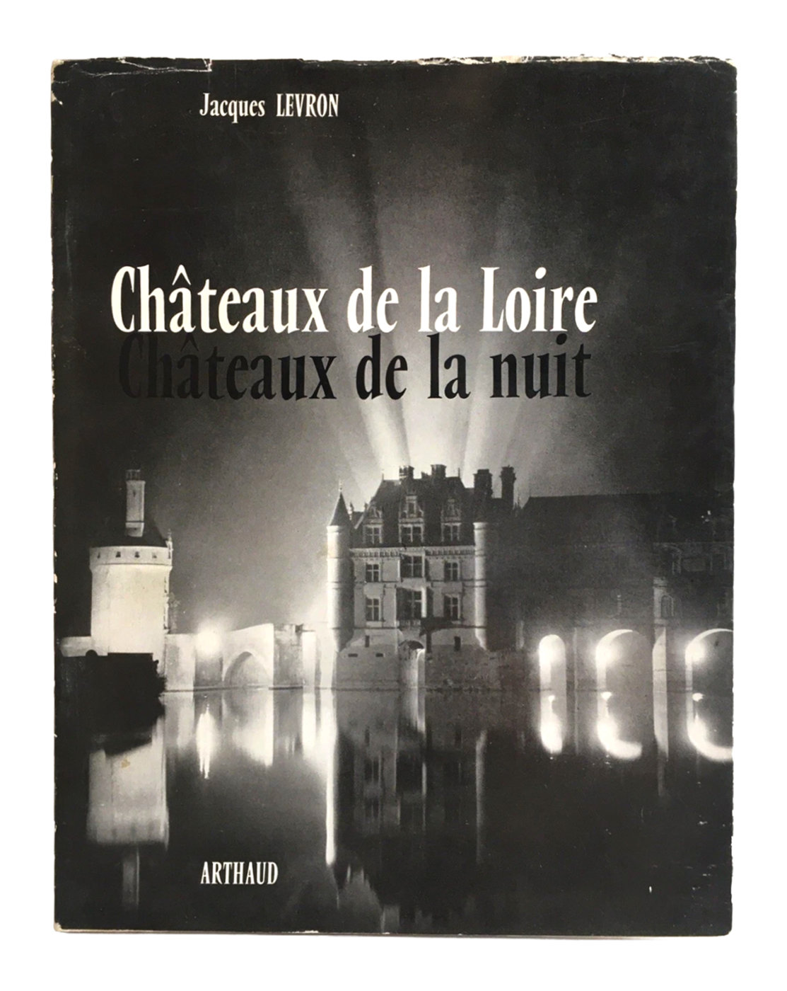
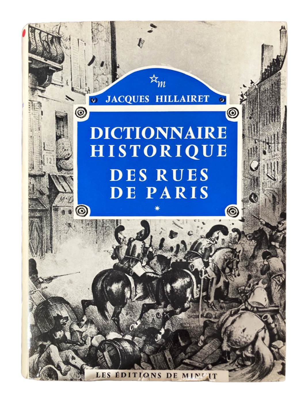
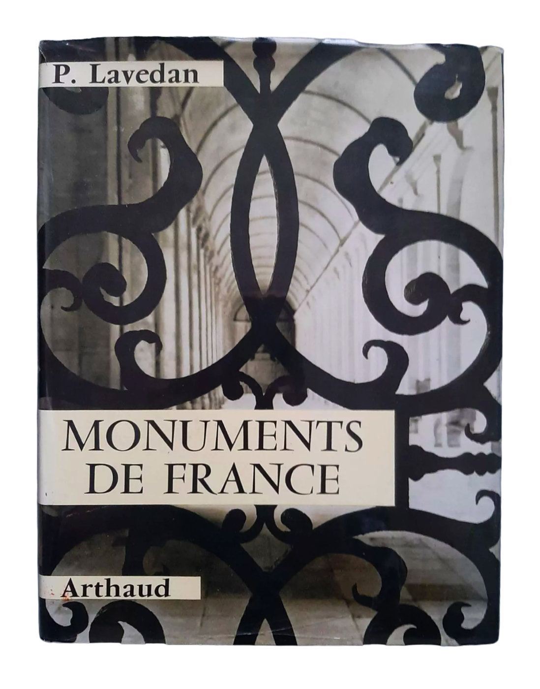
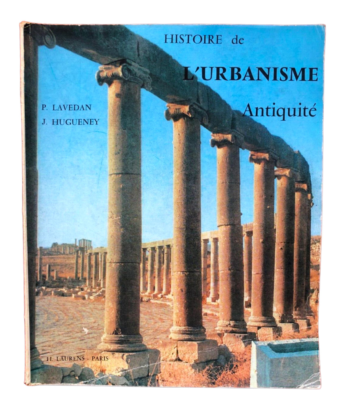
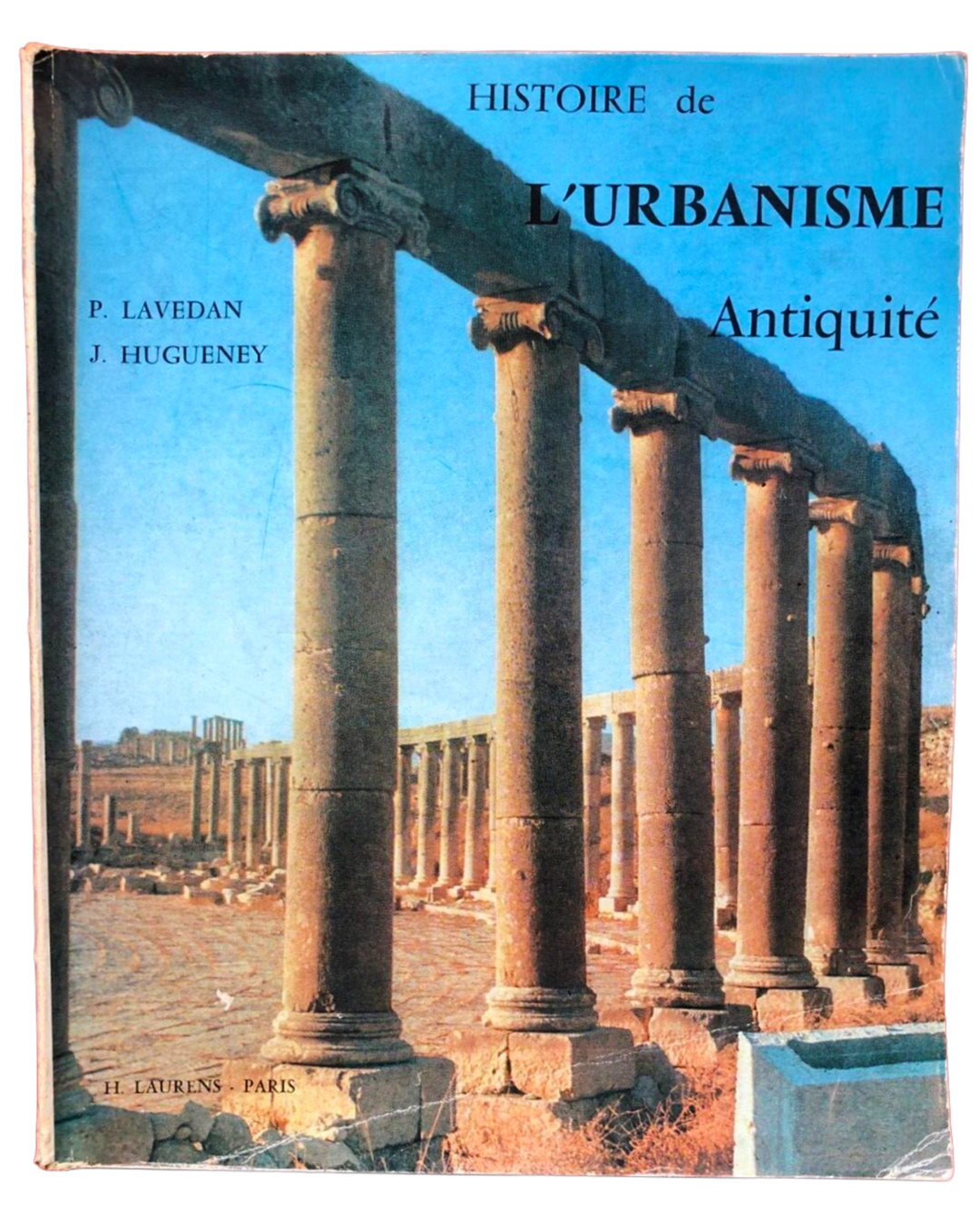
Vendôme’s ascension coinciding with the boom of gastronomic tourism in Postwar Europe means that I often will find Vendôme in travel publications and advertisements, on cookbook covers, and on food packaging. The somewhat inscriptional quality of Vendôme’s capitals makes it a perfect typeface for books concerning the built environment as well. Even here, it’s visible that “The CHEZ FRANÇOIS Cookbook” is actually lettering, or chopped-up letraset, intended to blend in with Vendôme everywhere else. I assume that as photoype took over in the 60s and 70s in the United States, and Vendôme found its way into a few different libraries (such as VGC), a designer with a niche eye could know that Vendôme would make something look French, the same way that Johnston can make something look British.
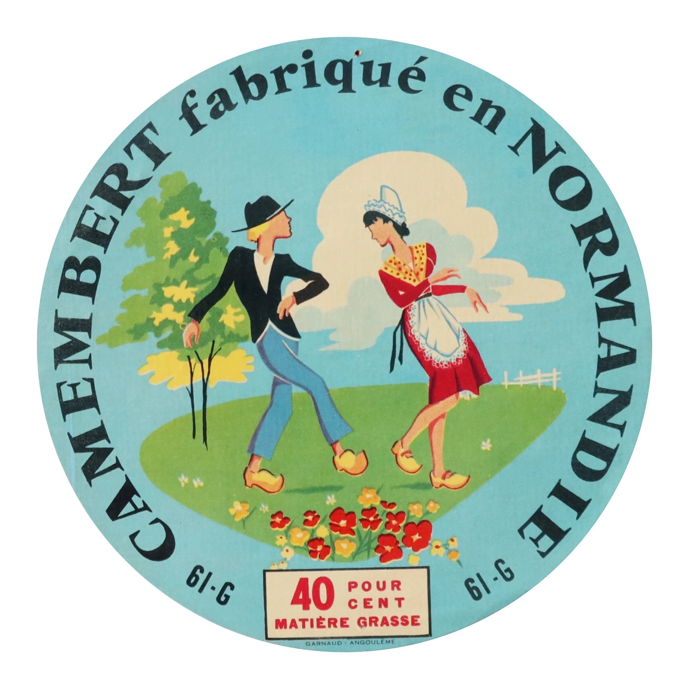
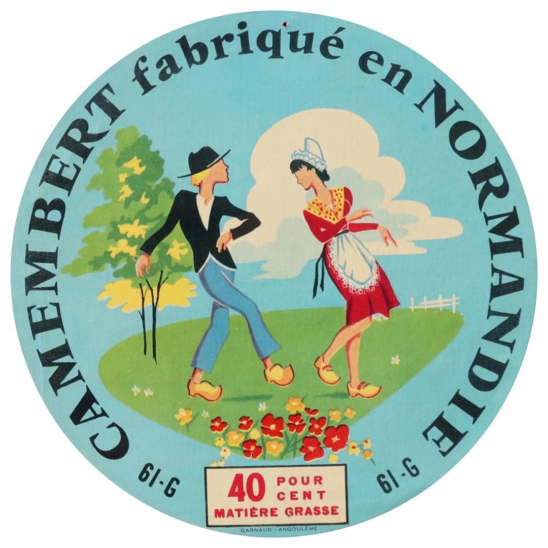
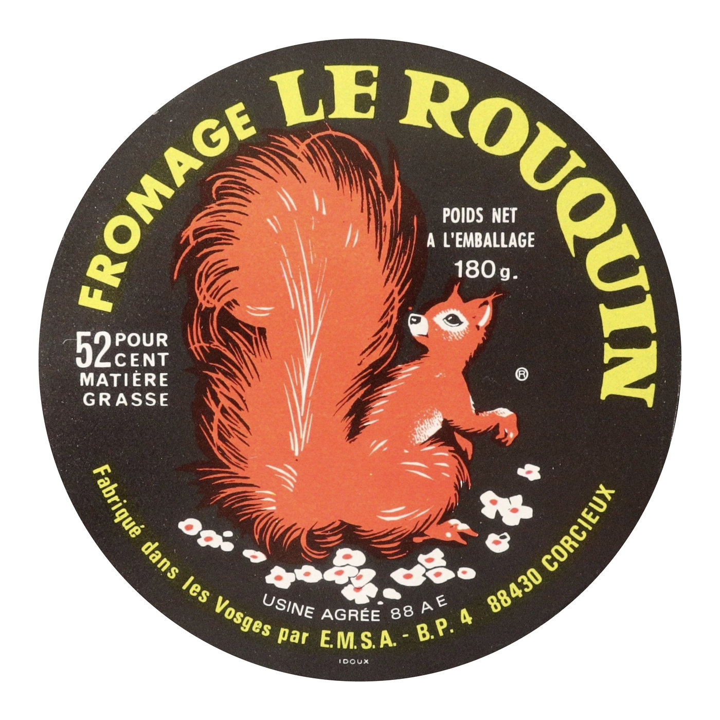
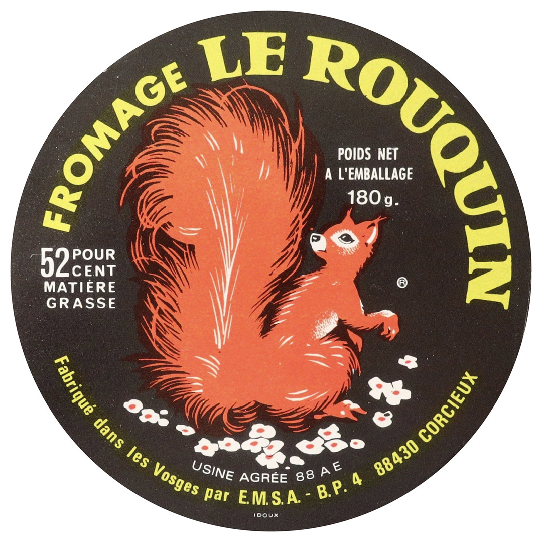
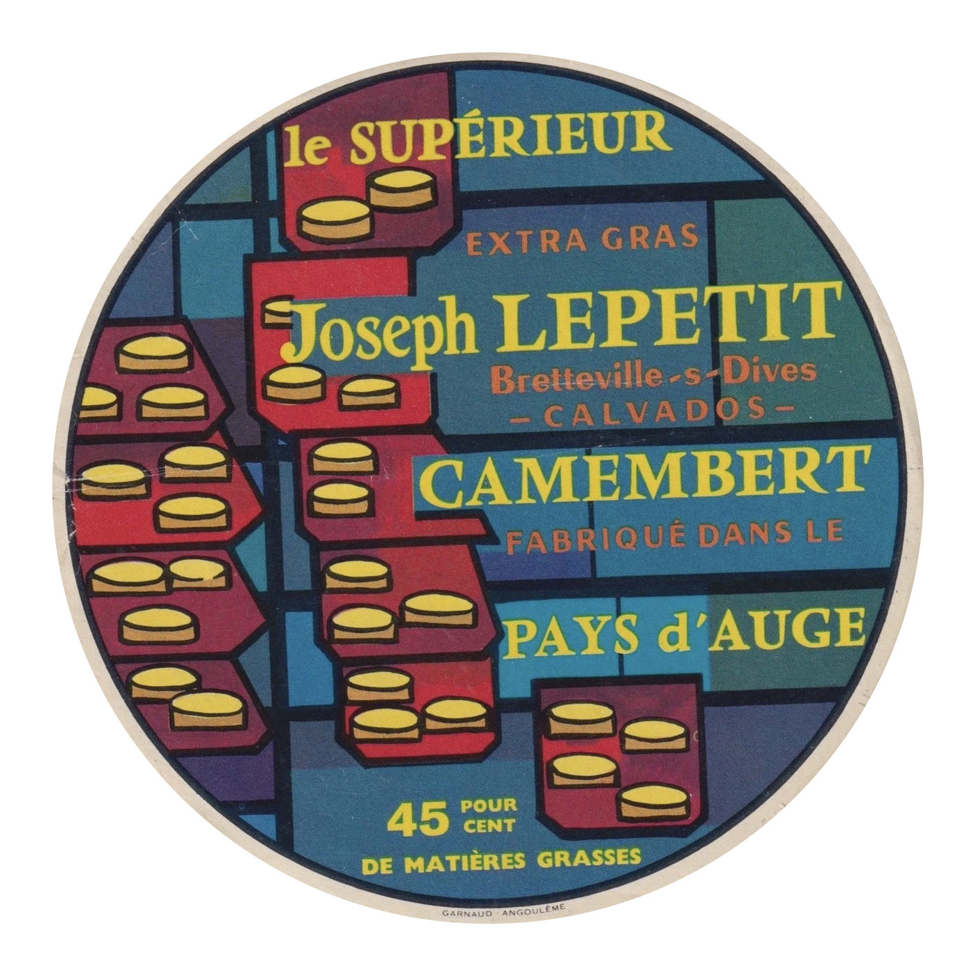
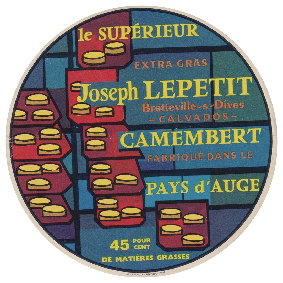
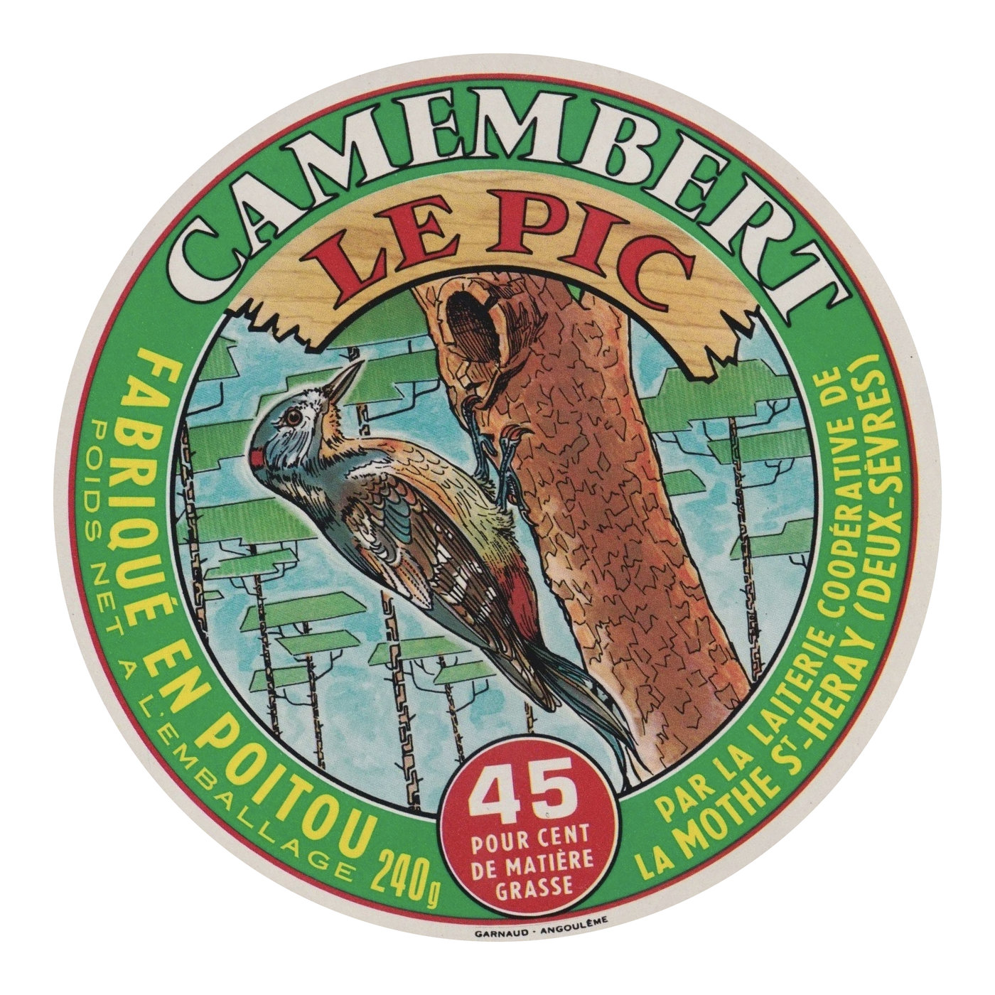
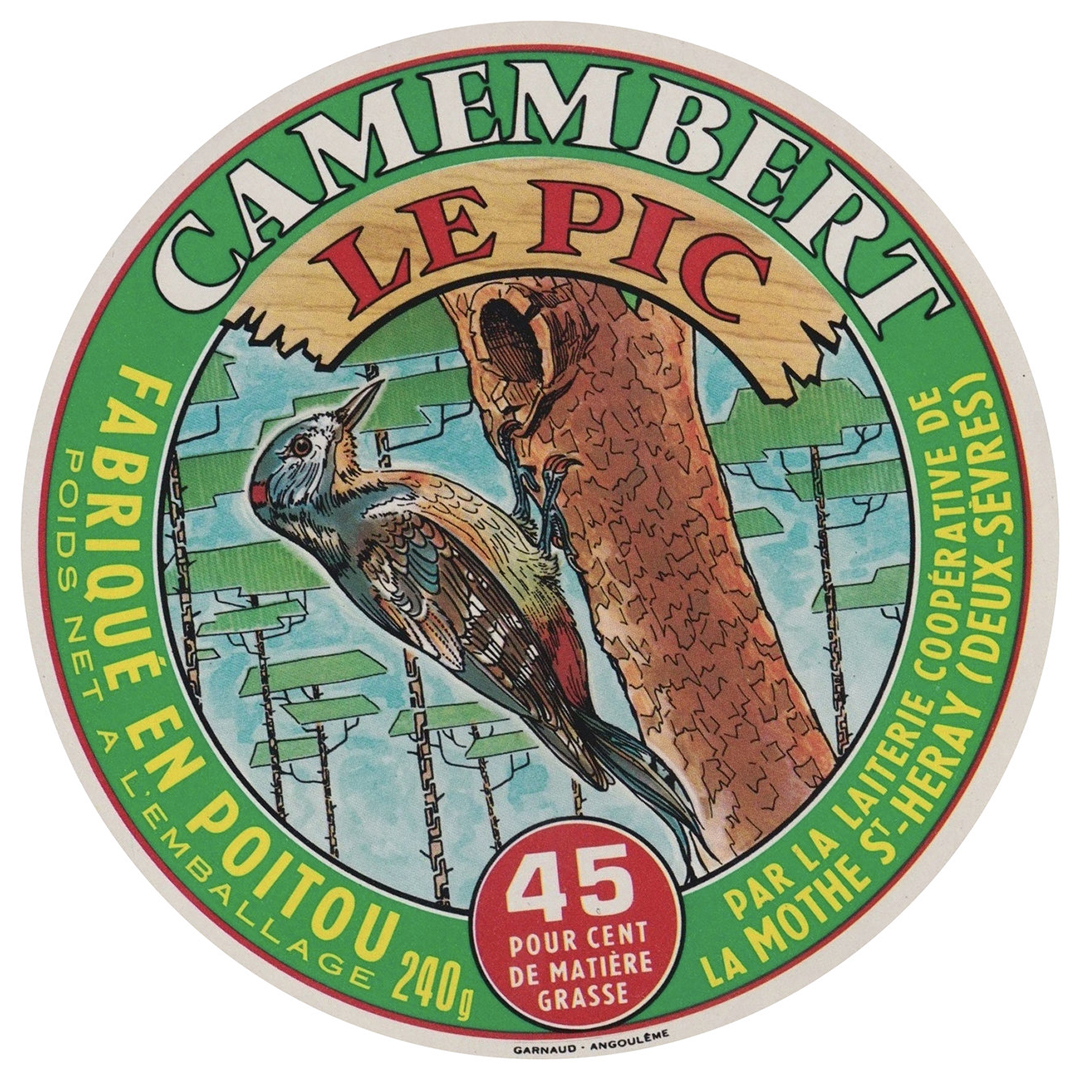
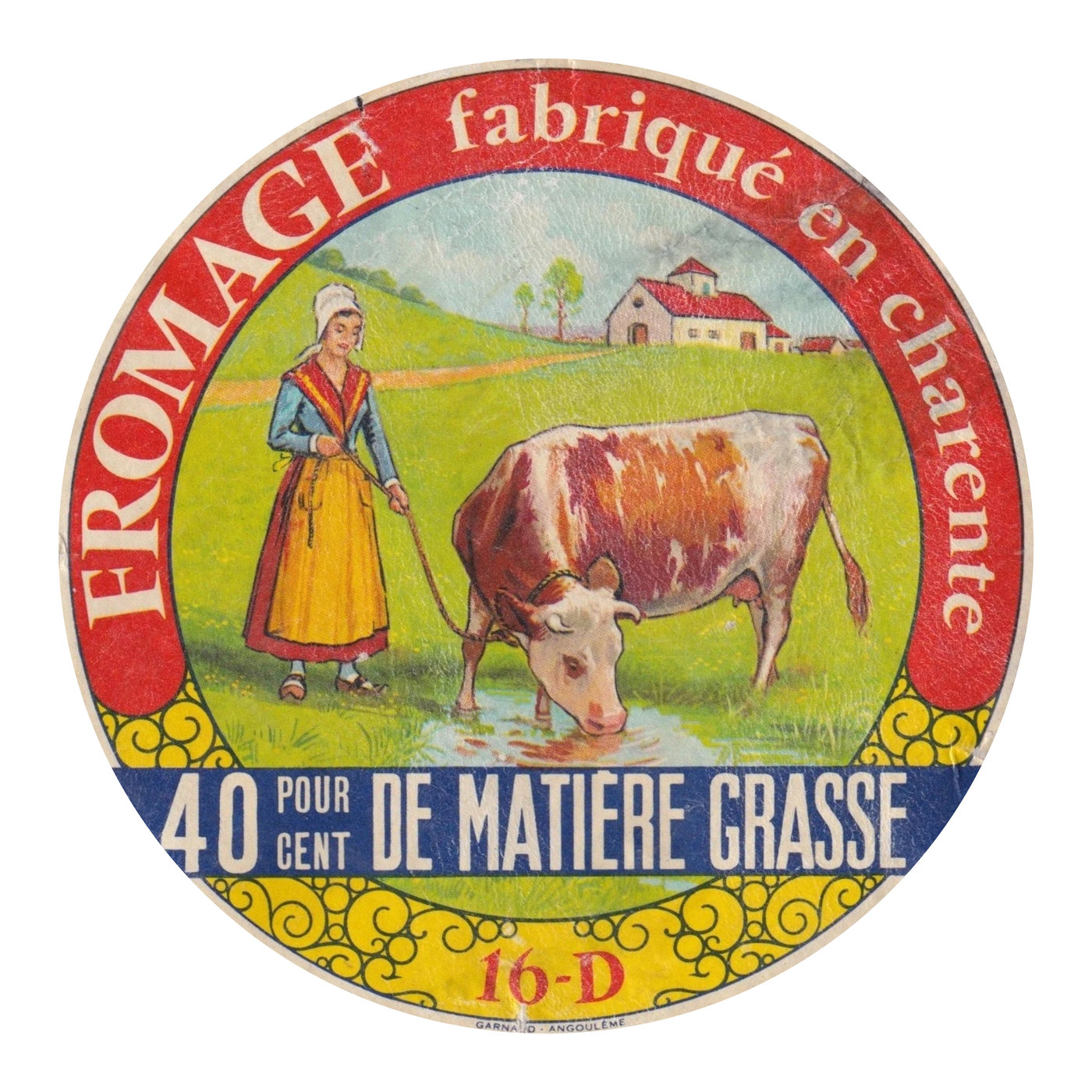
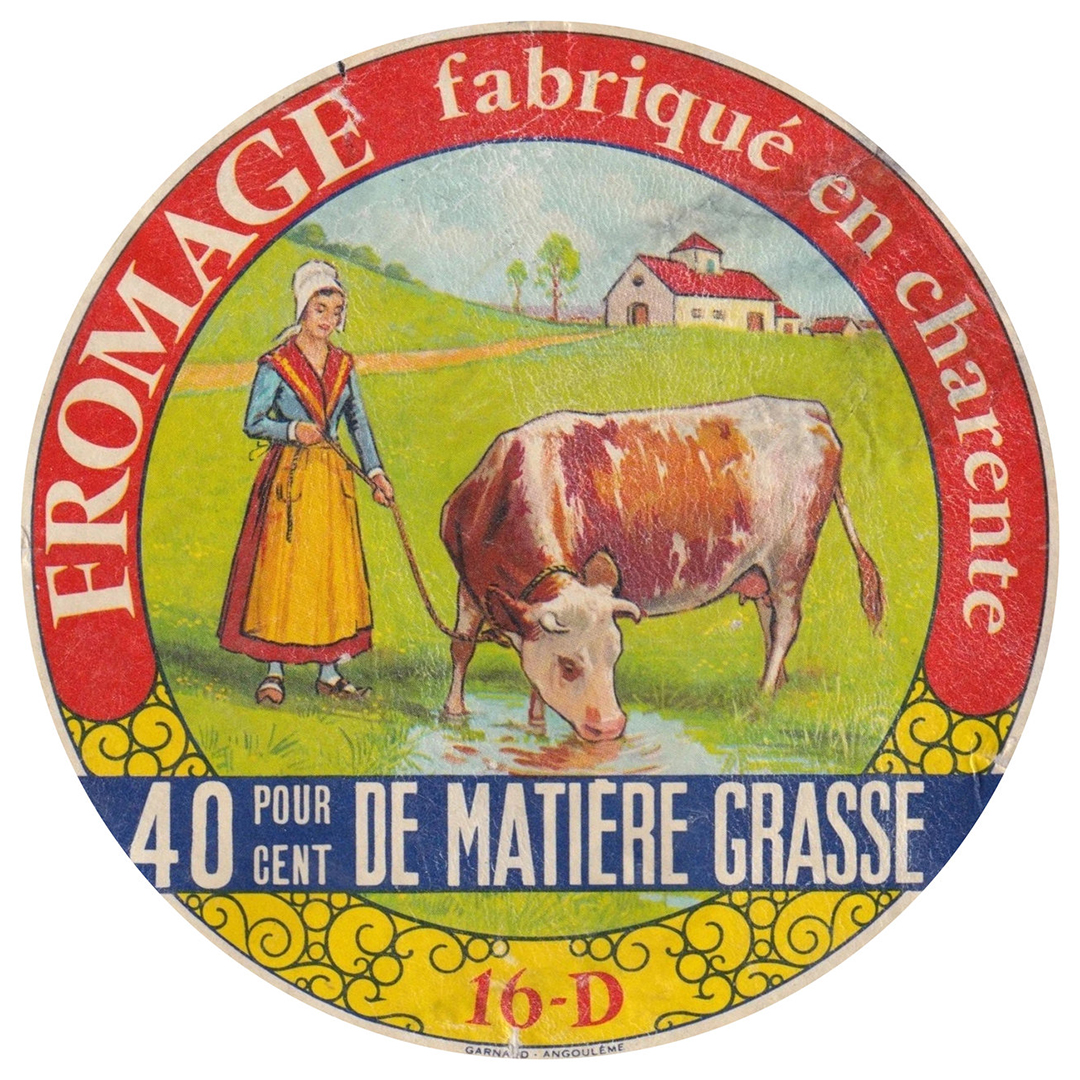
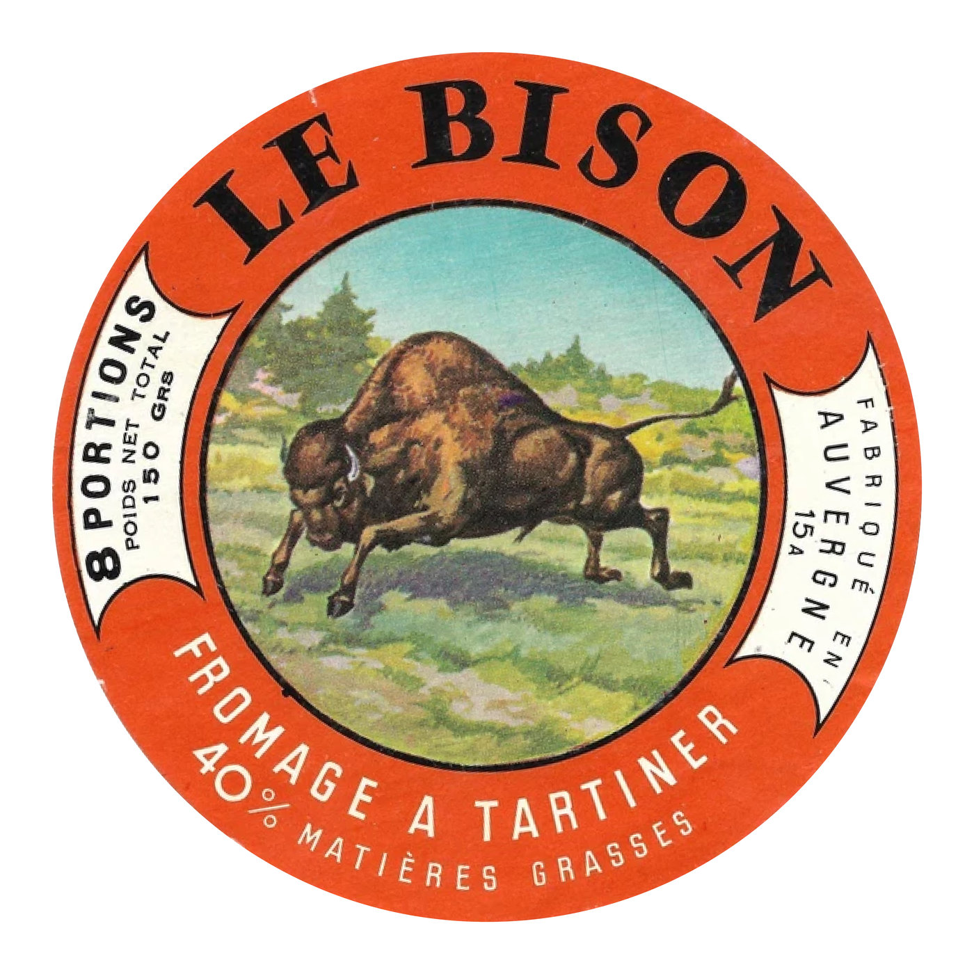
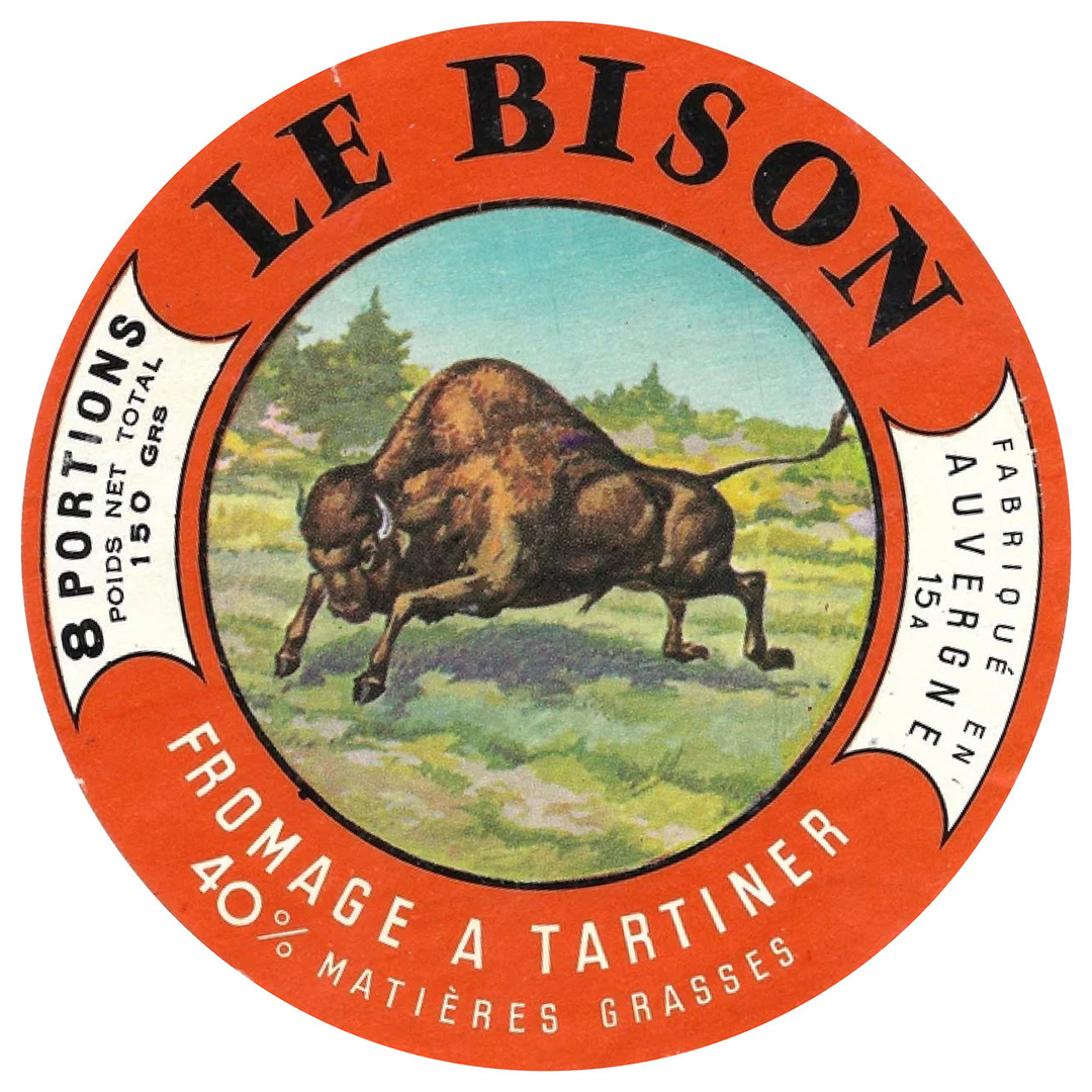
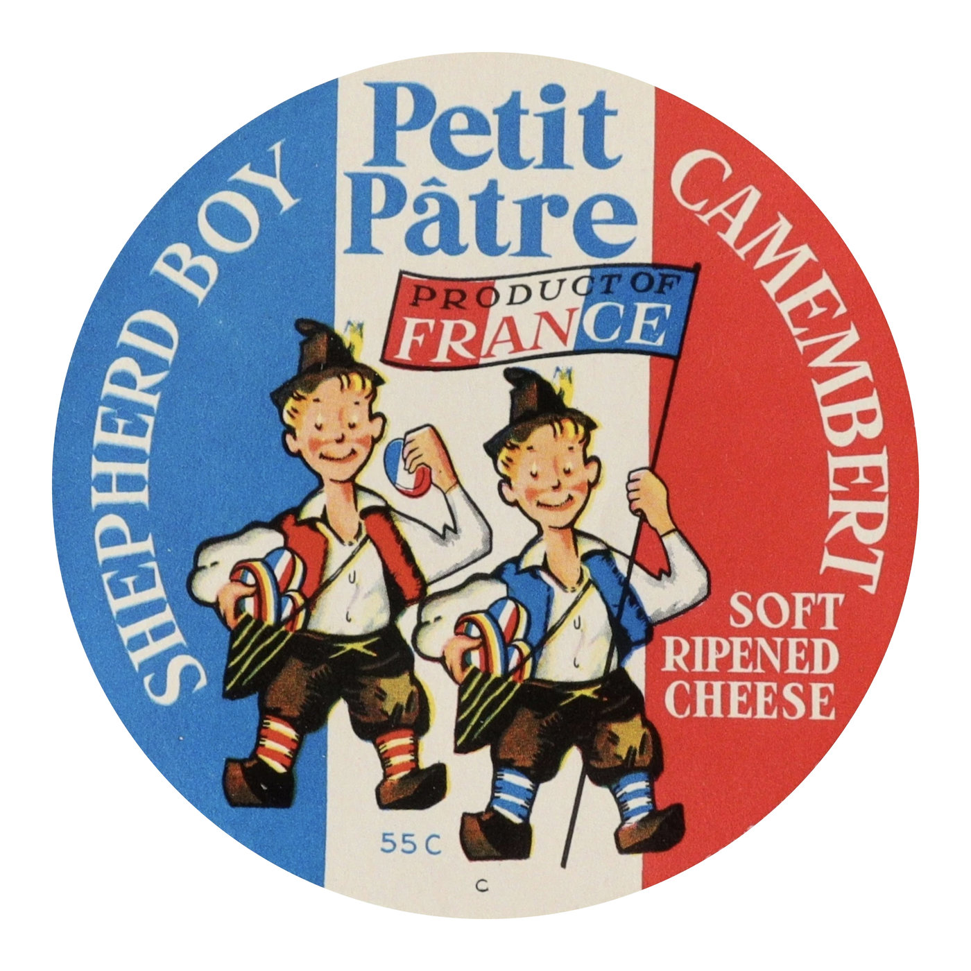
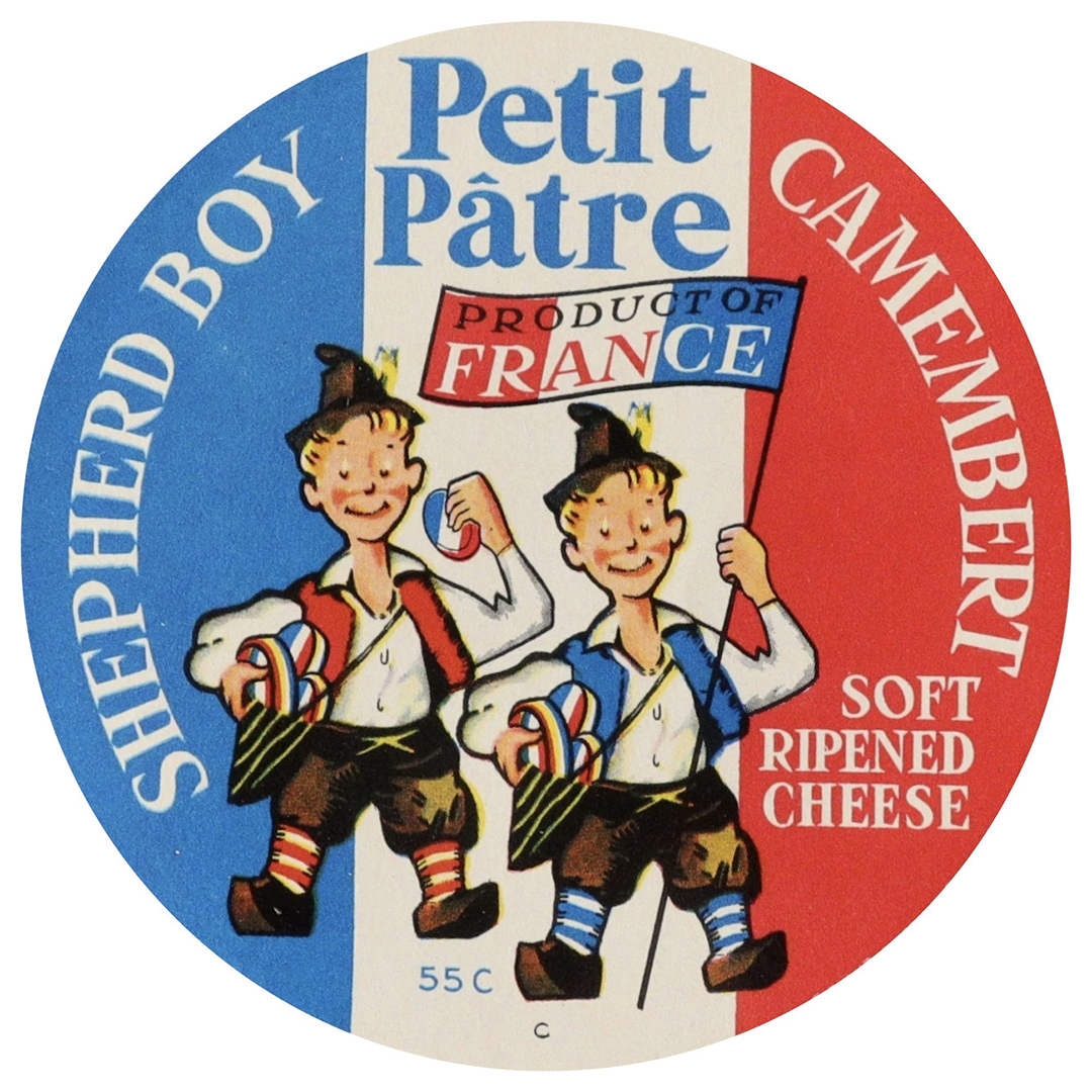
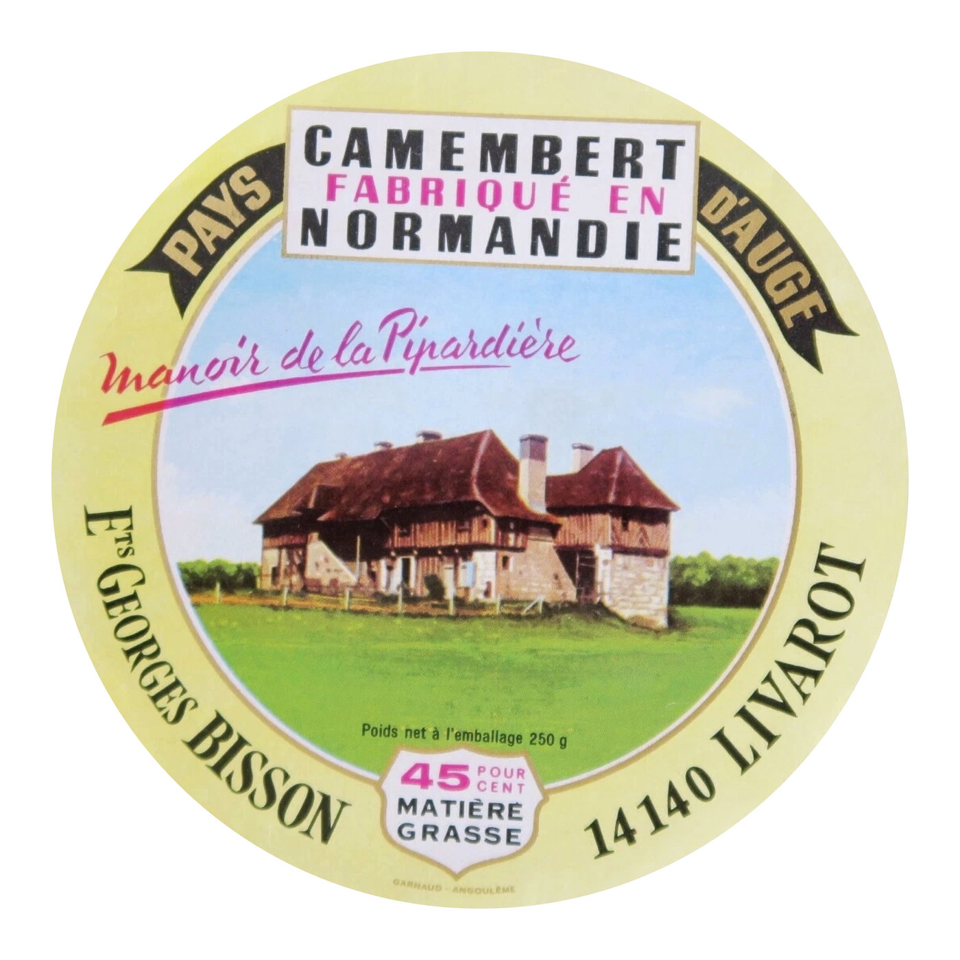
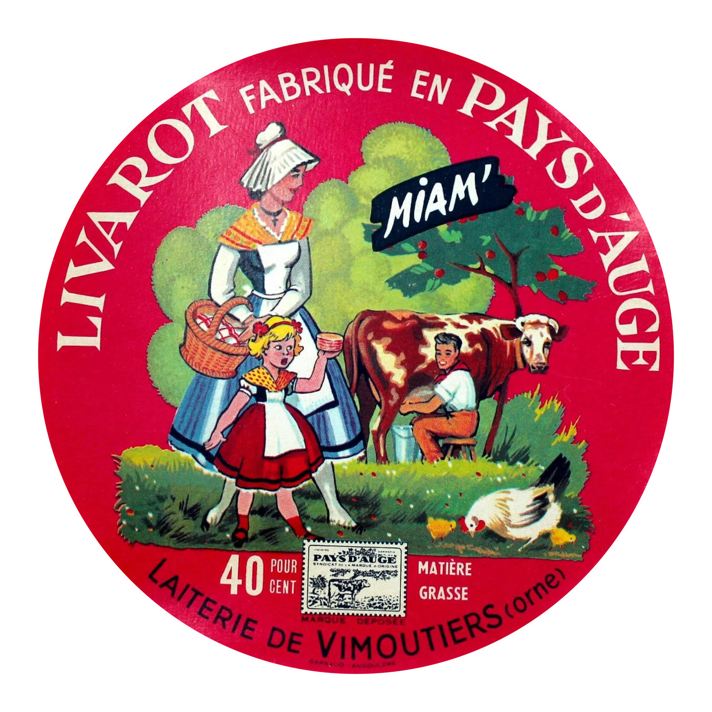
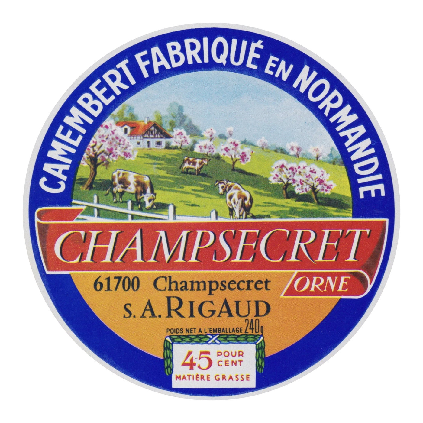
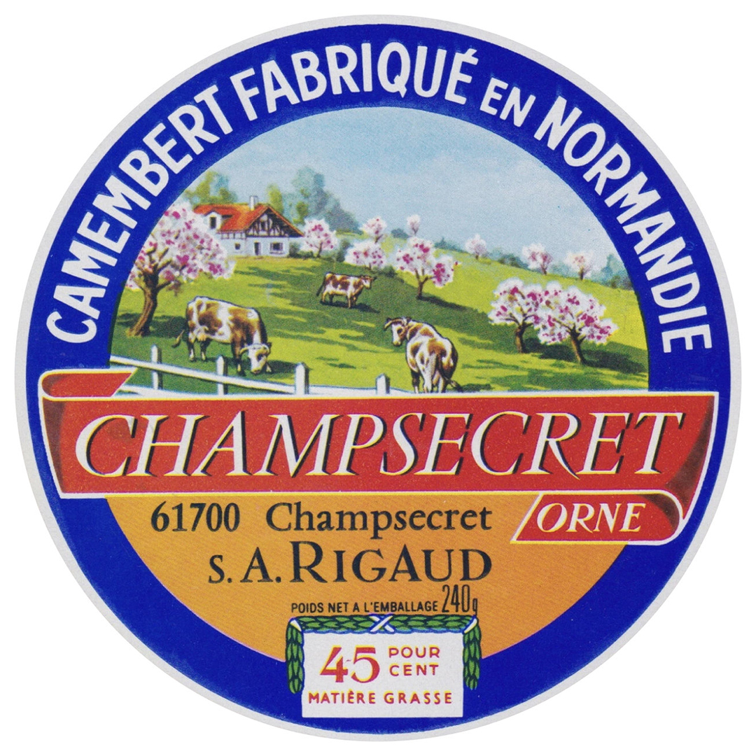
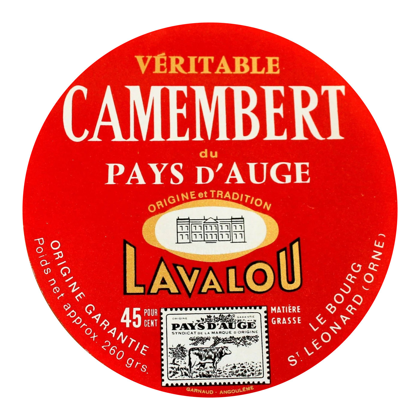
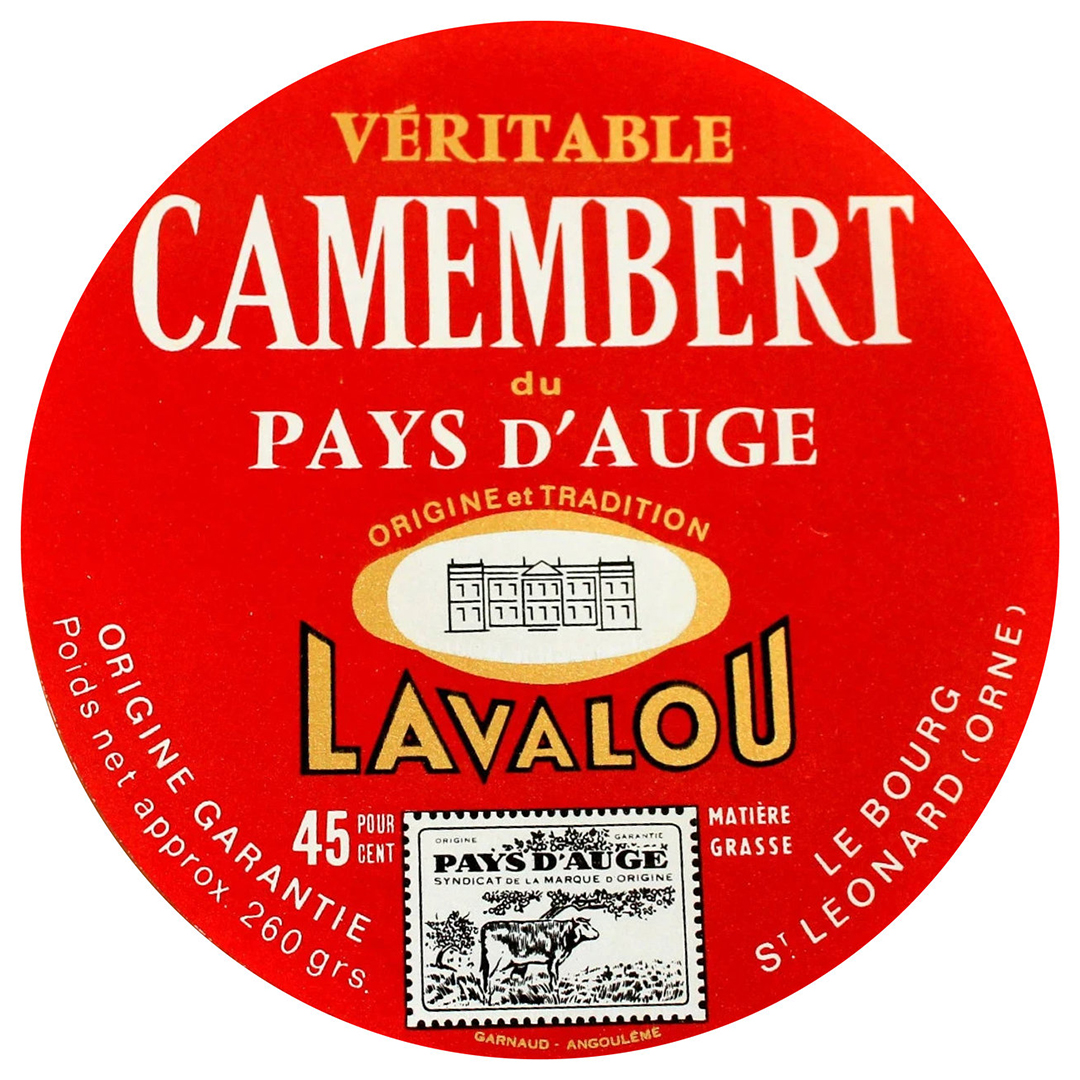
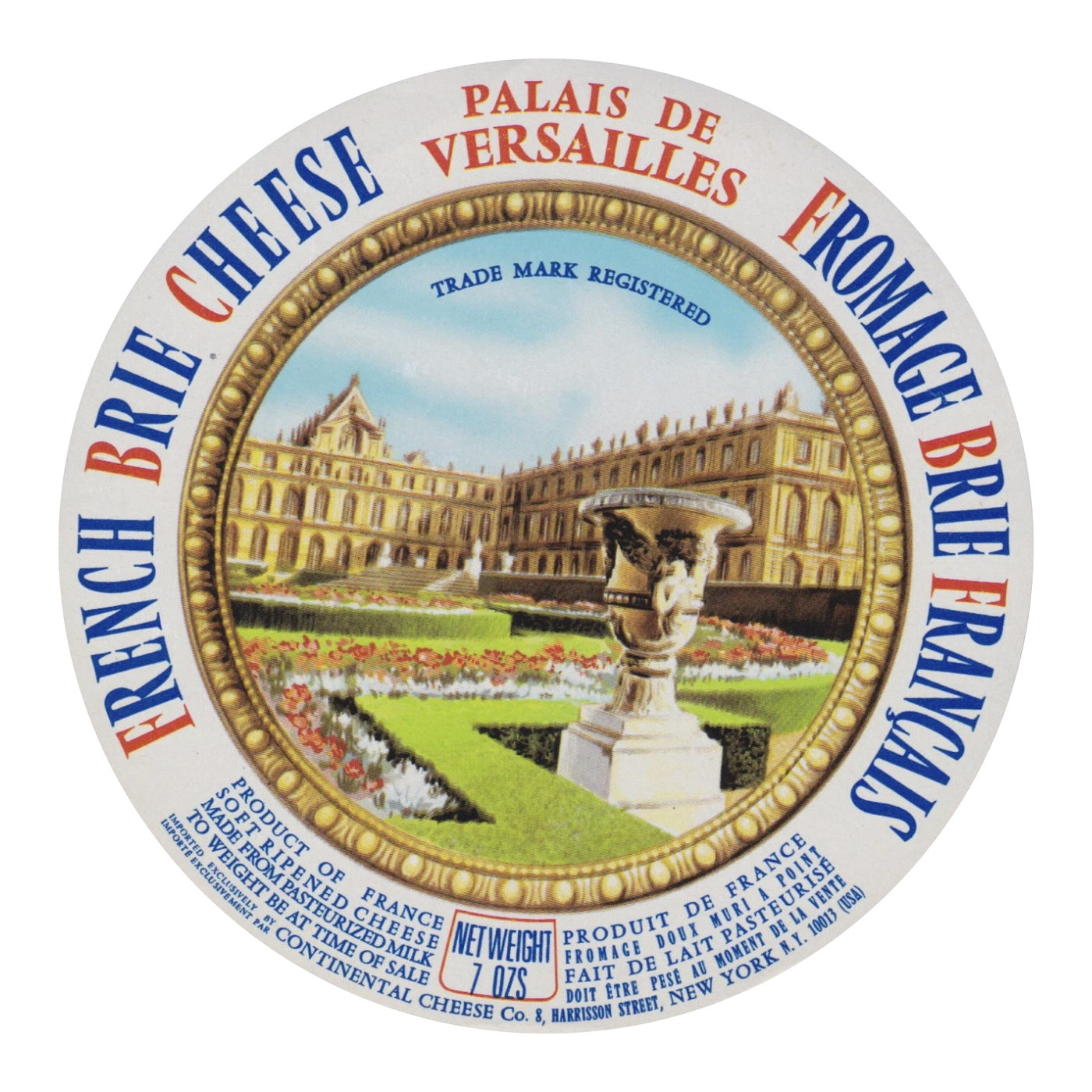
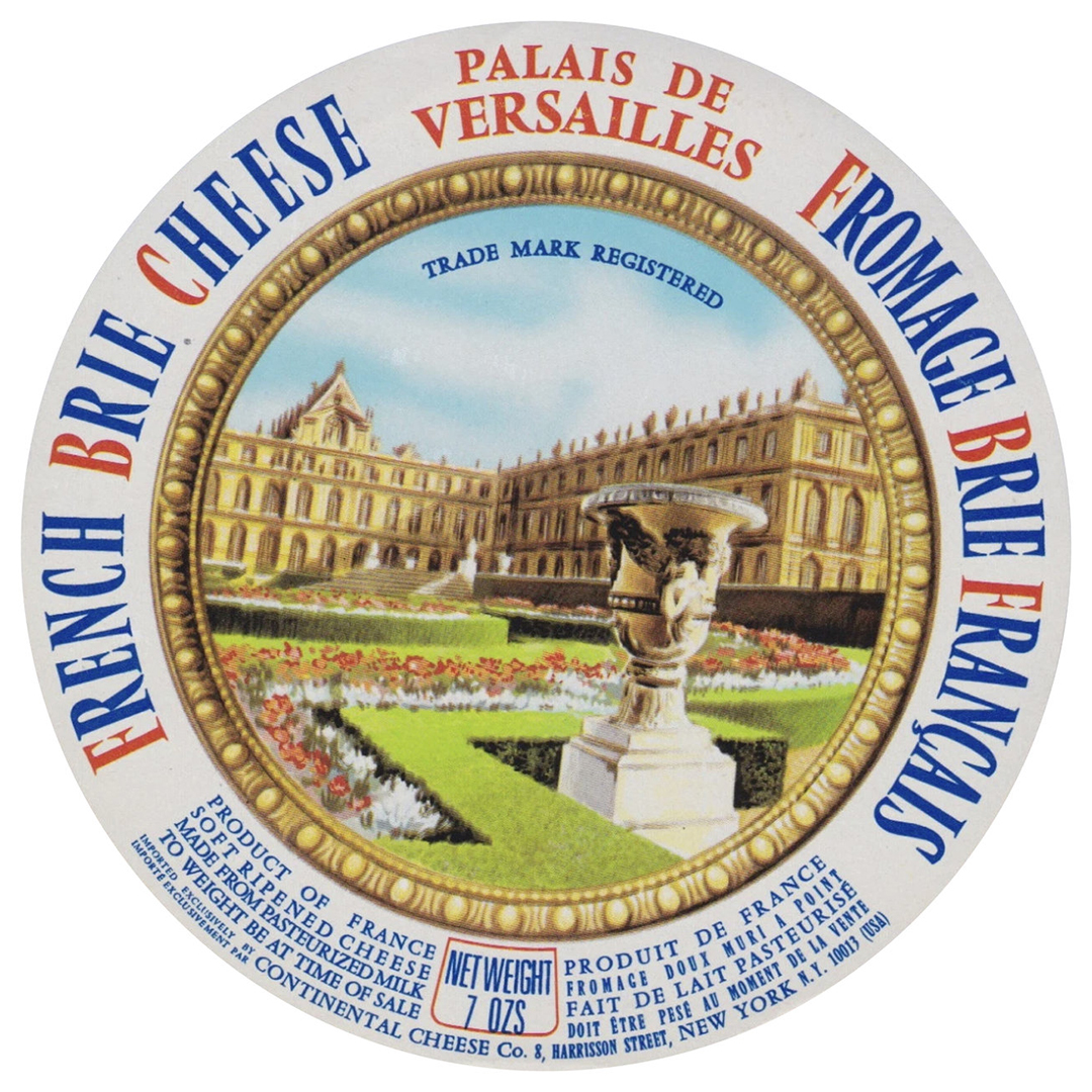
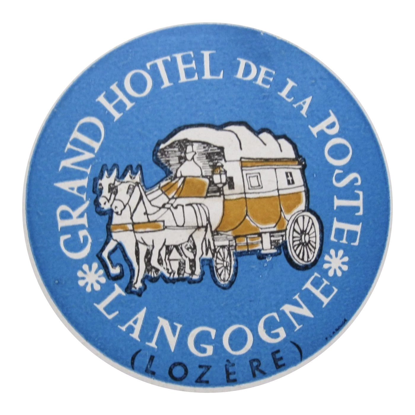
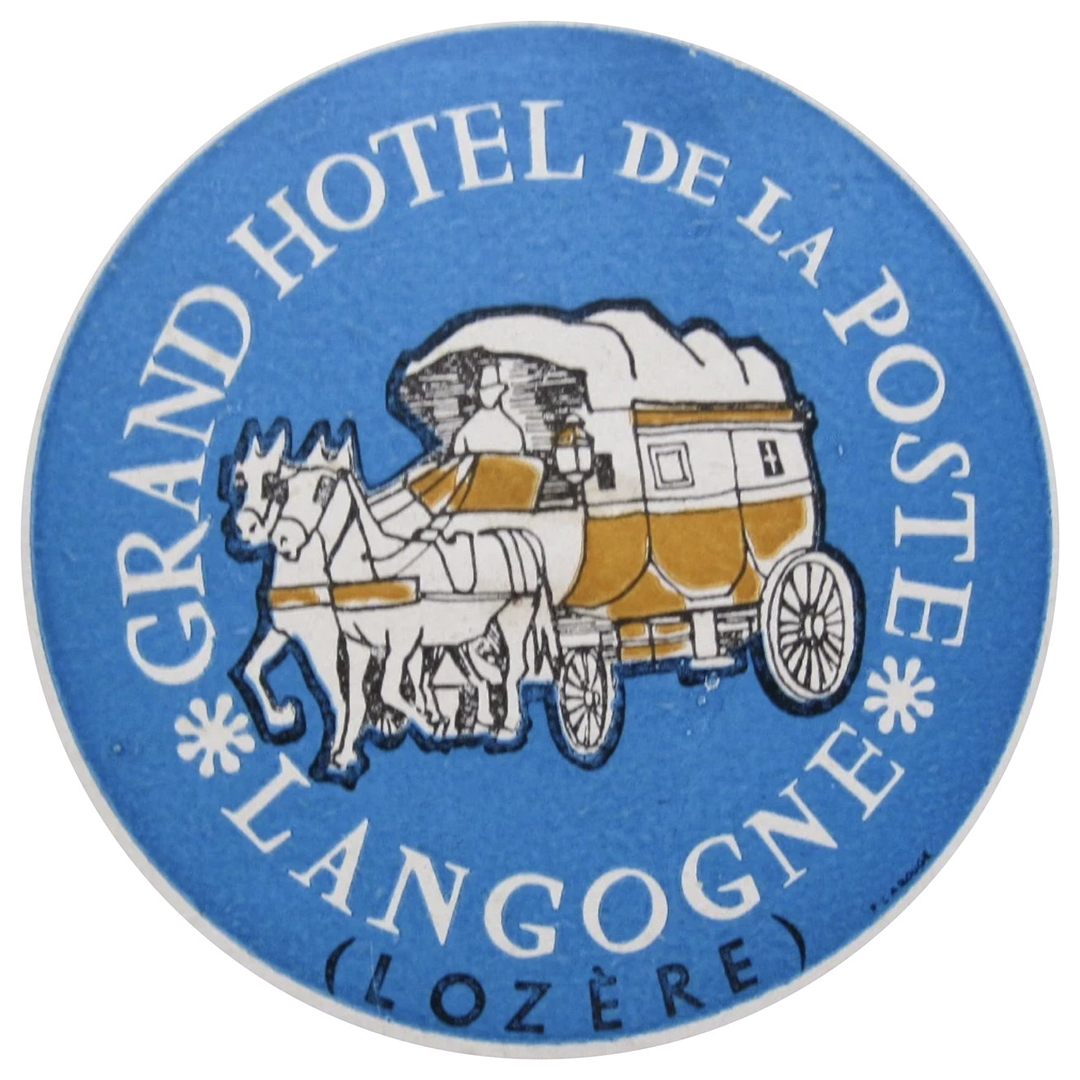
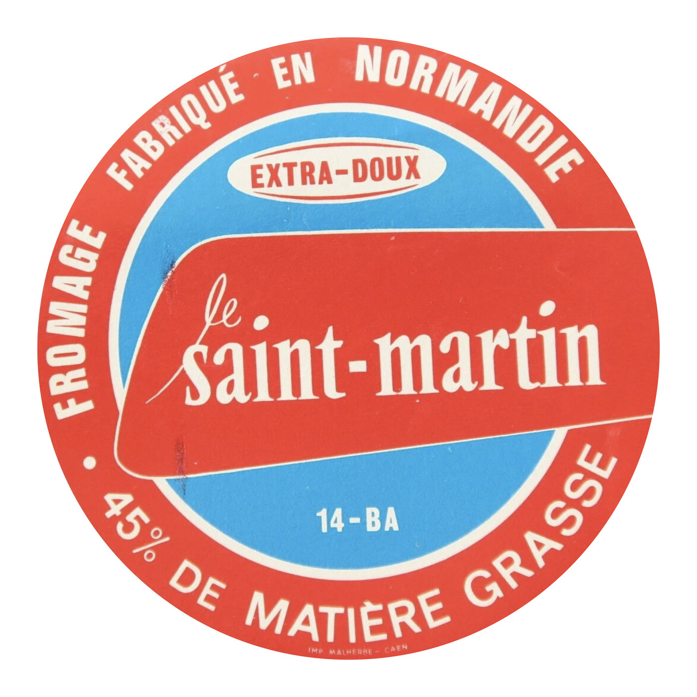
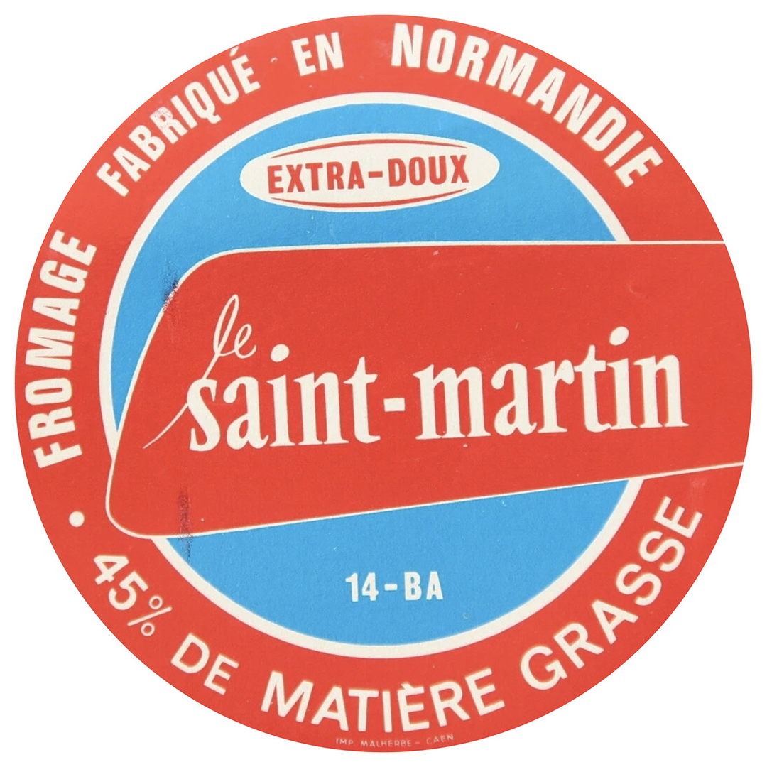
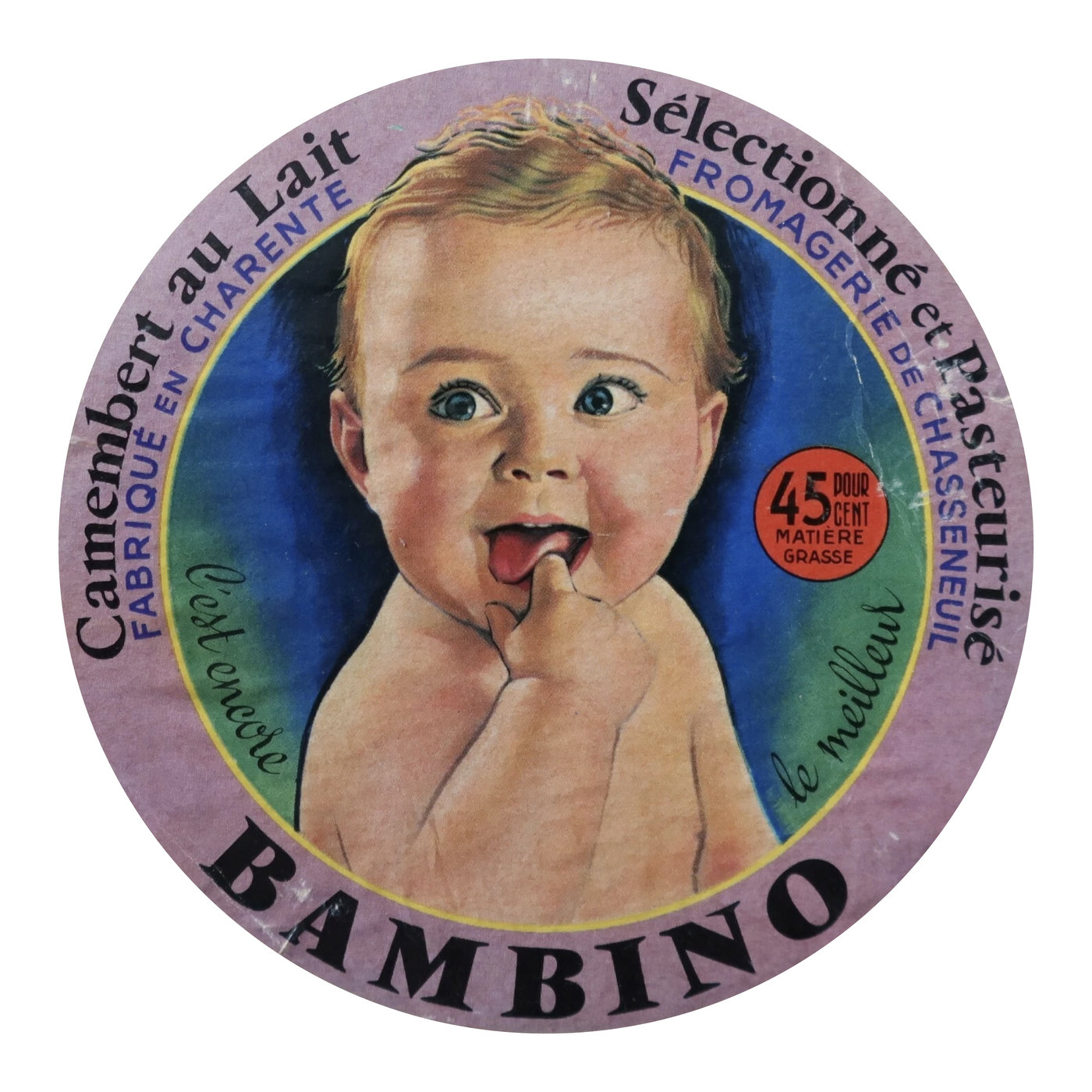
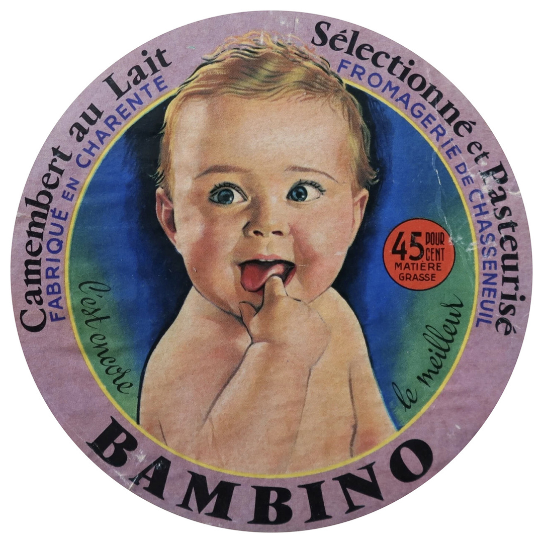
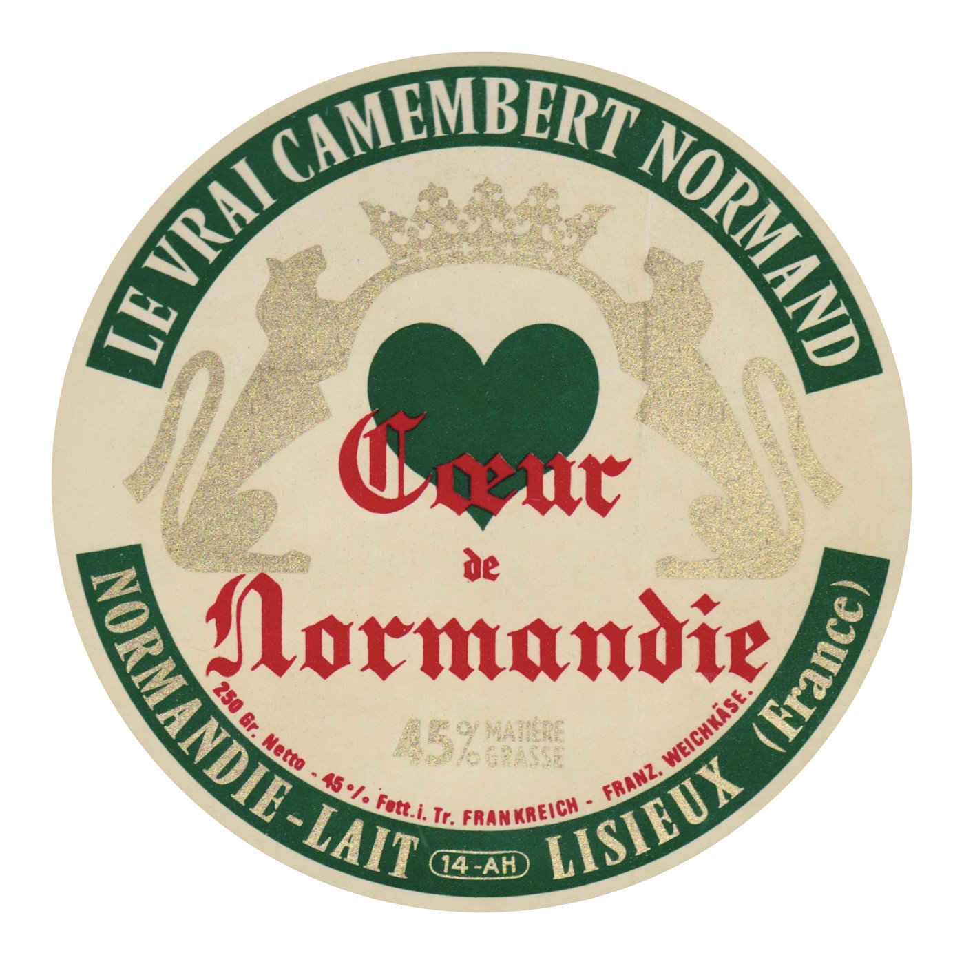
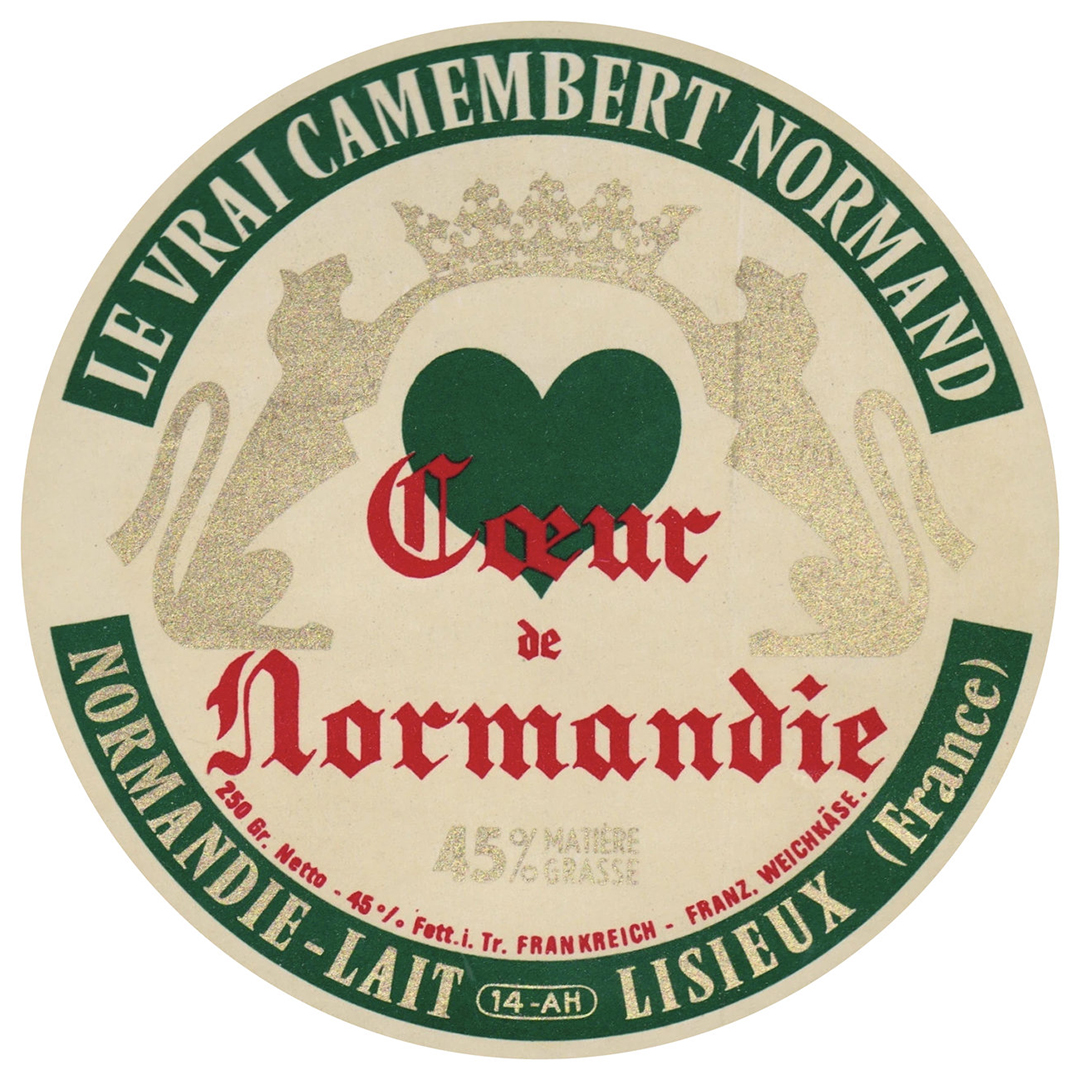
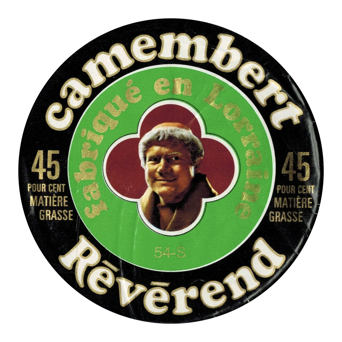
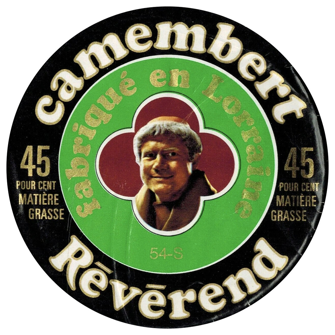
All the culinary ephemera I was seeing made me think back to that old Baby Ruth wrapper. I got thinking that there must be an equivalent that would be uniquely French, preferably from those same postwar years. Truth be told, this idea came to be after buying a wheel of Camembert at Zabar’s one afternoon, making my selection based on the label design alone. A google search for “old French cheese labels” led me to The Camembert Museum. Then, a little more digging revealed literally hundreds of beautifully designed, circular labels adorned with all sorts of type, lettering, and illustration. It turns out people have collected these for decades, and now I get why. I’ve bookmarked, saved, and purchased dozens of these.
I don’t see traces of hand-drawn Vendôme all the time, but with each one that I do, there’s a new, slightly different reworking of the typeface. I’ve also come across a number of times where the Vendôme itself is put to good use. Most all of them share that same plush, over-inked effect that I found in that first VGC scan.
Within each of the above touchpoints, I see all sorts of variations on the same theme: an artist admiring, studying, and drawing their own forms that feel like, but don’t trace over Vendôme. Tribute feels like a clumsy assumption, because in all honesty, the people behind the labels, the signs, and the posters, they had a job to do. They knew Vendôme looked good, and they knew that if they followed it, they’d end up making something good too. And while Rempart doesn’t resemble any of the hand-drawn forms shown above, it follows this same pursuit. Seeing all the different ways that these forms started from the same origin gave me the confidence to just draw what I wanted to draw, and let my own interpretation take shape.
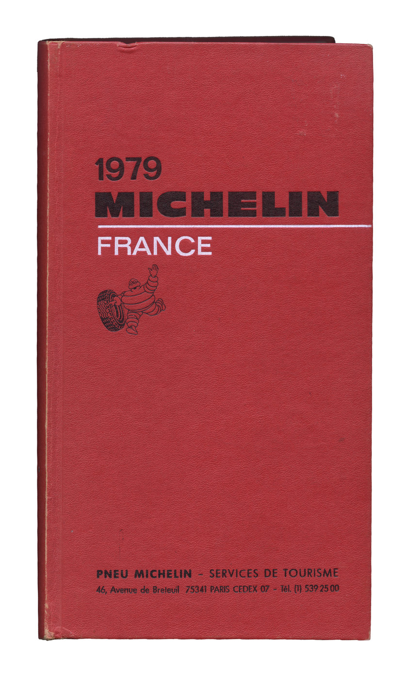
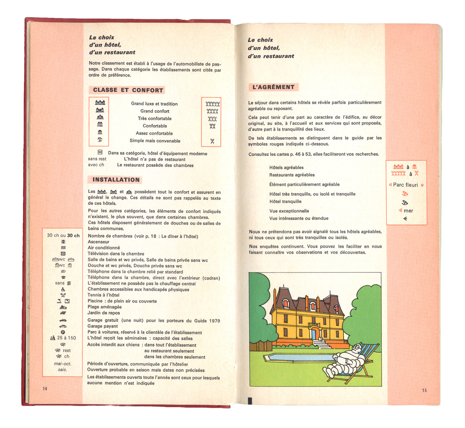
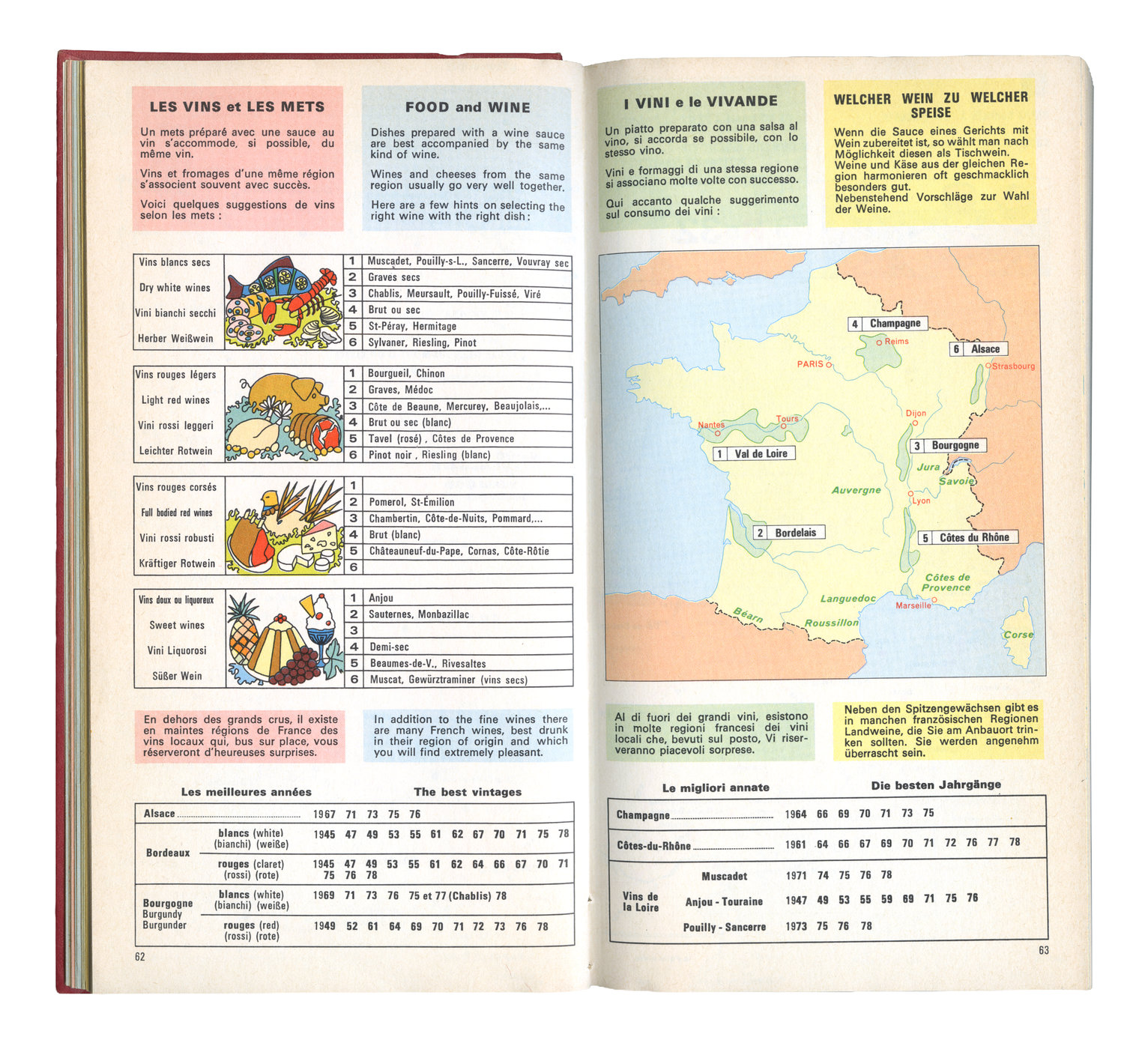
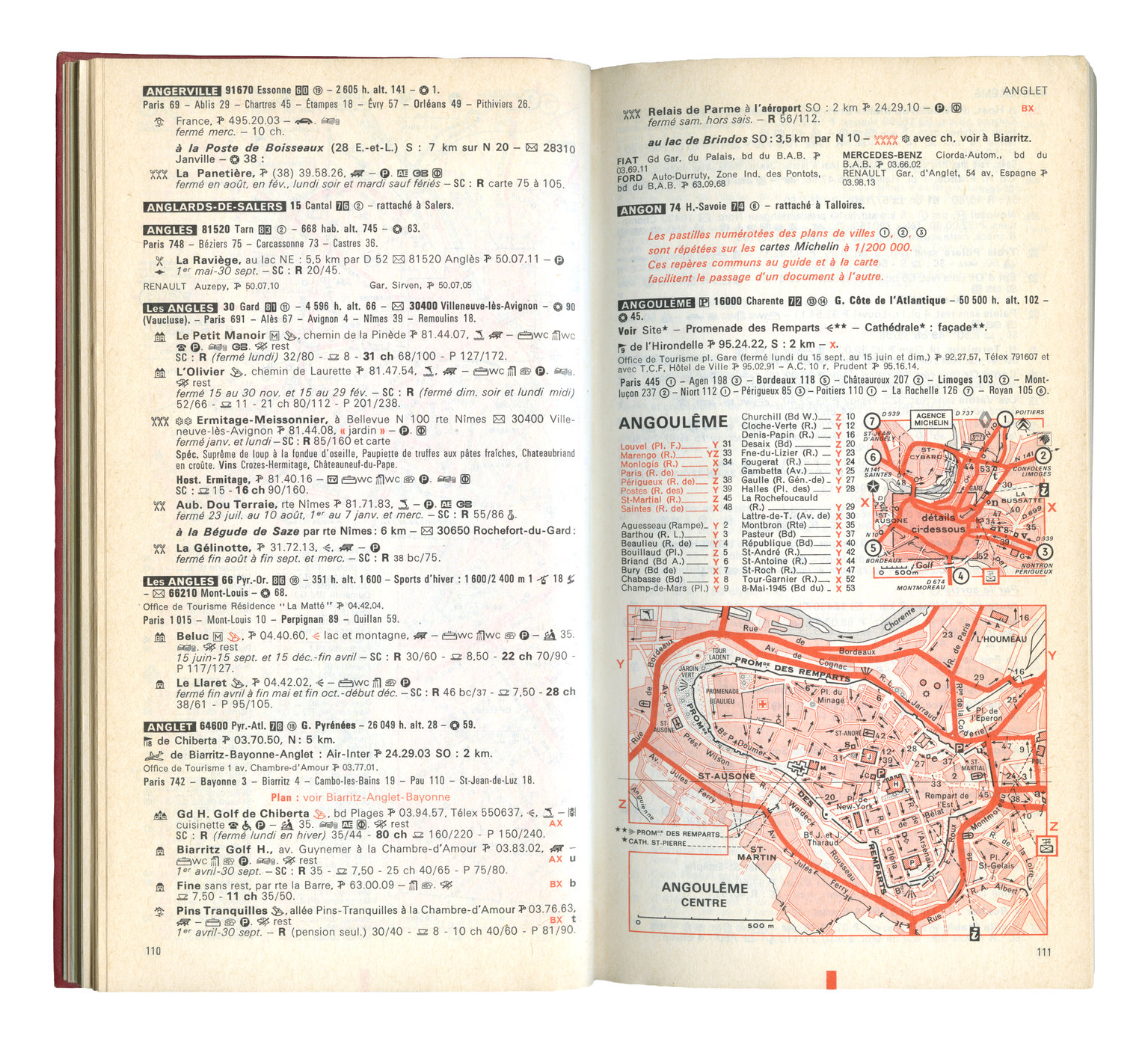
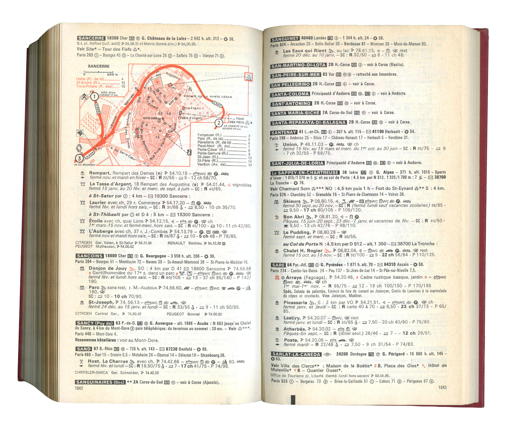
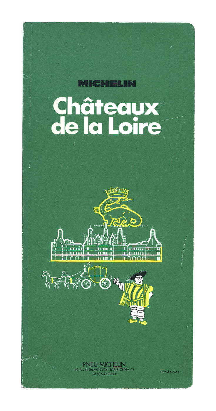
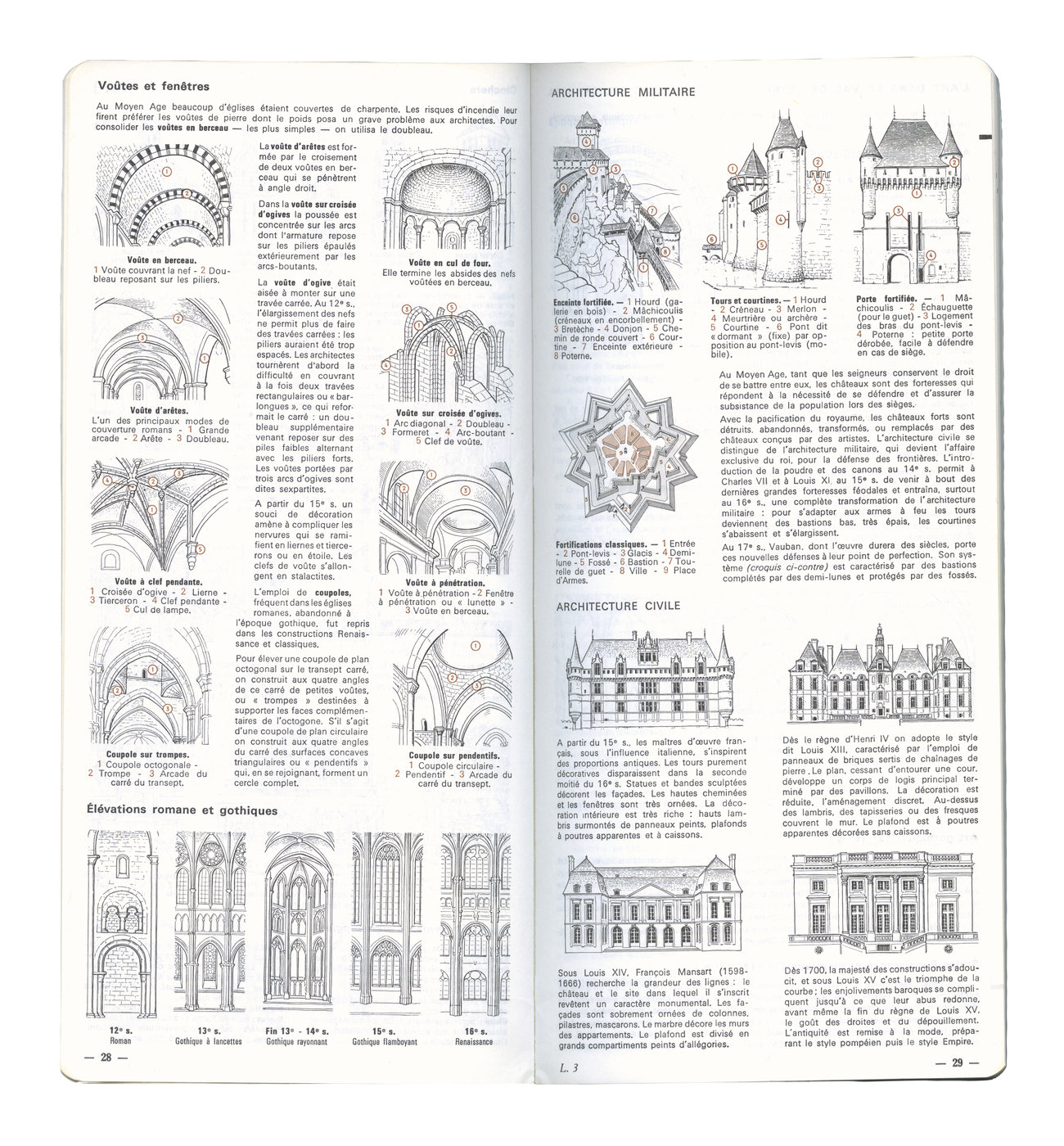
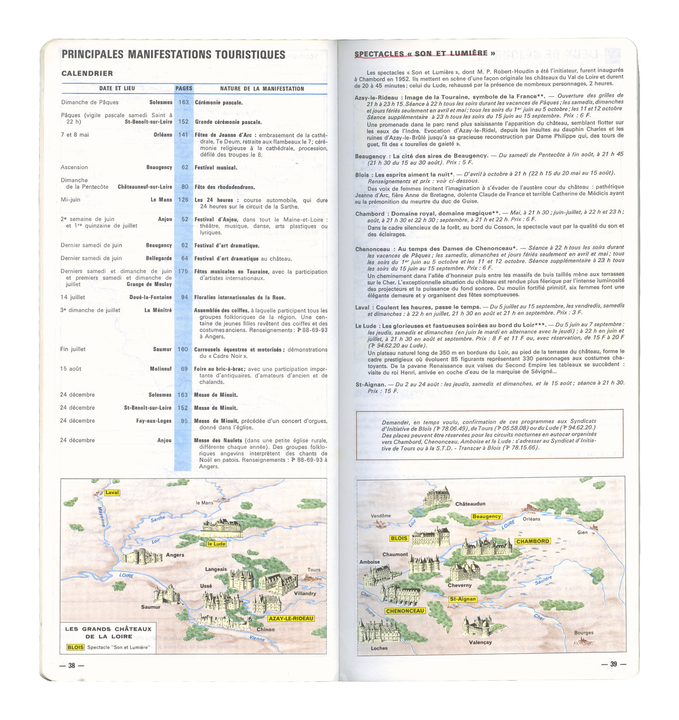
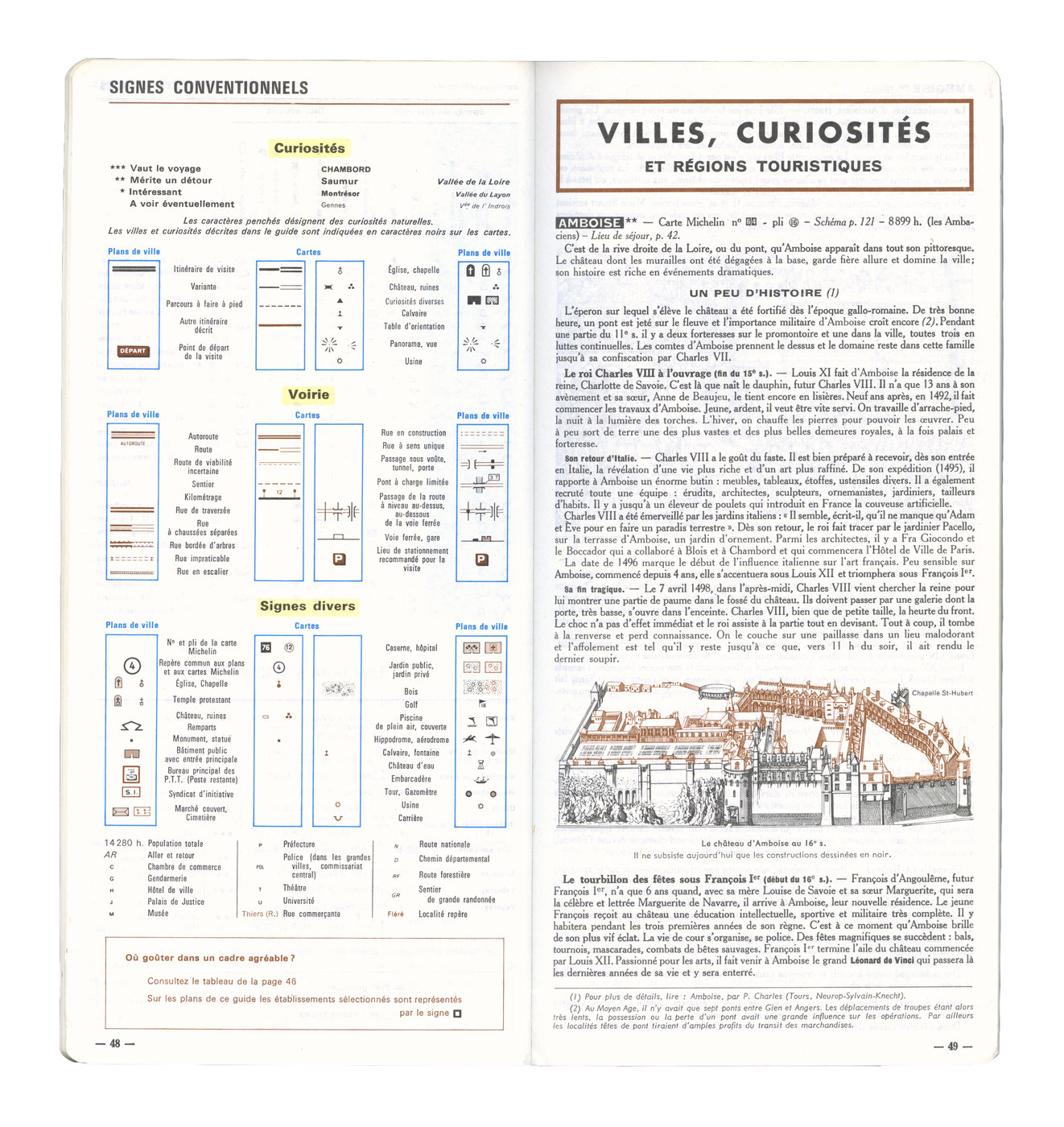
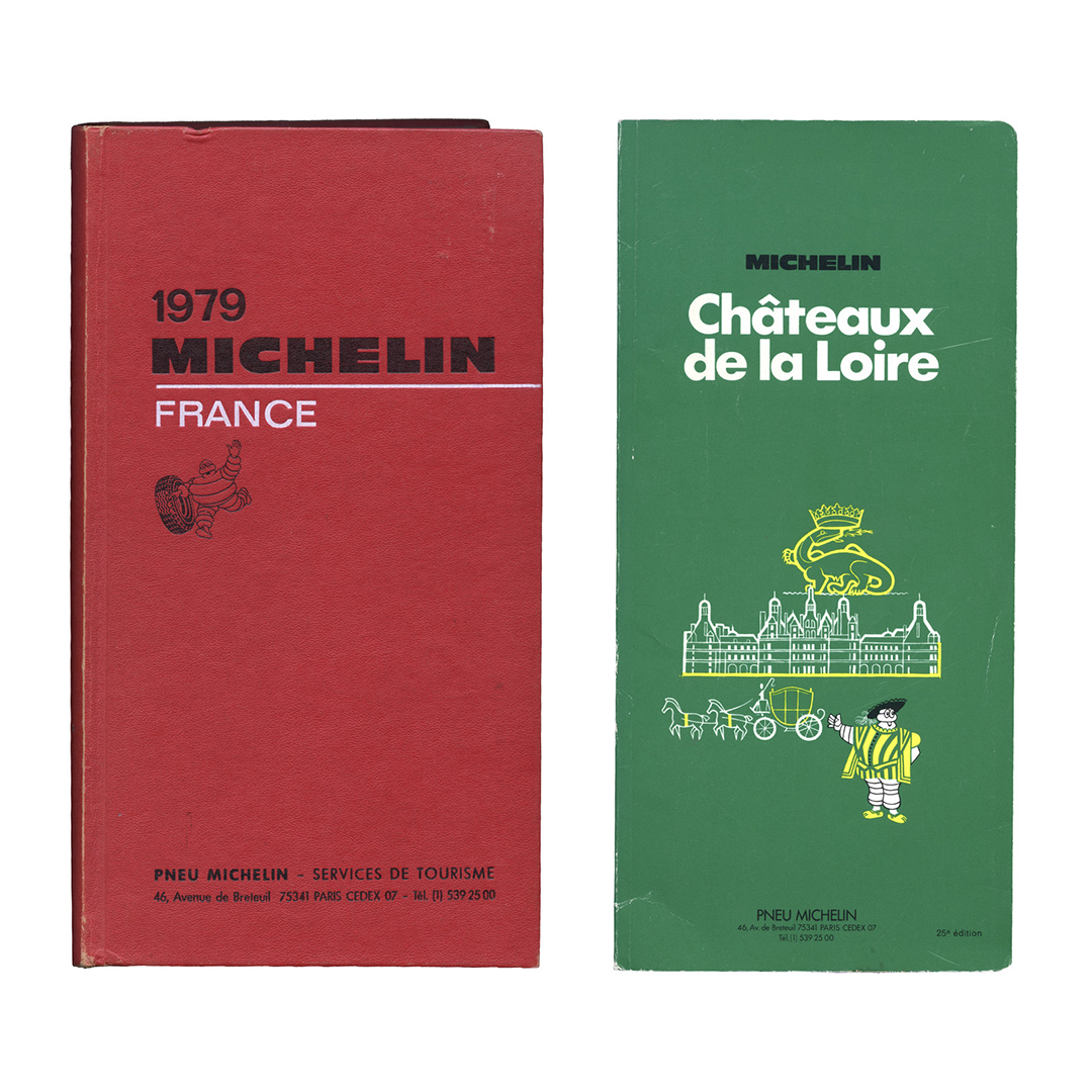
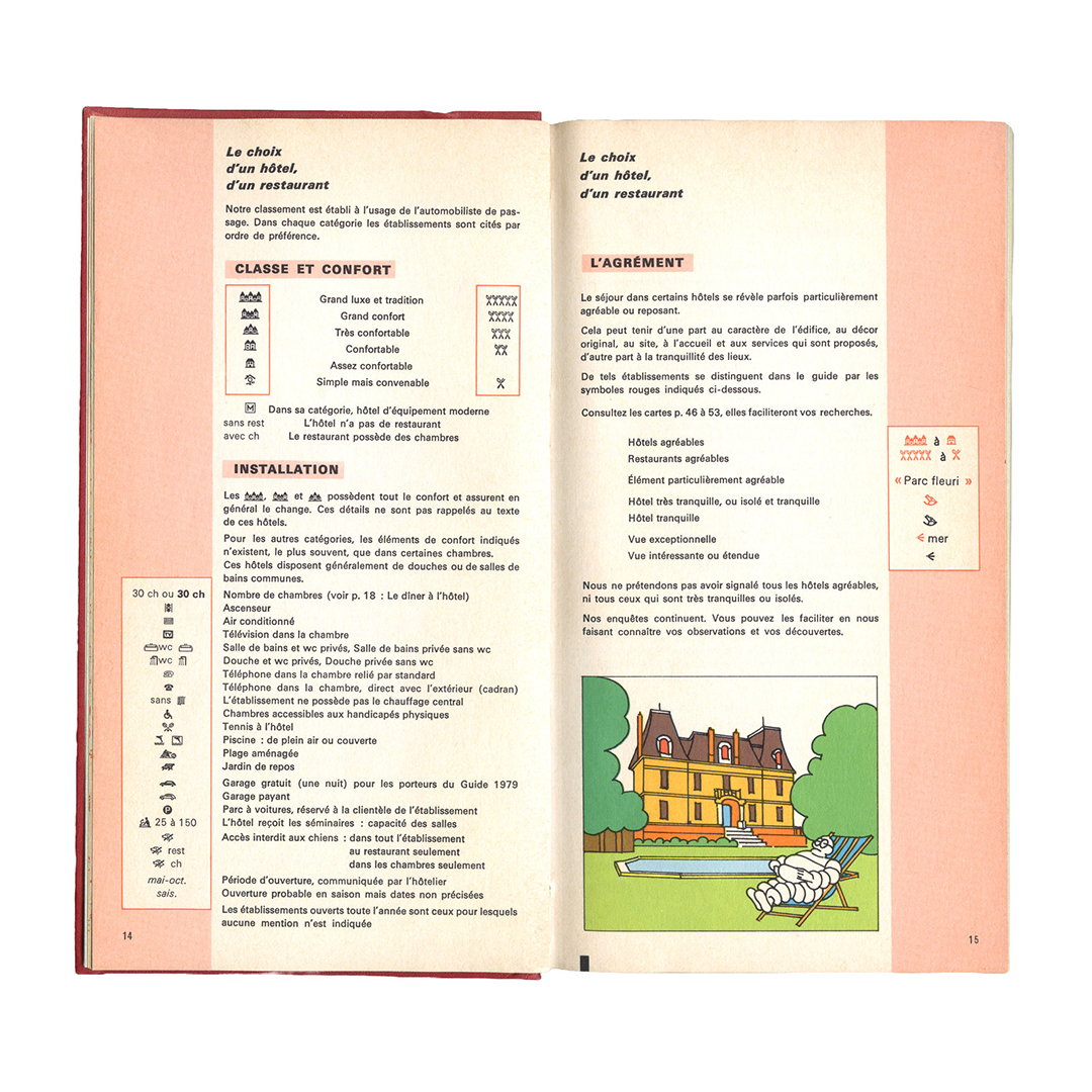
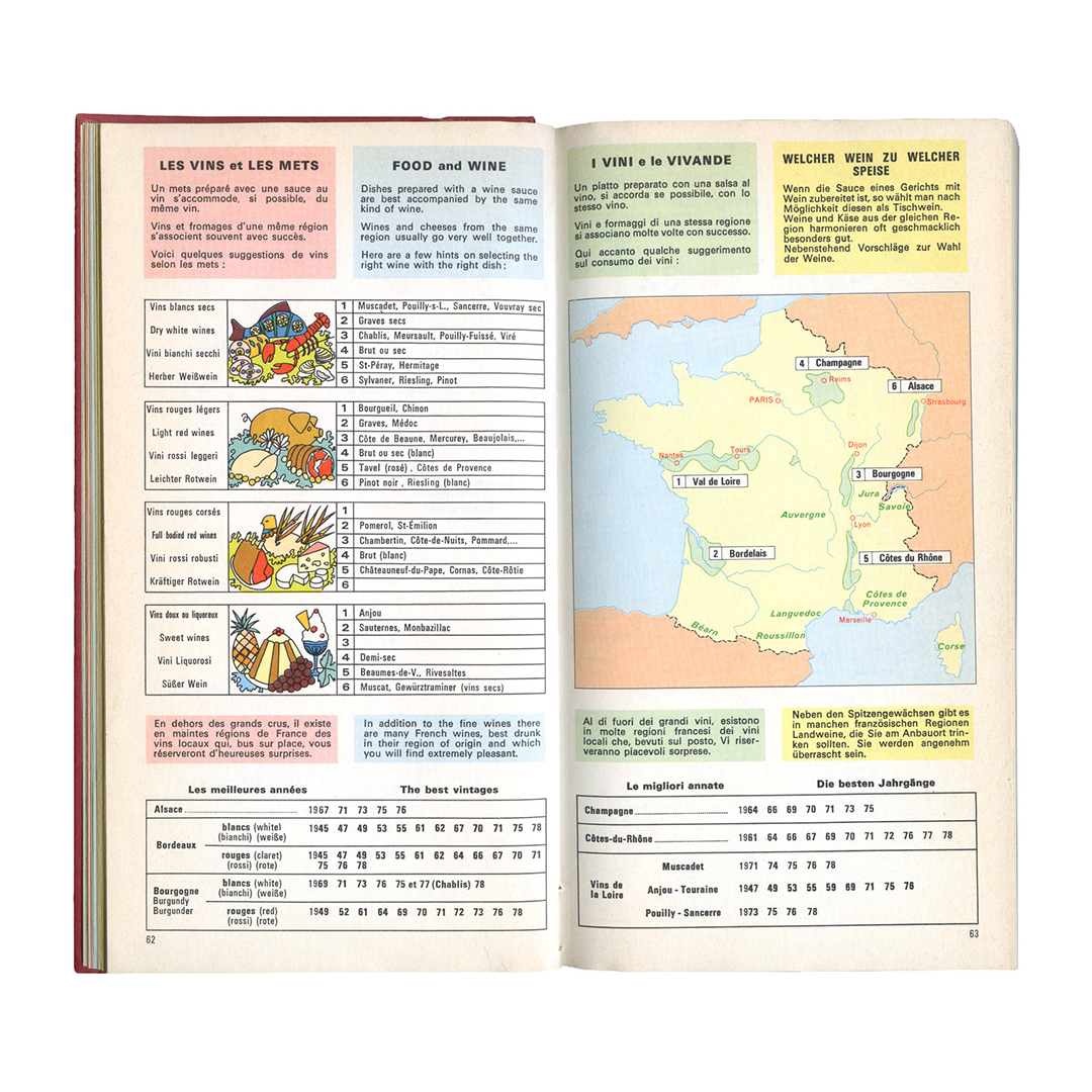
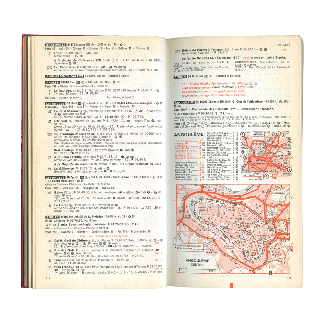
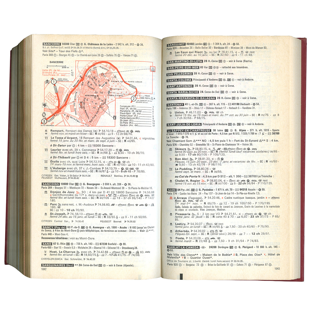
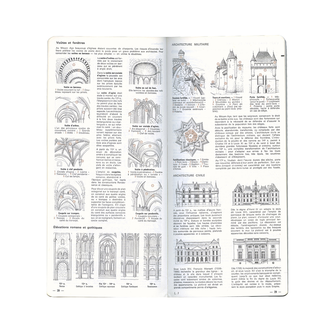
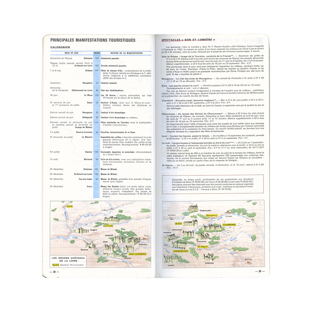
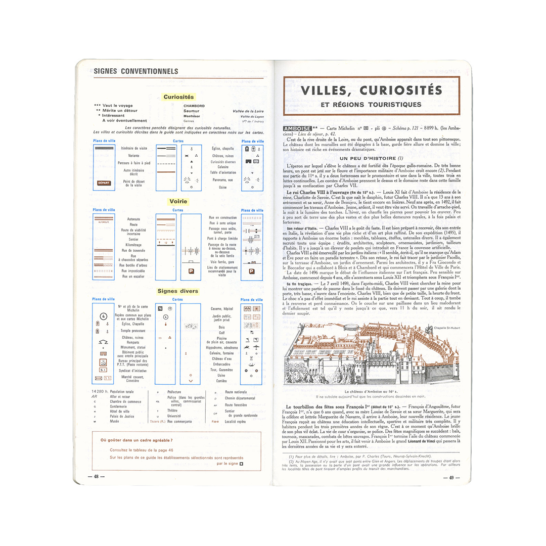
Last summer, I bought a bunch of old Michelin Guides at an estate sale here in Buffalo. While there’s no instances of Vendôme (Univers has never looked so good), the photos, maps, diagrams, and illustrations work together in perfect harmony. There’s also an incredibly intricate, yet legible, system of icons set within these dense blocks of text that are just fantastic.
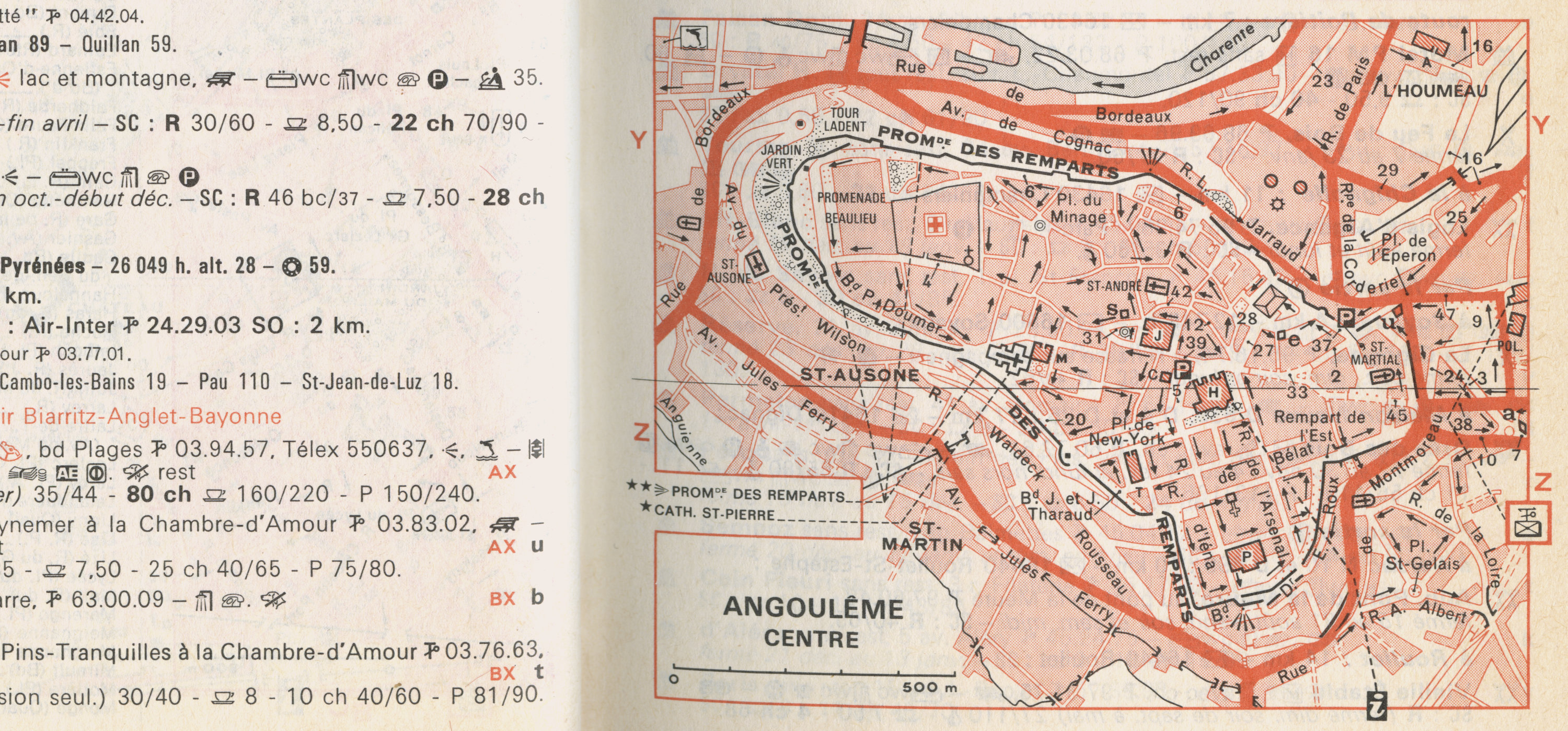
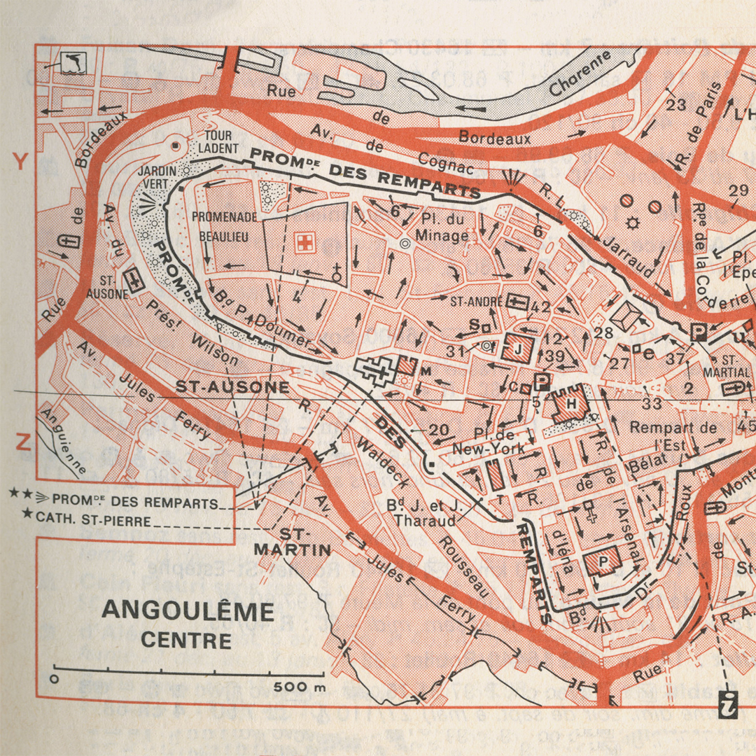
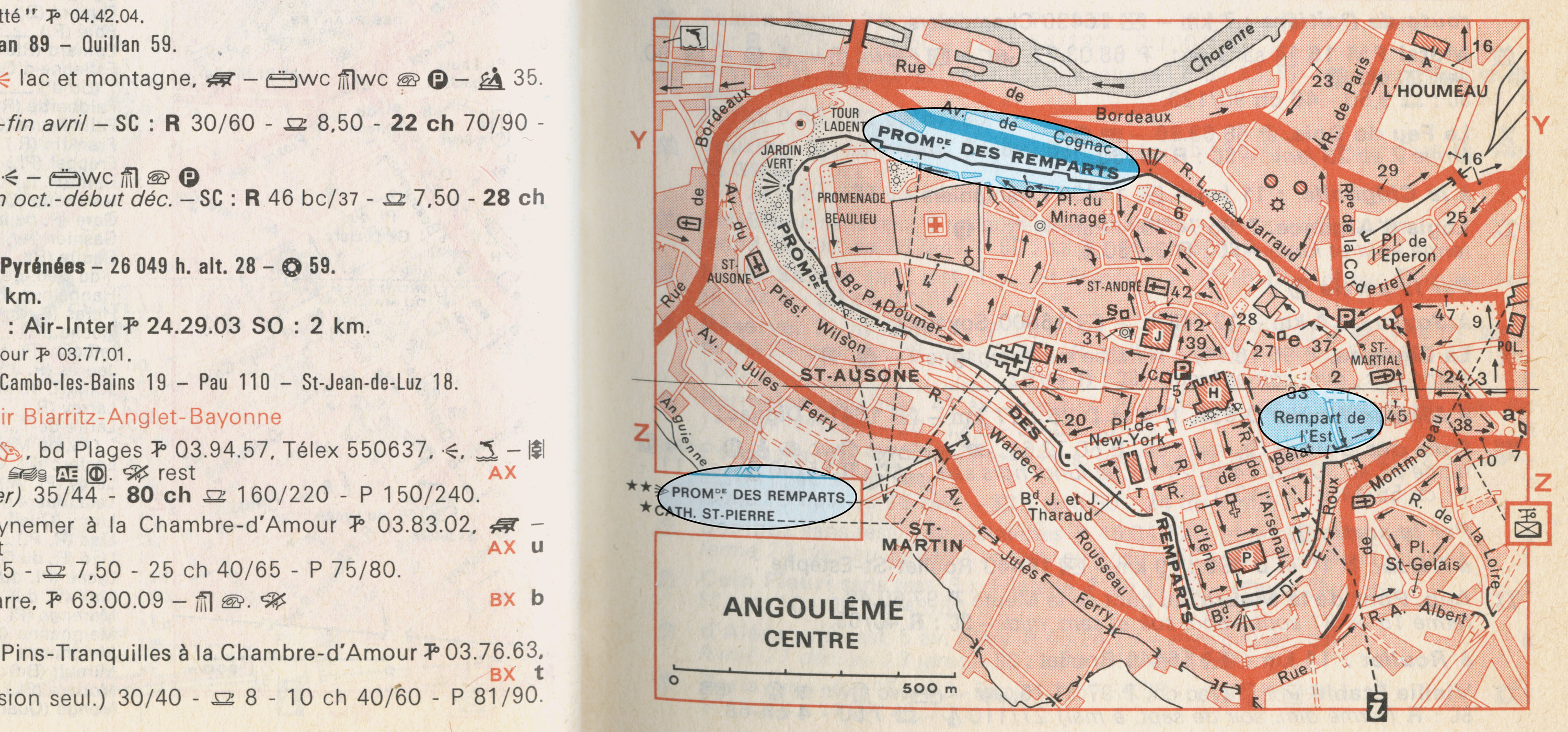
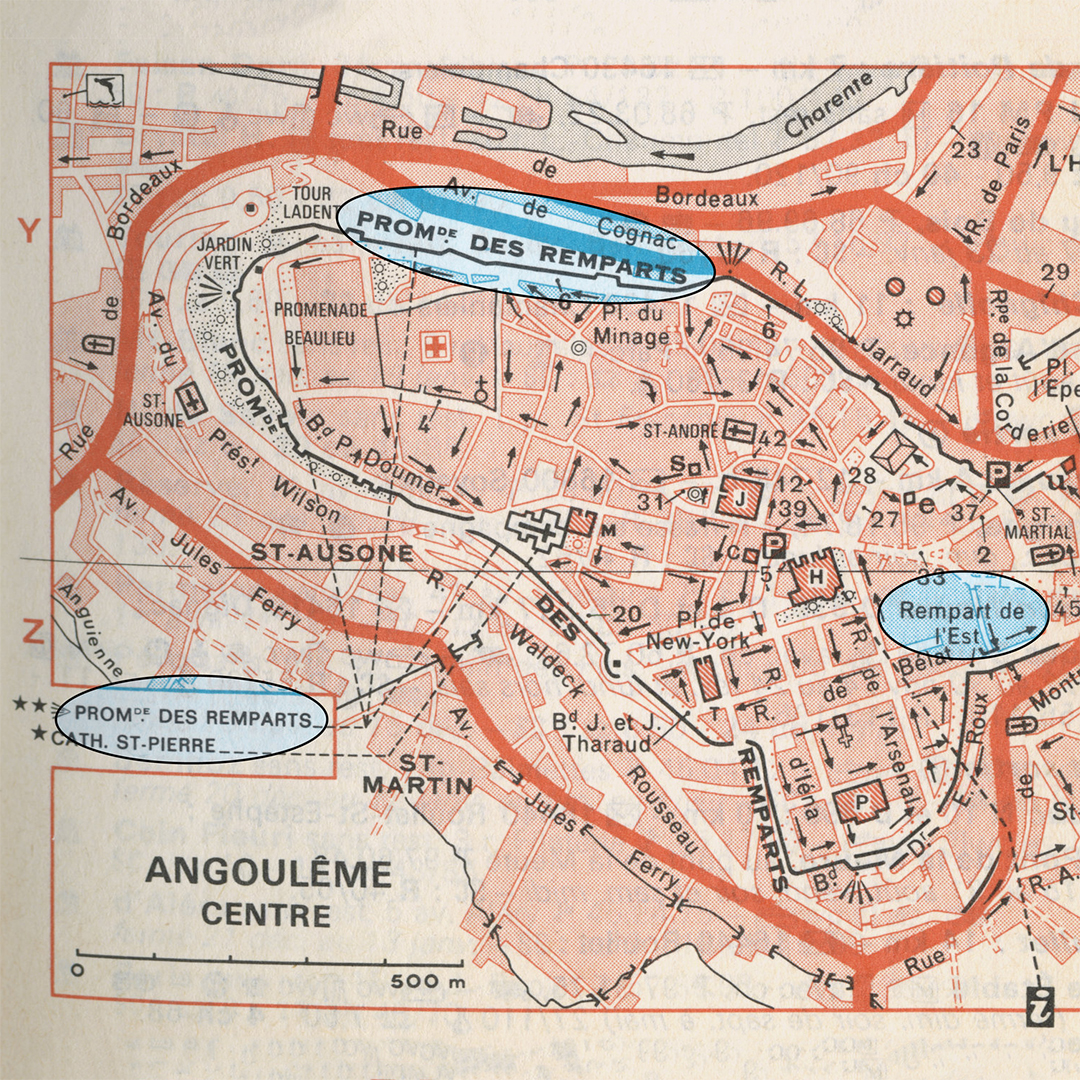
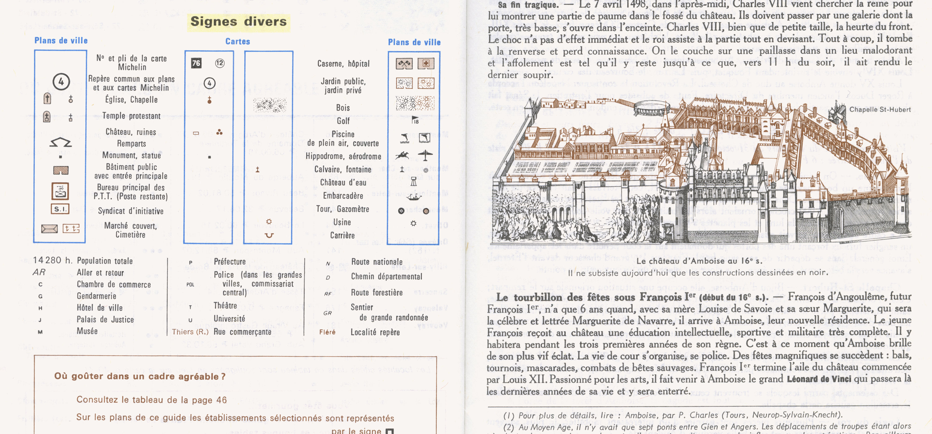
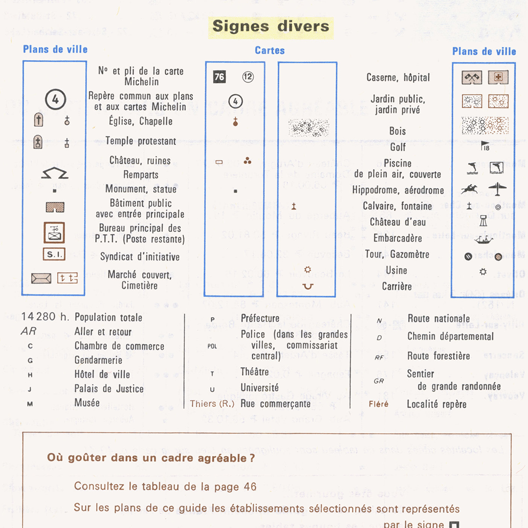
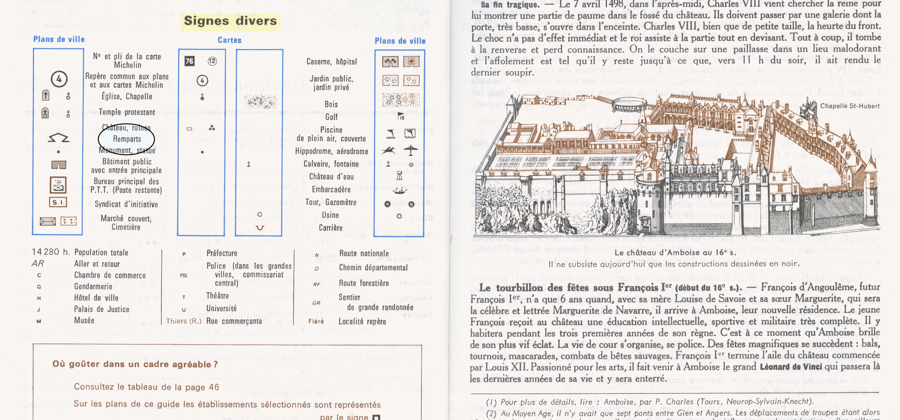
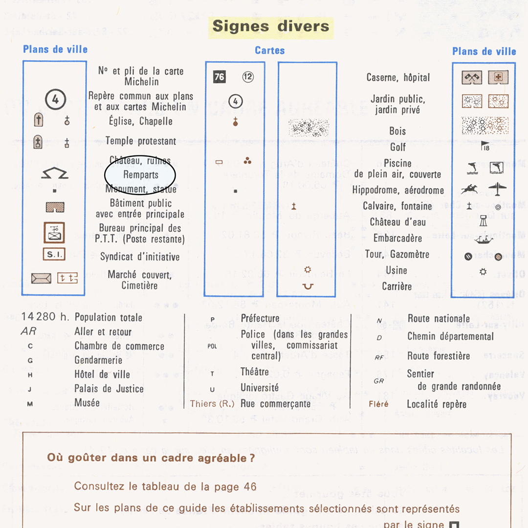
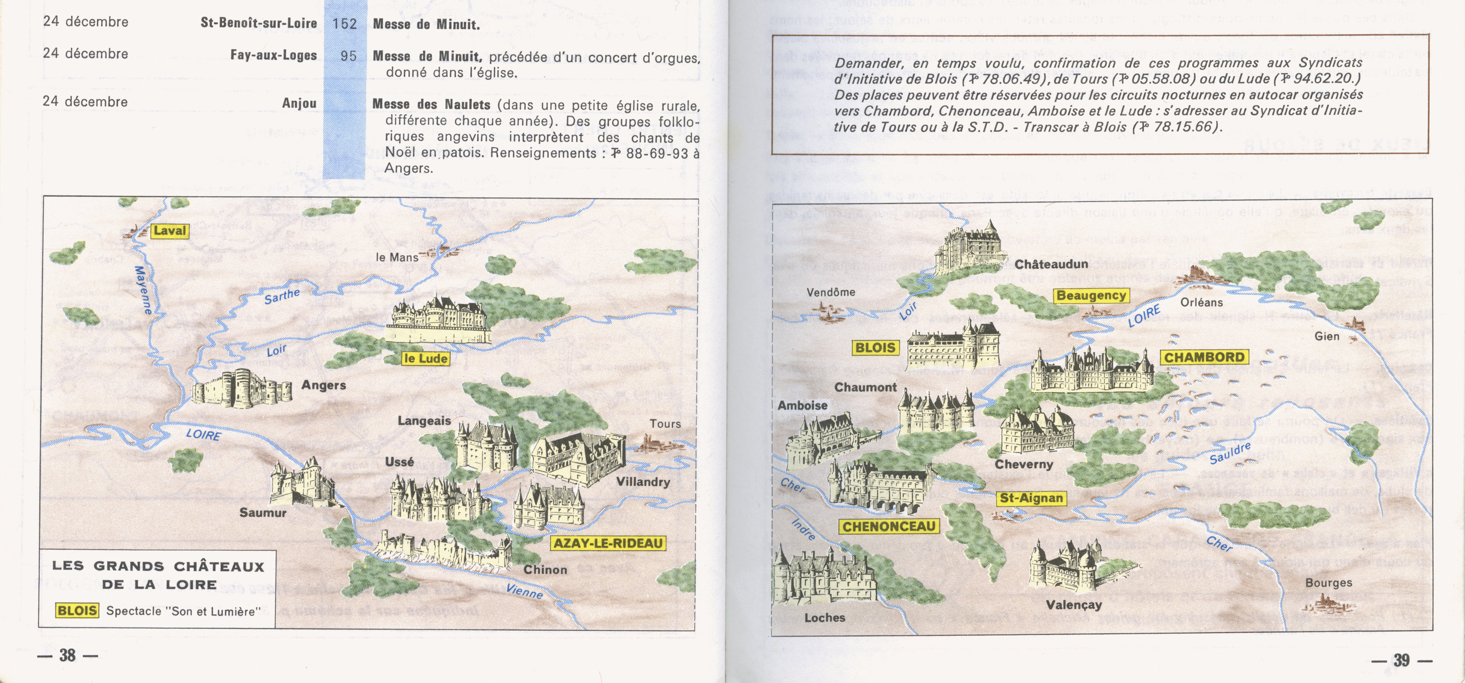
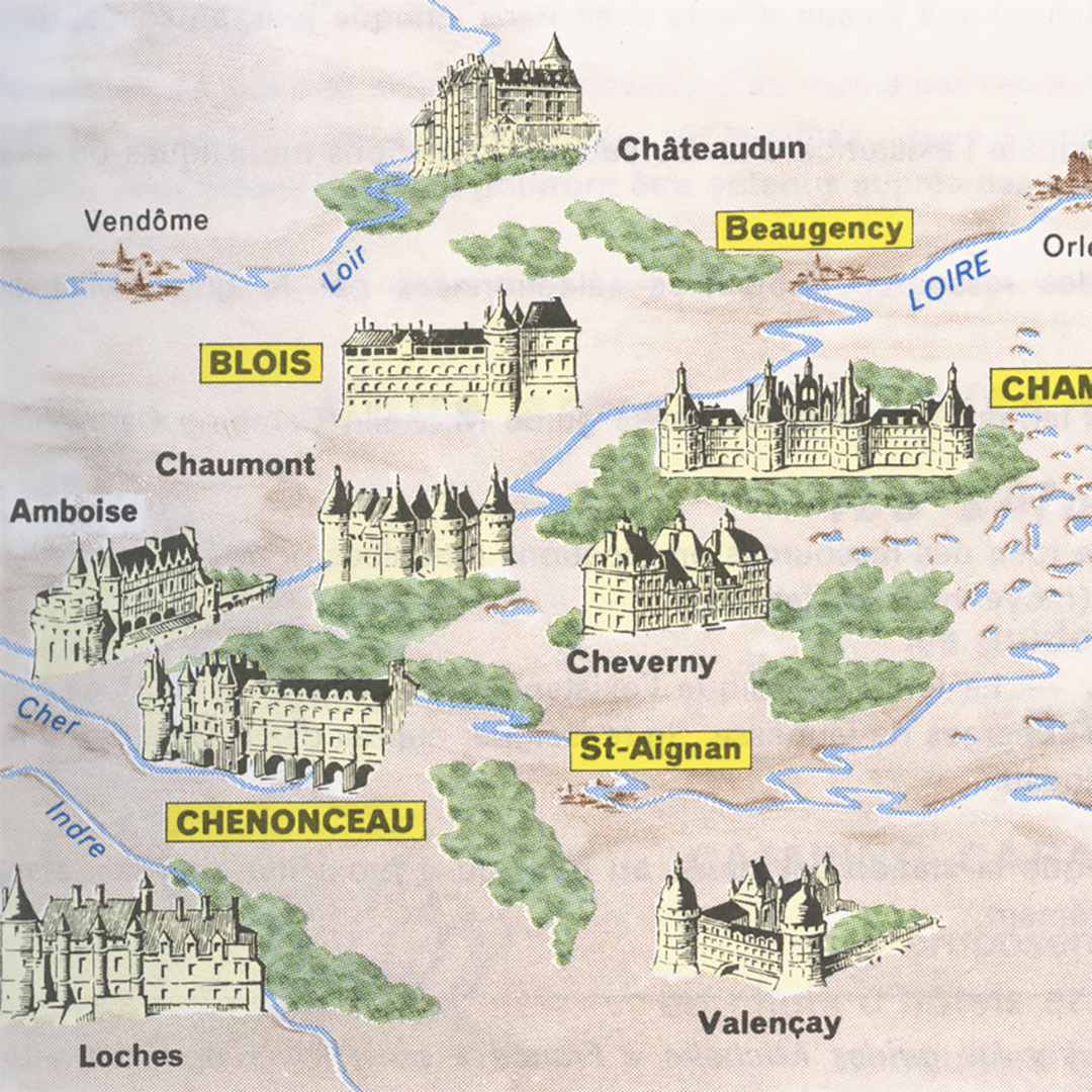
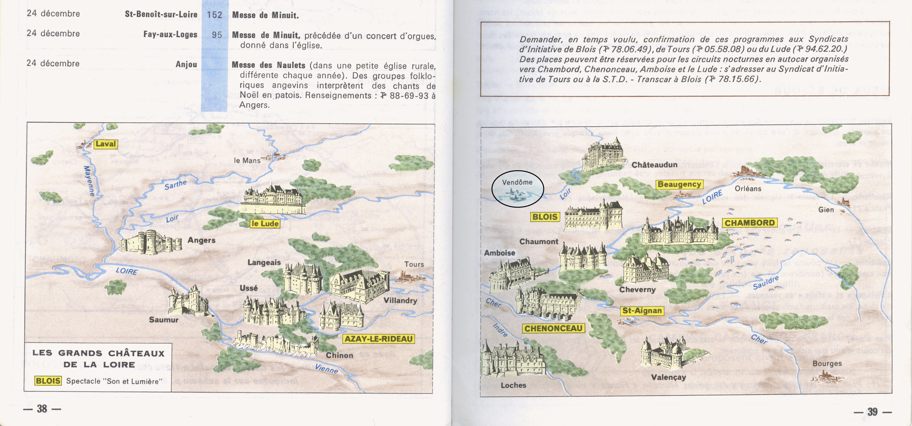
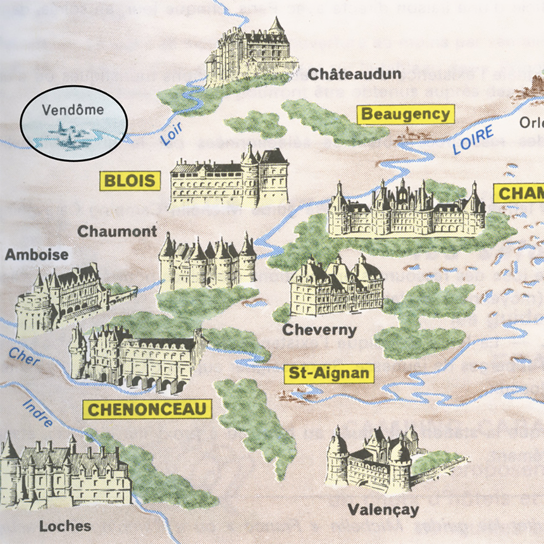
Flipping through them got me thinking of a name. There’s a few dozen instances of the word “rempart” in the 1979 guide, and In Chateaux de la Loire, there’s a diagram that denotes remparts as castle walls. Rempart stuck out to me. Not only is it a handsome looking word, it describes the most enduring, foundational, and recognizable part of a castle.
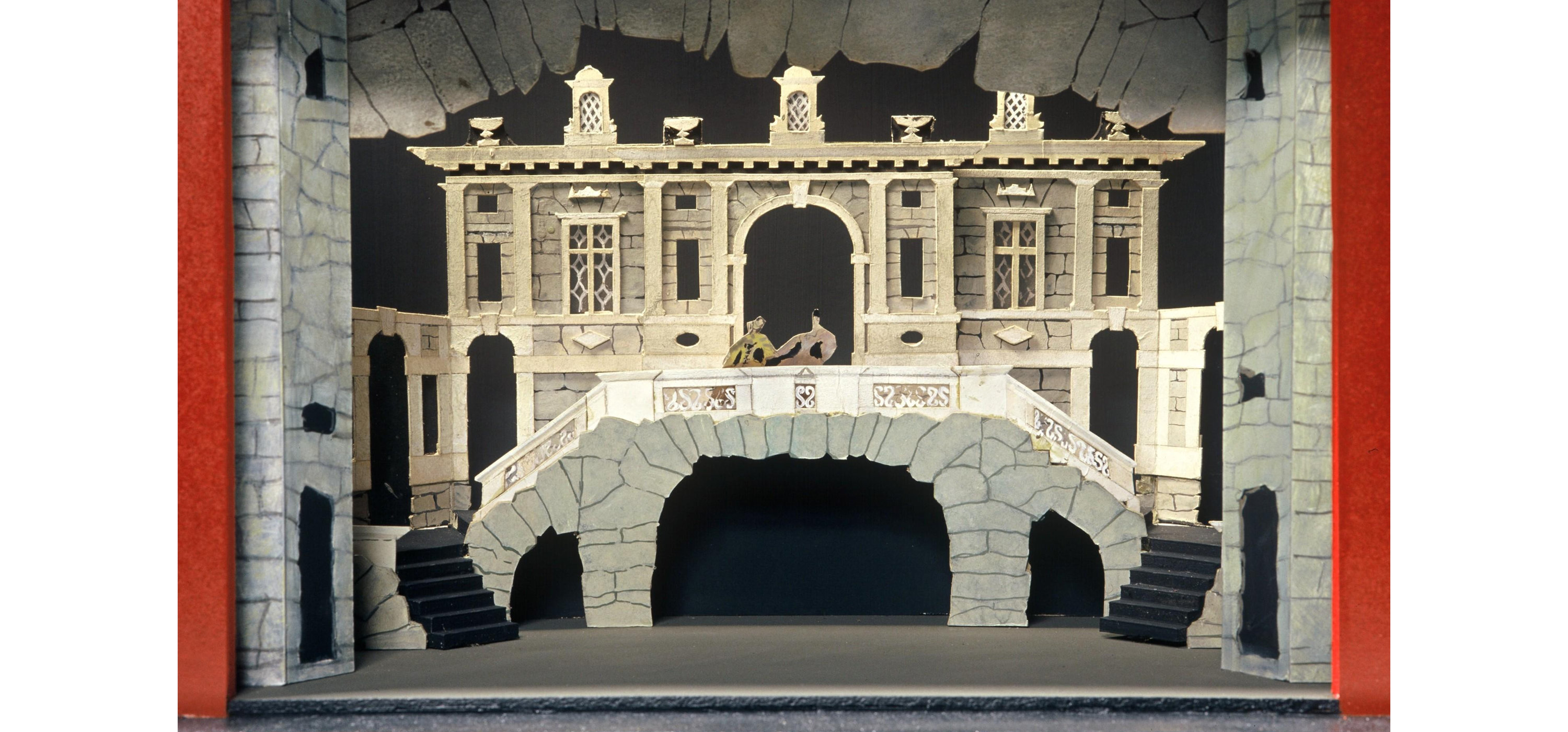
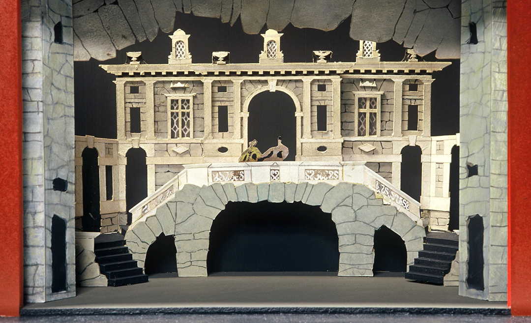
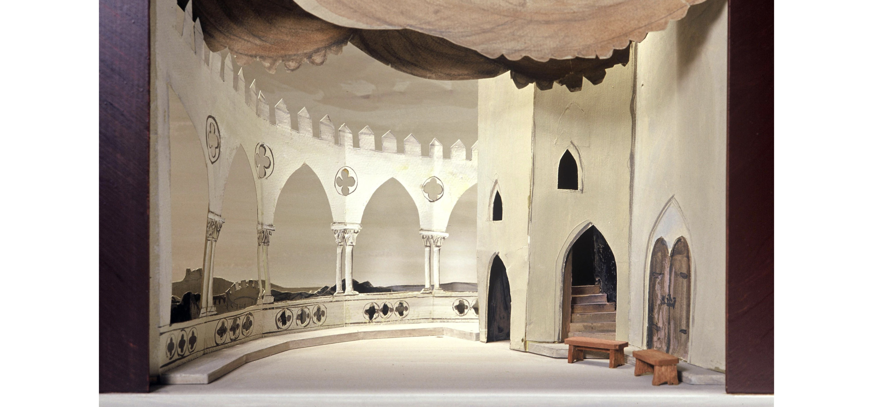
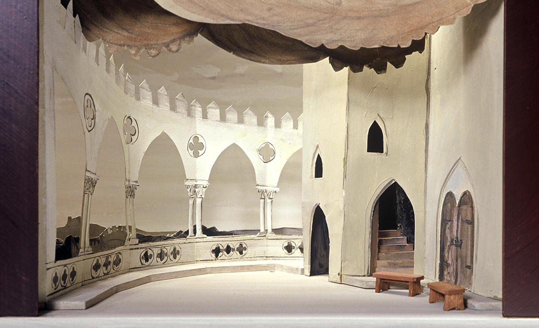
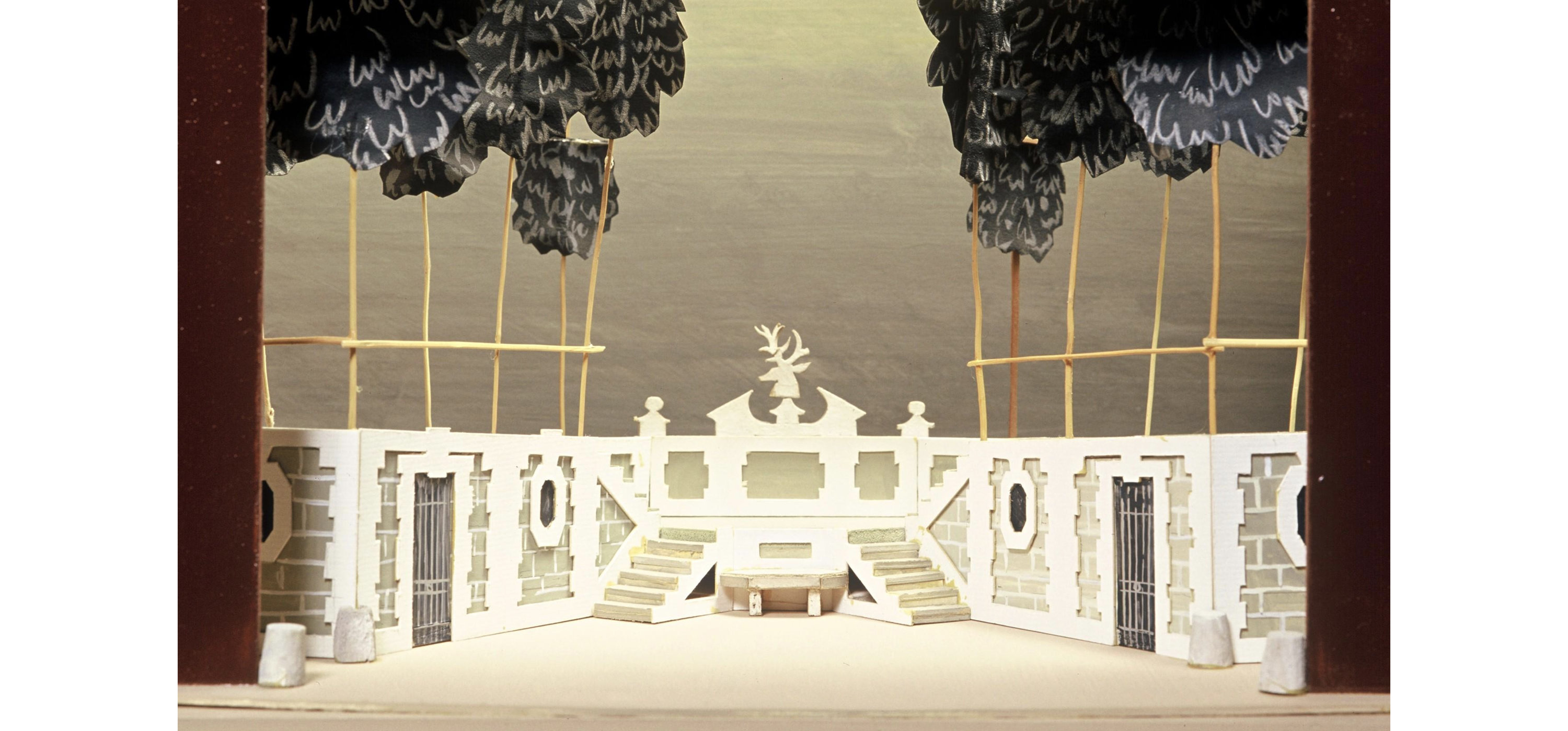
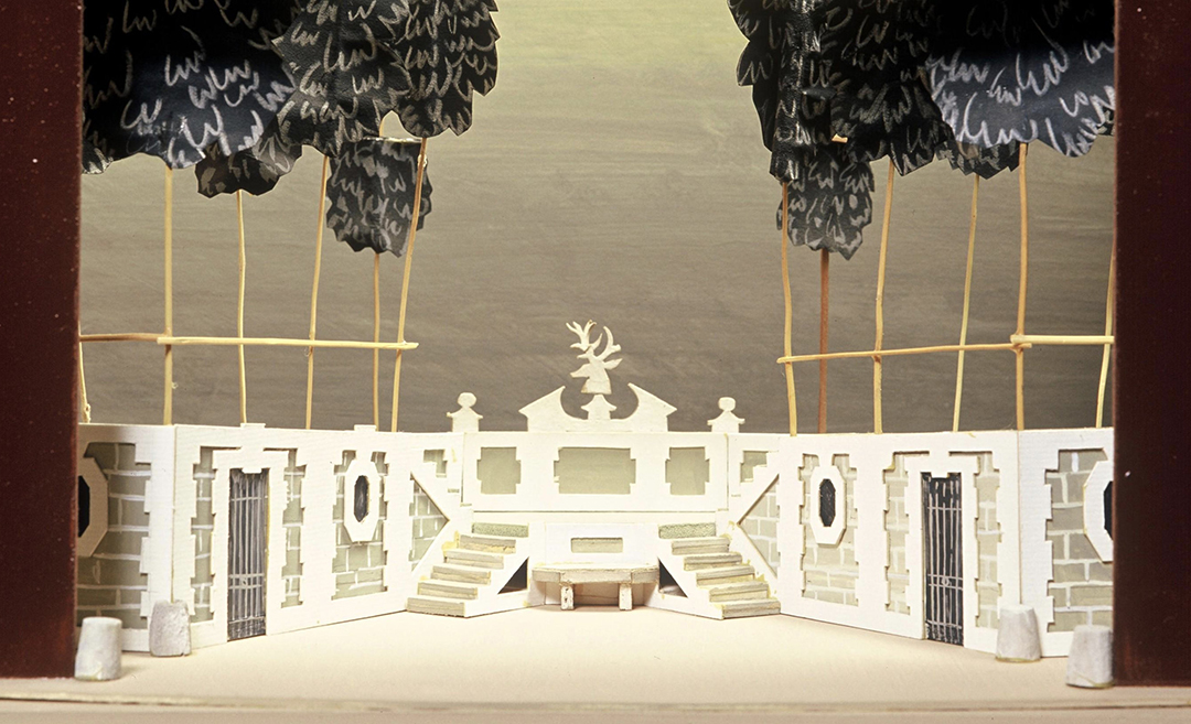
François Ganeau’s set design for Shakespeare’s As You Like It. Dir. Jacques Charon, 1951.
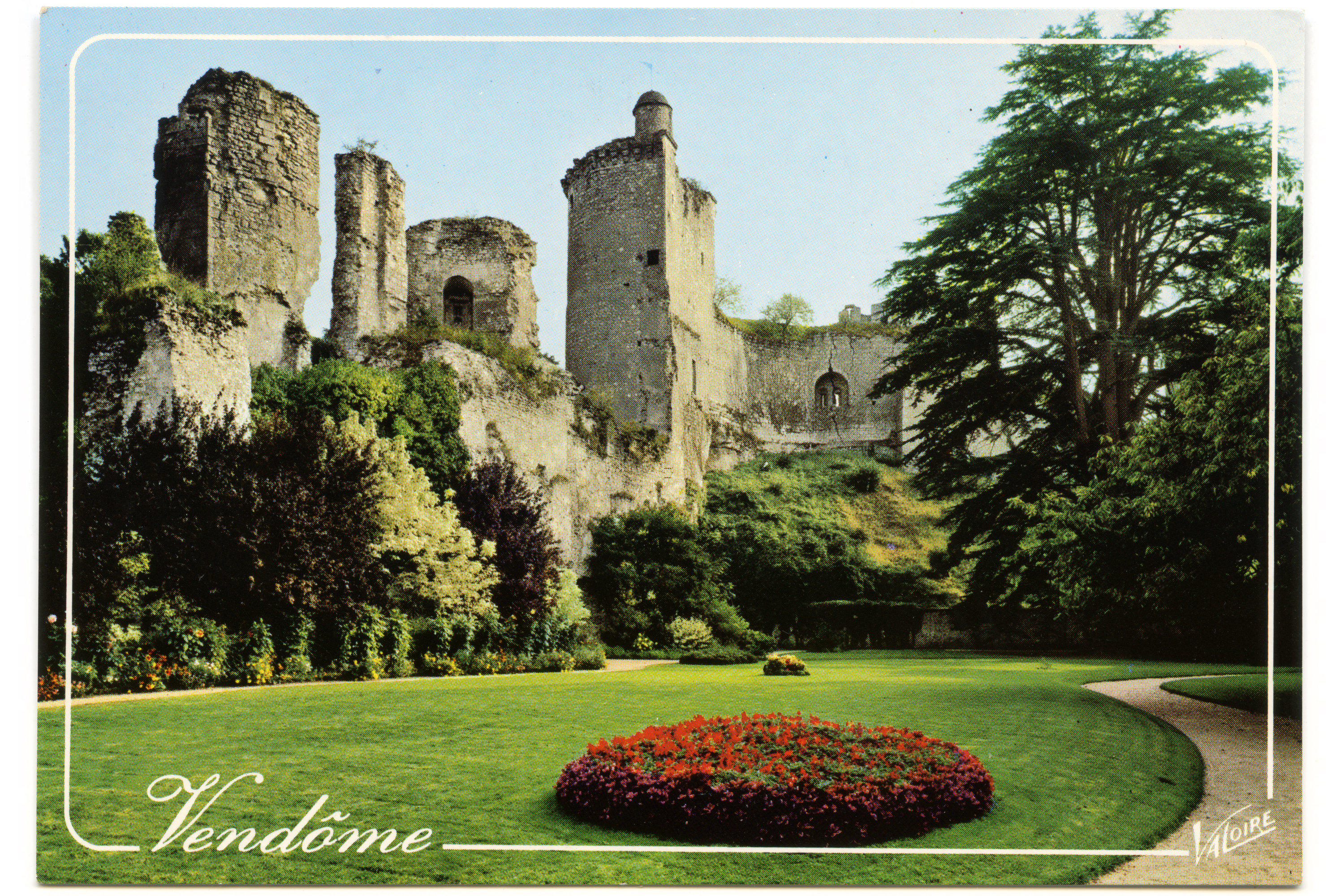
It’s unclear whether Vendôme is named after a historic plaza in Paris, a pavilion in Aix-en-Provence, or a castle ruin in the Loire Valley. The pavilion might be the most plausible, as Ganeau worked with the famed Festival Aix-en-Provence on a myriad of theater projects throughout his career. From my vantage point, I prefer the castle. Château Vendôme, tucked away deep in a valley, feels like the perfect backdrop for an artist to have created such daring, monumental forms.
Rempart is not an updated or better version of Vendôme. It doesn’t pick up where Vendôme left off, or discover something left behind. Rempart is a new typeface, built with today’s technology. It didn’t take shape through analysis, but through interpretation. Rempart does, of course, pay tribute to Vendôme. It does so by looking to Vendôme as a recipe: a base set of ingredients and techniques that can be added to, subtracted from, and altered to an individual’s personal taste.
When I see Vendôme in my mind’s eye, I see the cheese labels, the old signs, and the gallery posters more than I see the letters I’ve scanned from the books I’ve bought. In this way, Rempart pays tribute to the myriad of impressions that Vendôme has left on these artists, designers, and craftspeople, most of whom remain anonymous while their work lives on.
Fonderie Olive at the Salon International des Techniques
Taken from Bruce Kennet’s Lecture at the Cooper Union
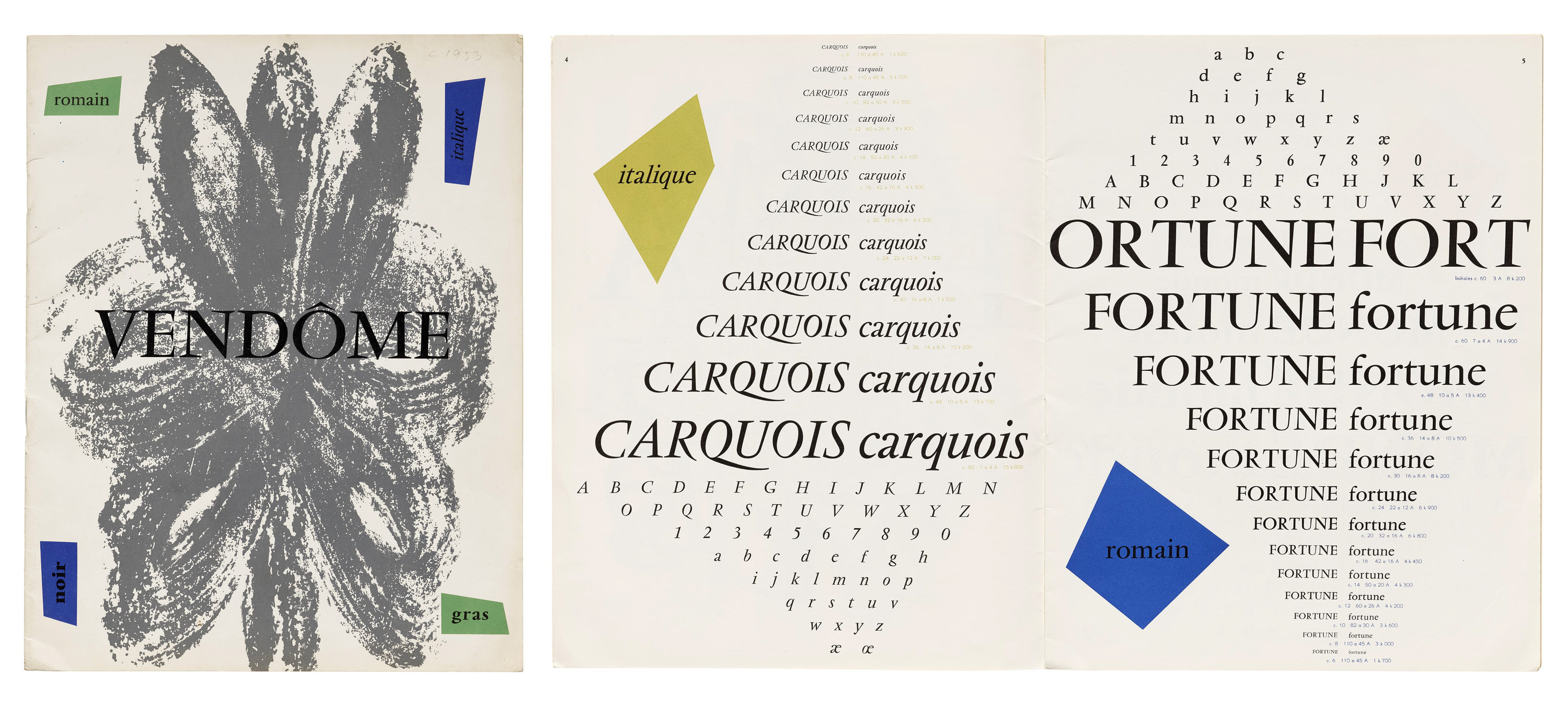
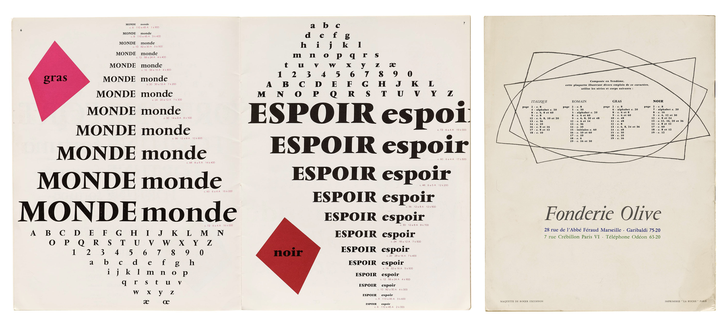
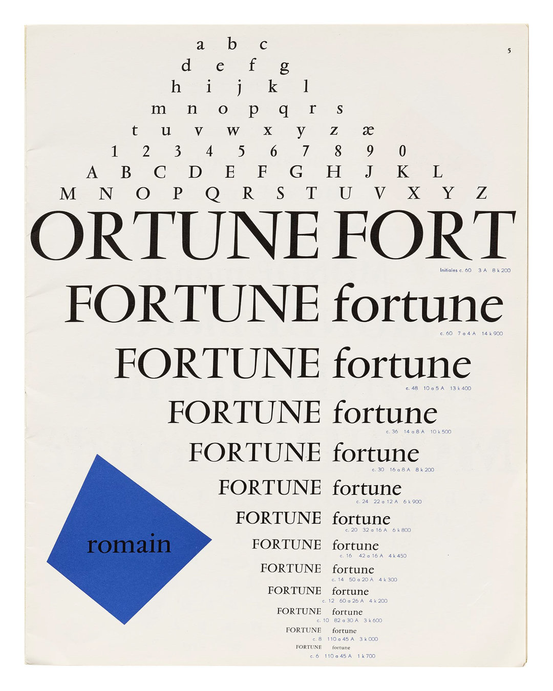
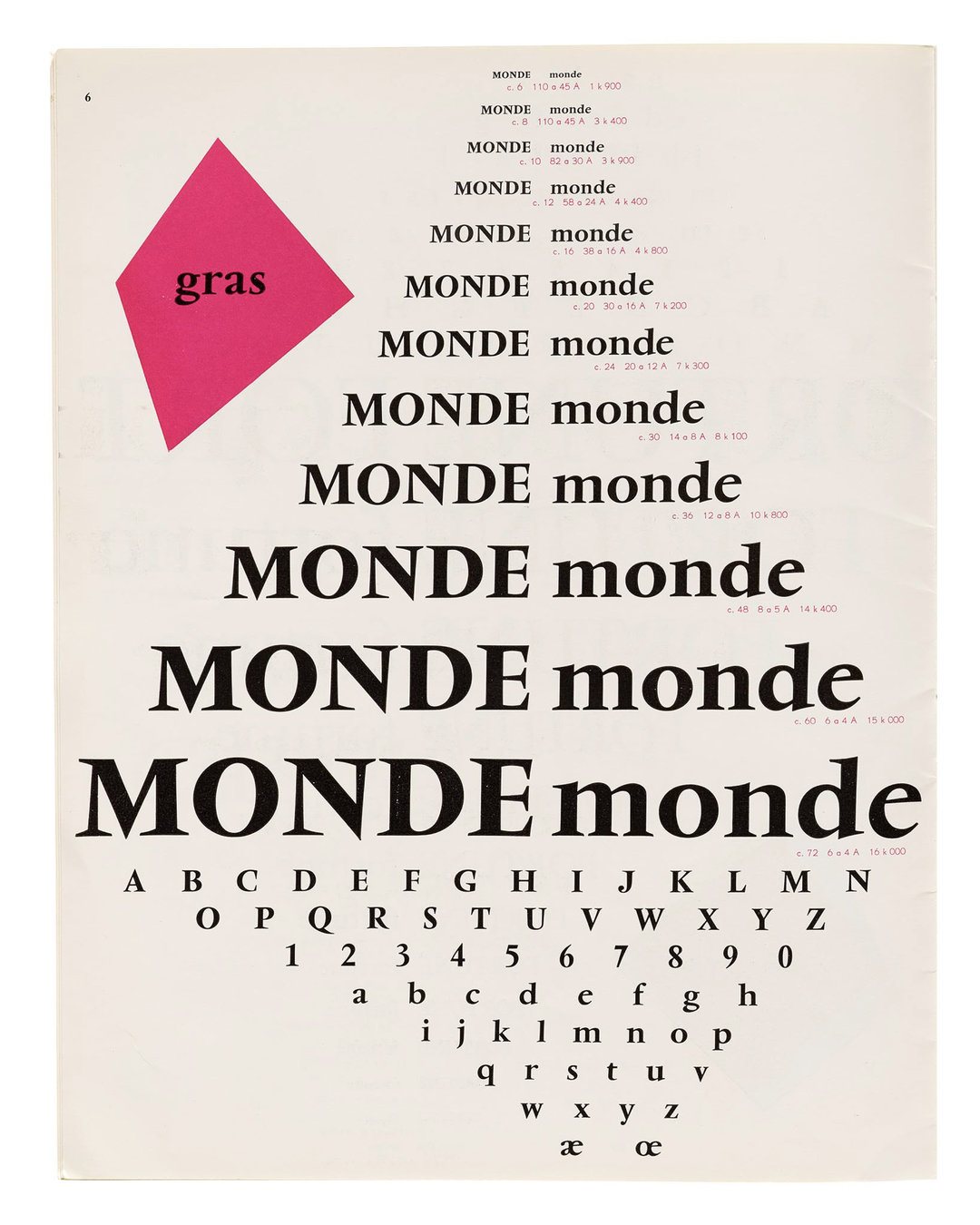
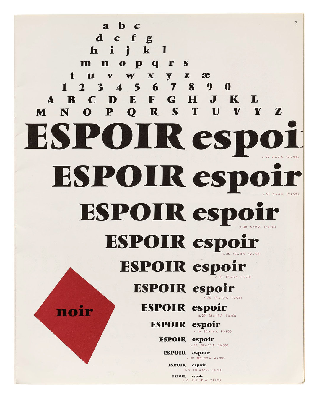
Pages from Vendôme: Romain, Italique, Noir, Gras
Taken from the Letterform Archive’s Online Collection
Specimen images with Stacks of words set in Rempart
Made with the help of Max Esnée’s Stack & Justify
Scan of Vendôme from VGC Pamphlet
Courtesy of the Herb Lubalin Center
Scan of Vendôme Gras Italique Ç
Taken from Roger Excoffon et la fonderie Olive.
Sandra Chamaret, Julien Gineste, Sébastien Morlighem.
Ypsilon Éditeur, 2010
Paris Street Signs Found on Google Maps
Les Ursulines by Mauro Vieira
Librarie Point Du Jour by Pierre Slamich
Le Quincy by Chanwook Lee
Jacques Fourastie Posters
Taken from Posteritati and CineMaterial
François Ganeau Posters
Taken from MutualArt and Invaluable
Imprimerie Mourlot Posters
Taken from La Belle Epoque NY and Mourlot Editions
Secret of Mana artwork
Created by painter Hiroo Isono
Specific credit to the logo is unknown
Book Covers Featuring Vendôme
Personal photos taken from various used book stores
Other covers found on Abe Books
Camembert Cheese Labels
Taken from The Camembert Museum and eBay
François Ganeau’s Set Designs
Taken from the online archive of Comédie-Française
Rempart was designed by Douglas Hayes between 2020-2026, and is his first commercial release. View and test ↗