Tidal Magazine
Tidal is a culture magazine where East Coast sophistication meets a relaxed West Coast charm. Working with Creative Director Tida Tep, and Founder Anna Wolf, we created a logo for Tidal Magazine that puts a new spin on familiar forms. It’s groovy, it’s classy, it’s a little off-kilter, and at the same time it’s expertly crafted. It embodies everything that Tidal stands for.
Creative Direction
Tida Tep
Logo Design
Douglas Hayes
Issue 15
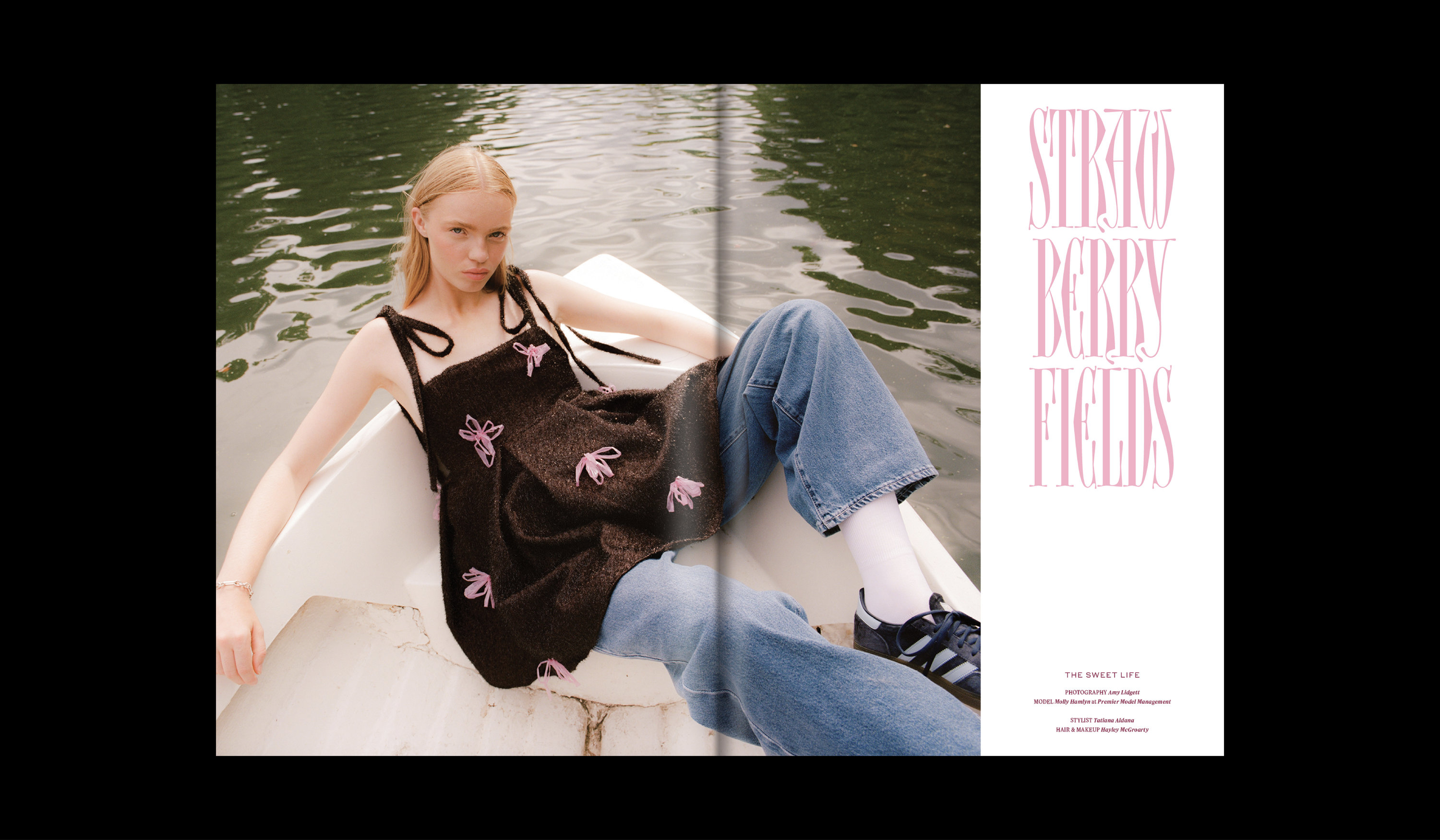
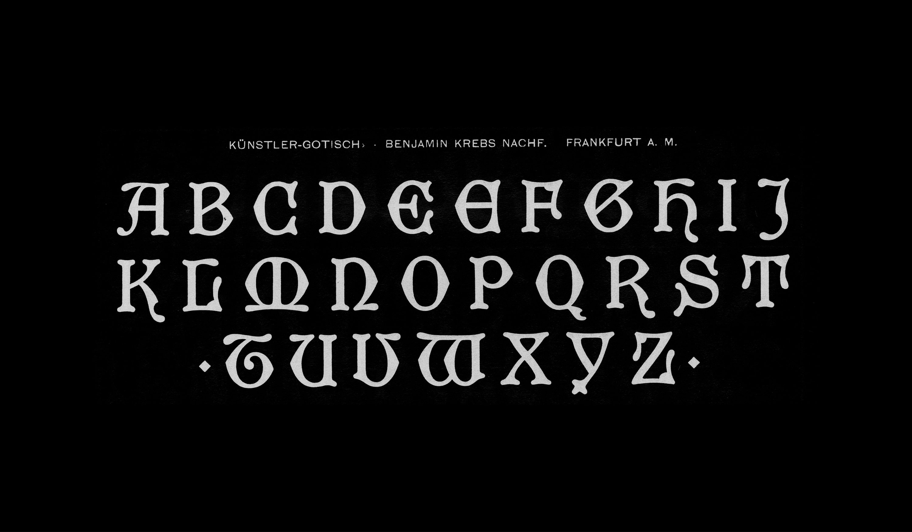
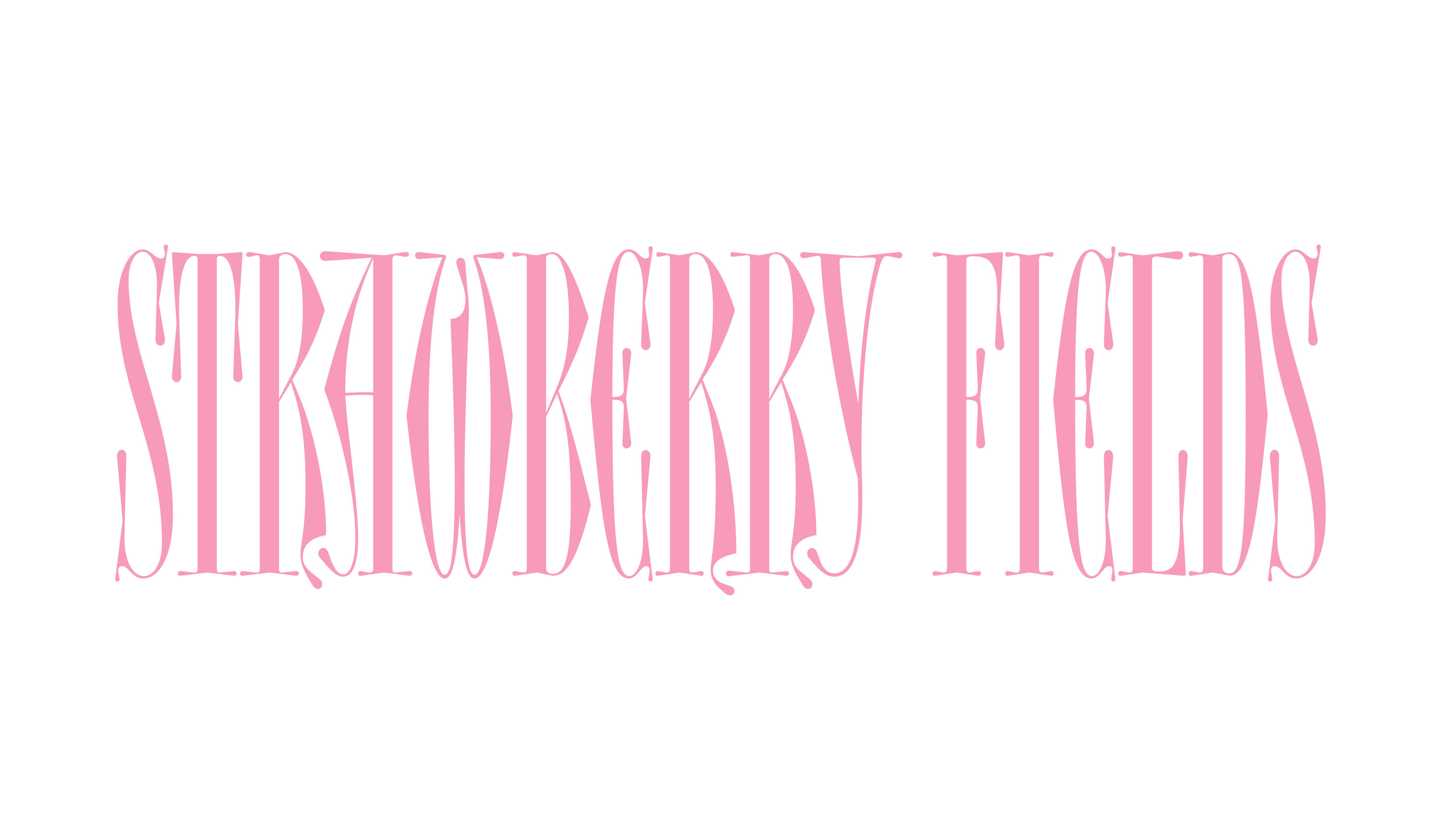
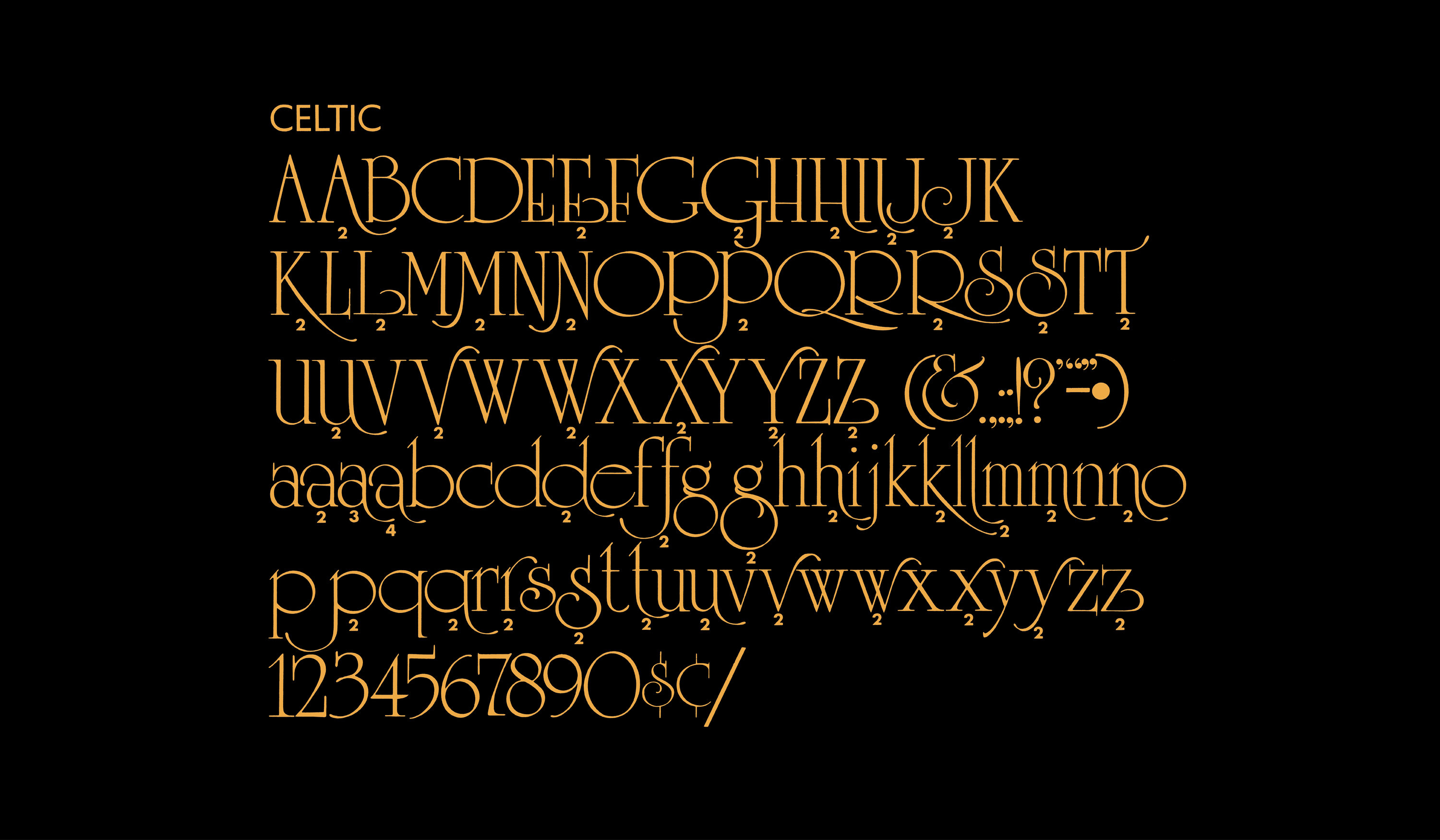
For Strawberry Fields by Amy Lidgett, the use of landscape combined with elegant, yet edgy knitwear designs led us to drawing something that felt twiggy and slightly scratchy, but with a comfortable elegance. We took a look at a few alphabets that could loosely be described as “Medieval” and drew something with much more narrow proportions and higher contrast. We kept referring to this lettering as “Renaissance-Fair-Chic.”
Fall/Winter 2022
Issue 16
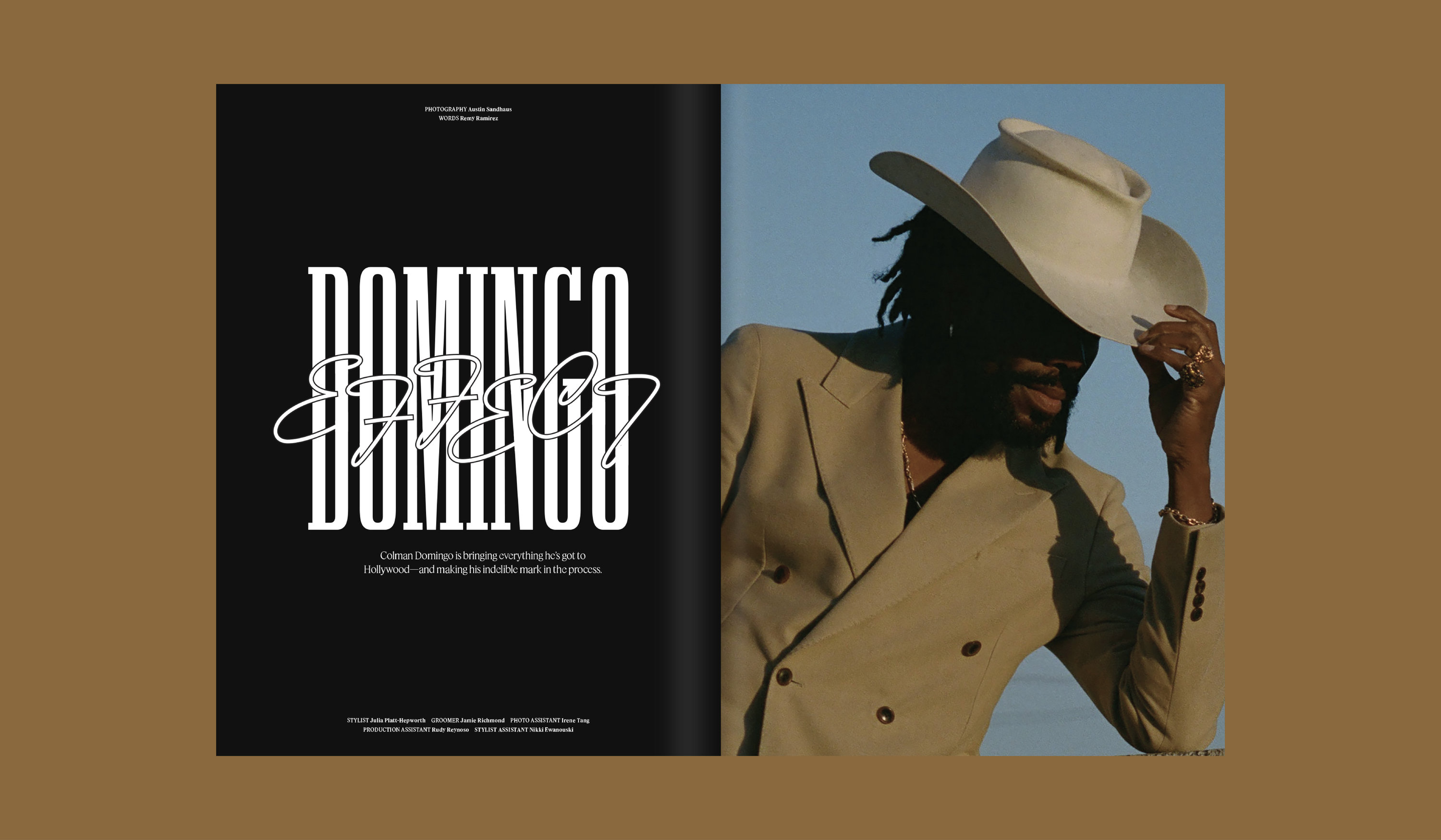
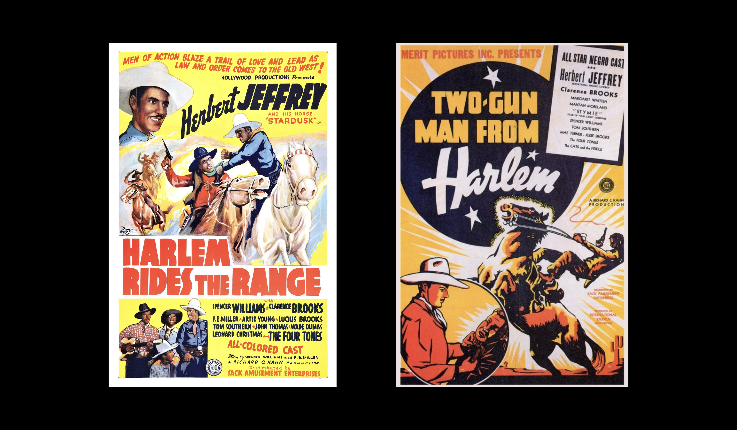
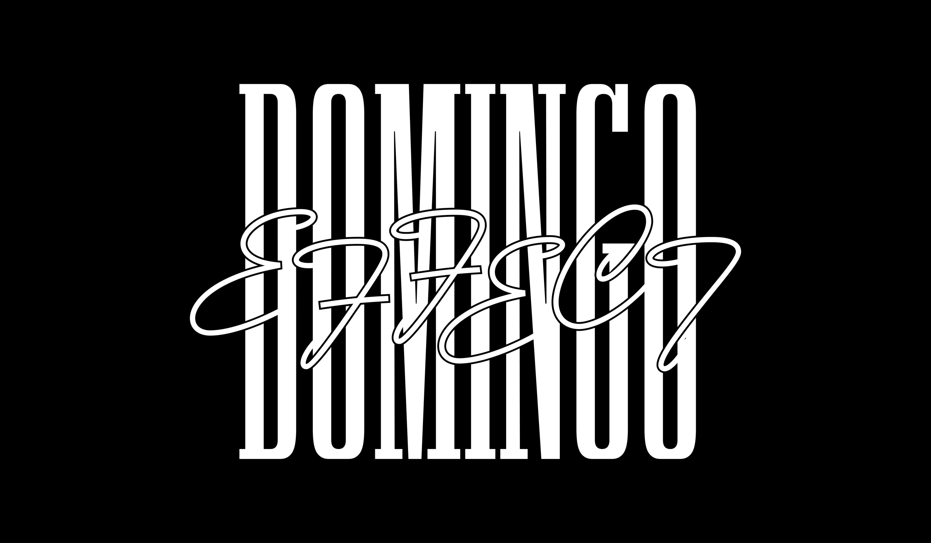
For Domingo Effect by Austin Sandhaus and Remy Ramirez, we began looking at posters for Black Western movies, L.A. Crime Thrillers, and comic book lettering. A prominent, all-caps DOMINGO, is contrasted by a scripted, lasso-like EFFECT, modeled after the classic Brush Script typeface.
Spring/Summer 2023
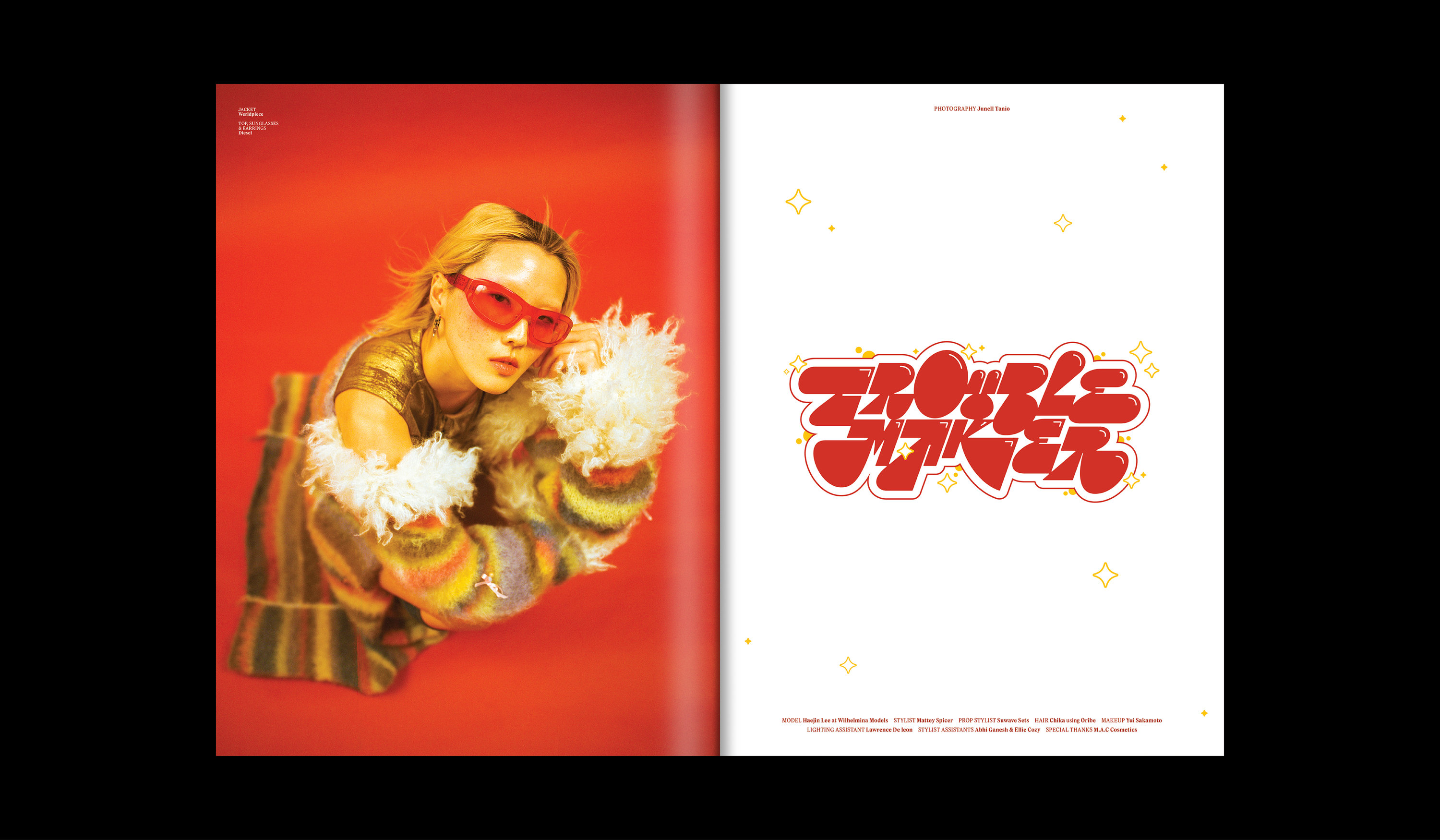
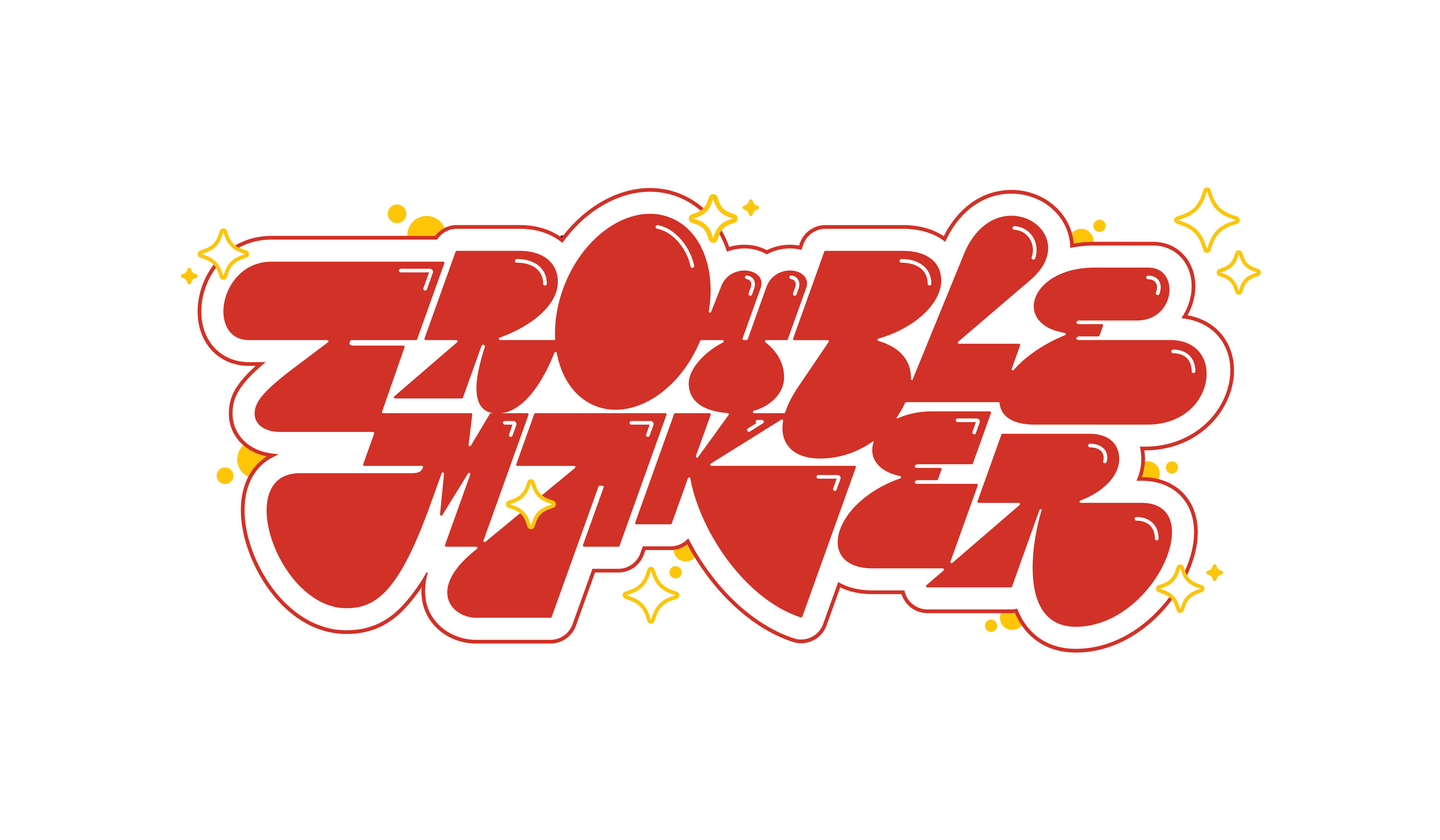
For Trouble Maker by Junell Tanio, we decided to play off of the obvious Y2K styling of the photoshoot, and draw a piece that’s reminiscent of graffiti, cartoons, house music and extreme-sports logos of the late 90’s.
Spring/Summer 2023

Issue 17
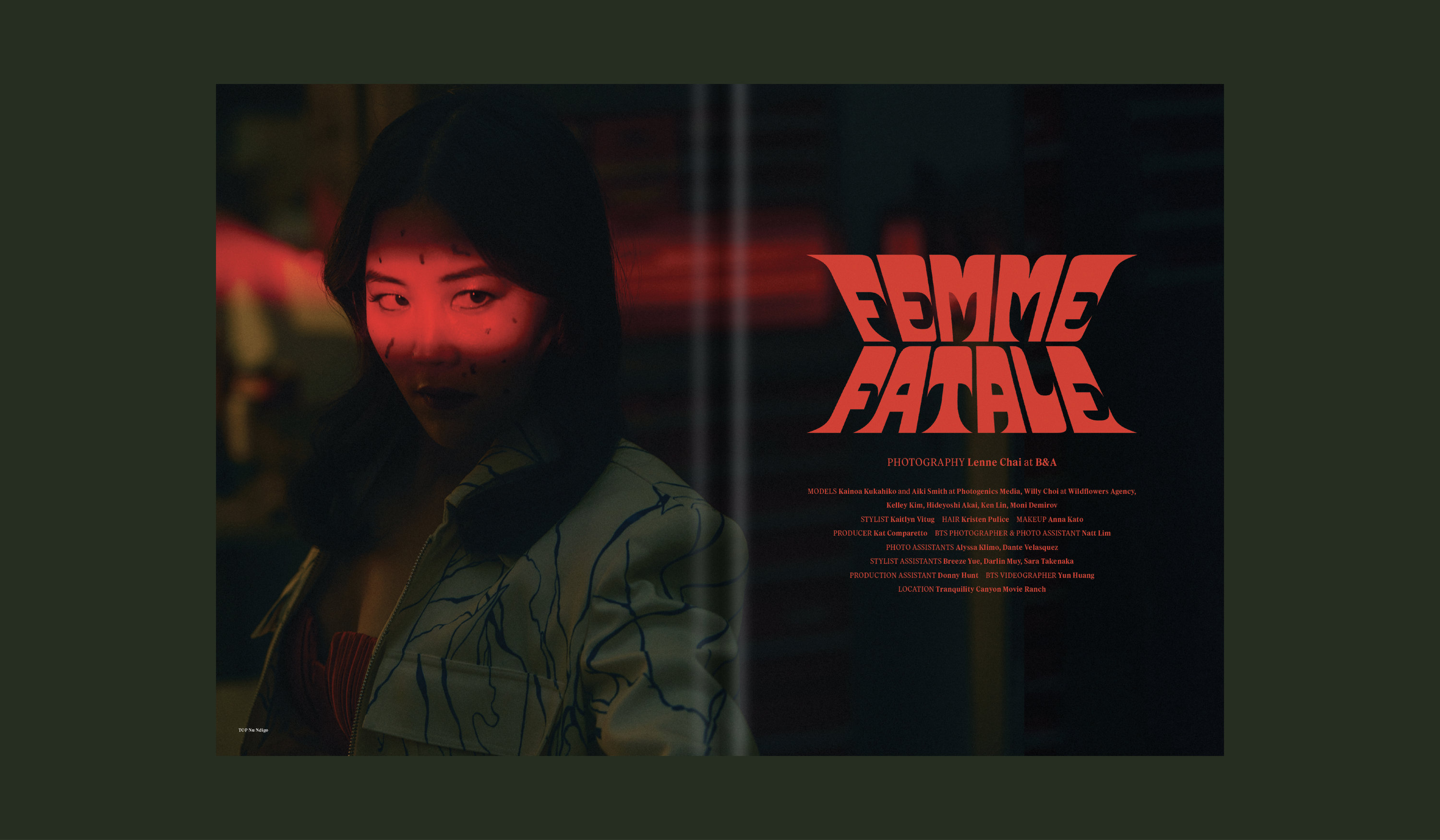
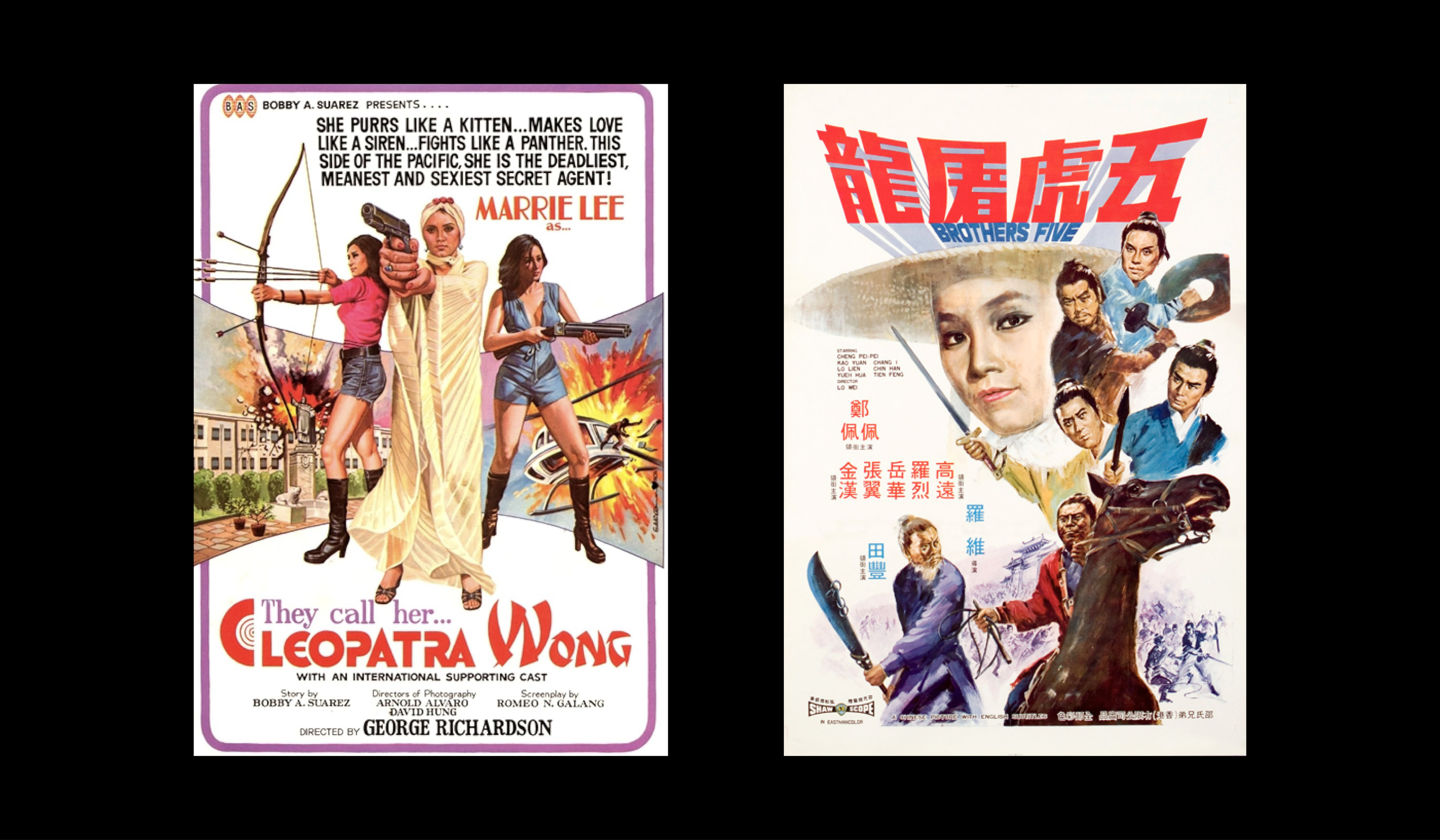
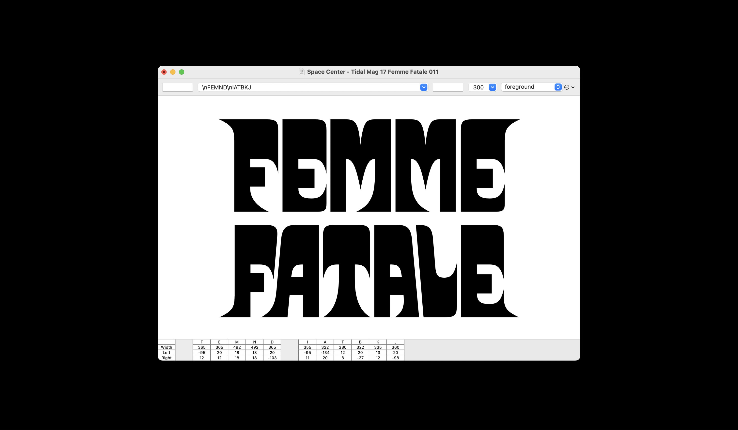
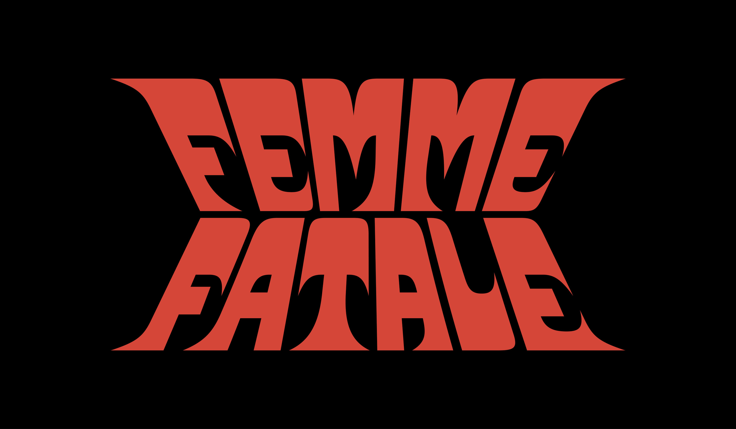
The theme of the Femme Fatale shoot by Lenne Chai was classic martial arts thriller. We got started by looking at Kung-Fu movie poster lettering, and drew something that has a similar energy without the special effects. We then took those forms (drawn in Robofont and exported to an .otf font) and warped them as live text to get our desired end-result.
Fall/Winter 2023
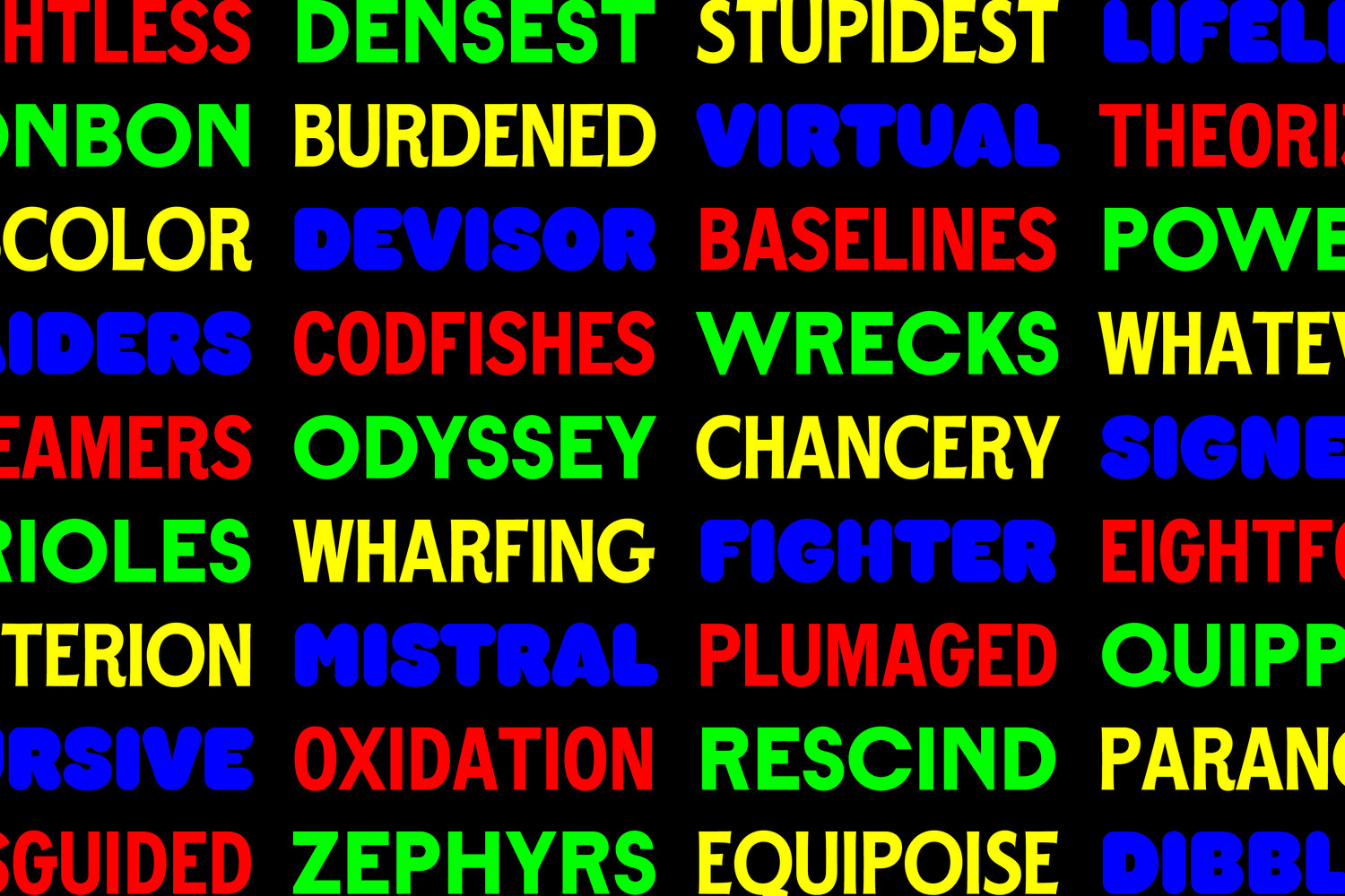
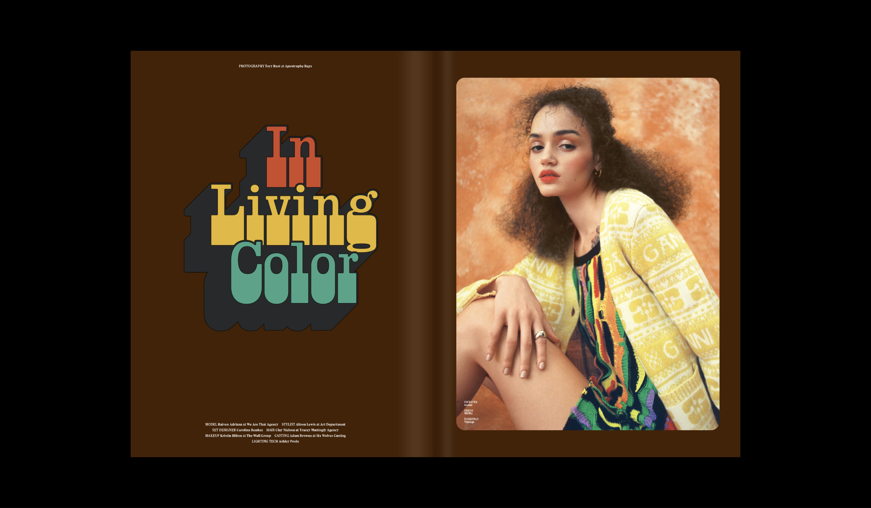
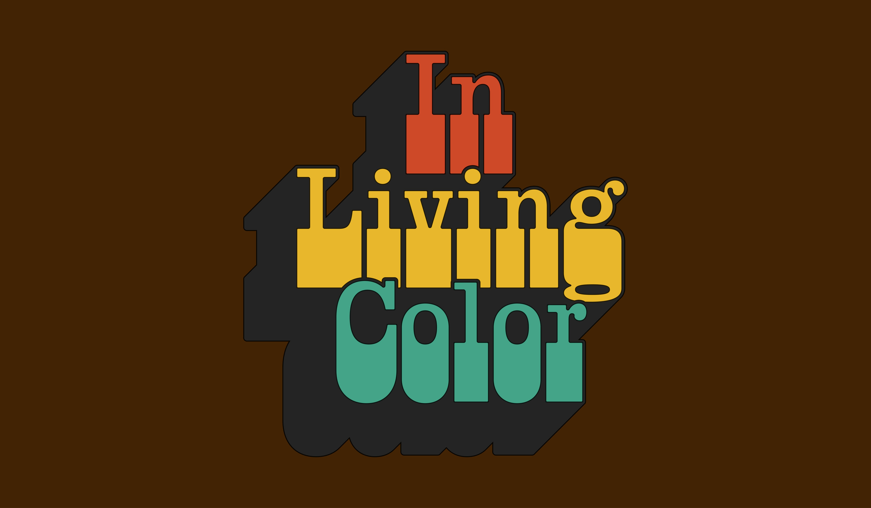
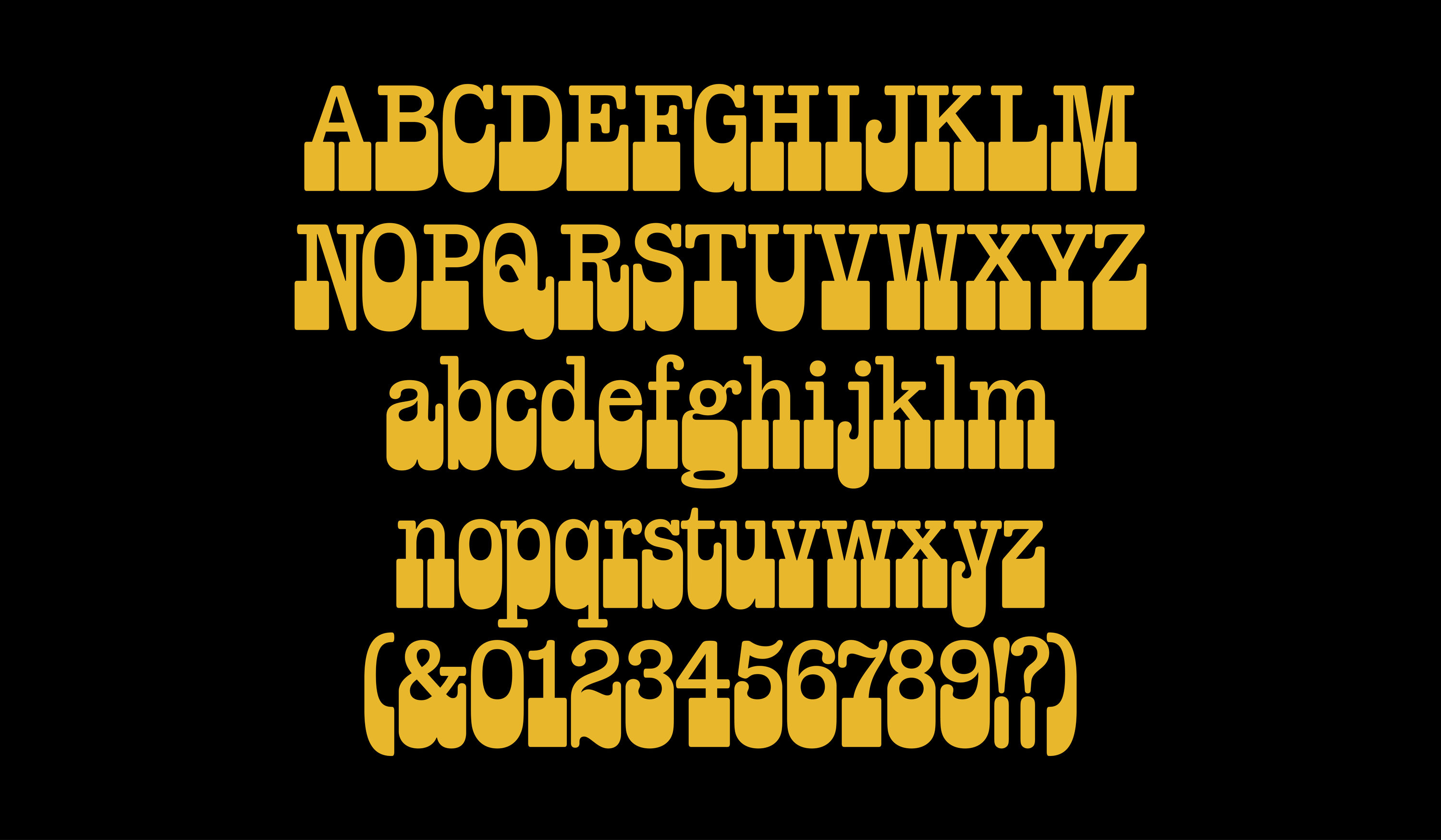
Lettering for Tory Rust’s In Living Color shoot came together rather quickly. Since the styling showcases a collection of densely textured, 70’s-style knitwear, we chose to create something complimentary. The bell-bottom slab serifs provide personality and exaggeration to an otherwise well-structured, Clarendon style of letter. This lettering prompt ended up turning into a complete typeface, which is currently in progress.
Fall/Winter 2023
Issue 18
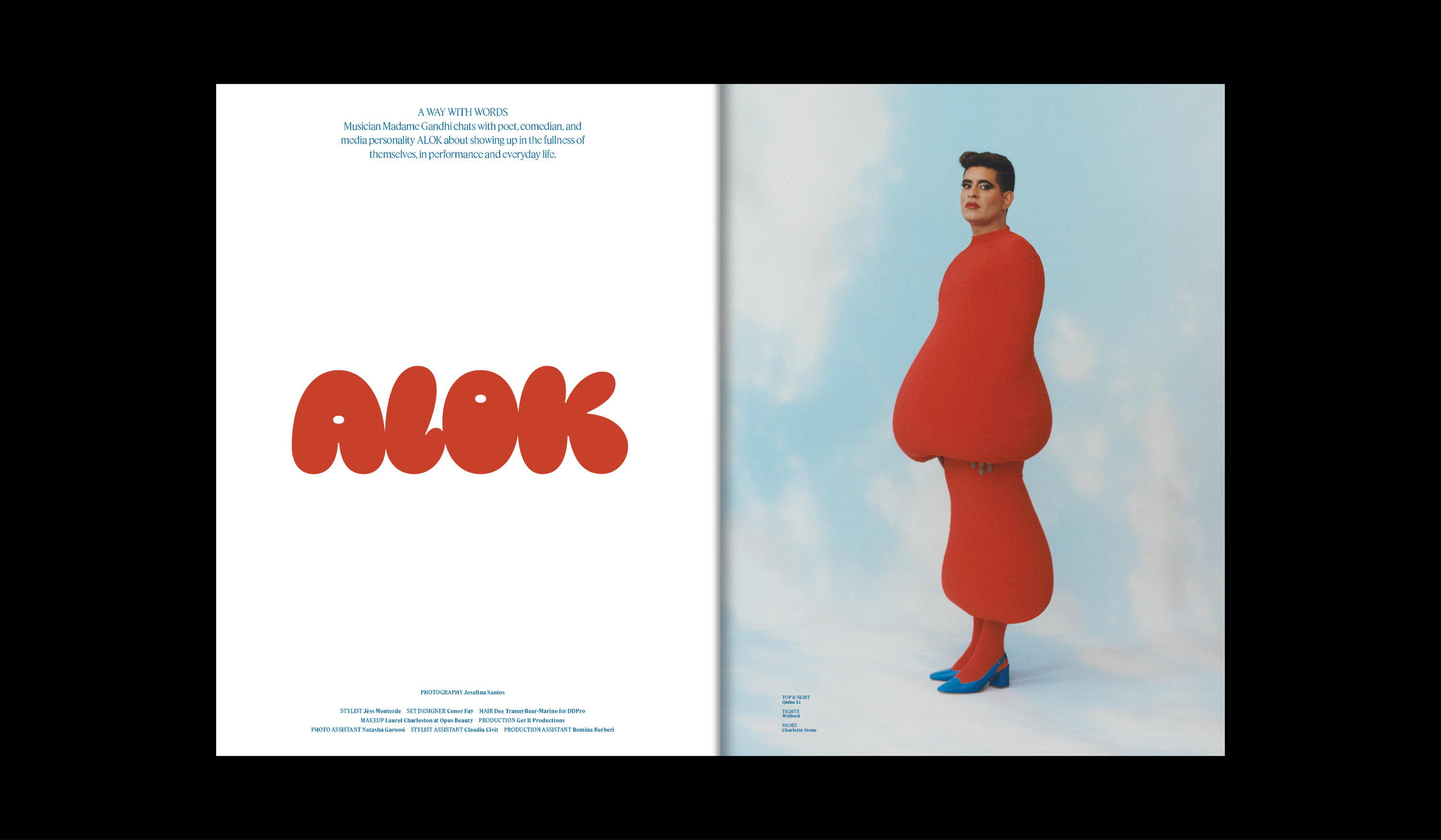
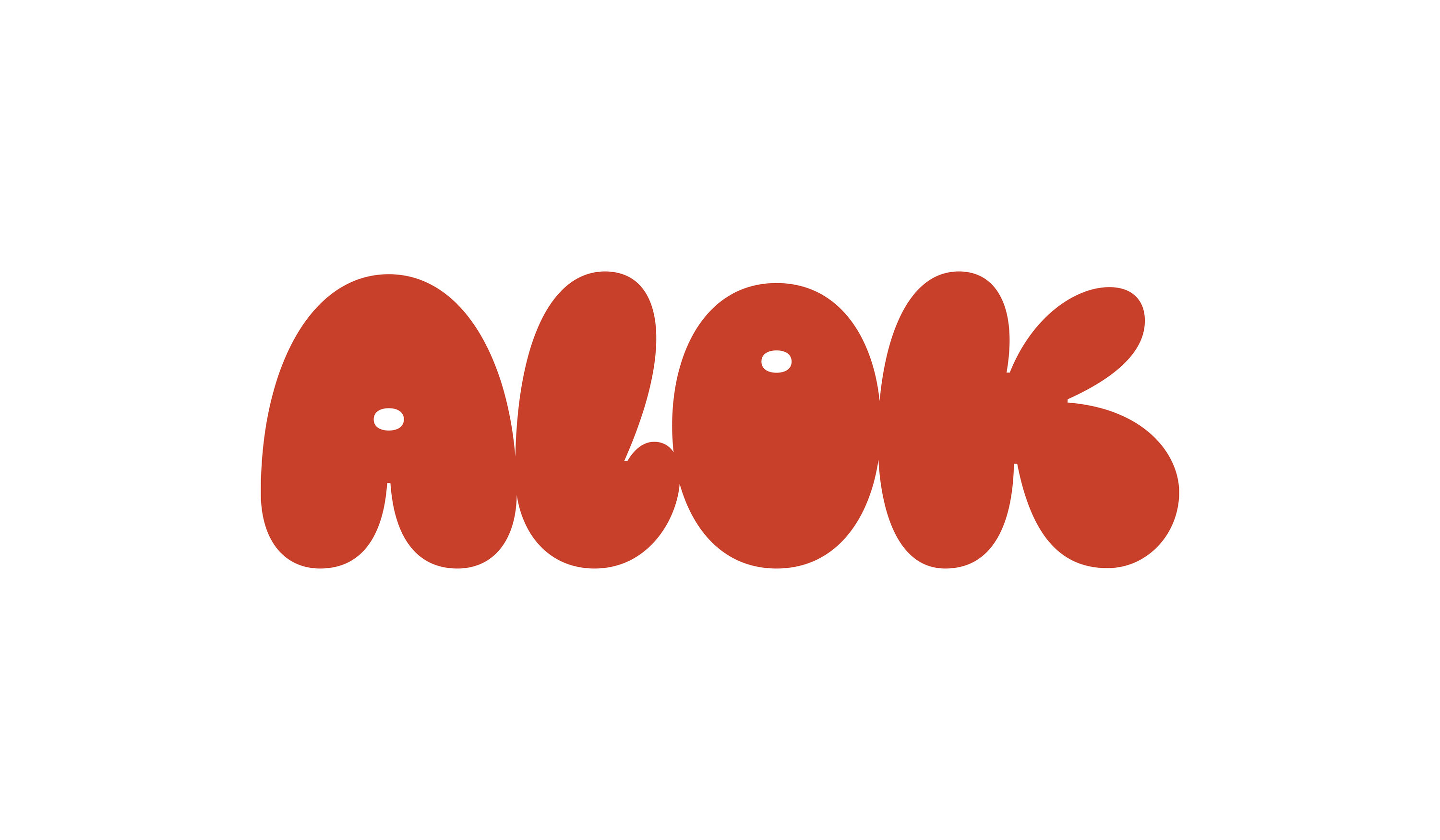
For this issue’s feature on Alok Vaid-Menon we went for headline lettering that resembled the opening image. The voluptuous, curvy forms of the styling, contrasted with Alok’s expression are mimicked in the opposite lettering.
Spring/Summer 2024
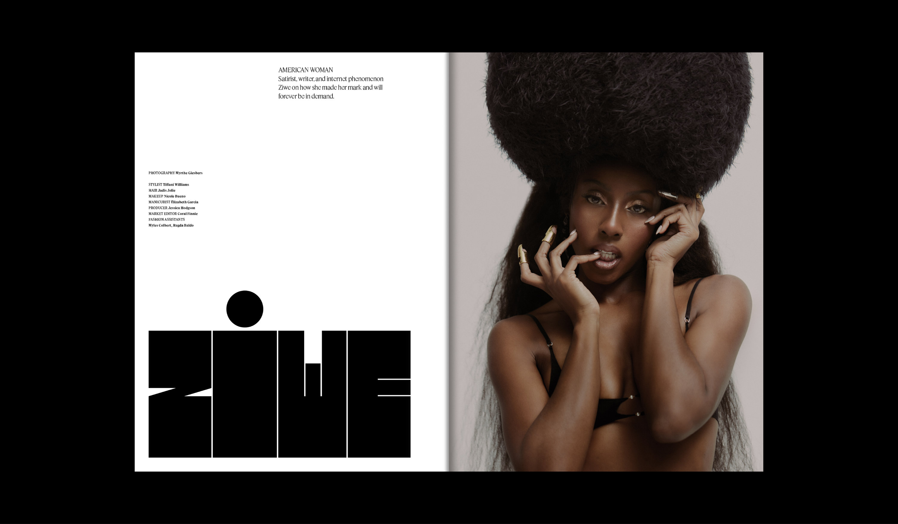
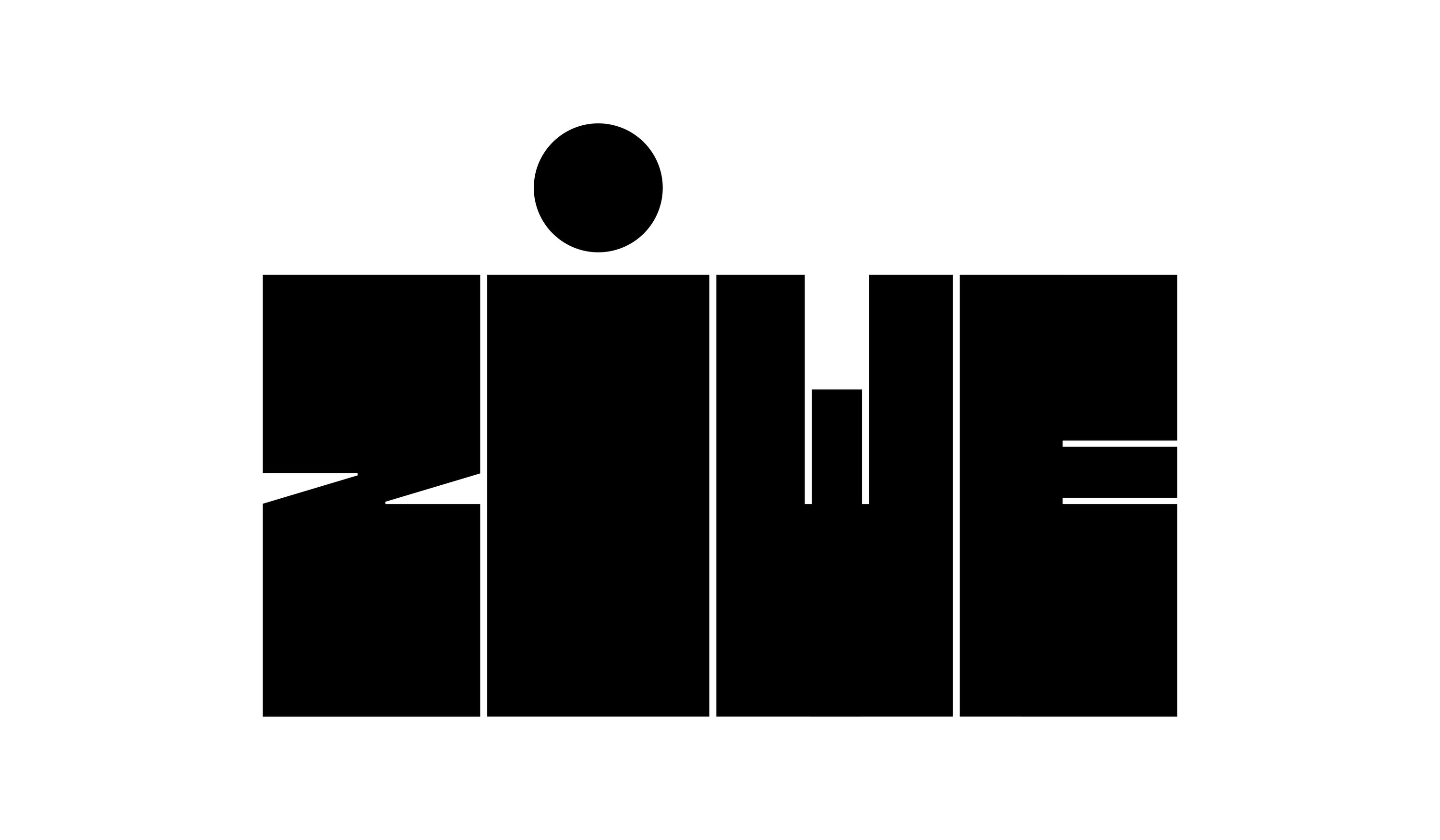
Tida Tep’s idea for Ziwe’s feature in Issue 18 was to create block letters that contrast the photography, with the dot above I being a playful tie-in back to the photography. After a few quick revisions on spacing and proportions, we were good to go.
Spring/Summer 2024
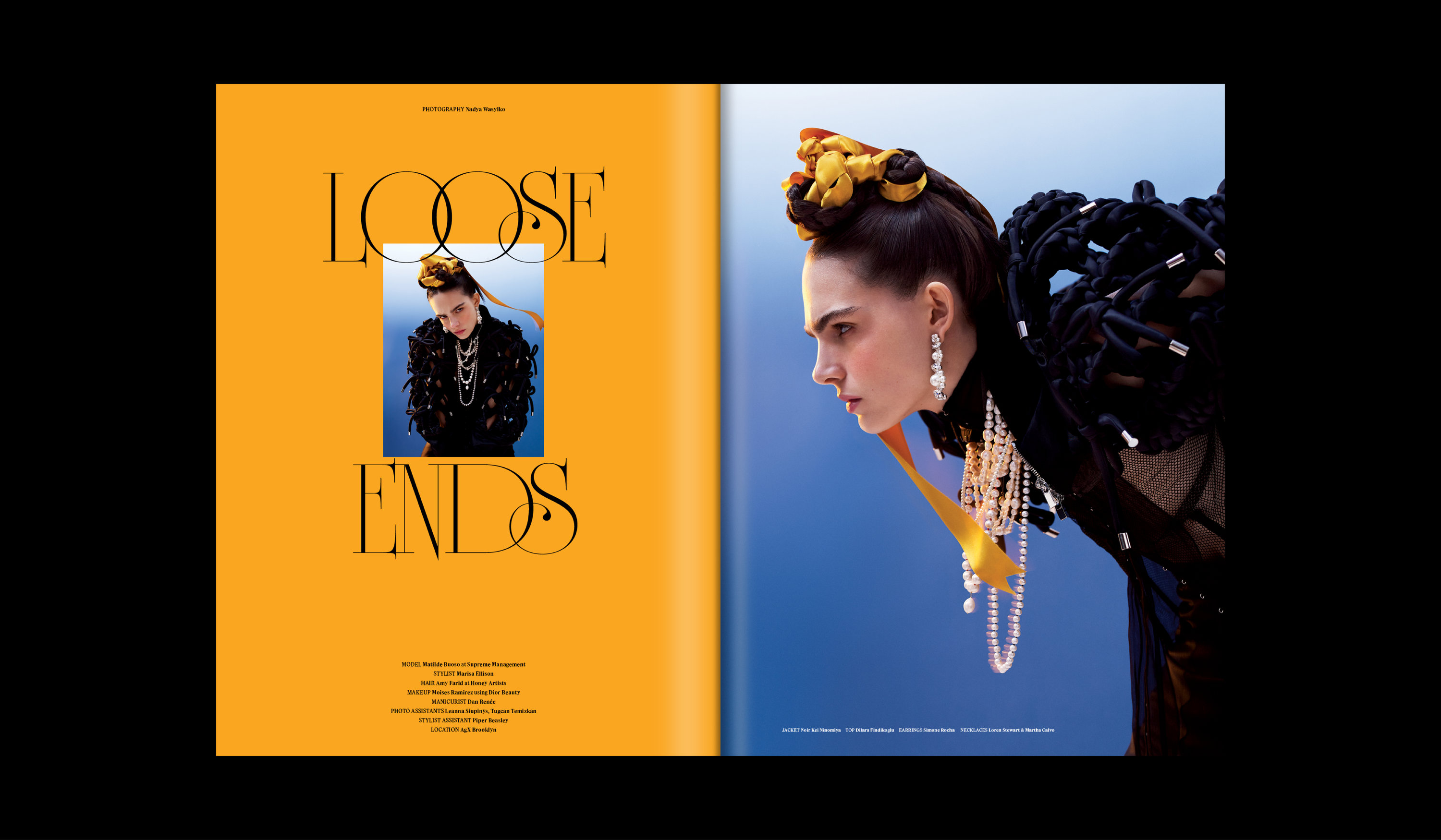
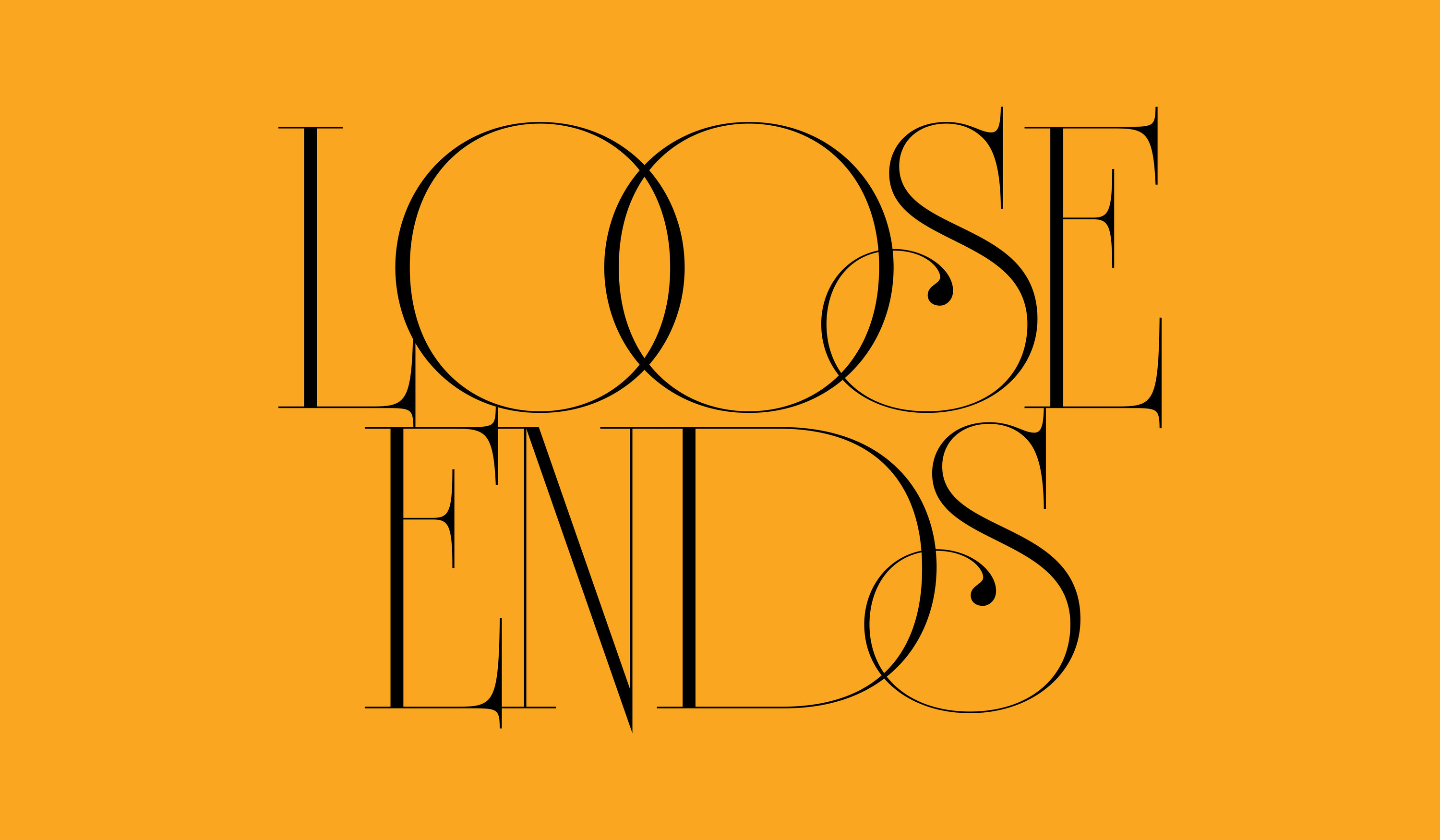
For Nadya Wasylko’s Loose Ends shoot, we wanted to create something with a prominent fantasy element to it, since the styling of the shoot is a fantastical interpretation of traditional Ukranian clothing. We decided on an ultra posh, high-contrast version of the classic University Roman typeface.
Spring/Summer 2024
Issue 19
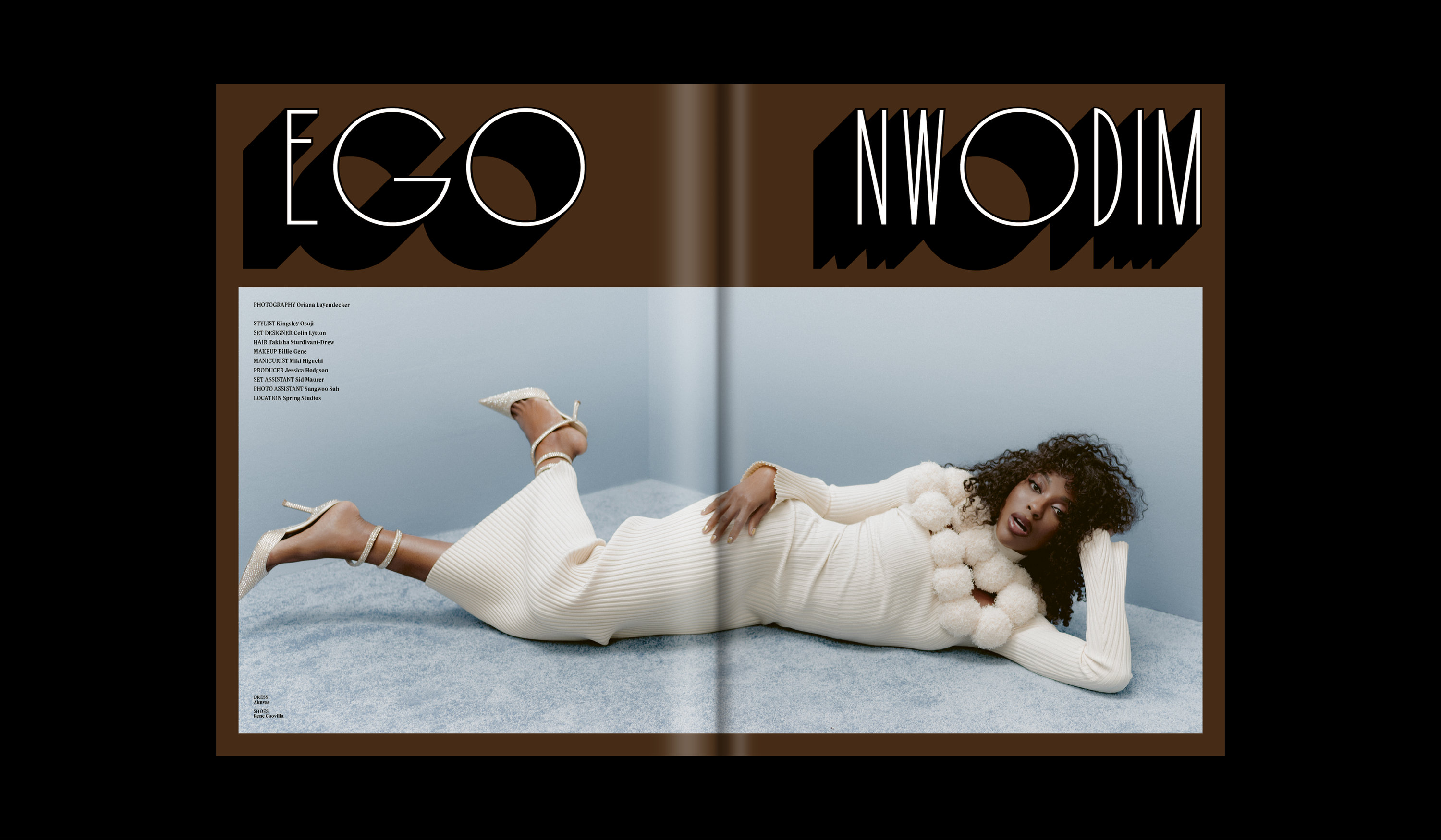
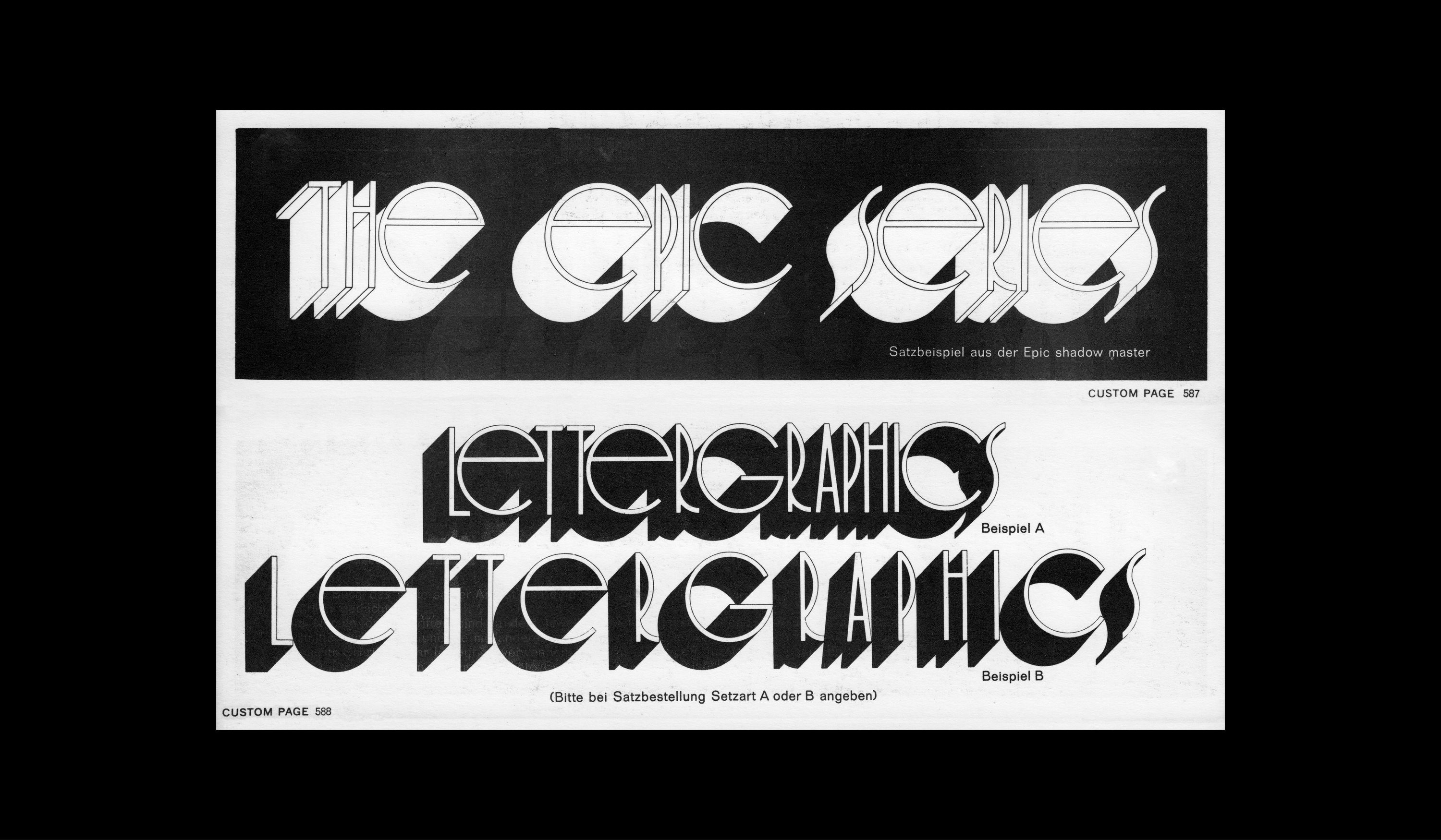
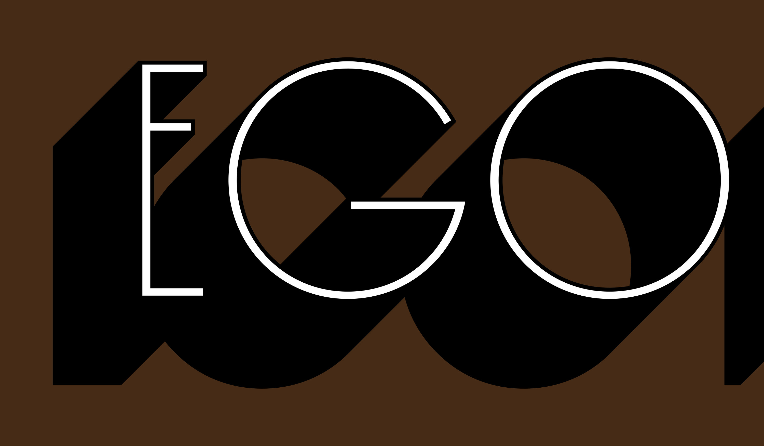
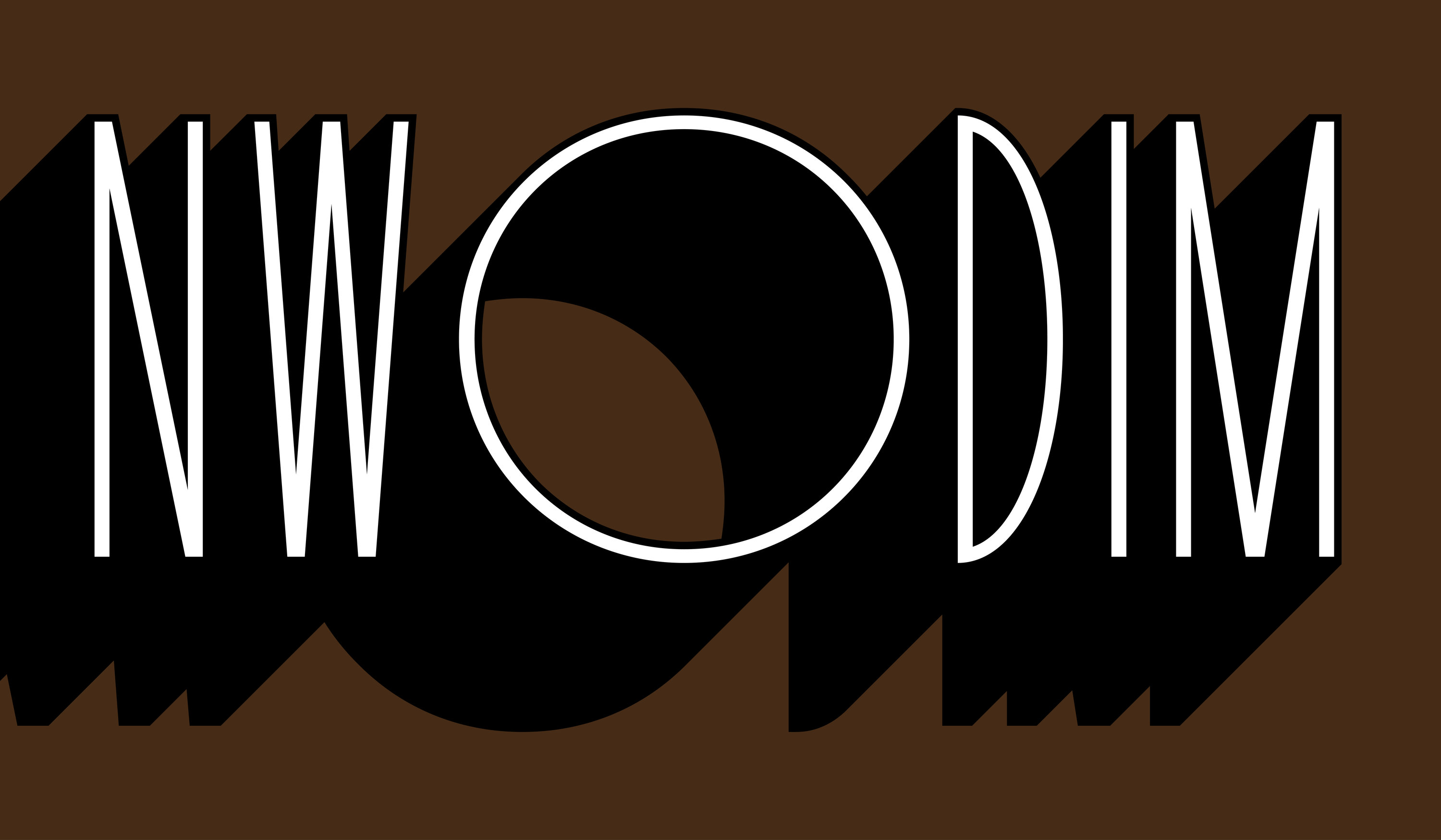
Ego Nwodim’s feature in Issue 19 captures her in a way that acknowledges her role as a comedian, but also portrays her in a slightly serious, more mature tone than one might expect if they’ve only seen her on SNL. After iterating on a few ideas for a headline, we found The Epic Series via Fonts In Use, and knew immediately that a digitization of it would fit perfectly … and it did.
Fall/Winter 2024
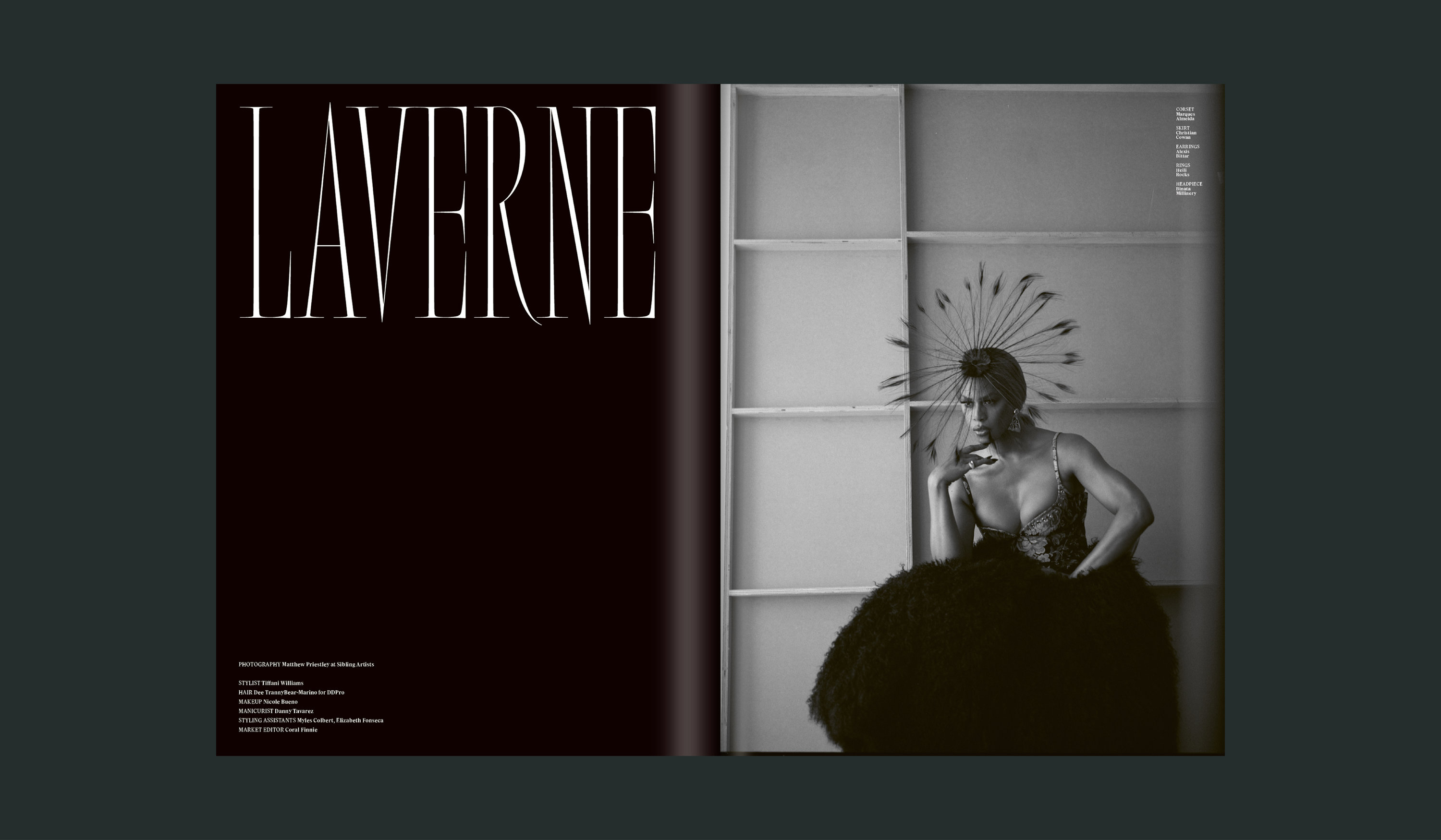
After Hours & Laverne Cox
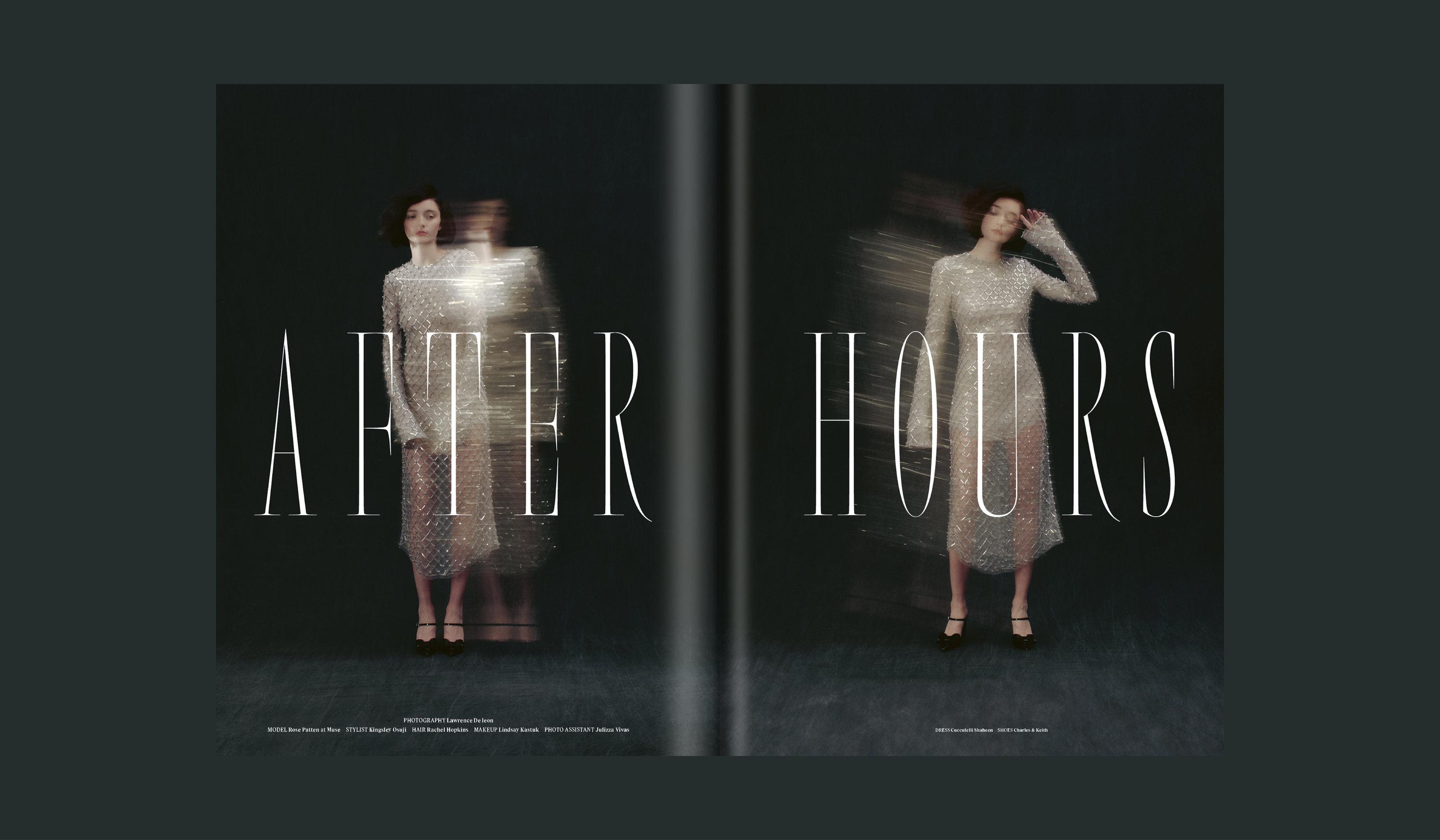
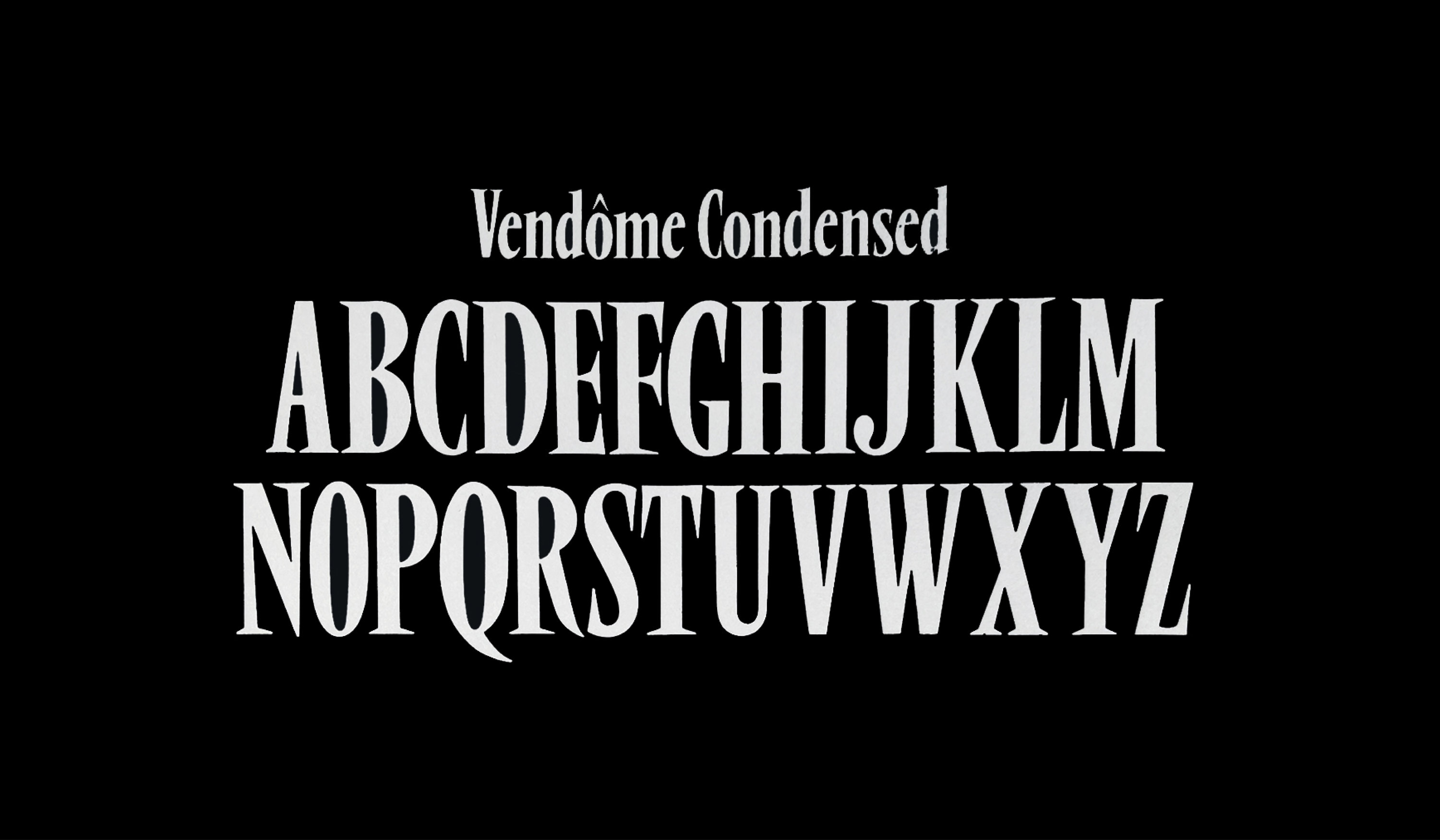
An extremely light weight, high contrast play on Roger Excoffon’s eponymous Vendôme got put to good use for two different features in this issue: After Hours by Laurence De leon, and a feature on Laverne Cox by Matthew Priestley.
Fall/Winter 2024
Issue 20
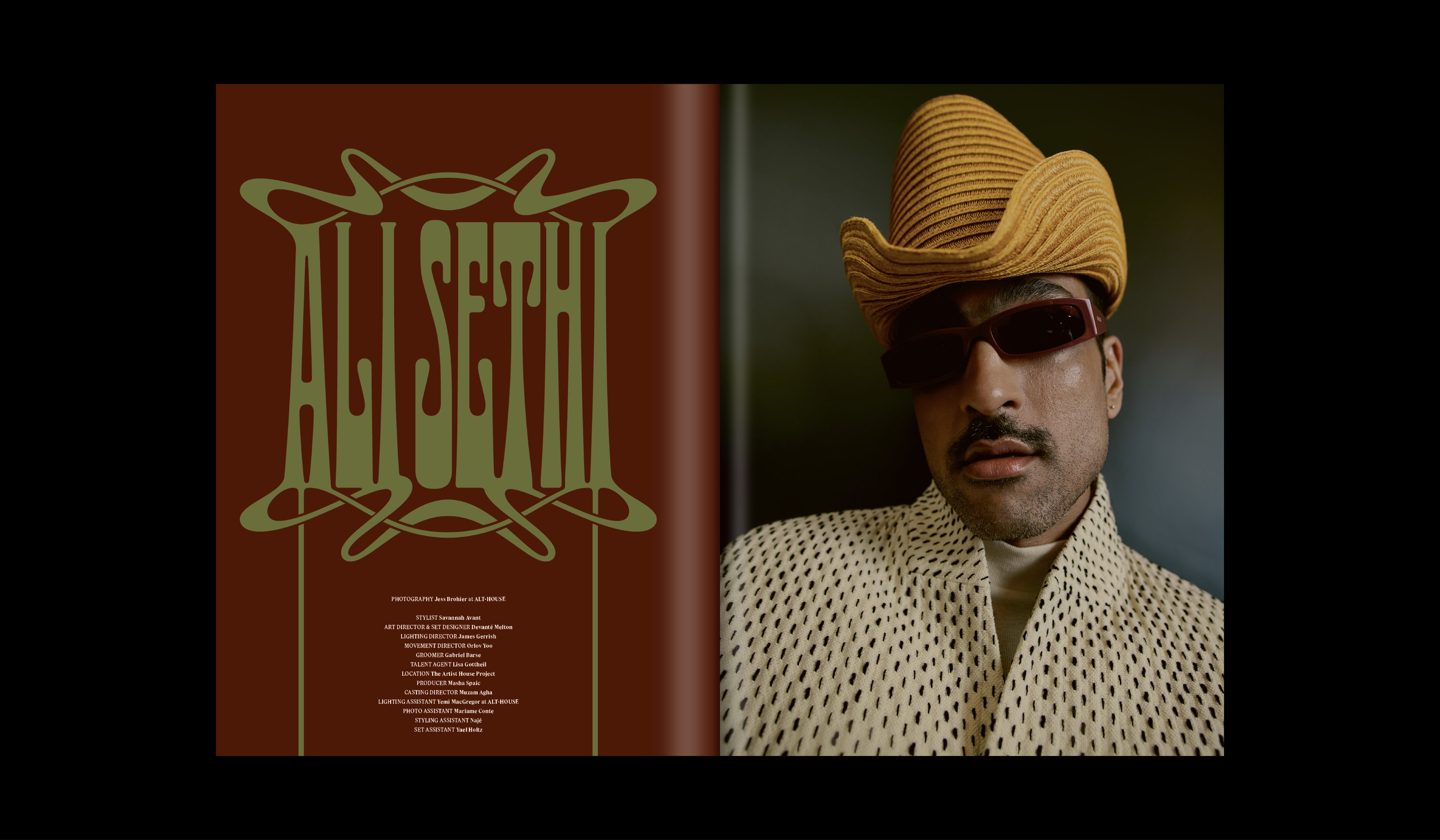
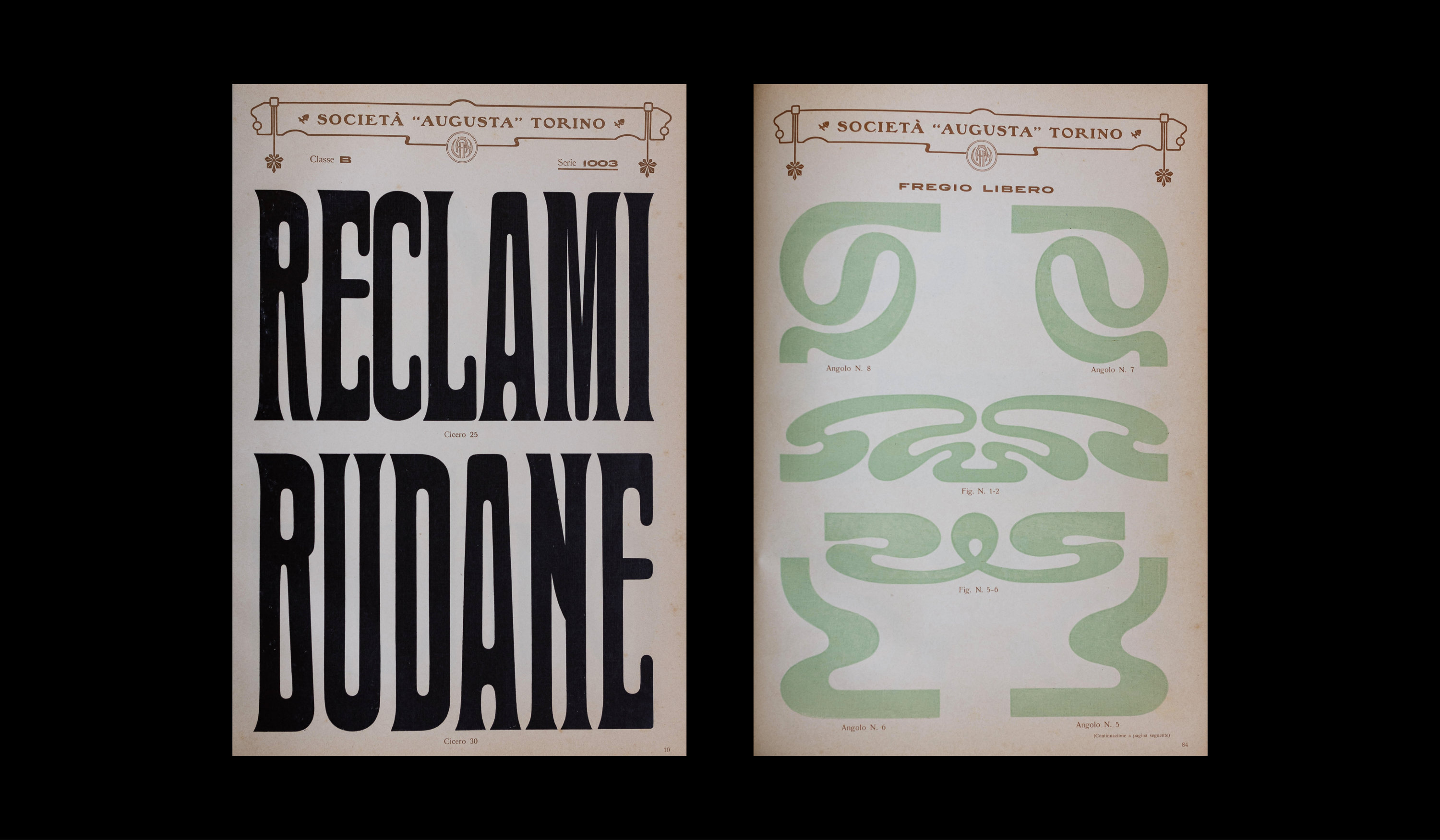
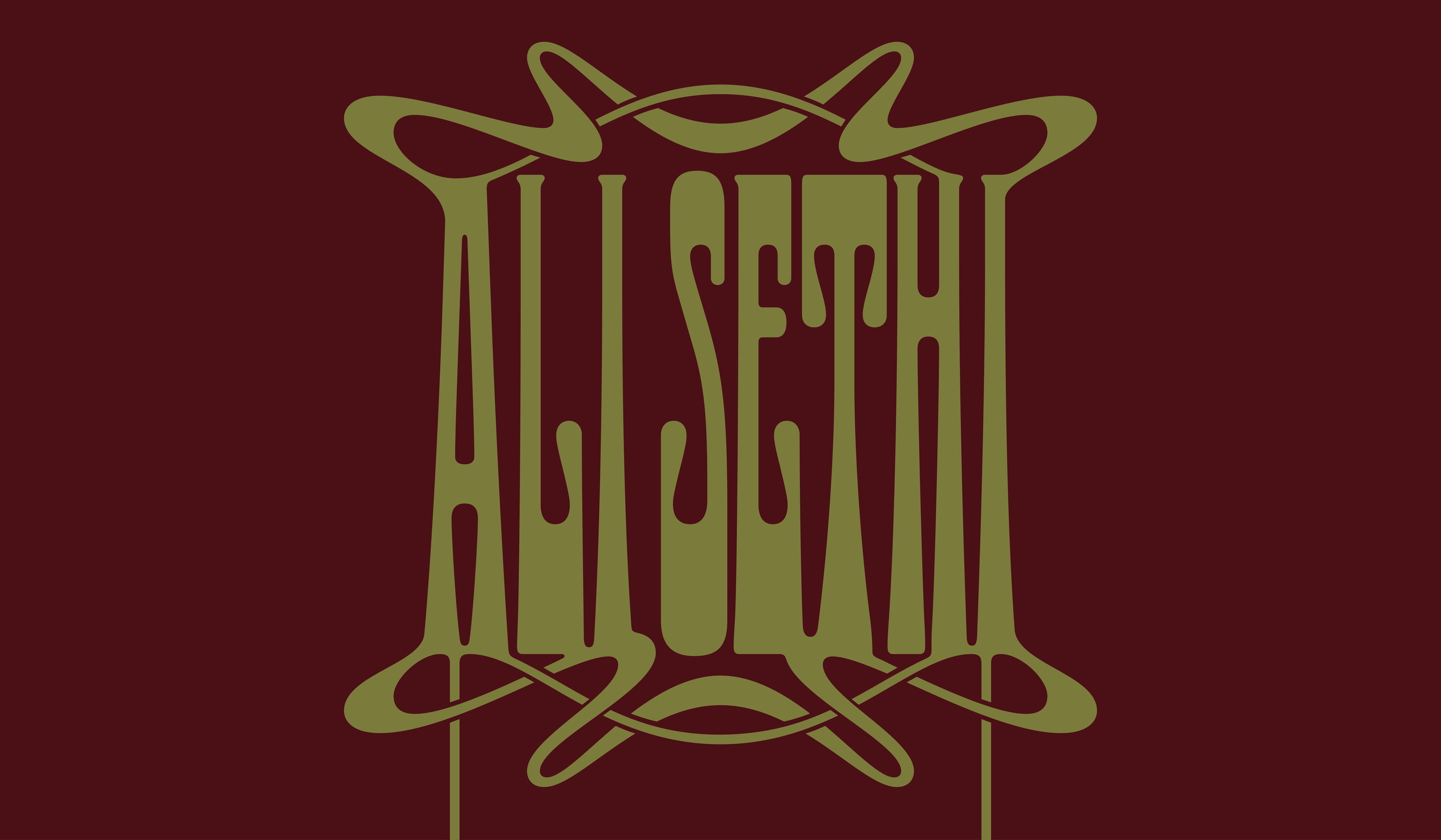
Ali Sethi’s feature in Issue 20 was shot and styled in an old, ornate brownstone in upper Manhattan. The visual styling of the shoot led us to drawing in an Art Nouveau style that mirrors the genre-blurring world Ali builds in his music and videos.
Spring/Summer 2025
Images courtesy of Tidal Magazine